- Auckland
- Brand Strategy
- DA Friends
- Design Studio
- Fresh from the field
- Graphic Design
- Identity
- New Zealand
- Packaging Design
Fresh From The Field – Talbot Forest Cheese Co. By Onfire
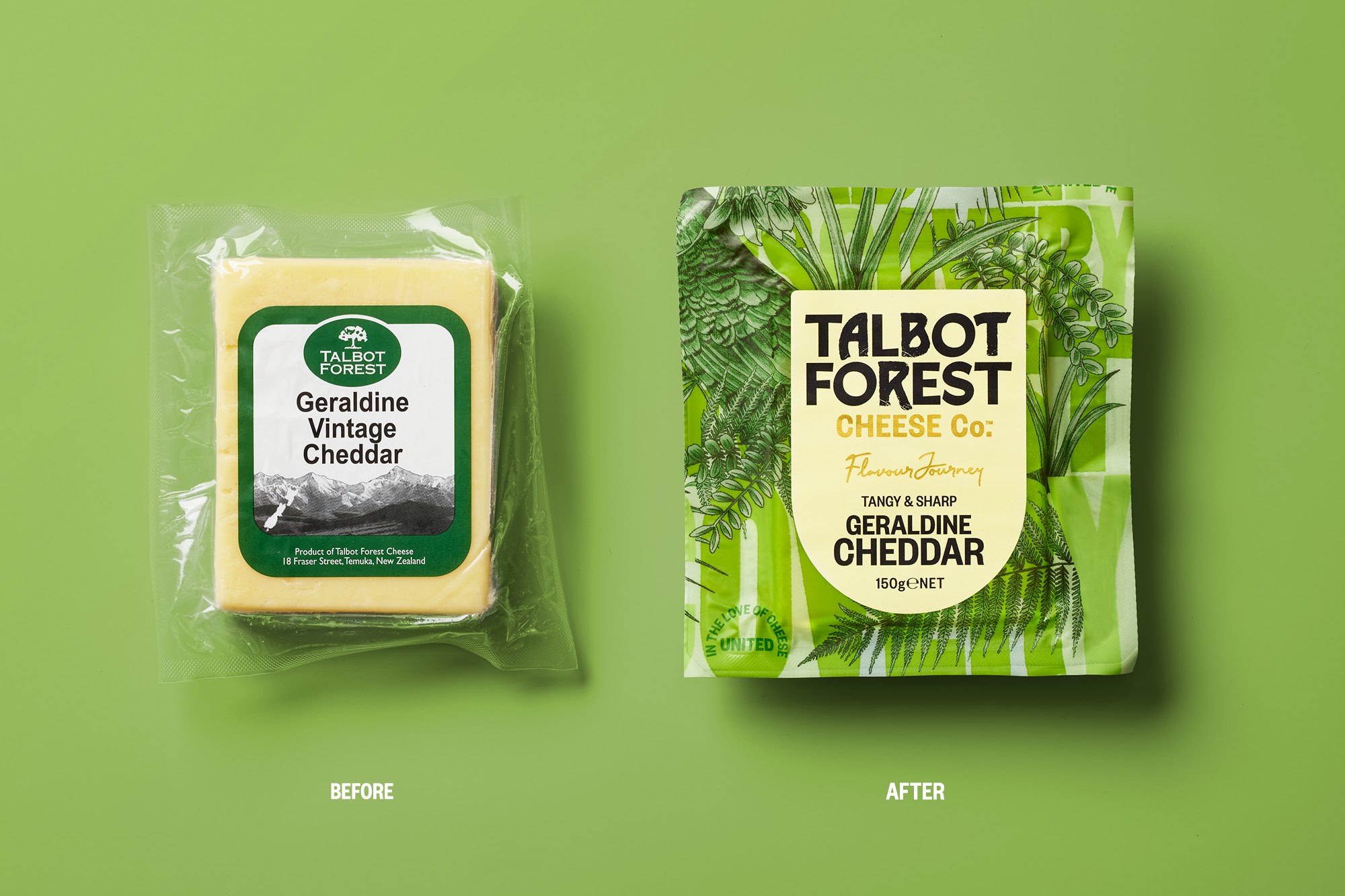
Off to a red hot start to the year, Onfire has been awarded packaging design Gold at the World Brand Design Society Awards for its work on Talbot Forest Cheese Co. Bringing to life the cheesemaker’s story and the nature its inspired by, Onfire has artfully woven these together – incorporating Kiwi flora, fauna and birds in their winning design. They’ve set Talbot apart from the competition and have re-ignited the brand with an iconic kiwi flair.
Want to submit your own work to Fresh From The Field? Fill out the FFTF form here.

Welcome to the forest friends
“Having worked with Onfire Design on several successful packaging design projects I knew the team was well placed to deliver on the challenging brief. The outcome is a fresh, bold design that embraces the brand’s roots and story but does so with a contemporary vibrant look that sparks curiosity and attention – a real game changer for the brand and for the category!” – Maja, Marketing Manager

The brief:
Named after the local forest in the South Island of New Zealand, Talbot Forest Cheese was established in 2000 to produce high-quality, specialty cheeses. This small operation soon grew, annually making tons of various cheese styles.
However, a lack of attention to the brand and packaging has resulted in a ‘manufacturer’ brand rather than the disruptive iconic Kiwi brand it should be. We were tasked with its recreation and challenged to bring to life its story, quirky personality and unique perspective in cheese making.


We found inspiration in its forest origins. Bringing this to life with a bold typographic woodblock pattern. Through which weaves botanical style local flora, fauna and birdlife illustrations; the size of which allows for multiple crops applied across the cheese styles. This creates an ever-changing forest scene in retail. The previously dated brand logo lozenge was taken away, allowing for a new wordmark to be used at a much bigger scale, with a considered mix of refined and rough tree-like letterforms.
Inspired by its new motto, ‘United in the love of cheese’, a shield-shaped label is applied with refreshed taste descriptions with a pale colour palette to aid product navigation. The result is a brand that sparks curiosity with a distinctive opinion and personality in a category awash with various iterations of the now commoditised craft story.


- Golden Granola! More packaging design Gold from the World Brand Design Society Awards – this time for Hubbards Be Mighty Granola. By turning the Hubbards brand language up to the max, we helped Be Mighty Granola stake a claim in the natural energy category and struck Gold in the process! View Project →
- Savoury Snacking Silver – Onfire created the catchy name and bright coloured packaging for EAT savoury snacks, with big bold typography that punches personality into these tasty little morsels on retail shelves. Picking up World Brand Design Society Award Silver along the way was a bonus! View Project →
- #7 in the world! – Each year, World Brand Design Society releases their top agency rankings and, for the fourth consecutive year, Onfire is in the global top 10 – coming in at #7 and top among New Zealand agencies on the list. Now we’re looking forward to delivering even more world beating creativity for our clients for the rest of the year. Read More →


