Fresh from the Field — Rhodes Physiotherapy Brand Identity by RUN
If you have new or recent work that you would like to share in Fresh from the Field email Lana for details.


The Brief
Rhodes Physiotherapy is a physiotherapy practise based in Auckland. The team are young, vibrant and greatly experienced in sports physiotherapy. They came to RUN wanting an identity that stood them out from the typical stylised sports figures that are all too familiar in their industry. They wanted a look that was fresh and different from the rest, yet still said physiotherapy.
The Response
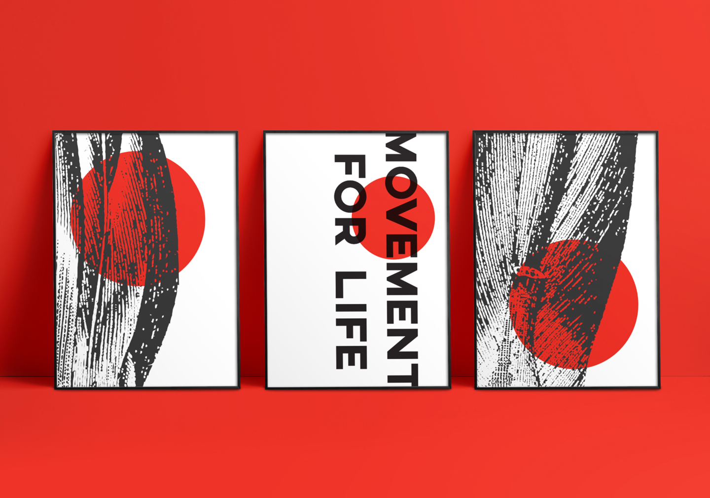
At the initial briefing meeting with the client RUN pulled out the phrase ‘movement for life’, which formed part of their focus. They loved the idea of using the human form, although somewhat stereotypical in the physio world, so needed to twist this in an interesting way.
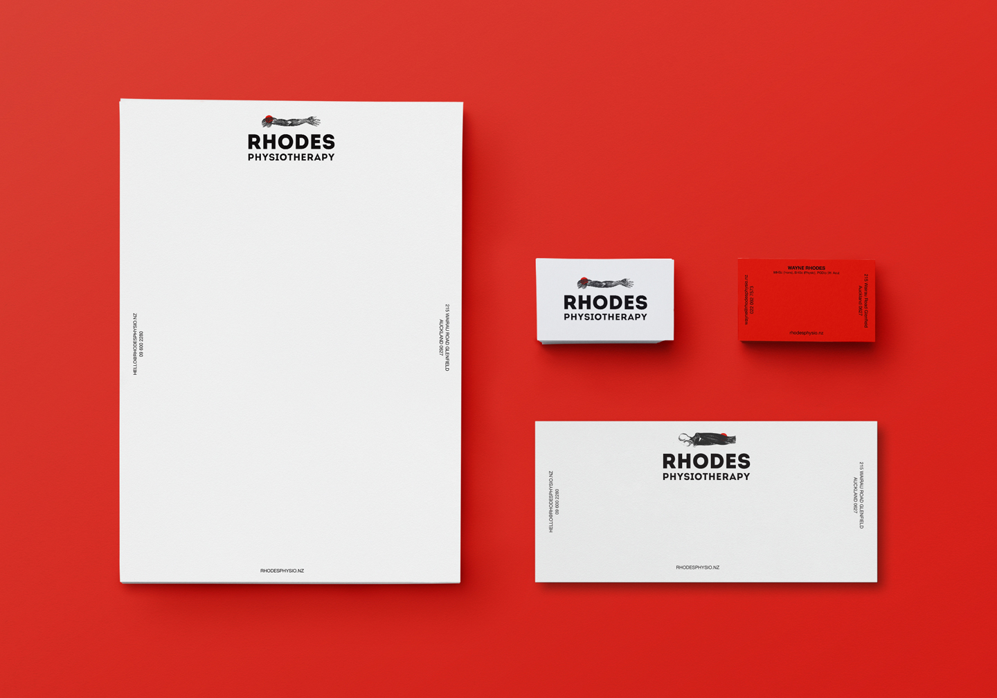
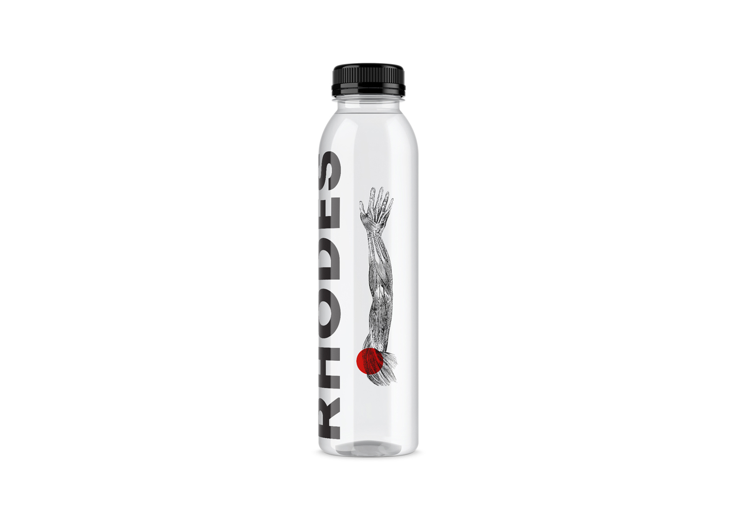
With da Vinci’s Vitruvian Man in mind RUN unearthed some vintage engraved illustrations, from various encyclopedias and medical dictionaries dating back to 1851, then refined them further to form a set. After seeing a wall of green and blues in physiotherapy brands during their research they decided that red was much more closely aligned to the idea of the human form and obvious as it is what rushes through our veins. So a red circle was added to each, referencing another industry commonality of a pain point.
Along with strong, simple typography, these elements came together to form the basis of the Rhodes Physiotherapy identity, solving the client brief by creating an engaging identity with an original twist on the usual.
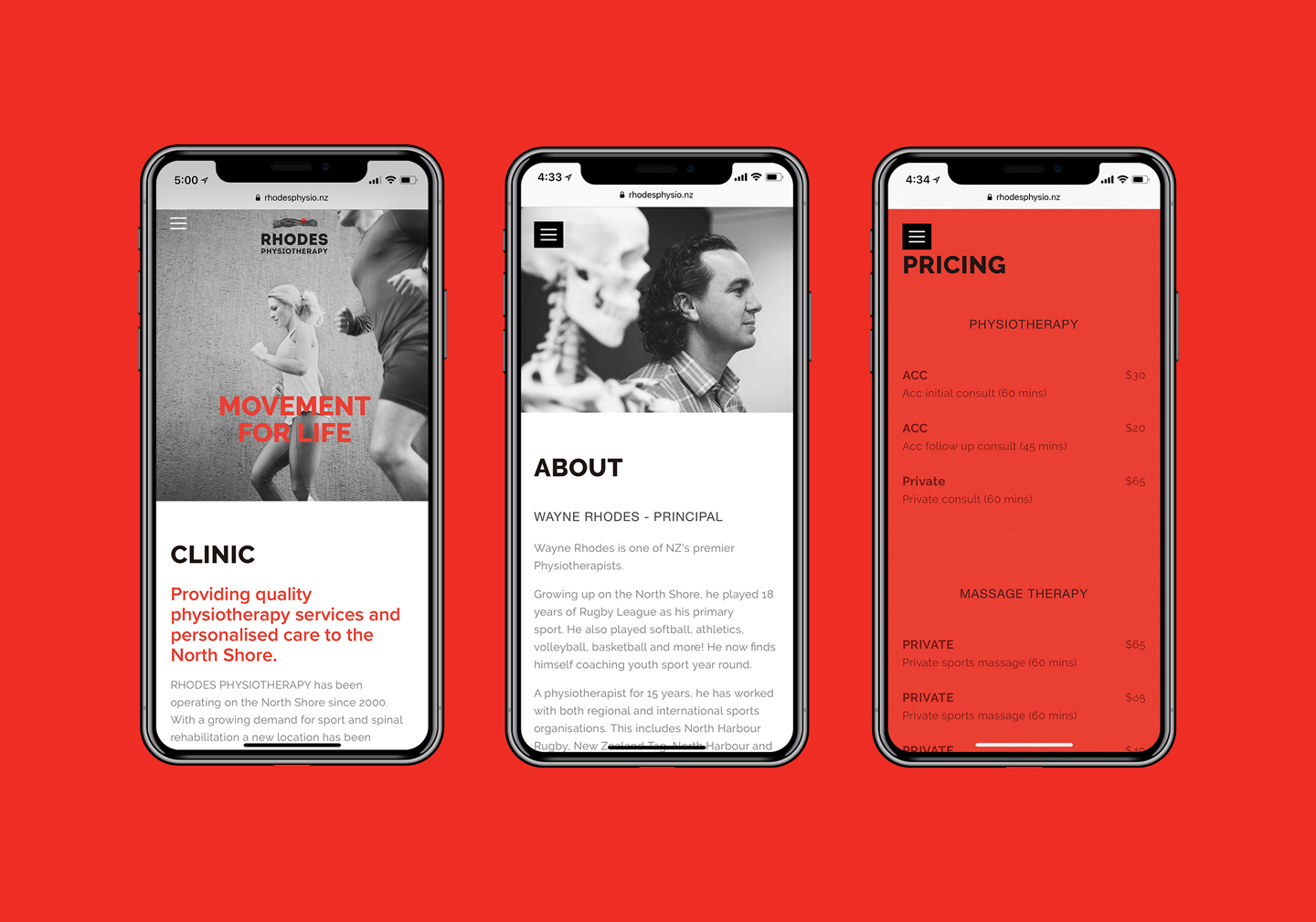
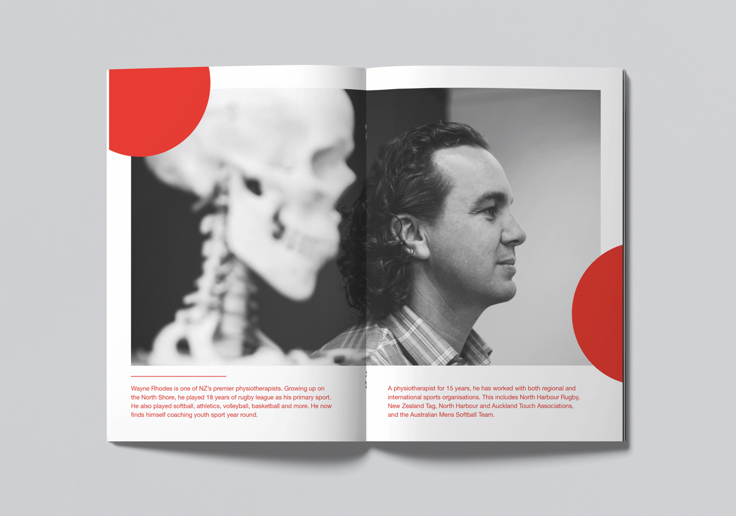
The brand identity was then rolled out by RUN across stationery, signage, brand books, digital and products.

See more from the team at RUN by visiting: www.runwithrun.com