Fresh from the Field – Cascade Electrical By White Rabbit
2 years ago by Louise Kellerman
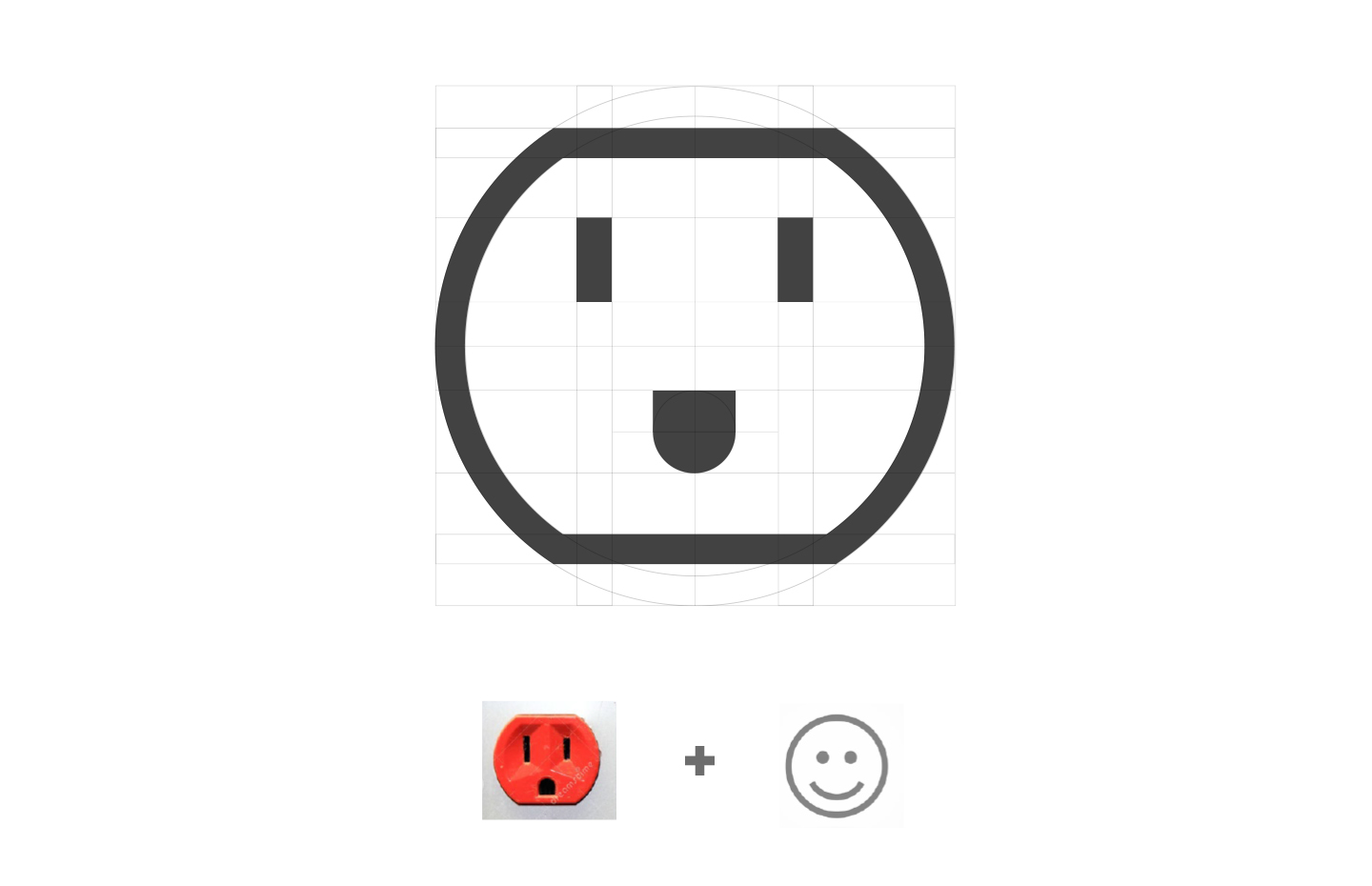
White Rabbit was approached by Cascade Electrical to develop a new logo and business card. The resulting design is a clever play on the happy face which helps bridge an emotional connection to the audience while embodying the client’s key values.
Want to submit your own work to Fresh From The Field? Fill out the
FFTF form here.
The Brief / project Kaupapa:
Cascade Electrical provide electrical work for residential to commercial and anything in-between. The owner has over 20 years of experience in the industry and decided to put these to good use, forming Cascade Electrical. He is passionate about providing customers with genuine advice and knowledge so they receive the best outcome possible. They produce work of a very high quality and providing an honest and reliable service is one of the utmost important factors for them. Good communication, reliability and trustworthiness are key values of the company. Cascade asked our team to come up with a logo and business card design that embodied these values. Something that provides a sense of approachability while also looking professional. We were pumped to start working on this project and were inspired by the owner’s passion for the industry.

The Design Response/what was created: (approx 300-500 words)
For this concept, we were inspired to design a trustworthy identity as a response to our conversations with the owner around the philosophy behind Cascade Electrical.
We focused on the customer-centred values of the company. We wanted the design to convey an approachable, friendly, and reliable look and feel. Inspired by the NZ wall sockets, we crafted a likeable logo mark that would spark a positive reaction from the audience. The happy face creates a sense of reliability for Cascade Electrical and reflects their drive for client satisfaction.
Vibrant colours and a bold, modern and rounded typeface were applied to polish off the approachable and fun look. This branding is sure to provide a big point of difference from the stock standard branding often seen in this industry. The design not only stands out but also creates an emotional connection with their target audience. The new brand identity achieves all of this, while also keeping a minimalistic and modern aesthetic.

We then continued to work on other brand assets such as their company business cards. The striking new logo mark was centre stage on these with the contact details clearly displayed on a contrasting white background on the reverse side. We printed these on a premium satin matt art with a double matt laminate to provide a beautiful smooth tactile finish.
Hopefully this logo design will make others smile when they see it. It sure made us smile while working on it.
The Collaborators (creative team/app developers/consultants etc):
Simon Ellery
Nicole Wong
And any social handles/URLs we should link to.


