- Brand Strategy
- Christchurch
- Design Studio
- Digital
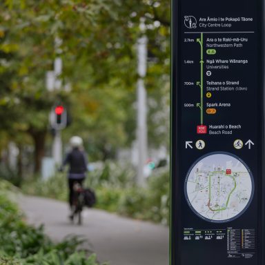
- Environmental Graphics
- Fresh from the field
- Graphic Design
- Identity
- New Zealand
- Typography
- Website Design
Fresh From The Field – Venues Otautahi by McCarthy
We get great insight into McCarthy’s process for designing a brand in their project for Venues Ōtautahi – a mix of striking photography, bold colours and expressive illustration styles gives Venues Ōtautahi a versatile and creative brand, which can be adapted as needed and adds to the impact of the overall experience.


The brief:
Venues Ōtautahi (formerly Vbase) is an established event delivery and venue management organisation offering an impressive 15 year service to Christchurch. Following a number of significant changes within the organisation, they approached us, recognising the need for a substantial change to their brand and experience.


Vbase was an established event delivery and venue management organisation with five unique large-scale venues and an impressive 15 year history here in Christchurch. When asked to partner with them on the refresh of their brand we asked ourselves a few questions; how do we initiate positive change and start shifting people’s perceptions; how do we effectively launch a new brand within the context of a global pandemic; and beyond that, how do we build engagement and show that Vbase is the sort of organisation that Cantabrians want to support and stand alongside?


The design response:
Commencing with brand strategy, we identified the need to change the name of the organisation. Keen to move away from ‘Vbase’, which had come to have a negative connotation in the market, we settled on the bilingual name ‘Venues Ōtautahi’.
We created a concept that looked to energise the organisation, placing focus on storytelling to bring to life the idea of manaakitanga, as well as the ways in which the venues enrich our lives.


A brand system was developed where a rectangular space, representing the venue, can be filled with a variety of different images or graphics – photography, illustration, typography or pattern, or in some instances a combination of these. This rectangular device is used consistently throughout brand application and even features within the logotype itself.


Due to budget constraints, we were required to produce the illustration in house. We came up with the idea of utilising two different styles – a more simplistic line based approach that depicts the various events one might experience at a single venue; gala dinner, basketball game or concert for example, followed by a more colourful expressive style that is used to depict people in action – a popstar singing onstage at the arena, a rugby player breaking through tackles at the stadium and a couple of bridesmaids fighting over a bouquet at a wedding. These are subtly animated for social media and digital applications which further bring them to life. The resulting illustrations bring a notably human aesthetic to the brand.


Commencing with naming, we set about developing a multi-faceted brand identity. The concept looked to energise the organisation, placing focus on storytelling to bring to life the idea of manaakitanga, as well as the ways in which the venues enrich our lives.
Photographic and illustrative imagery depict the special moments that take place at each venue. These enliven the identity, bringing about a notably human aesthetic, while a bright and playful colour palette complimented a simple language system and typographic approach. The result is a progressive expression of Ōtautahi; a confident, contemporary identity that connects and engages with its people through a welcoming invitation to experience more.

Credits:
- Studio: McCarthy
- Creative Director: Matt Kitto, Stephen McCarthy
- Design Team: Joel Kitto, Richard Burson, Stefan Downs
- Illustrator: Stefan Downs
- Typeface: Founders Grotesk, Klim
- Account Director: Claire Jones
- Social: @mccarthydesign