Fresh From The Field: Telegraph Hill – By Onfire Design
Proof that first impressions matter, especially when they’re drizzled in great design. Onfire Design serves up a fresh new identity for Telegraph Hill.
Fresh from the Field is a weekly article series sharing fresh and inspiring work from the Design Assembly community. Want to submit your work to Fresh From The Field? Fill out the form here.
The brief
Founded in Hawke’s Bay in 2001, Telegraph Hill began with a bold idea – growing olives in New Zealand when the industry was virtually non-existent. Through perseverance, founder Geoff Crawford proved the region’s climate was ideal for Spanish Manzanillo olives, planting the first grove on a hill once crossed by telegraph lines – the inspiration for the brand’s name. From these origins, Telegraph Hill grew into a local favourite, renowned for its exceptional Extra-Virgin Olive Oils and inventive range of dressings, vinaigrettes and drizzles.
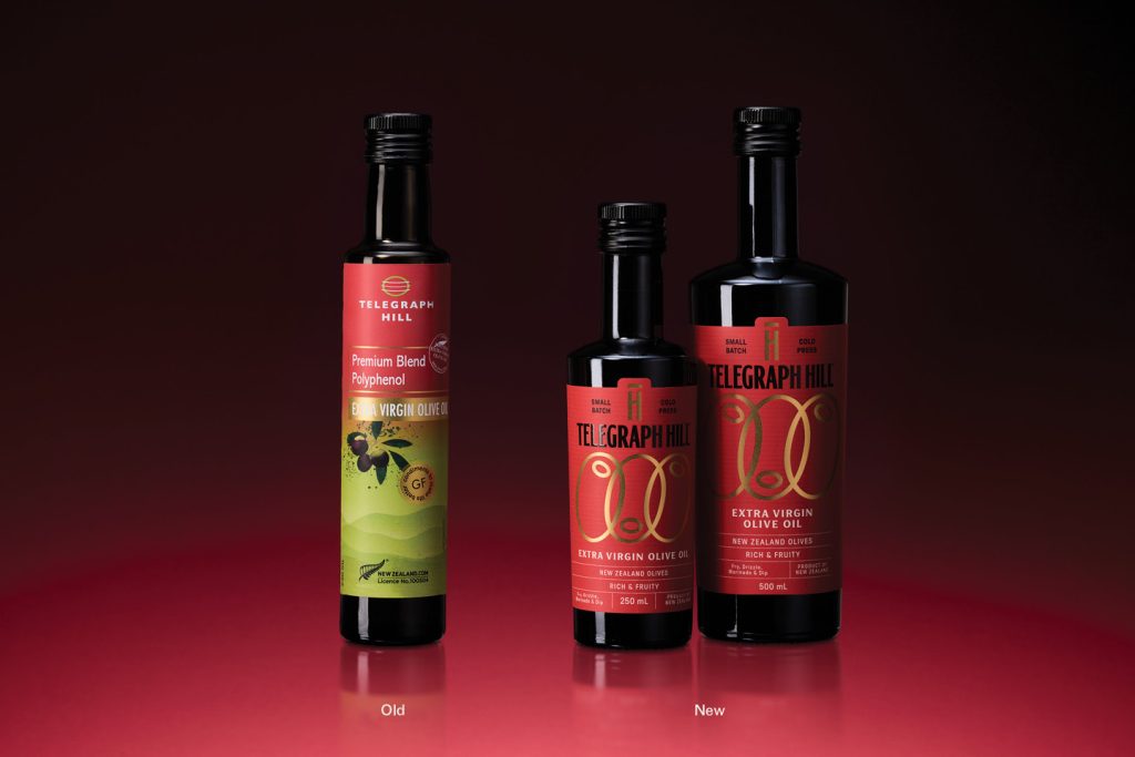
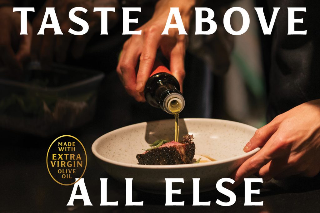
2025 marked a new era. With Geoff stepping back a new team was charged with evolving this much-loved brand for national retail, keeping its heart while refining it for today’s premium-mainstream foodie audience. The challenge was to create a new cohesive master brand system that acknowledged its heritage, and foodie-elevated, which could flex across multiple categories seamlessly, anchored by a unifying brand idea that celebrates a love of cooking and flavour – “Taste above all else.”
The design response
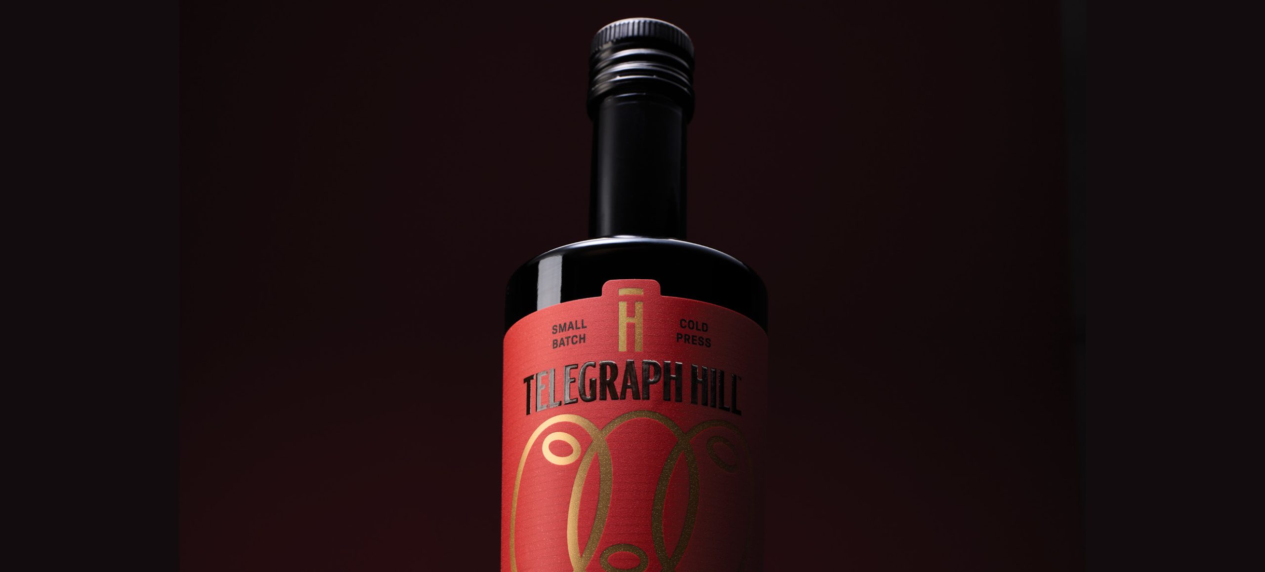
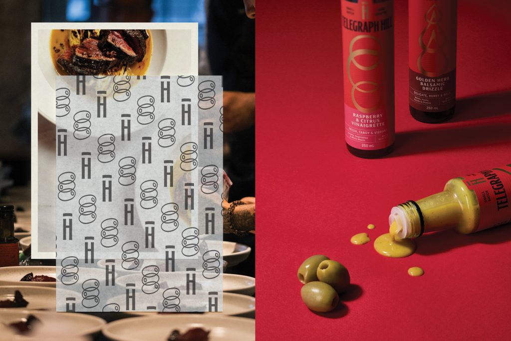
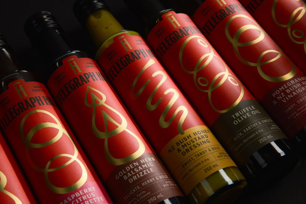
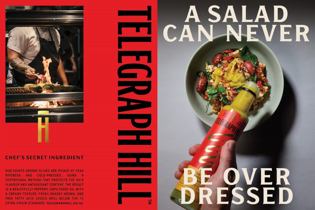
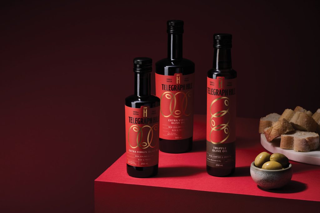
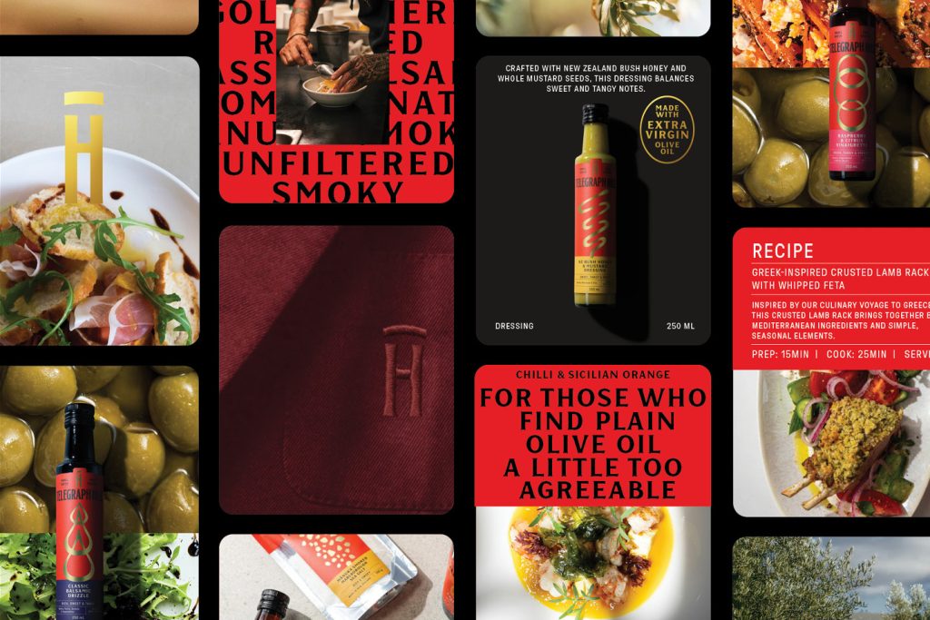
This philosophy shaped every design decision. The packaging needed to express quality and culinary credibility while remaining grounded in flavour-curious, Hawke’s Bay authenticity. The familiar red was retained as a bold brand block, representative of the brand’s passion and flavours. A new illustration language was developed, merging two distinct ideas: the well-known organic form of an olive and the repetitive diagrammatic signal waves of telegraph transmissions. The result is both abstract in its meaning and memorable in its composition. A refined gold pattern that is an icon and metaphor – representing the brand’s essence and the care that goes into every drop.
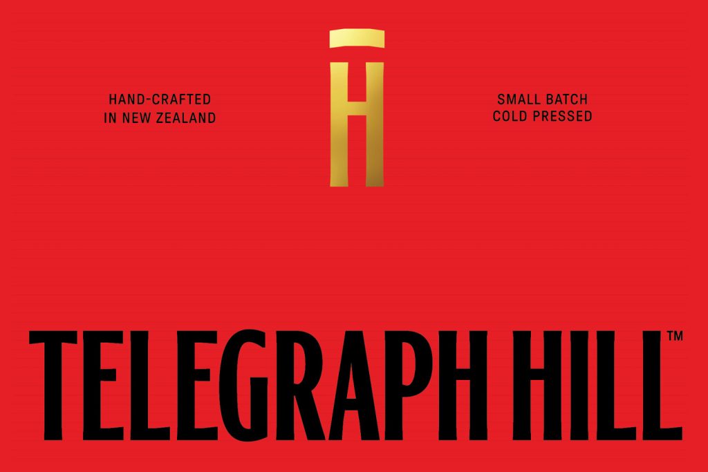
The new wordmark introduces tall, elegant letterforms inspired by the stature of telegraph towers, while a TH monogram balances positive and negative space to create a timeless, wine-label aesthetic. Fine linear detailing subtly references telegraph wires, while refined typography and messaging layout cues draw from the world of fine dining and modern gastronomy.
Across the range, the system flexes effortlessly. Colour bands aid navigation, while the illustration style evolves to express product texture and usage – from creamy dressings to delicate vinaigrettes – each one rendered with restrained precision, gold foil, and a more subtle but important repetition of three elements.
The result is a mature, confident rebrand that elevates Telegraph Hill from a firm local favourite to a proud New Zealand icon. A design language that captures both provenance, love of ingredients and progress – proving that when passion, craft and storytelling align, taste truly does come above all else.
The design team
https://www.weareonfire.co.nz/
Instagram: @onfiredesign
Facebook: Onfiredesign
Linkedin: Onfire-design
The client team
GoodFood Group