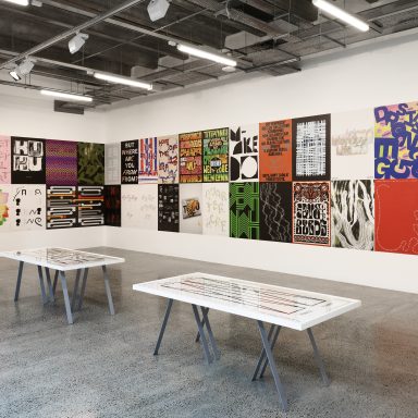
Our Impact
This essay by Lee Parkinson and illustration by Isobel Joy Te Aho-White is part of a commissioned series of essays, interviews and artworks commissioned by Creative New Zealand for our 2020 pilot of the Aotearoa Design Archive.
![]()
2020 was by many measures, a terrible year. It was a year of upheaval, a year of social unrest. It was a year where world leaders began to look inwards. And that was before COVID-19.
In January 2020, there was much to be concerned about, but at least the world was finally waking up to the reality that climate change was real and happening.
As bush fires raged across Australia, the need to do something, to do less harm, to halt the damage we had already wrought upon the world was no longer the domain of those greenies and alt-lefties, had crossed over, it was the main event.
However, climate change was not the only thing to be concerned about.
The world was turning inward. A narcissistic man full of hate and vitriol was ‘leading’ the USA. His divisive, insulting, hateful tone and manner had emboldened the racists, the conspiracists, and the ‘anti-inclusivists’. This encouraged many other nationalist world leaders to behave equally badly.
Against this background, the Black Lives Matter movement exploded, leading to protests and mass gatherings worldwide.
So there we were, at the beginning of 2020, already overwhelmed with waves of negative thoughts, words and deeds. Unaware of the impact, a previously unknown virus would in many ways change everything.
In this critical year COVID-19, social and political unrest wreaked a new kind of uncertainty, worry, fear and confusion on the world.
—
It is said that great leaders rise up for their time, and when the world is sorely tested (no matter our individual politics), we all need robust and resolute leadership.
New Zealand was lucky. In the first months of this pandemic, Aotearoa had firm and determined leadership. Jacinda Ardern stepped up when it mattered, and in a world where many leaders were turning ever more inward and behaving badly, our prime minister, took bold action and suggested that we should make kindness our beacon. New Zealanders were encouraged to be kind to each other.
I think that was a profound moment and provided an opportunity for reflection amongst many of us.
There is much talk about resilience, and while resilience is important, it is only part of the answer. Resilience means we can withstand all that is thrown of us and come out of the other side unchanged. This is without doubt useful.
However, the thought that we may come out of these difficult times unchanged, is hopefully not the answer.
In 2012, Nassim Taleb wrote a book, Antifragile. Taleb could not find an existing word in the English language to explain his concept. He created the word ‘antifragile’ to describe organic systems, communities and societies that can experience and emerge from the other side of major catastrophic change improved, better for the experience, transformed for good.
We have no choice but to do better. To be better.
A year into this ‘time of Covid19’, and the pandemic chaos in other countries means we will continue to face disruption and change.
However, as a design community, we must respond to the frustration and fear by leading from the front – as a community with a problem-solving mindset, with positivity, optimism and yes, kindness.
A long introduction, perhaps, but 2020 was an extremely long year. The changes to our world are yet to be fully understood.
How has the past year affected contemporary design practice in Aotearoa New Zealand?
IMPACT
This discussion is about design that made an impact; perhaps making a difference socially, improving lives, changing perceptions; promoting better outcomes for our planet, designing products and solutions that aim to do less harm, or even do real good. Design that may demonstrate authentic commitment towards a bicultural future where Maori and Pakeha collaborate. Holding up an indigenous lens to Aotearoa New Zealand design practice creates better understanding and trust.
Impact is also about the reach, results, the ROI of the mahi.
In essence, impact is about design that has made people think, feel, engage, and perhaps even act.
When asked to contribute this essay for the first year of Katoitoi, writing about impact, I didn’t really know what to expect in this year of massive change.
I had already noticed that conversations were changing. I have been meeting clients who were thinking more about who they are and why they are, and this was no longer about box-ticking. But then things would cloud over again as the day-to-day realities of a severely lop-sided economy were biting, but I digress.
In the kaupapa ‘Impact’, there are understandable tensions at every step of the design process.
Storytelling and ‘story-doing’.
Commercial design will always have constraints that ‘side-gigs’ do not. Designing for a client can be tough. The reality of budgets and fulfilling the client’s prime objectives makes it difficult to help them extoll the virtues of their socially responsible, sustainable organisation. At a practical level, influencing their choice of packaging materials, paper or ink types, can be hard.
Disciplinary Boundaries.
The lines between advertising and design continue to become more blurred, but that can only be for the good – it is the tension between the two disciplines that can create amazing work that connects at every level, aesthetically, emotionally, and fit for the purpose it has been designed for. Advertising and design are intertwined in a number of ways, but ultimately, both disciplines are problem-solving.
TRENDS
What design trends can we deduce from looking at the design pieces selected for the 2020 Kātoitoi collection?
Although COVID 19 created a lot of fear, worry and uncertainty, it is precisely that which is strangely, providing some new-found hope and optimism. A new nostalgia for the ‘good old days’. The comfort and warm embrace of home of family and friends, leading to a growth in community connection across cultures. The emergence of graphic design that is more’ hearts and craft’ – work that feels both raw and authentic and stands out and connects by being almost ‘unresolved’…..by design. Technology as an enabler to achieving the desired outcomes of a design-led approach.
We can also see more caring and kindness as 2020 has caused us to reflect upon what we have been doing to ourselves, to other people and our planet.
ENVIRONMENTAL STEWARDSHIP

Packaging. Beyond storytelling through beautiful graphic design, some are really committed to reducing the environmental impact of packaging and materials. Others embrace the concept of the circular economy and consider their environmental impact at every step of their business process. Look at Round Theory Wines as a terrific example of this.

Practical action. Driving people to act. Doing something to ‘do less harm’ is a growing trend, and digital technology design can help. The Litter Intelligence Insights Dashboard is an example that quantifies and collects litter data from the public and communities and can help the wider community connect with the size of the problem and how they are contributing to the solution. I have resisted describing ‘data visualisation’ as a trend, in the same way using a spreadsheet isn’t a trend, but this new searchable data visualisation dashboard developed for Sustainable Coastlines puts environmental stewardship in the hands of all of us.
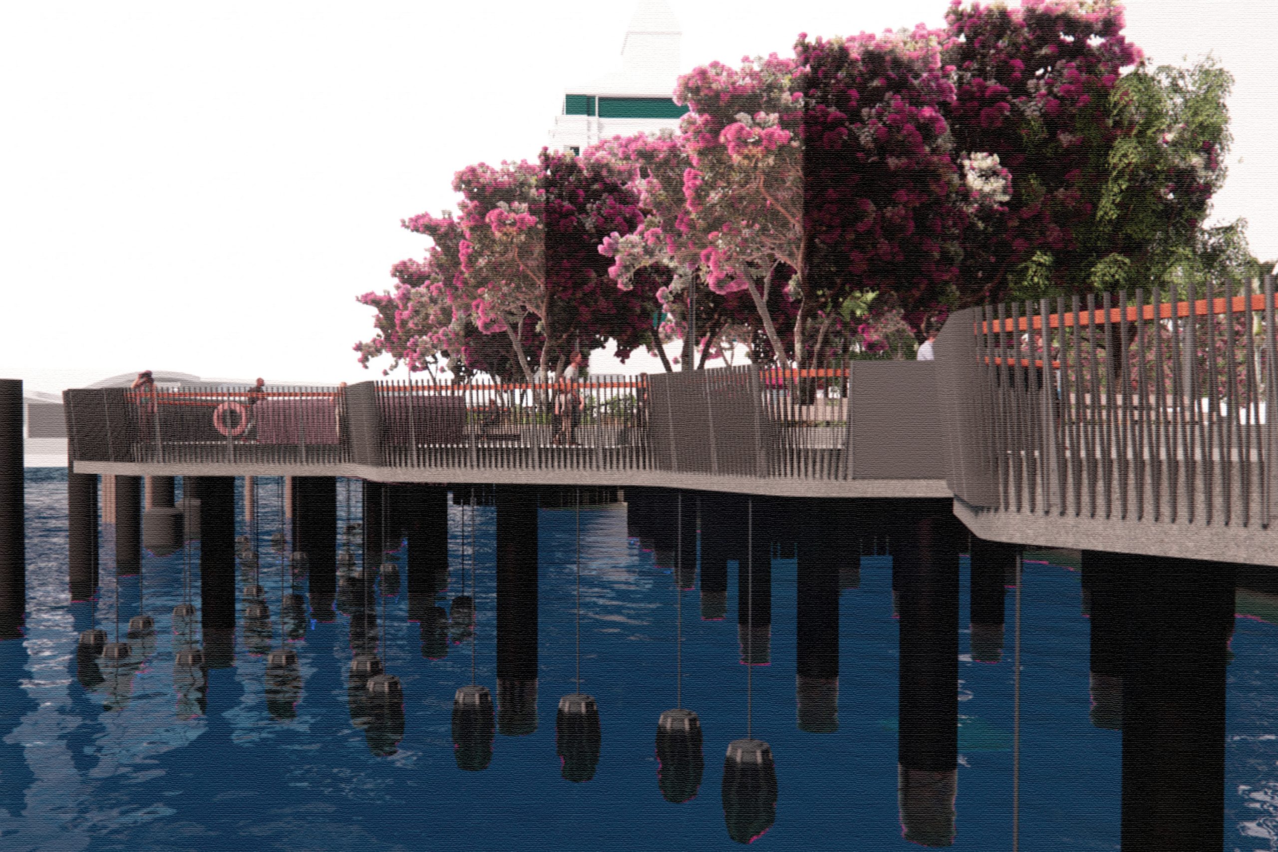
Reconnecting with our world/nature. Katoitoi is a unique archive as it celebrates all forms of design, and never more so than with The marine ecology ropes -Te Wānanga. A demonstration of how human and marine ecosystems can thrive if designed to be shared by all living creatures is both science and Maori wisdom, woven together like the ropes themselves.
These ropes are woven from flax and filled with mussel spat and wrapped around waka floats to help re-establish native ecologies and is pure genius. This work tells a story, it is clear about the problem and provides a solution. A novel solution that will continue to make people think and create positive change just by being.

Positivity and bravery.
We are a food-producing nation, and consumer needs are changing. Plant-based diets, organic foods and product alternatives such as seed butters are fast becoming mainstream, and of course, they use optimistic, visual design that is bold, colourful and full of storytelling.
For a country so entrenched in the dairy industry, the consumption of non-dairy milk products is growing. Exciting for many, but for thousands of farmers, confronting.
On the basis of environmental stewardship, the packaging of the All Good new oat milk product shows that being vegetarian, vegan, or just dairy-free does not have to be ‘worthy’ and full of sacrifice. It can be fun, captivating to kids and adults alike, and most importantly on supermarket shelves, instantly recognisable.

Design activism.
Designers are people with unique skills. When most people become frustrated, they often feel they can do nothing. While no small group can on their own directly halt climate change, design and communications can activate others through creating conversations, keeping the issue in the limelight, and connecting with growing movements demanding action from world leaders and corporations. Mate Act Now was such a project. Self-funded, it was a co-ordinated response to drive climate action with over 300 designers from New Zealand and around the world designing a poster to protest against the current state of play. This curated project was itself designed. The resulting collection showed what can be achieved by a bunch of motivated creative designers united by one belief.
REACH / RESULTS / ROI

New-nostalgia and Authenticity.
There is a definite trend for people to go back to their roots, look back wistfully for the ‘good old days’ and a simpler life, and the Manuka Emporium packaging and identity are good examples of this. Inspired by the apiarists of the past, the packaging design talks to a highly crafted boutique product. The glass jar and beautiful ‘new-nostalgic’ labelling would look as at home on an Edwardian ladies dining table with a toast rack and pots of tea, as it will in a contemporary NZ environment, eating at the breakfast bar or couch.

Conversely, being authentic can be simple, bright, contemporary design that doesn’t embellish, where ‘it is what is said on the packet’, and where the striking simplicity of design can fully complement the actual product. In many ways, the first movers in categories can get back to basics, break conventions, and stand out because of their simplicity, freshness, and bold approach. Kapsi is such a design project.

Community and Connection.
Place branding for a new public facility in a young bicultural nation such as ours is a huge privilege, opportunity, and responsibility for designers. He Puna Taimoana — Hot Pools By The Sea was a place branding project carried out in full consultation and collaboration with the wider project partners including Christchurch City Council and Matapopore. Matapopore created the design concept and supporting narrative, and then interpreted and incorporated into the overall brand strategy and design for He Puna Taimoana. This brand design and supporting storytelling achieved results far in excess of what had been expected for the client, Christchurch City Council.
Optimism/playfulness.
Optimism and playfulness can be used across a wider range of design problems waiting to be solved. From selling another breakfast cereal in a crowded category, imparting vital, scientific information in a way that it can be re-used, remastered and interpreted for different people around the world, through to encouraging overseas Kiwis to ‘meddle in the New Zealand election’.

Hubbards ‘Be Mighty’ displays the pure optimism you’d expect from a product called ‘Be Mighty’. For grocery products all shouting for attention on the shelf, overall packaging design is a key consideration. It needs to be considered in the context of creating something that stands out from the rest of the category. This does. Playful, bold typography that is fun and communicates so strongly on the white space of most of the package. Spot colours are bright and optimistic. Although actual results have not been mentioned, this is a worthy example of ‘Reach, Results, ROI’ because supermarket retailers are tough and that supermarket category managers are requesting an extension to the flavour offerings.
There is nothing remotely funny about COVID 19, but in a world worried and fearful, at a time where there was so much conflicting and complex information and misinformation circulating on the internet and social platforms, it makes sense to explain what is happening, why it is happening and what needs to be done to prevent the spread, as simply as possible. Spinoff’s Covid19 communications used an almost playful, comic-book format to present the narrative and graphics. They ruthlessly distilling the verbal and visual messaging to make the key information clear, unambiguous, available to be used and re-used in New Zealand and internationally. As for results? Well, as some of the work has been translated into multiple languages including Māori, Samoan, Mandarin and Hindi, and released under a Creative Commons license, we can see that the work has had an extensive reach.

Designing a solution to combat the extremely low rate of offshore Kiwis voting could have been so…..dry. However, this challenge was met with the playful, comedic, and darkly rebellious Meddle in the New Zealand election social media led campaign. This was communication design at its best and the overall reach, results and ROI were all outstanding. Take a look.
SOCIAL GOOD
This part of the ‘impact’ kaupapa is for work that seeks to improve lives, or has ambitions to do good for our community, and should be an easy category to discuss.
It isn’t because ‘social good’ is a very broad canvas, and undoubtedly why there have been so many designs accepted into this category of the archive of New Zealand design. The most striking thing about this category is a sense of optimism combined with a belief that we must do better. There is a refreshing youthfulness to the Social Good section, and yes, some design projects were obviously from student entries, but this youthful feeling was across many projects. Many in this section don’t just rely upon storytelling either –interaction and tools design featured heavily. Some observable themes / trends are:

Inclusion.
Inclusion means just that. And whether in a local, national or international context, inclusion is about having the right to be who you are and to be accepted unconditionally. It is heartening to see a spectrum of projects, each tackling ‘inclusivity’ in various ways. From More Than Alright, providing a sense of support and pride in the local LGBTQIA+ community of Õtautahi Christchurch, to Promised Land Tales, a series of LGBTQ themed children’s books, to Voice of Racism.
As we continue on our path towards biculturalism, Voice of Racism has provided the opportunity to get real about the everyday racism that occurs in our country. Kiwis may like to think we are an egalitarian, open, non-racist society, but sadly we are not. Institutionalised everyday racism abounds, but at last, we are waking up to it. Voice of Racism is an example of a confronting, immersive experience designed to change the way we consider racism. It has opened the doors to real, raw conversations and hopefully a commitment to change.

Doing better.
Design thinking and empathetic design are approaches used throughout great design projects. While many projects use these approaches, Sport New Zealand Ihi Aotearoa embraced them as a way to really get to the core of the matter in their own areas of custodianship. This led to the design and production of stories that marked the start of many conversations about the future of physical activity for fully-abled and differently-abled people within Aotearoa.

Understanding.
It is difficult to separate some of the above-mentioned emerging themes relating to ‘Social Good’ within the Aotearoa New Zealand design community today, as they are intersecting in so many ways. However, understanding is a powerful outcome of learning on the way to gaining knowledge, and Woven gave me one of those “Wow” moments – where you feel a shiver of delight and possibility.

This is a student design project that knows the possibilities for a young bicultural nation working together. To weave the wisdom and Māori cultural values of Manaakitanga and Kaitiakitanga into our lives, and show we can benefit from embracing key principles of sustainability and the passing on knowledge/teaching through shared experience. This whole experience was designed as a metaphor. The beautifully woven harakeke artefacts are merely an output for today, respecting those who came before us and those who will come after.

Care.
If ever there was a piece of design that so symbolises the trials and tribulations of 2020, is something that most of us carry around with us, that is (or should be) in daily use, it is the NZ COVID Tracer App.
As one of the archiver’s responded on the site, “How can this not be in an archive of New Zealand design?”
It has caused discussion and debate by those concerned about privacy issues, conspiracy theorists have demonised it, but it is an integral part of helping this nation protect itself from COVID 19. Most importantly, it is an elegant design, a simple to use interface between the user and the environment you are entering. The amount of data that can be called upon and cross-matched down to the premises people may have had contact with each other in is breath-taking. Love it or hate it, this piece of design symbolises 2020 life in New Zealand.
The Aotearoa New Zealand design community – Caring, courageous optimists.
This discussion began with me painting a bleak picture of our world in 2020, and the world still has many overwhelming challenges to overcome.
However, even as we endured one of the most worrying and fearful years in generations, the design projects in the archives first intake show that some of us were already viewing the world differently. Even in our darkest moments. Knowing that we had to get real, do less harm to each other and our planet.
We were looking at ourselves to see what we can do better.
Exploring ways to revive community, destroy old hateful attitudes, find solutions to old problems not yet faced, helping businesses and organisations continue to survive and eventually thrive, and designing new ideas for a new world.
This is my hope.
That Aotearoa New Zealand will lead the world in coming through these troubled times, changed but transformed for the better. Antifragile in fact.
Kinder, because kindness is something we must practice. We are a young country. We are still learning and making mistakes. Yes, we may stumble and fall on our journey, but we will get up again and forge ahead. We are learning. We are trying.
I am excited by the possibilities ahead. I am optimistic for the future.