5 minutes with… Michael Barron at Marx
We are in constant admiration of the work Marx design produces. The studio’s creativity and bravery is a beacon in our design landscape. We took the opportunity to learn more about one of their senior designers Michael Barron that has been at the helm of their recent awarding winning work for Almighty.

Who were your early creative influencers? Was there someone from an early stage that might have inspired you to pick design as a career path?
Influence seeped into culture more slowly in the days when I started to find an interest in design! I’m not going to pretend I had impeccable taste from day dot. My primordial design diet consisted of surfing magazines (not designed by David Carson, but designed by people who had heard of David Carson), album art (I remember really liking that Blur album with a Banksy on the cover) and video games (The Designers’ Republic via Wipeout). I saw that graphic design could straddle so many segments of culture which was incredibly appealing to me.
Can you tell us about your career milestones and what lead you your role as Senior Designer at Marx?
Out of uni my first job at Designworks was a great starting point for a career in design – I’m grateful to the team there who gave me some large clients and projects to get involved in at an early stage. This was followed by a spell as a contractor in both Auckland and London. I’d recommend the experience to any designer as you get to trial many different studio cultures and ways of working. A highlight was working at the JKR London office. They do brand and packaging at a scale and level of ambition that was completely above anything I’d worked on before.
What does a typical work day involve for you?
I’m lucky to be able to walk to the studio from my place, which cuts through a reserve with some native bush and a wetland. Every day we kick off with a WIP and plan out the day, the team here are one of the best at managing timings and workloads. The studio is a perpetual motion machine – I need to make sure I’m briefing other designers and suppliers to keep them moving, while finding intervals to focus on my own work to then review with the creative leadership here. There’s rarely a day where something doesn’t need to get out the door – the practice at Marx operates in a tight loop between client and designer, and we aim to get everyone aligned at regular intervals.

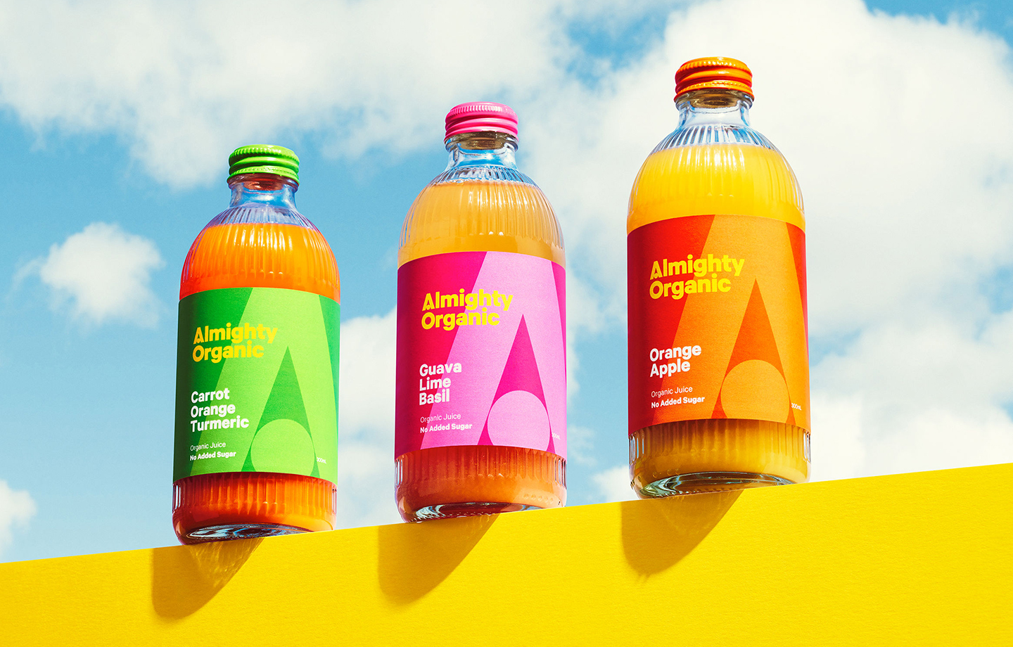
We loved your recent work on Almighty. What was the most challenging part of this project and what did you learn from it?
Thanks very much! The bottle form for Almighty is the part I’m really pleased with; our aim was to create something memorable and meaningful for them and I believe we hit the mark. The challenge was achieving that within the limitations of cost and practicality. The margin to spend on the extra glass for a soft drink bottle is less than a mass-market beer brand, let alone some of the spirits brand whose highly embellished bottles we were coveting at the time. Within that constraint we were able to work with Almighty and Croxson’s to make something that felt special and a little nostalgic.

What insight can you give us to your scope of work on this project?
What helped this project to succeed was that we were briefed on the brand identity, packaging form and labels in one swoop – which made all of the parts of the project coherent and talk to each other.

We love the bold colour use! What are your favourite design elements in the Almighty identity and packaging?
Something we were able to do for the Almighty team over lockdown was create a sub-brand for Almighty Mart, their online store. We drew inspiration from the bright, positive visuals of 90s supermarkets and convenience stores, and whipped up the cheeky logo featuring ‘Marty’ who is becoming a cheerful mascot for the brand.
What project (personal or professional) are you most proud of and why?
I grew up in Northland so creating the brand identity for the region early in my career is naturally something I’m proud of. It’s very heartening to see it’s continued use and longevity after all these years.
Do you have a project that is memorable because it challenged you, if so what lessons did you learn from that work?
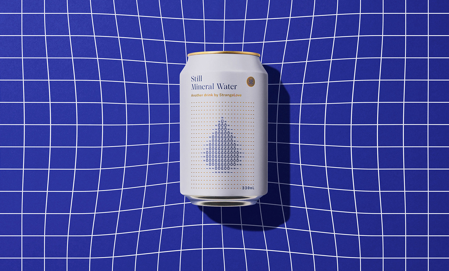
Our recent work for Strangelove Waters is a challenging project that comes to mind. We needed to create something that felt at home with the beautifully packaged products that have been created for the brand so far, as well as something that would stand out in an over-saturated and competitive category. The ASCII concept was weird and a little risky, but the great response we’ve had for the work so far really shows that being different is a big part of being chosen.
Which other Aotearoa designers do you admire/look up to?
Parkby Projects – Ross Murray – Kelvin Soh / DDMMYY
Finally, where can we see more of your work/connect with you?
We‘ve recently relaunched the Marx website, please head there and feast your eyes: www.marxdesign.co.nz


