Fresh From The Field — Fuss Pot – By Curious
Fresh from the Field is a weekly article series sharing the fresh and inspiring work of our Design Assembly community.
Our friends at Curious take us behind their design response for Fuss Pot. Here’s how they developed a brand identity that flipped the script on what it means to be fussy while standing out against the sea of sameness so commonly reflected in other hemp based products on the market.
Want to submit your own work to Fresh From The Field? Fill out the FFTF form here.
The Brief:
Fuss Pot came about through a mission to hero hemp as a powerful ingredient for skin health. Founded by a driving force in the medicinal cannabis industry, the goal was to enter the market with an offering that expanded the perceptions of hemp-based skincare.
In a landscape where most hemp-based skincare plays to the ‘wholesome hippy’ trope, our challenge was to break the mould: elevating hemp skincare from its traditional image, into something sophisticated, solutions-focussed and fun.
In exploring the brand’s point of difference, we found that the combination of safe and natural, yet highly efficacious products resonated with a particular type of audience: female skewed, mid to high disposable income who are seriously fussy. Fussy about what they put on their skin, fussy that it’s safe, natural and ethical. And fussy that it works.

The Design Response:
And so, Fuss Pot was born. With a strategy that turned the negative connotations of a fuss pot on its head, it made the brand’s collective fussiness into its superpower. Its obsession with ingredients, infatuation with efficacy and nit-picking over the smallest detail. A bold tagline of ‘powerful skincare for picky people’. And a brand personality that’s sophisticated, neurotic, picky, and playful – just like its consumer. The brand message became a rally cry: “Isn’t it about time you got fussy too?”
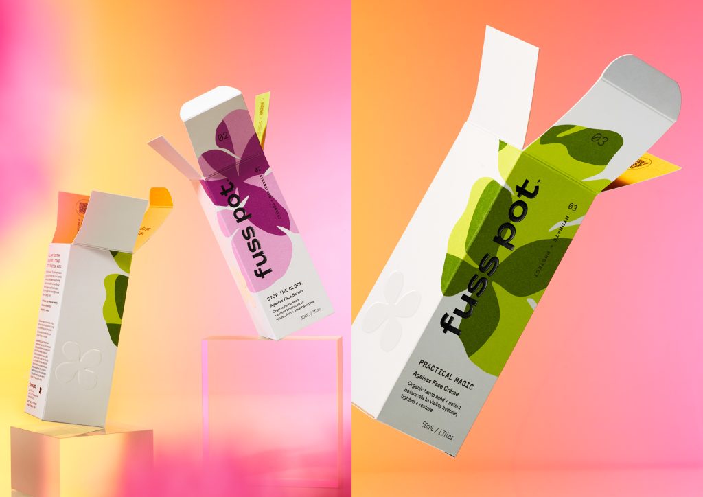
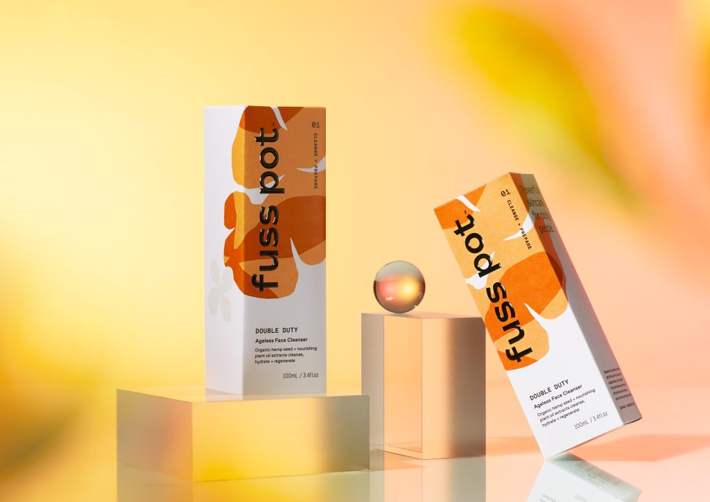
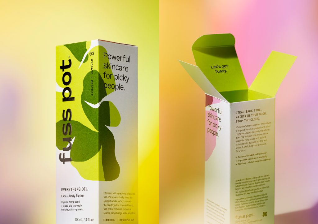
When it came to design, much of the market utilised dull, muted colours and minimalist graphics to reflect the hemp origins, resulting in a sea of sameness that defined the category. Our challenge was to break this mould, with a design programme that reflected the product’s natural origins, whilst communicating the contemporary, performance-focused features that made it so unique.
In a humorous nod to the nostalgic lava lamp that many of our customers once owned, organic abstract shapes were developed to represent the products’ natural, ethical properties, with a vibrant colour palette conjuring up the sassy, playful nature of the Fuss Pot personality. Uncoated stock provides a natural texture, with the branding and flower icon embossed and varnished to create an additional tactile experience. Inside, sleek black bottles contrast the bold box packaging, to sit stylishly in any bathroom.
The Design Team:
Nigel Kuzimski – Creative Director
Kendyl Middelbeek – Designer
Curtis Walker – Designer
https://www.curious.co.nz/
https://www.instagram.com/curiousdesign_nz/
https://www.facebook.com/curiousdesignnz
The Client Team:
Fuss Pot
https://www.instagram.com/imafusspot/
https://imafusspot.com/