Fresh from the Field – One Design’s Astrolabe Identity and packaging
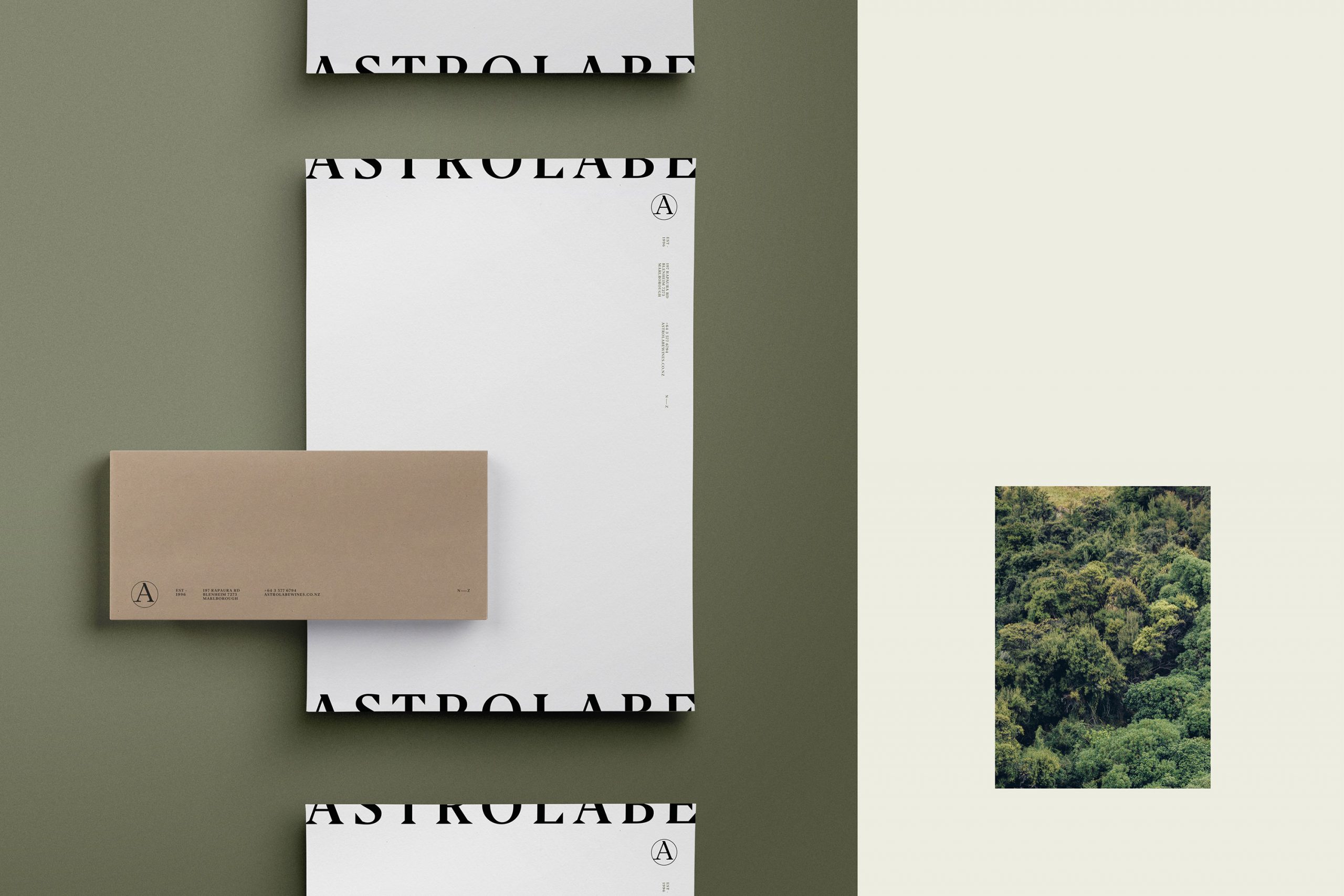
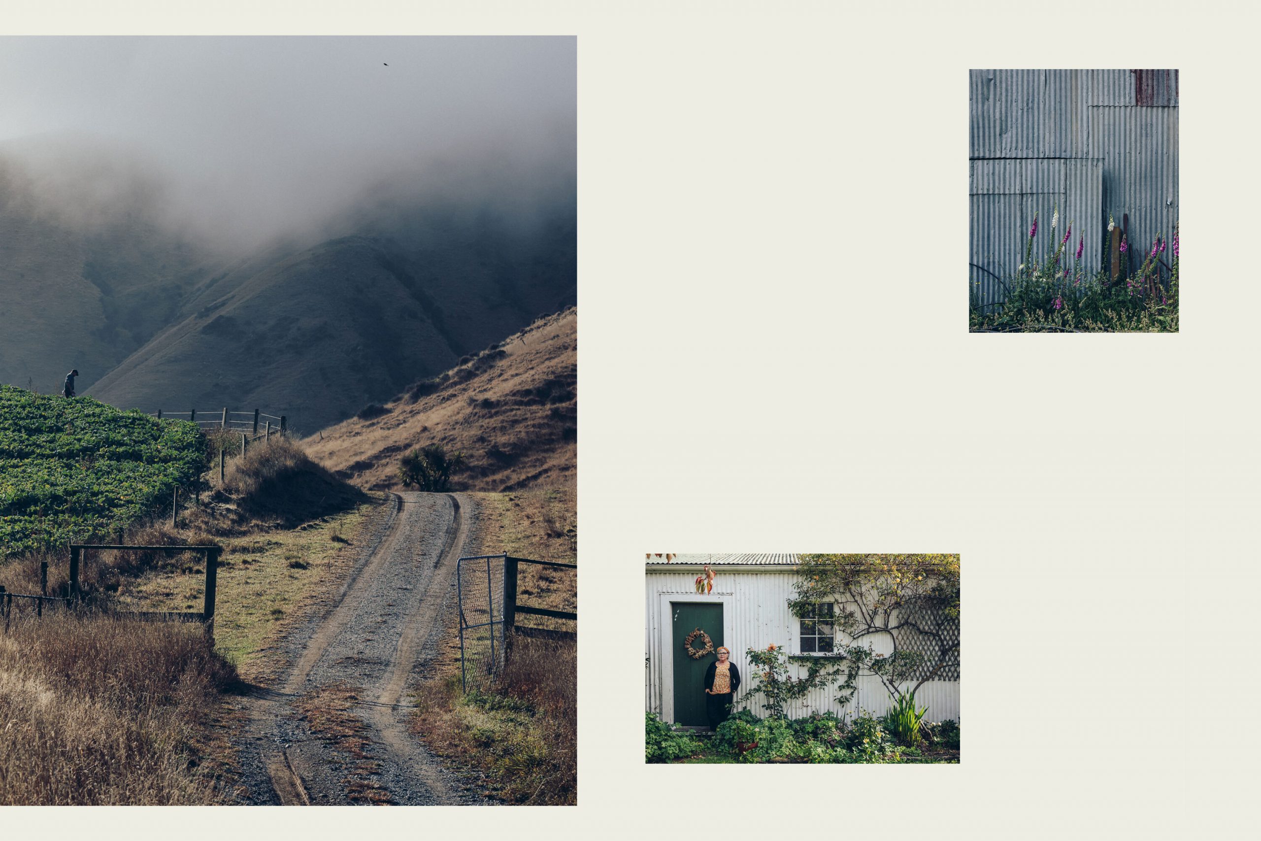
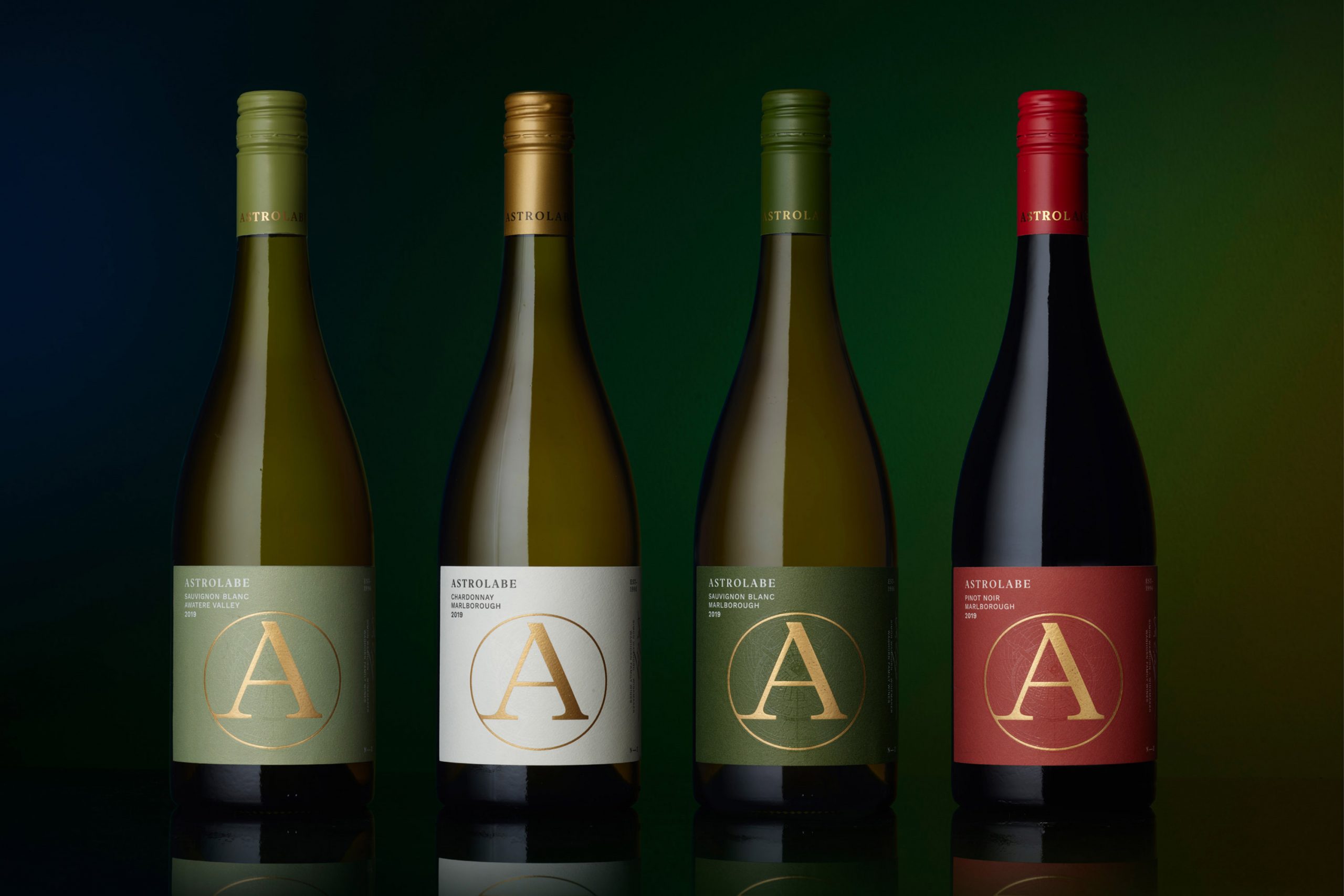
The Fresh from the Field features ONE Design’s work for Astrolabe, who proudly celebrate their pastoral, unpretentious surroundings, this landscape drives the brand expression.
The Brief:
Astrolabe is a family owned wine company based in Marlborough, New Zealand. They grow their own grapes and also source from a tight-knit group of local growers who live on their land and farm sustainably – many who have supplied Astrolabe for over 20 years. The founders Jane and Simon Waghorn live in a 100 year old cottage on their Farm Vineyard and practise living on the land gently. Their two daughters, Arabella and Libby initially fled the nest but have returned to Marlborough and the two generations work closely together today.
They required a brand & pack refresh to inject an understated modernity on and off pack, reflect their dedication to fostering sustainability and biodiversity, and create a cohesive narrative across their prestigious offering. With a large selection of premium wines (15+ SKU’s) across multiple ranges, prices vary and are sold through grocery channels, on and off premise throughout New Zealand as well as exported internationally (EU, USA, AU).

The Response:
Drawing from where the brand had been and where it was aiming to go, the identity is reflective of the Waghorn intent to create a sustainable winegrowing operation to be passed down through generations, while visually retaining a nod to their history.
Where traditional wine brands market themselves with imagery of pristine, vast rolling vineyards, Astrolabe proudly celebrate their pastoral, unpretentious surrounds with an intentionally small-scale, and rustic appeal. It was therefore essential that we imbue the brand with a palpable sense of place and history.
A hurdle to overcome was retaining a version of the Astrolabe ‘A’ icon as a nod to the brand’s history. While we were initially keen to start afresh, it became apparent that the significance of this circular form was a valuable asset because it alluded to their continuous approach to innovative improvement across all aspects of the business – not only the winemaking craft itself but also to treatment of the land, its future biodiversity and their carbon footprint.
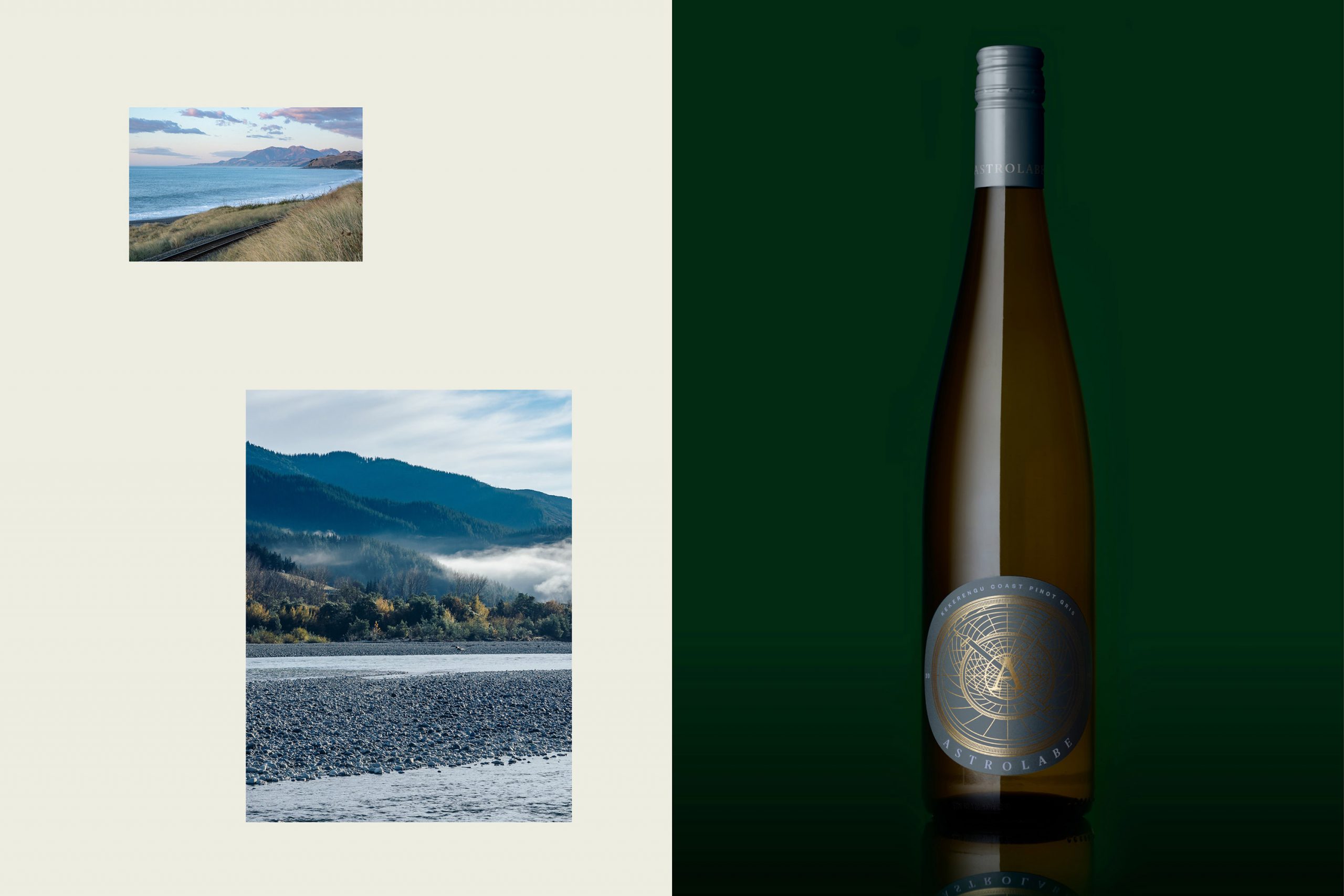
The icon was therefore carefully refined to possess strong ties to the original aesthetic. A clear correlation was drawn between the icon and newly created logotype with strong base serifs and clean lines. A delicate line illustration referencing the Astrolabe ‘device’ from which they took their name was also created to give context to the brand’s history and name.
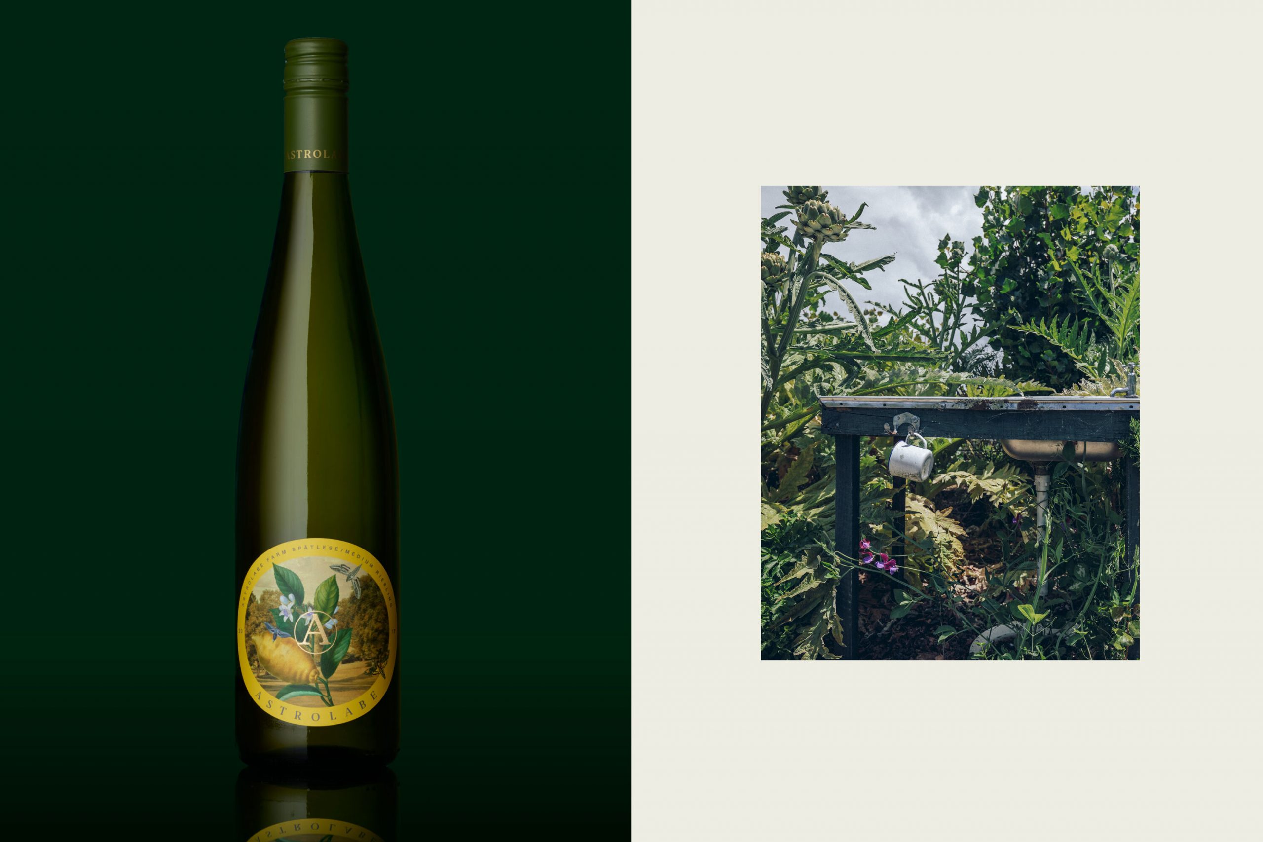
A visual distance was needed to differentiate the ranges of packaging, as previously there was little variation to distinguish the wine quality which had led to customer confusion at point of purchase. The new branding was applied in tiers, with the largest export range —Province—to showcase a significant amount of brand, while steadily limiting it as the varietals became more experimental and produced in smaller batches.
