Fresh From The Field — RAAD
This Fresh from the Field is brought to you by our awesome partners Portfolio Recruitment.

The Portfolio team are heavily invested in our design community and reached out to tell us about Creative Director Matt Saunders latest project RAAD. We think this is a phenomenal initiative and admire the kaupapa, the environmental stewardship, the RAAD business model as well as the aesthetics!

The Brief:
RAAD came about as a seed of a thought after we had our second daughter. She was born two months early which meant our life was turned upside down and cleaning became super important (germs could have been dangerous to our little one). With business and design backgrounds behind us (and an increased need to clean) we could see an opportunity to take a critical household item and utilise our design experience to develop a line of products that would fit the needs of a progressive customer.
We set ourselves this brief:
Build (from scratch) a NZ made range of premium, high performing, eco-friendly and beautifully packaged cleaning products delivered via a world-class digital subscription service. Why? So style-conscious customers can have sleek, matching products, less guilt about their sustainable footprint and one less thing to do at the supermarket.
The Design Response:
The solution was to utilise a design approach synonymous with fashion brands and apply it to the cleaning category.
On day one, we locked in three personality attributes that would drive all decisions for the brand; STYLISH, PLAYFUL, HELPFUL. From here, we broke everything down into our key pillars, then used the personality to inform each component from the ground up – always with a focus on the solution we were providing for our future customers.
- The Brand
- The Look
- The Performance
- The Fragrance
- The Eco profile
- The Service
RAAD was selected as the name to evoke a sense of playfulness, gender neutrality and an edge not traditionally seen in cleaning. Having an acronym (Remarkably Awesome and Dirt-free) provided the opportunity to build on the brand story and offering, while also increasing brand recall straight off the bat.

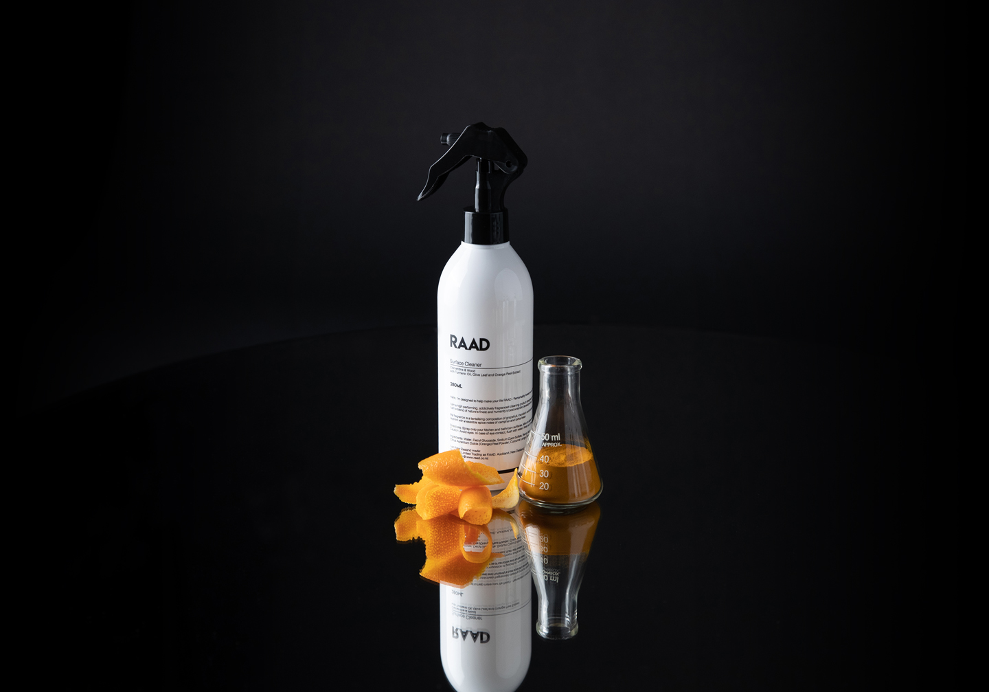
The packaging was hugely important for RAAD, it needed to communicate who we are instantly and have appeal in a digital world. We took inspiration from pharmaceutical brands as we felt that best conveyed high-performance ie “this stuff really works!” Monochrome meant it would be the perfect addition to a multitude of house-proud customers. We wanted RAAD to look so desirable that it would be released from under the sink onto the benchtop. There is a lot of important information on household products and we are very transparent with this, so having it as part of the design aesthetic made sense. Long-lasting high-gloss bottles with dominant feature pumps ensured these babies certainly aren’t shy! RAAD refills also follow the monochrome pallet with a simple white pouch, black type and the black lid. Easily flat-packed or stood in the cupboard for fast top-ups. The debut range also features the unique “travel Jacket.” A custom-made pouch designed to provide a multi-faceted solution: safe travel for the bottles while also eliminating the need for plastic wrapping; a lush experience when the customer opens their delivery and a handy reusable gift – sunglass cases, makeup bag or give it to the kids for their pencil case!

Designing a product that could confidently call itself “high-performing” meant the R&D process was significant. We knew these products would cost more than your average supermarket version, so it had to do more than your average supermarket product. This meant the final four pillars all needed to work together perfectly to provide a worthwhile investment.
The performance – RAAD products are manufactured in NZ using premium plant-based ingredients. They are cruelty-free and vegan friendly. We worked with highly experienced formulators to design exceptional recipes that feature beautiful botanic additions that were selected to ensure every clean is top-notch – germs gone, surfaces sparkly and skin supple.

The fragrance – we were delighted to collaborate with a locally based french perfumer who helped design to our bespoke brief. The fragrance is a critical component to take the cleaning experience out of the dire and into desire! Our two signature scents, Clementine & Wood and Bergamot & Moss (great fun to name these!), are stunning, gender-neutral fragrances that leave you wanting more. The visual representation was very important in a digital world too – real ingredients on a monochrome background helped create a collection of lush visual content.
The Eco Profile & Service – it goes without saying that any new business these days needs to be sustainably responsible, it’s what we feel good about contributing to the world and it’s what customers demand. To deliver on this, RAAD is designed as a subscription service where you are sent long-lasting bottles which are followed by refills. The experience of purchasing has been an intricate digital design to ensure the user has smooth flow throughout the site right along to receiving their order in fantastic compostable packets.
RAAD – Remarkable Awesome and Dirt-free. We create high-performing, addictively fragranced cleaning products, delivered straight to your door for free so you can enjoy a lush cleaning experience.

The Collaborators:
Matt Saunders – Co-founder and Creative Director
Rebecca Saunders – Co-founder and Marketing/Comms www.raad.co.nz
@living.raad


