Riffing Off Walters: the art of distinguishing ourselves
Written by Michael Smythe
Supported by Creative New Zealand
![]()
Gordon Walters has gifted us a visual language that is capable of representing New Zealand’s bicultural foundation in infinitely variable ways. It is a legacy to be valued and handled with care by professional designers. In this article Michael Smythe records the personal experiences, and interesting connections, which have informed the viewpoint of one ‘stale pale male’ daring to contribute to the korero.
In 1963 I was a 17-year-old junior artist at National Publicity Studio — an operational arm of the government’s Tourist and Publicity Department. It employed commercial artists, photographers, screen-printers, display builders and writers. I had scored the job because my dad sometimes shared a commuter bus seat with fellow parishioner Howard Malitte, an old-school artist who had succeeded Marcus King as the Studio’s resident landscape painter. King’s depictions of the signing of the Treaty of Waitangi are among his best-known works.
One of my duties was to take type specs down to the Government Printing Office and pick up the linotype galley proofs. The person I dealt with was 43-year-old Gordon Walters who ran the GPO graphic design studio. He always had time for a friendly chat. We discussed typography and design. I knew nothing of his other life as an artist, which is unsurprising given his first exhibition was three years away.
During that year I attended night classes at the Wellington Polytechnic and saw some of the full-time student work on display. The standard was high and the design approach was much more modern than I was seeing at work. I saved my wages, grew a goatee, bought a Vespa (because it had a carrier that could accommodate a portfolio) and enrolled for the following year.
In my second year, 1965, we were given an exhibition design project. I chose to tackle race relations, which was in the news — the 1965 Springbok rugby tour was the catalyst for forming the Citizen’s Association for Racial Equality (CARE).
At that time I was going out occasionally with Jane Hanan, daughter of the Hon. Ralph Hanan, Minister of Māori Affairs in the Holyoake-led National government. Hanan drew my attention to the Hunn Report on the Department of Māori Affairs, commissioned by the previous Labour government, delivered in 1960, but not released to the public, by Hanan, until 1961. I was very interested in Jack Hunn’s definitions of alternative approaches to race relations:
- Assimilation: To become absorbed, blended, amalgamated resulting in the complete loss of Māori culture. Hunn used the example of the British as assimilated Celts, Britons, Hibernians, Danes, Anglo Saxons and Normans.
- Integration: To combine (not fuse) the Māori and Pākehā elements to form one nation wherein the Maori culture remains distinct. He offered the Swiss integration of French, Italian and German as an example.
- Segregation: To enforce a theoretical concept of ‘apartheid’. One school of thought in New Zealand advocates ‘parallel development’, which in essence is segregation under another name. Hunn was obviously referring to South Africa, but that regime of oppression and inequality was not the ‘parallel development’ approach which, since then, has gained greater understanding as Tino Rangatiratanga.
- Symbiosis: To have two dissimilar peoples living together but as separate entities with the smaller deriving sustenance from the larger (seemingly an attempt to integrate and segregate at the same time). Hunn’s dismissive tone seemed to allude to the dependence of a parasite on its host. The dictionary definition suggests a more equals partnership: ‘a mutually beneficial relationship between different people or groups’.
Hunn saw integration as the obvious trend, and it was happening in practice. Integration stuck in my mind as a realistic direction, although symbiosis seemed the more enriching possibility. I cannot recall how I tackled the topic in my exhibition design, but I did form the view that the Prime Minister of the day was implementing integration as assimilation — an approach I labelled ‘Kiwi Keith’s Khaki Kulture’.
Over the decades I found myself surprised and concerned at the apparent popularity of cultural homogeneity. Was the answer to racial prejudice a blended sameness? I was among the many attracted to Blue Mink’s 1969 hit ‘Melting Pot’ — which looked forward, in a hundred years or more, to coffee coloured people by the score — until I reflected on the lyrics. Did we really all want to be the same? Surely equality and ‘vive la différence’ could be compatible?
Meanwhile, back in 1967, I had graduated and moved to Auckland to join the Fisher & Paykel staff as an industrial designer. At some point in the late 1960s I visited the Auckland Art Gallery and came upon Gordon Walters’ Painting No. 1 (1965). It stopped me in my tracks. The most recent of many revisits was at the ‘Gordon Walters: New Vision’ exhibition at Auckland Art Gallery this year:

I saw the painting as a brilliant representation of a bicultural society. Rather than evenly blending (assimilating) two cultures into a grey togetherness each is distinguished by the presence of the other. What makes it lively and mutually enriching is each, alongside each other, backing off and providing the space for the other to flourish.
Some years later, I bumped into Walters at an exhibition opening somewhere and told him of my response to Painting No. 1. “You are most welcome to that interpretation, Michael,” he said, “but my paintings do not represent anything but themselves. I am engaged in pure abstraction.” That made sense to me — Mondrian, Kandinsky, Mrkusich and Hotere had taught me that art exploring two-dimensional form, line, texture and colour could simply be itself. When I suggested that what made it work so eloquently on its own terms is what made it work as a metaphor, Walters assured me he was very happy for people to find meaning in his works.
Some academic voices have vilified Walters as a disrespectful appropriator of Māori culture. Art historian Ngahuia Te Awekotuku accused him of “promiscuous and irresponsible plundering of Māori motifs.” Curator Rangihiroa Panoho said Walters used the koru form as “simply another motif with which to recharge his art.”
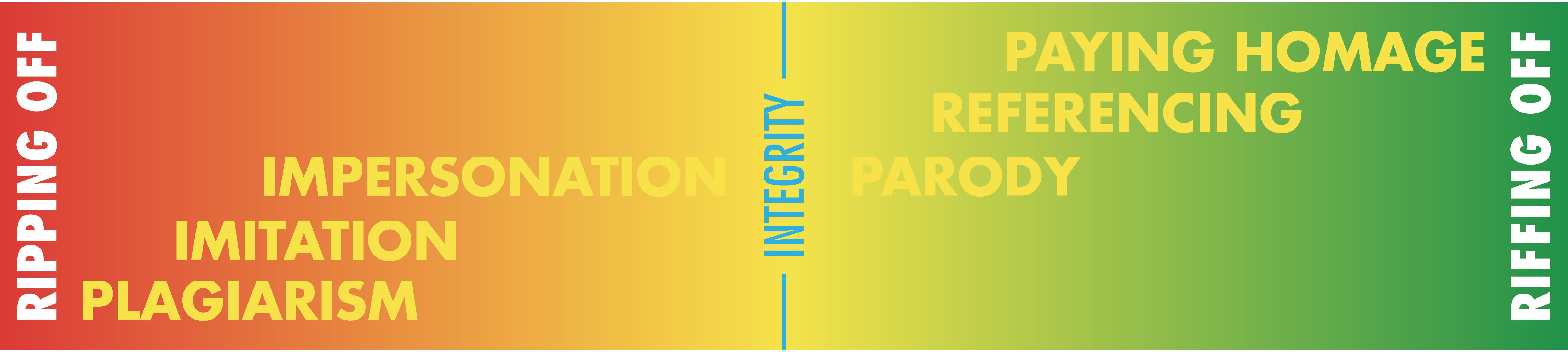
My response was defensive — Walters’ work was speaking powerfully to me as an identity-seeking New Zealander. While engaging in an international conversation about pure abstraction, with a nod to op art, he was honouring the artistic heritage of the country he called home. I argued that Walters was operating at the respectfully referencing end of the spectrum that has plagiarism at one end and ‘paying homage’ at the other. Walters was riffing off, not ripping off, Māori art.
My tidy positioning of Walters works required reconsideration after I began attending Ngā Puna Waihanga hui. The organisation, originally named The New Zealand Maori Artists and Writers Society, had been established in 1973 by practitioners who felt that Māoritanga should not be confined to museums and traditional cultural showcase events — it is a living, growing, contemporary culture that can be expressed in any medium. The only qualification for attending the annual Ngā Puna Waihanga hui, held at Queen’s Birthday weekend, was that you were interested enough to turn up. I made it to Waahi (1986), Te Kaha (1993) and Parihaka (1994).
The hui provided informal opportunities to discuss design projects in which I had chosen to reference Māori imagery. Over those eight years I invited critiques of work done for scientific, tourist, professional, cultural and health sector organisations.

The Pacific Enzymes, City Design and Taranaki Healthcare logos made use of the woven nihoniho pattern. The Taupo Ika Nui logo for a timeshare enterprise was based on an ornamental stone fish hook, sourced from the Auckland Museum collection, with the negative space reading as the lake. The New Plymouth Public Library logo referred to ancestral moko lines flowing into a kete a wananga (basket of knowledge) and/or pages of a book and/or information flowing in and out of a satellite dish. The response at the hui was generous:
Ka pai. We’re glad that you are including, rather than ignoring, the Māori element of our collective heritage. But we ask that you do this with aroha, respect and understanding. There is always a narrative. This is our written language. It is never simply decorative.
When I asked for the visual vocabulary I was told that the motifs could have whatever literal or metaphorical meaning I chose. What they found unacceptable was gratuitous, superficial ‘Māorification’.
So, was Gordon Walters wrong to create Māori-referenced work that was not telling a story or representing a person? Was he treating Māori art as meaningless surface decoration? No. Walters was honouring Māori art as his starting point for exploring new territory, viz: the possibilities of visual art as its own language. It was something that music had been doing forever while paintings were usually representations of something else. Unlike his contemporary Theo Schoon, Walters did not imitate Māori art forms. He distilled the koru motif, and appreciated the interplay of background and foreground seen mostly on moko, to create strong, deeply considered works that were simply themselves. He was being a serious New Zealand /Pacific artist with informed respect for the indigenous heritage of his chosen discipline.
Walters’ personal pursuit of pure abstraction has resulted in a distilled New Zealand visual form language that recognises the two cultures — Māori and Pākehā — for whom this country is home. It is an integration, not an assimilation; a symbiosis in which each component is defined and strengthened by the presence of the other.
Back in the mid-1980s it had become common for government departments to identify themselves with Māori names and symbols. It concerned me that, in aspiring to become more bicultural, some were appearing exclusively Māori — placing a Māori cloak on an essentially Pākehā organisation. I felt it must be possible to be inclusive by creating designs that could speak to both Māori and Pākehā — motifs that are meaningful within plural frames of reference.
I first turned to Walters’ form language to grapple with this issue in 1992, thirteen years after he had collaborated with the New Zealand Film Commission to develop their well-liked logo. Primary Health Organisations (PHOs) had become the vehicle for distributing government funding in a way that promoted good health rather than only treating sickness. The Tauranga Primary Care Network comprised doctors, nurses, midwives and medical technicians working within a range of practice models. I was specifically asked to make the services feel accessible to Māori who tended to wait till they were in an advanced state of illness before seeking help.
It was clear to me that if I used Gordon Walters’ work as my starting point, I should take his visual language in a new direction — emulate not imitate. I also accepted that anything referencing Māori art should have a narrative. I curved the lines and added smaller nodules similar to those in Walters’ Study for Waitara (1959). The layers of meaning included a range of health services reflecting a diverse community — from people on their own to large families — and the vitality of good health.
In February 1993 I sent my concept to Gordon Walters to check if it was okay by him. His response was collegial, generous and positive. “Dear Michael, he wrote. Thank you for sending me the proof of your design …”

The experience of consulting with the tangata whenua over these projects was interesting. On behalf of my Tauranga client I asked the Māori Language Commission for a translation of PrimeHealth Network. They suggested Hono Ora Matua. When the client and I took our finished concept to the local marae at Welcome Bay the women pointed out that ‘matua’, meaning ‘first’ and ‘important’ (thus ‘prime’) could also mean father — it may be seen as a men’s health service. They suggested the more inclusive Hono Ora Tangata which would read as ‘the people’s health assembly’. It was no longer an exact translation but it was more welcoming. The Māori Language Commission was happy to defer to the local iwi.
When Taranaki Healthcare approached me, days before deadline, the client and their in-house designers had already agreed that the visual identity should show the mountain with a healthy pulse defined by the snowline. After presenting my concept, I requested consultation with local iwi and was directed to a Parihaka-based kaumatua. He wanted to see the mountain as viewed from Parihaka, and he did not like my reference to woven nihiniho — it was women’s art. He wanted me to use the distinctive Taranaki kupenga (net) pattern to represent the sky that we all shared. Try as I might I could not translate a relief carving motif into a two-dimensional texture behind the mountain that worked — it looked like a giraffe’s neck on the chopping block. I was stuck. I took the problem to the 1993 Ngā Puna Waihanga hui at Te Kaha, asked if anyone from Taranaki was present, and was introduced to the formidable kuia Aunty Marge. After I explained my design thinking she gave it an enthusiastic thumbs up. That was all the endorsement my client needed and the project proceeded.
Sometime later I was asked to design a signage system for the New Plymouth Public Library in which the wording would be in English and Māori. Designing the main directory led to a visual device that could also be a logo — something they had spent many years unable to agree on. Because of the way the project evolved, there had been no consultation. At the dawn ceremony I felt very nervous when the kaumatua with whom I had engaged on the previous project rose to speak. He referred to his problems with my Taranaki Healthcare design — then complimented me fulsomely on the design for the library: “This time he got it right!” My relief was tempered with the realisation that he was patriarchal and thus only happy if it was male artforms that were being drawn upon.
These case studies informed my submission to the 2006 Waitangi Tribunal hearings on the Wai 262 flora, fauna and intellectual property claim. I suggested that “treading on eggshells” was as counter-productive as “wading in with hobnail boots”. Putting bicultural design in the “too-hard basket” would lead to mono-cultural, or generic Pacific, representations of New Zealand. I said “I would appreciate easy access to authoritative advice on consultation and collaboration so that inclusive expressions of New Zealand culture can be undertaken with continuously improving authenticity and integrity.” And I proposed Te Taura Whiri I Te Reo Māori / Māori Language Commission as a possible model. (See footnote for the outcome.)
By that time I was engaged in the flag debate and drawing on Walters once more. It began when I heard Lloyd Morrison talk about his New Zealand flag design project during Radio New Zealand’s ‘Rainy Day at the Bach’ programme early in 2004. On 27 January Don Brash, leader of the opposition National Party, delivered his infamous speech to the Orewa Rotary Club. He quoted Governor Hobson’s statement, spoken as each Māori chief signed the Treaty of Waitangi, “He iwi tahi tatou,” and applied the commonly accepted translation, “We are now one people.”
Brash was objecting to what he saw as Māori privilege. He seemed to be preaching assimilation with European culture dominant because it was superior. ‘Kiwi Keith’s Khaki Kulture’ was being updated to ‘Brash’s Beige Blancmange’.
Ten days later, on Waitangi Day, I listened to the broadcast of a lecture by Dame Joan Metge entitled ‘RopeWorks — He Taura Whiri’. She used the plaited rope metaphor to show how “disparate elements can combine in unity”. The 73-year-old anthropologist ended her talk by addressing the words given to Governor Hobson: “He iwi tahi tatou,” and suggested that the English translation had probably came from William Colenso. Metge, who happily identifies as Pākehā, applied her deep knowledge of te reo to the text and advised that ‘tahi’ meant ‘together’ while ‘tatou’ signals two or more distinct groups. She concluded: This short sentence in Maori packs in a lot of meaning. “A fuller English translation would be: ‘We two peoples together make a nation’.”
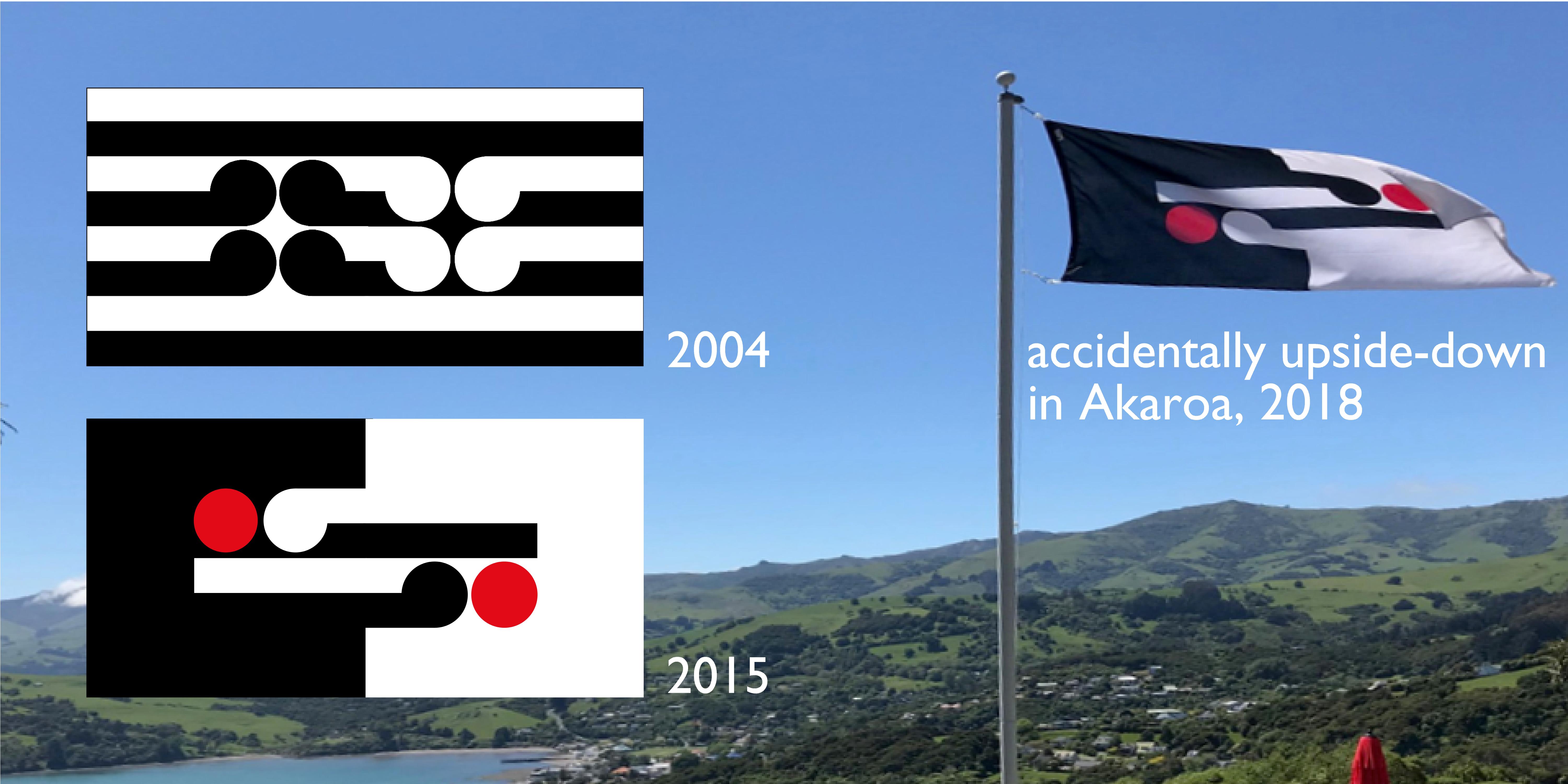
Dame Joan Metge’s lecture consolidated my thinking. At my computer I created my submission to Lloyd Morrison’s website forum. With Walters’ Painting No. 1 as my starting point I referenced Metge’s plaited rope by turning the white koru downward. (Walters horizontal works always turned them upward.) I suggested that the cluster of four could read as the Southern Cross or the letters NZ.
Many iterations followed over the years with my ‘interactive nation’ version being submitted to the competition that led up to the 2015 New Zealand Flag Referendum.
The visual language bequeathed by Gordon Walters is capable of infinite variation and evolution. Many designers have explored this potential. Here are some of my examples — each made with meaning while open to interpretation by each viewer:

The wonderfully comprehensive exhibition Gordon Walters: New Vision, attracted large audiences in Dunedin and Auckland and is now running at Christchurch Art Gallery until 17 March 2019, has initiated reconsiderations of the old debates and added fresh perspectives.
In the conclusion to her catalogue essay ‘Pitau, Primitivism and Provocation: Gordon Walters’ Appropriation of Māori Iconography’, Dr Deidre Brown (Ngāpuhi, Ngāti Kahu), professor of design and history at the University of Auckland School of Architecture, writes:
… given that kaupapa Māori investigative methods are becoming the norm in New Zealand art practice — they require consultation if not participation of Māori in projects affecting them or their culture — it is unlikely that the types of sampling and abstraction that Walters used would be acceptable today.”
It can be argued that Walters did consult, albeit through direct study of traditional Māori and other Pacific Islands’ art in museums and books rather than engaging in dialogue with living Māori. In parallel, his wife Margaret Orbell researched, wrote and edited many books on Māori literature, tradition and belief. Such investigation, and the academic analysis and/or creative expression it generates, is often a solitary activity, but it becomes collaborative when the outputs inform the work of others.
The outcome of Gordon Walters’ personal odyssey, accomplished with great care and attention to detail, is now embedded in our collective consciousness. Professional designers, who are attuned to reflecting collective needs and wants rather than personal expression, should accept the gift and continue the conversation — with aroha, respect and understanding.
___________________________________________________________________
Michael Smythe, MDM, Dip ID, LifeDINZ, is a graphic and industrial design practitioner who now spends most of his time being a design writer, historian and curator.
TITLE IMAGE REFERENCE: King, Marcus, 1891-1977. Attributed works: ‘Reconstruction of the signing of the Treaty of Waitangi’. ca 1950? Reference Number: NON-ATL-0173
FOOTNOTE: Ko Aotearoa Tēnei, Te Taumata Tuatahi A Report into Claims Concerning New Zealand Law and Policy Affecting Māori Culture and Identity (Wai 262) was delivered by the Waitangi Tribunal in 2011. The Summary of Recommendations (p.56) drew a distinction between taonga works and taonga-derived works:
A taonga work is a work, whether or not it has been fixed, that is in its entirety an expression of mātauranga Māori ; it will relate to or invoke ancestral connections (whakapapa), and contain or reflect traditional narratives or stories. A taonga work will possess mauri and have living kaitiaki in accordance with tikanga Māori.
A taonga-derived work is a work that derives its inspiration from mātauranga Māori or a taonga work, but does not relate to or invoke ancestral connections (whakapapa), nor contain or reflect traditional narratives or stories, in any direct way. A taonga-derived work is identifiably Māori in nature, but has neither mauri nor living kaitiaki in accordance with tikanga Māori.
The key reforms recommend for achieving the goal of protecting taonga works and mātauranga Māori included:
A general objection mechanism to prohibit the derogatory or offensive public use of taonga works, taonga-derived works, and mātauranga Māori.
A mechanism by which kaitiaki can prevent any commercial exploitation of taonga works or mātauranga Māori (but not taonga-derived works) unless and until there has been consultation and, where found appropriate, kaitiaki consent.
An expert commission to have wider functions in relation to taonga works, taonga-derived works, and mātauranga Māori.
We await the government response to this report.


