Fresh from the Field — Taylor St Baristas by Hardhat Design
This week’s Fresh from the Field features a ‘luxurious’ identity for US and UK coffee company Taylor St Baristas by Hardhat Design.
If you have new or recent work that you would like to share in Fresh from the Field email Lana for details.

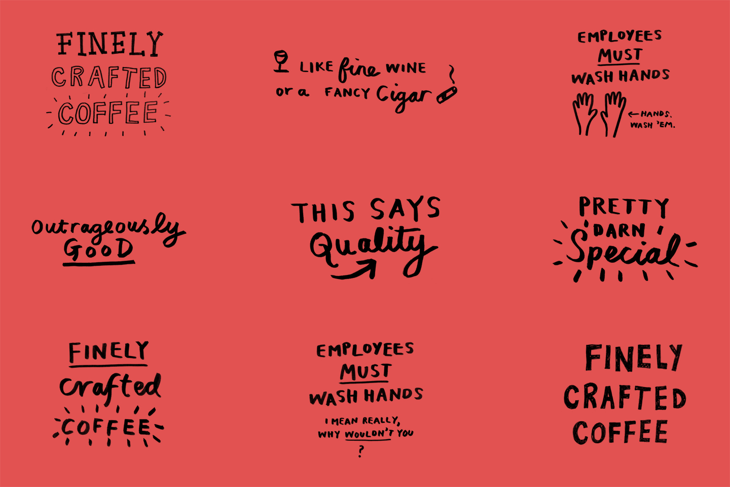

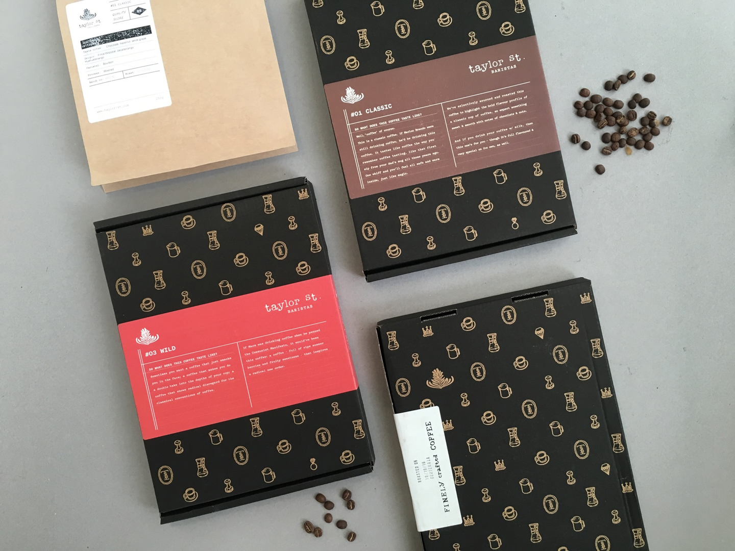
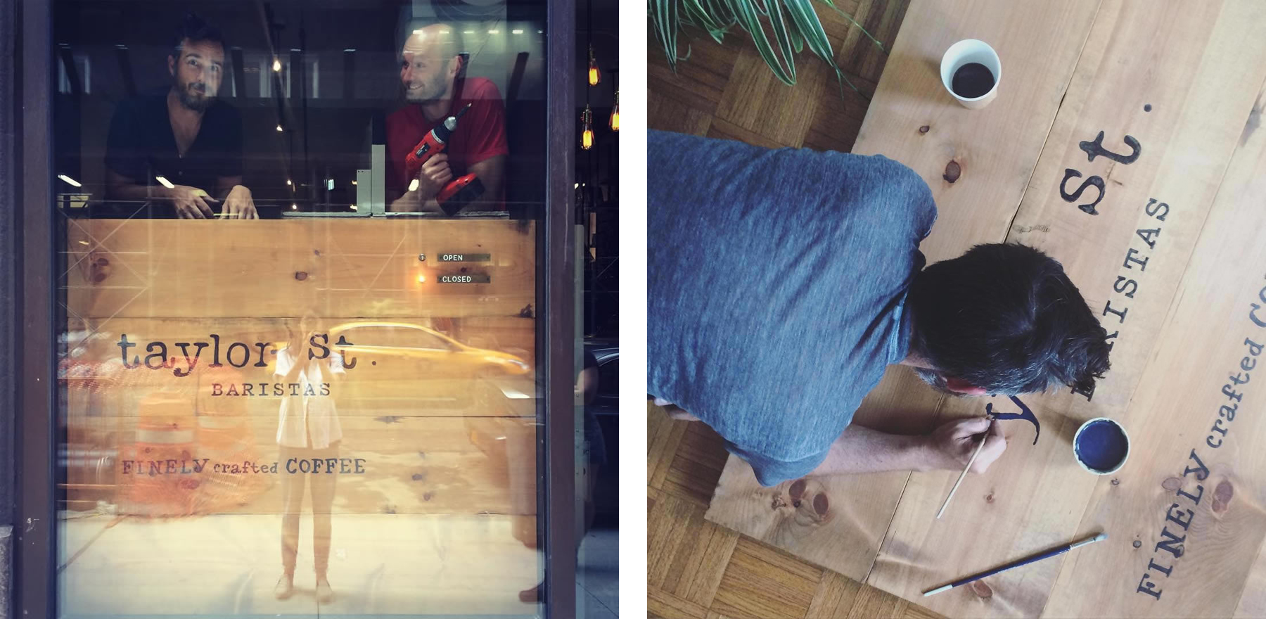
A rebrand for Taylor Street Baristas to coincide with the launch of their coffee supscription service. Hardhat delivered a coherent identity that needed to be future-proofed and easy to apply across all touchpoints (interior & exterior signage, menus & all other print collateral, online, packaging etc).
This included a new logo, typefaces, brand colors, a toolbox of hand drawn illutrations, and design of their subscription services offering. Packaging design needed not only to work within UK postage constraints, but also in a retail environment. Taylor Street are a quirky brand known for their unorthodox nature and application of humor; this could not be just another predictable piece of coffee packaging. Playing on the idea of ‘luxury’ (this is quality coffee) we created a humorous repeat pattern reminiscent of a high-end fashion brand, and non-standard sized boxes that were more reminiscent of a collection of classic novels than traditional coffee bags or boxes.