Fresh from the Field — Chamber Music New Zealand by VOICE
This week’s Fresh from the Field features a brand refresh for identity for Chamber Music New Zealand by VOICE.
If you have new or recent work that you would like to share in Fresh from the Field email Lana for details.
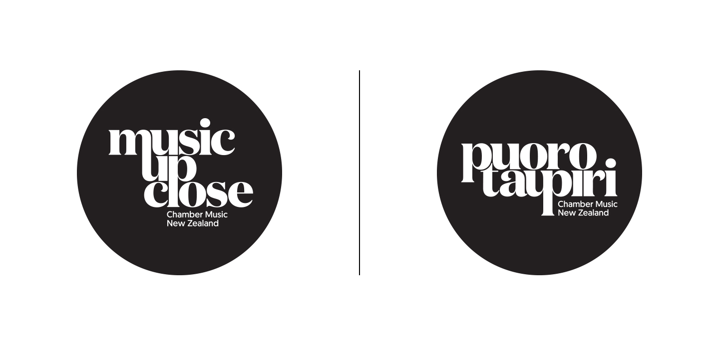
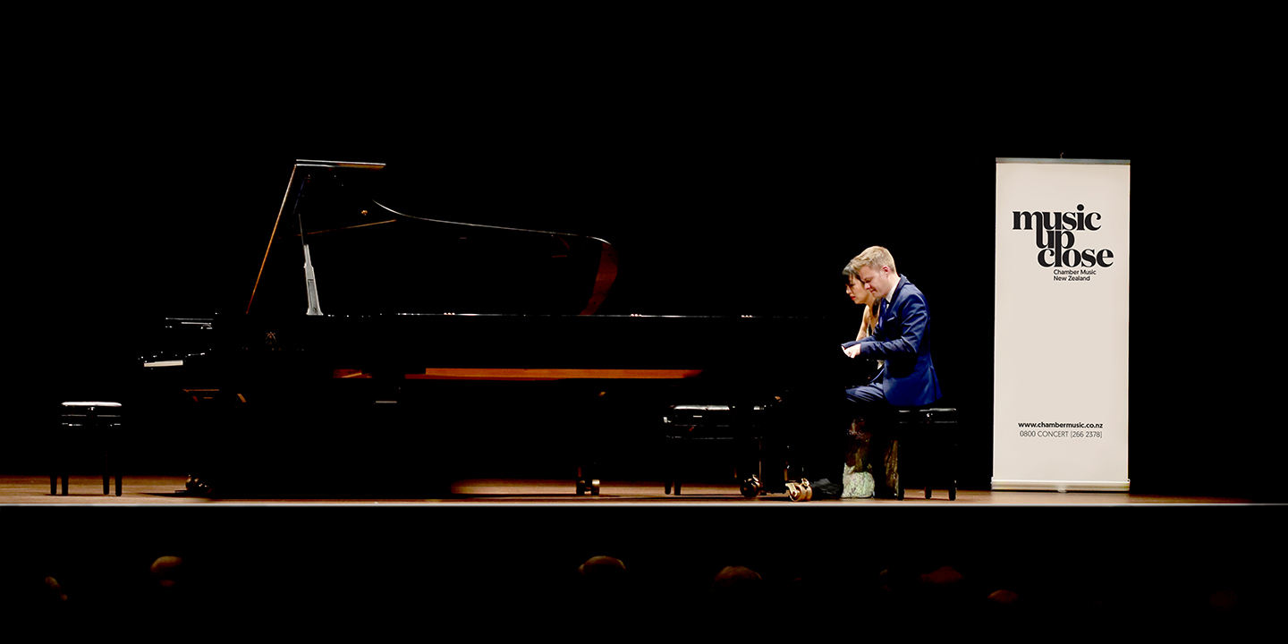
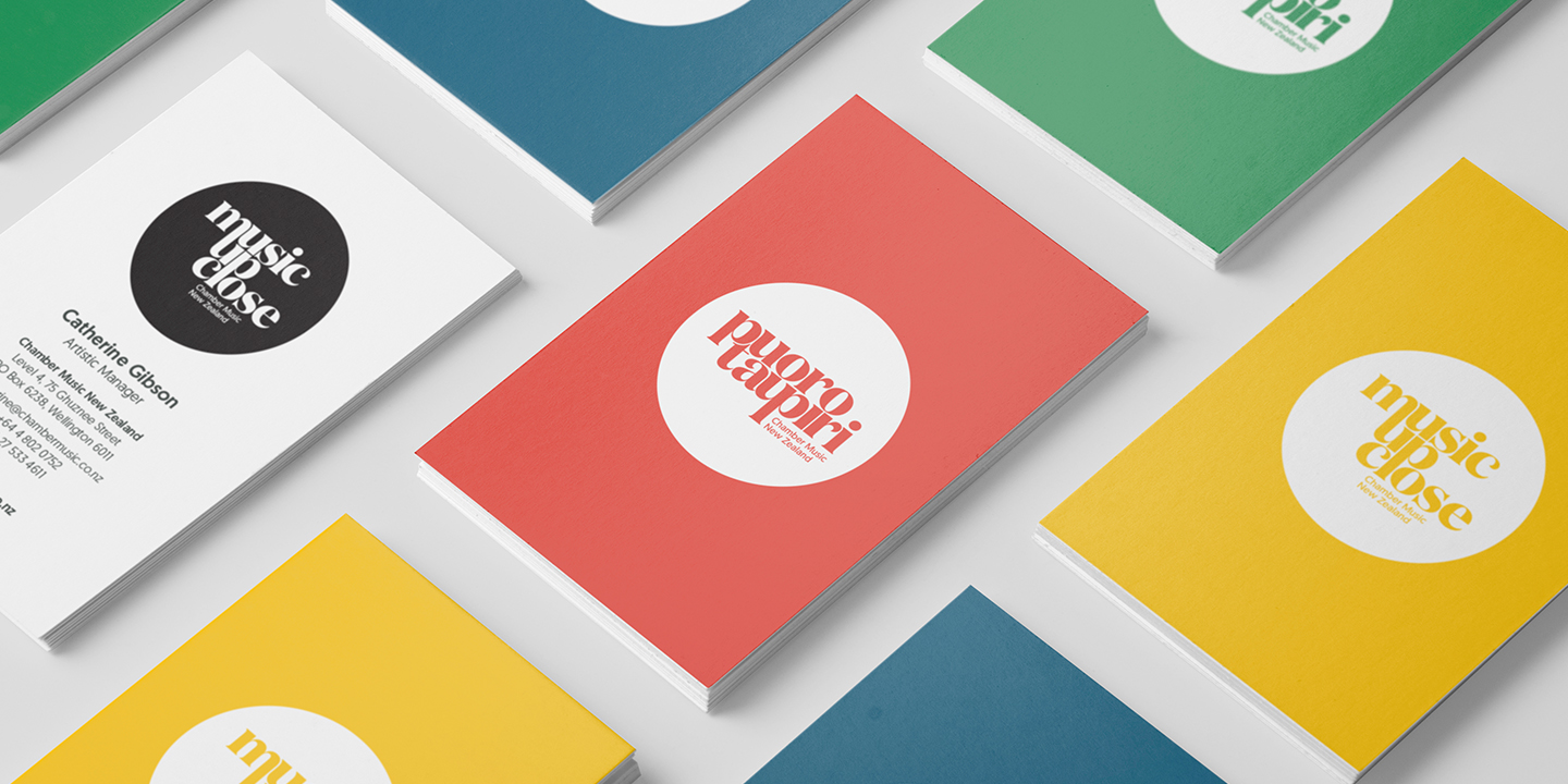
As part of VOICE’s creative partnership with Chamber Music New Zealand, the branding agency has just revealed a brand refresh for the organisation. With a view to strengthen their connection with existing concert-goers and introduce the genre to new audiences, the organisation’s new direction sees it celebrate the intimate and immersive nature of chamber music with a dual consumer-facing brand: Music Up Close and Puoro Taupiri.
Voice’s strategy and recommendation was to create two sister logos in English and Te Reo, with neither as the lead language. The two versions can be used alone or together. “It’s a true partnership – which is as it should be,” says VOICE’s Principal Jonathan Sagar. “It’s about being confident in our bicultural identity. As a country it’s high time we stopped making token gestures and fully commit to incorporating te reo into our vocabulary as well as our identity. Chamber Music New Zealand’s decision to treat the te reo branding with equal importance to its English counterpart is a wonderful symbol of the organisation’s cultural values.”
To find the te reo partner phrase to Music Up Close, VOICE and Chamber Music New Zealand worked closely with Te Haumihiata Mason, former Kaitiaki Reo (language guardian) of Te Taura Whiri i Te Reo Māori (Māori Language Commission) to select the phrase Puoro Taupiri. ‘Puoro’ means music and ‘Taupiri’ translates to intimacy or closeness. “It was not only essential to us that both language versions should be of equal importance, they also needed to have a similar word structure for visual balance” explains Sagar. “It wasn’t a straightforward task but it was vital that it was correct.”
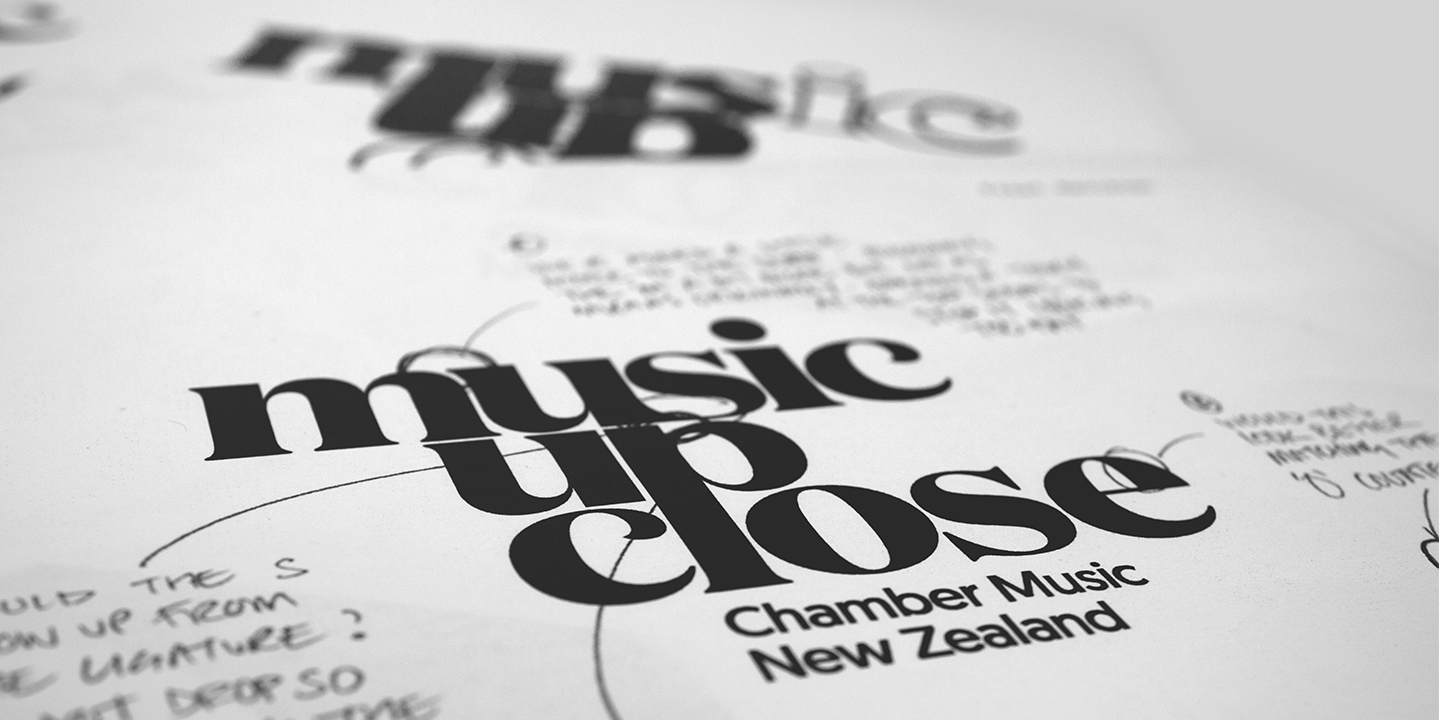
“To reflect the lyricism and essential nature of music itself, the typography was handcrafted from scratch,” says VOICE’s Creative Director, Sean McGarry. VOICE commissioned Sydney based typographer Dave Foster of Foster Type to assist in the refinement of the letter forms for both logos. “We wanted the look of the new logos to communicate the very essence of what Puoro Taiwhanga Aotearoa | Chamber Music New Zealand delivers to its audiences, namely an intimate, personal experience of high-quality music,” says McGarry.
“We have been working with Chamber Music New Zealand for a year after they initially approached us to work with them,” says Sagar. “The launch of Puoro Taupiri | Music Up Close is a significant step forward and the first tangible manifestation of our creative collaboration.”
