Fresh from the field — Marx’ self promotion
This week’s Fresh from the Field celebrates 2017’s three-dimensional gift package from Marx.
If you’ve got new or recent work that you’d like to share in our weekly Fresh from the Field series email Zoë for details.

Christmas is a time for giving.
So…
on the first day of Christmas, our clients got for free,
a daily planner with design complexity.
As a creative studio we believe that the best work happens when staff and clients balance the intensity of work, with creativity and inspiration that often occurs during leisure time.
So this was our idea: to create a daily planner with a twist, to showcase our ability and help our clients balance their work and downtime, without giving precedence to one over the other.
To be true to the notion that work and life should be considered in equal weighting, the project was designed so there is no ‘right way up’, with each component designed to be read and orientated two ways.

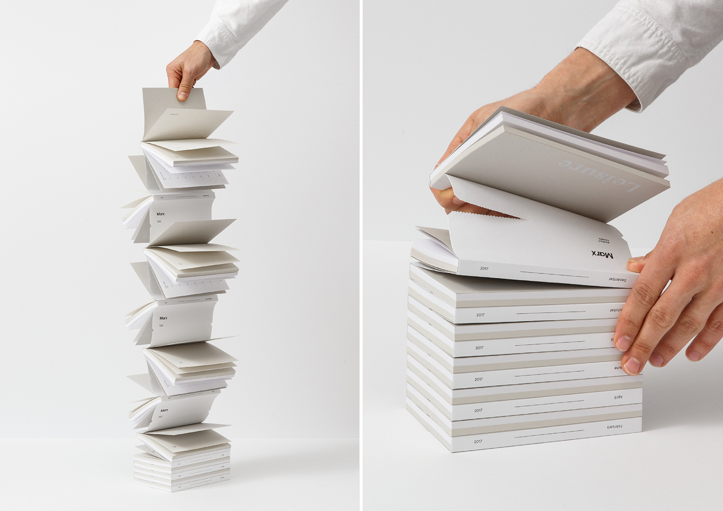
 We created a set of 12 books to stack on top of each other back to back, locked together in a spine made from a premium-textured stock, inspired by traditional bookbinding tape. The spine zigzags between the books, locking them together in a brick-like stack, with six spines facing out on each side. A new planner is designed to be torn off each month along a perforated seam.

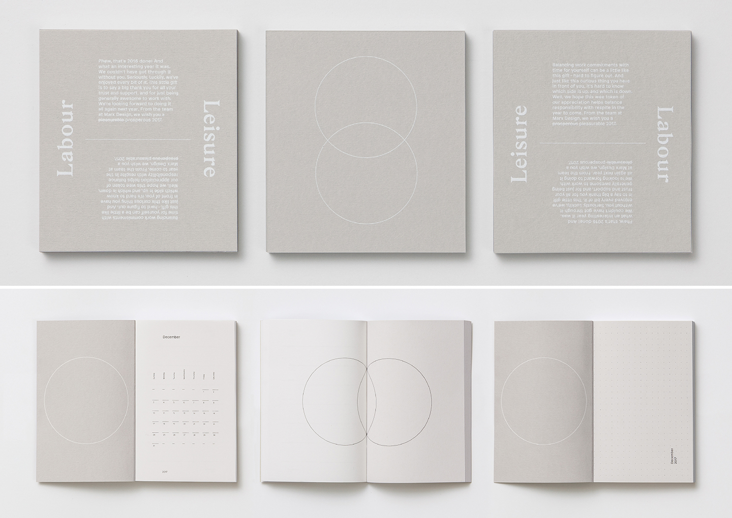
 To reflect our view on work life balance, each month’s book has two covers; ‘Labour’ and ‘Leisure’. On opening, this delivers just the right amount of intrigue as they’re connected, with half appearing upside down, demonstrating the equal importance of both work and play.
The ‘Labour’ section, printed on stark-white uncoated stock, is a working day broken into quarter hourly increments to facilitate chunks of productivity. The ‘Leisure’ section, printed on light grey rough uncoated stock, has a fine-dotted grid for doodling, sketching ideas or writing rhymes for an upcoming rap battle — basically anything enjoyed in downtime. Inside each cover is a key line cycle coming together in the centrefold as a Venn diagram illustrating the intersection of the two aspects.
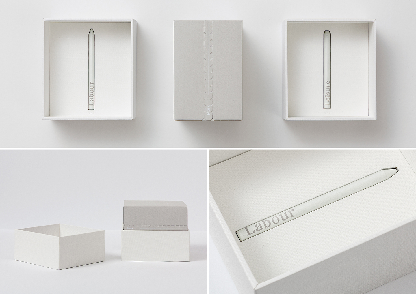
If you’ve received something this beautiful, you don’t necessarily want to write in it with a basic biro. An aluminium designer pen for ‘Labour’ and a quality pencil for ‘Leisure’ are housed in two custom made display boxes. The boxes are finished in tactile bookbinding cloth with matte foil text.


With the complex nature of the structural elements, a pared-back approach to the graphic elements seemed appropriate. We selected a modern, yet understated lightweight sans-serif typeface for the detailed elements and a feature serif typeface referencing the corporate traditions of daily planners.
The daily planner showcases our ability to craft incredible products with personality, while also highlighting our brand ethos with clients; strengthening relationships and well-being by creating a clever tool to be useful all year round.

See more from Ryan and the team at Marx by visiting: www.marxdesign.co.nz


