Interview with Todd Atticus
Written by K. Emma Ng
Supported by Creative New Zealand

Emma Ng is a contributor to Aotearoa Design Thinking 2017, a series of commissioned critical design essays published by Design Assembly and funded by Creative New Zealand.
This article is the third in a four part series on design and politics that will be published over the course of this year — bookended by the 2016 U.S. election and the 2017 New Zealand election. The series will consider the role of design and designers in shaping political engagement through subjects as diverse as “the worm” (remember that TV gem?), and initiatives designed to engage citizen participation outside of the electoral system. What do politics look like? And why does it matter?
Part one: What does a fact look like?
Part two: Feeling Our Way Toward Election Day
The hoardings are up, and the 2017 General Election is drawing near!
For this third instalment in my series about design and politics, I wanted to chat to a designer about what it’s like to work on election campaigns—a rather niche corner of the graphic design world. Todd Atticus is an artist and designer, originally from the UK. He’s worked extensively with political causes and parties, and four years ago, during the 2014 election cycle, we were living together as flatmates in Wellington. And let me tell you, there’s no rest for the graphic designers during an election year. With design work to be done for both the party and individual candidates from electorates all over the country, the workload is relentless.
Todd and I reunited over Skype to discuss what it’s like to design the graphics for the side of a campaign bus, the differences between election materials in New Zealand and the UK, and whether slick design is a turn-off for voters.
Emma Ng: You’ve worked for political causes as a freelance graphic designer and worked with the Labour Party as an in-house designer. How did you come to do this kind of work?
Todd Atticus: The funny thing is when I arrived in New Zealand, I got off the plane and during that first car journey I saw a Labour hoarding being put up at the side of the road. This was just at the start of the 2011 campaign. I thought, “Wow, they put people’s faces on hoardings here, that’s such a strange thing.”
A few years later, once I was in Wellington, I began doing some graphic design work for Generation Zero and 350 Aotearoa. That was the first time that I used my design skills in a political capacity.
This was all voluntary work until one day, one of my contacts got in touch and said, “The Labour Party conference is coming up. Would you be interested in designing the programme?” I thought it was the most exciting prospect I’d ever heard of! Which is funny now that I think about it, because it was basically just typesetting a functional document. That was really my first contact with actually doing design work for a political party. I started freelancing for them, which then gradually snowballed into working for both the parliamentary wing and for the party itself.
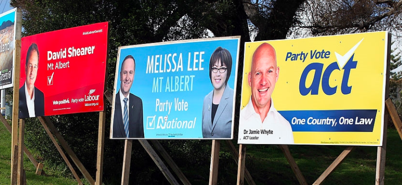
 Hoardings from the 2014 election campaigns. All about the faces.
EN: Hoardings ended up being one of the things you were designing, but what other kinds of materials did you work on?
TA: Pretty much anything, from something as small as a leaflet or calling card (which most candidates use) to the graphics for the side of their bus, which was fun. Interestingly enough the bus is basically just a business card but 300 times the size!
Once you’re in the thick of a campaign you tend to have elements that you can roll out for a whole variety of items. They really just make themselves in the end. You’ve got a slogan, you’ve got a colour scheme, and you’ve got your brand elements. You use them in a very similar way—it’s just that sometimes you have to accommodate for wheels and windows and other times you don’t!
EN: Is there a party style guide?
TA: Yes, in my experience every party tends to have a style guide, which usually gets updated about four to six months before an election. There’s a style guide so that a range of designers can work upon material. That’s an interesting thing—local teams often have designers who volunteer for them. As a way of trying to keep materials consistent nationwide, the style guide is sent out. It doesn’t always mean it is consistent, of course.
EN: That’s what I was going to ask! Do individual candidates sometimes surprise you with materials that are different because they’re trying to do what they think will work in their own electorate?
TA: Yeah totally. Different people have different opinions about whether local campaigns should be able to run with their own look and feel. I know that’s often not advised from a national perspective.
EN: Most designers understand that message and design are intertwined. But I feel like political design is actually one space where the distinction between content and aesthetic is more obvious—perhaps because there are so many candidates utilising the same templates. In this context design often feels like a distinct, secondary priority. Do you think that in designing for political campaigns, there’s more of an emphasis on content rather than design? One example would be the photography you mentioned earlier. Hoardings really revolve around people’s faces and photography.
TA: Definitely. I think the difference in political advertising versus advertising for other products is that actually, when you’re selling a political party, it’s almost like you’ve got an abstract product—a combination of ideals, which isn’t embodied in a particular product. You have to find a way of communicating what that is. In New Zealand where the candidates’ faces are used very prominently on materials, I think they’re often trying to become the vessel for that product. They’re trying to sell themselves as the person who embodies the values of the party. At the end of the day, as a voter when you go to vote, you are voting for a person. A person who embodies the values that hopefully closely fit your own.
 A Green Party web banner from their 2017 campaign.
EN: I had never known that that the prevalence of faces was unique to New Zealand, or at least different from the UK. Are there any other major differences you’ve observed?
TA: One interesting difference, which is because of the difference in electoral systems (New Zealand with MMP; the UK with first-past-the-post/FPP), is that many of the materials here feature one call for an electorate vote for the candidate and a call for the corresponding party vote. Which is not something you’d have in Britain where you have a candidate who embodies their party and you only have one option to vote within the FPP system.
So, in New Zealand materials tend to feature two calls to vote, which I always find baffling because there’s lots of emphasis on calling specifically for a “party vote”. I always wonder what the value is in calling for a party vote is when it’s quite obvious what you’re trying to achieve through your advertising. I think it’s led to a lot of party material being quite literal. It’s like Apple signing off at the end of an advert saying “buy an Apple product”.
Something that I thought was quite interesting in 2014, with the Green’s campaign (their Love New Zealand campaign), was that it wasn’t a very literal message. It was more trying to inspire the voter to think of a set of values versus simply just telling them to party vote Green.
 One of the images used for Green Party hoardings in their 2014 “Love New Zealand” campaign.
EN: I wonder if the stubbornness of the two-tick materials is a hangover from the change to MMP in the mid-1990s. Perhaps the parties have the perception that people are still confused about what to do, and they’re attempting to literally illustrate what you do on your ballot. In terms of design, there’s a relationship between the way the ballot works and the way the ad looks.
TA: Totally. Of course there’s also the conversation about whether it’s a tick we put on a hoarding or a cross we put on a hoarding—“which best mimics the voter paper?” You’re right. I think it might be a hang-up. I wonder if 20 years has been enough to have educated people on MMP and how it functions?

Examples of “double-tick” hoardings from a previous election year.
EN: On the other hand I suppose it is a slightly confusing system, and there’s always new voters every election. But maybe that’s something that should be a burden for the electoral commission rather than party designers! Have you noticed any major trends or shifts in New Zealand’s campaigns this time around?
TA: In terms of design aesthetics, they’re a bit of a hodgepodge. I haven’t observed any design developments this time around—except the small tweaks in the Green’s campaign: a different typeface and a more neon green. I think they’ve freshened it up, which makes it more appealing in the digital space.
Otherwise, it seems to be a year of trying to get a slogan right. I saw something the other day that suggested that National’s slogan and Labour’s slogan both seem very like they’re offering supermarket delivery services, which I thought was kind of funny.
It just seems that it’s very much business as usual. I don’t think anyone’s really thinking outside of the box. If you’re National you’re going with your blue. If you’re a Labour you’re going with your red. You’re gonna put the leader on the hoarding. You’re going to put your logo on the hoarding. You’re going to have a party vote message. You’re going to have a slogan. It’s very bog standard. There’s nothing I’ve seen that eschews that.
 Grocery delivery slogans? Labour’s “A fresh approach” and National’s “Delivering for New Zealanders”.
EN: Do you think most of the energy goes into things like the TV appearances and TV commercials instead?
TA: Yeah, and also social. It’s interesting, I think in the three-year cycle since 2014, we’ve had lots of other political design elements come into play. Now you have MPs with Bitmojis, and pretty much every party has affiliated meme pages on Facebook. Design seems to be playing a part, but not necessarily through official channels. I think social media will really drive design changes, whether it’s in this election or perhaps the next one.
 A tweet from Bill English, announcing his debut on Snapchat and featuring his very own Bitmoji.
EN: That’s true. It could be the next one—we might still be waiting for that to really have an impact.
TA: From a design perspective, my feeling about how important design is to elections and political success has really been affected by Trump’s win, by Jeremy Corbyn’s win in the UK as Labour leader, and by Brexit. What joins all three of those particular instances (I’m not necessarily equating them all politically) is that all three campaigns had awful design, but all three campaigns were incredibly successful.
Trump’s in particular I thought was really interesting. Aesthetically you would never say that his design was on point. He had a red baseball cap with white letters. It’s like something grotesque from… I don’t know? Hopefully one day we won’t ever see one again.
 The logo for the “Vote Leave” Brexit campaign and the logo for the “Stay” campaign.
EN: I’m sure museums will be acquiring them.
TA: I’m sure museums will. It seems that design had no part to play whatsoever in the win. Or maybe it did. Maybe Hillary’s campaign seemed too sleek? Maybe it seemed too well formed? Too professional? Too much like she was a corporation that wasn’t listening. I don’t know. Maybe the design somehow did affect the way that people saw her campaign?
 Variations on the Hillary Clinton U.S. Presidential Campaign logo, designed by Michael Bierut of Pentagram.
EN: You think maybe there’s a “bad design = earnestness” factor?
TA: I think that definitely helped Jeremy Corbyn, for example. I think that was very much a sense of the campaign being grassroots. Maybe that also was how people perceived Trump’s campaign. By having bad design—but having a strong message the permeates itself on caps, on poor signs—actually means the message was seen as the crucial factor versus the way it was being designed and packaged. Maybe Hillary’s, in the end, was just too much of a packaged thing that people thought was very cold and very sterile and very “ad agency”.
Maybe there is a tightrope to be walked between those two elements. Maybe you can aspire for really grandiose design principles, but at the end of the day, if it’s going to alienate the voters, is that really good design?


