Feeling Our Way Toward Election Day
Written by K. Emma Ng
Supported by Creative New Zealand
![]()
Emma Ng is a contributor to Aotearoa Design Thinking 2017, a series of commissioned critical design essays published by Design Assembly and funded by Creative New Zealand.
This article is the second in a four part series on design and politics that will be published over the course of this year — bookended by the 2016 U.S. election and the 2017 New Zealand election. The series will consider the role of design and designers in shaping political engagement through subjects as diverse as “the worm” (remember that TV gem?), and initiatives designed to engage citizen participation outside of the electoral system. What do politics look like? And why does it matter?
Read part one here.
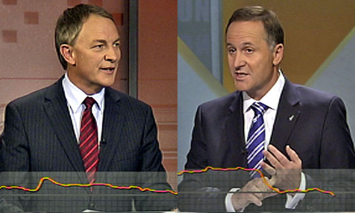
Stills from a 2011 Leaders’ Debate that featured ‘The Worm’, which in recent years has also been called ‘The Reactor’. Images sourced from Stuff.com.
The Worm has wriggled across New Zealand television screens intermittently during election debates since the 1990s. A mesmerising stream of pixels that relentlessly tracks up and down, marking changing voter sentiment in .33 second increments, The Worm has buried its way into the election year psyche—some might say, like a parasite. Spin Doctors, a locally produced satire of the early 2000s, centred a 2002 election special on The Worm, with their fictional PR firm helping political candidates manipulate it. Two years earlier, Helen Clark contributed a chapter titled ‘The Worm that Turned’ to a book on televised election debates. For a television graphic, The Worm was ascribed a lot of agency. Like Helen Clark, post-debate analyses often described it as having ‘turned on’ particular candidates. It was variously accused of trivialising politics, swaying viewers’ opinions on the outcomes of the debates, and responding more to language than policy. For example, it appeared to favour Peter Dunne when he used phrases such as “common sense”. In the Spin Doctors special, they showed it shooting skyward when a Green Party stand-in waxed lyrical about children swimming in crystal clear rivers and relaxing in pohutukawa-dappled shade.
Why was The Worm so enthralling? In that trembling line, do we see ourselves? Do we feel our own preferences rise and fall in sync with those of others? Or do we watch it as outsiders—eager to judge its fluctuations?

The Dominion Post front page. Image sourced from Scoop Politics.
I think one reason The Worm is so compelling is that it was it is a manifestation of feeling. It measures the gut reactions of undecided voters, surfacing the underlying—and primarily emotional—judgements that shape our political actions. But the discomfort and controversy it generated also highlights our unwillingness to confront the role of instinct and emotion in politics. On one hand, we take it for granted that emotional appeals are fundamental to political campaigning, on the other, they carry with them the taint of propaganda. We tend to consider appeals to emotion to be manipulative, inferior to reason when it comes to decision-making.
Recent research suggests that when it comes to issues such as climate change, presenting facts and information actually does very little to change minds. (1). Similarly, it seems that political advertising is most effective when it appeals to both affect and cognition. (2). Emotion stirs engagement, producing a sense of agency. When it comes to persuading people, engaging them as feeling—as well as thinking—human beings is necessary.
It is only by embracing emotion that the potential of designers and other image-makers—namely their ability to shape affective messages—can be celebrated. In harnessing a different type of language, designers might also be able to help to open up political discourse, accommodating multiple types of knowledge. Emotion, is after all, a form of embodied knowledge. In his piece on ‘design thinking’ published by Design Assembly, Cameron Ralston quoted graphic designer Katja Gretzinger:
‘Knowledge is not just communicated through language, but also functions along more abstract lines; implicitly and subconsciously. This knowledge is neither visible nor quantifiable; it may be more like a pattern or layout that is distributed according to conventions. This distribution implements hierarchies, searches for differences, makes simplifications, represents power relations. Graphic designers work very closely with this knowledge.’ (3).
I’m aware that this is a hazy area, which is kind of difficult to convincingly articulate. But designers, and other image-makers such as filmmakers, will likely recognise themselves and their way of working in Gretzinger’s words. And just as work is often produced implicitly and subconsciously (guided by instinct and shaped by a mass of cultural influences absorbed over a lifetime), so too the work is received implicitly and subconsciously (guided by instinct and shaped by a lifetime of cultural exposure).
A campaign that works well on an implicit and subconscious level can connect powerfully with the underlying spirit of the zeitgeist. It’s hard to imagine a purely informative campaign doing the same, even if the issues at hand are timely. Sometimes this can be scary; in the case of negative campaigning designed to exacerbate existing fears, an appeal made implicitly or subconsciously (through visuals or gestures) might act as a kind of evasive double-speak. Dog-whistle politics through pictures, riling up a particular group while remaining safely ambiguous to the rest. Ashley Murchison, whose doctoral thesis at the University of Otago explored televised political advertising, found that in the case of the 2008 election, advertisements that appealed to emotion (what she termed ‘pathos appeals’) most frequently had themes of patriotism, fear, and security/safety—followed by hope, desire for change, and frustration. (4). It could be argued that these types of affective appeals have been a core part of the exclusionary strategies (that play on a sense of ‘us’ and ‘them’) used by so-called ‘populist movements’ of the past 18 months, such as Brexit, the election of Donald Trump, and campaigns in Europe headed by figures such as Marine Le Pen and Geert Wilders.
It is interesting to note how many of the themes in Murchison’s list could be interpreted as negative or fearful. Several of them could be detected in The National Party’s 1975 television advertisement. The ad is described by New Zealand History as ‘probably the most famous – or infamous – piece of election advertising in New Zealand’s political history’ (watch it here). No matter what you make of the policy argument embedded within it, there’s no denying that the advertisement is engaging. The animation (created by the American cartoon studio Hanna-Barbera) and music are layered to promote a thick symbolic message that aligns the Labour government’s superannuation scheme with Soviet Communism. In a one-two punch, the advertisement follows up the animation (designed to stir-up feeling) with Robert Muldoon directly addressing the camera (a more measured appeal to the rational). The campaign could be seen to be effective; the National Party winning by a landslide that year.

A still from the National Party’s ‘dancing Cossacks’ advertisement of 1975.
Another advertisement from the same campaign similarly uses visual symbolism to point to a very specific message, while the language itself remains evasive. In the context of backlash against immigrants from the Pacific Islands (who had previously been welcomed as a source of labour for booming post-war manufacturing), the National Party aired an advertisement featuring swarms of planes crowding the skies, followed by an angry brown-skinned cartoon figure being kicked out of a pub and taking part in a fight. It clearly targeted and stereotyped Pacific Islanders, capitalising on the anti-Islander sentiment of the time. Yet the actual voice-over avoids stating this or naming the group directly, allowing the visual symbolism to do the work: “Then one day, there weren’t enough jobs either. The people became angry and violence broke out—especially from those who had come from other places, expecting great things.”
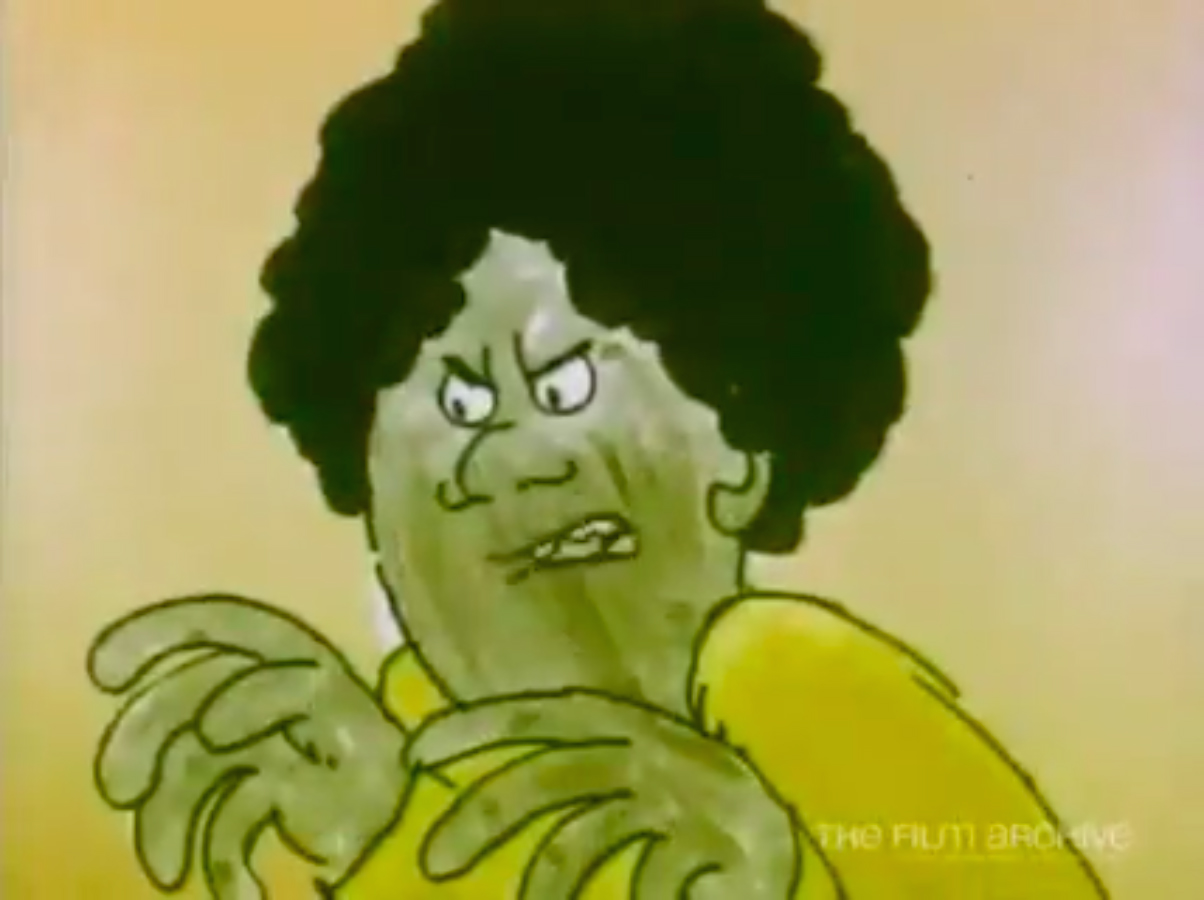
The image shown on-screen as the voice-over says, “The people became angry,” clearly insinuates that it was a certain group of people causing violence (still from a National Party advertisement of 1975).

Contrast this with the imagery shown when the voice-over states, “There was a time when New Zealand cities were quiet and clean. People said they were nice places to bring up children” (still from a National Party advertisement of 1975).
Two election cycles earlier, in 1969, the Labour Party sought to connect with the spirit of the closing decade with their ‘Make Things Happen’ campaign. Encountering it now, its sense of spirit and vision is striking. It combines imagery from the decade (everyday scenes as well as national and international events) in Pop Art inspired colour-tinted split-screen arrangements and is accompanied by a pop-folk theme song: “We’re a country that’s old enough to have a past to turn to, and yet young enough to have a future we ourselves can make… Round the corner are the seventies, a new decade to understand the path that every one of us must undertake… Make things happen, it’s your turn now. It’s too late to turn your back, the future’s here right now…” I can’t speak to how the advertisement itself was received in 1969, but it did not get the Labour Party elected that year. Perhaps the sense of change and optimism that it peddled, was not seen to be backed up by steady hands. Unlike the National Party’s Cossack’s advertisement, the 1969 Labour commercial does not combine a cognitive appeal with its emotional one. It is stirring, but fails to reel it in with concrete policies.

A still from the Labour Party’s 1969 ‘Make Things Happen’ advertisement.
Looking back at these advertisements (and because of my age, observing them only as an outsider) they seem to evoke far more spirit, and be far bolder in their aesthetic partisanship, than most contemporary election campaigns. Ashley Murchison notes that while pathos appeals were frequently utilised in the lead-up to the 2008 election, ‘there was minimal use of symbols and graphics throughout the advertisements analysed.’ There’s a watertight, almost airless, quality to the election advertisements of the last few election campaigns. Leaving little room for variations in interpretation, the messages seem entirely without subtext. Little trust has been placed in the ability of the image-makers to operate implicitly or subconsciously—and by the same token, little trust has been placed in the ability of voters to connect on this level.
As we draw closer to election day 2017 (September 23rd), we’ll see how each party’s campaign unfolds. The Green Party has already made a splash, with the debut of a refreshed look and their ‘Great Greens’ campaign. An Idealog interview with Double Denim, the Wellington-based agency behind the campaign, points to emphasis being placed on ‘heart and humour’ as well as policy. Accordingly, the upbeat launch video directed by Loren Taylor (aka Lily from ‘Eagle vs. Shark’) veers promisingly between the silly and the earnest.
Their Instagram account has also been handed over to Greens supporters in a series of ‘takeovers’, resulting in some similarly idiosyncratic content. The energy that’s been put into the Instagram account signals that the campaign is investing some faith into the power of the visual. As the Idealog interview notes, there’s been a noticeable shift away from text-heavy images on the account. The series of takeovers also seems designed to send a message of inclusiveness by loosening the sense of airtight control that usually characterises campaign imagery. Designer Jarred Bishop, who overhauled the Green’s look described the process of designing for a political party as laden with approval processes in the Idealog interview, so I’m sure the Instagram content is still somewhat controlled by the campaign, but the takeovers are a gesture that amplifies a sense of agency for individual supporters by making them feel engaged—rather than just informed.
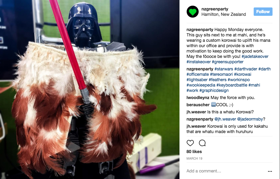
An Instagram post on the Green Party account, part of their ‘takeovers’ series.
An effective campaign depends, like a good story, on appealing to both heart and mind. It is perhaps a cliché to talk of storytelling, it’s advocated so often in design and advertising. But to return to The Worm—it is perhaps compelling because it features so many of the elements of an intriguing story: it is time-based (live, even!), suspenseful, and represents the fact that there is a lot at stake. In a way, it was proto-live tweeting. Running along the bottom of the screen, The Worm effectively allows a group of undecided voters to subtitle the potentially powerful who seek their favour. It gives some screen real estate over to anonymous plebeians, visualising their presence alongside the images of those jockeying for power.
The political philosopher Hannah Arendt described storytelling as the interface between private and public spheres; the space where we negotiate our values, interests, beliefs, and ideas. It is through storytelling that we as individuals come to understand ourselves in relation to a collective—whether it’s a nation, a whakapapa, or a religion. What is politics itself, except for the negotiation of individuals and a collective? Storytelling helps us feel connected to something bigger, and to overcome disengagement and voter apathy we need all the tools we can get. This election year, let’s hope for campaigns that trust us with visual stories, sweeping us up in their momentum. Let’s hope for campaigns that are moving, stirring, and positive—embracing the fact that we feel, as well as think, our way to the voting booth.
(1). http://www.newyorker.com/magazine/2017/02/27/why-facts-dont-change-our-minds
(2. )Richardson (2003) 132
(3). Katja Gretzinger, In a Manner of Reading Design, Sternberg Press, 2012, p. 165.
(4). https://nzpsa.files.wordpress.com/2008/11/nzpsa_conference-paper_ashley-murchison-20091.pdf


