What does a fact look like?
Written by K. Emma Ng
Supported by Creative New Zealand
![]()
Emma Ng is a contributor to Aotearoa Design Thinking 2017, a series of commissioned critical design essays published by Design Assembly and funded by Creative New Zealand.
This article is the first in a four part series on design and politics that will be published over the course of this year — bookended by the 2016 U.S. election and the 2017 New Zealand election. The series will consider the role of design and designers in shaping political engagement through subjects as diverse as “the worm” (remember that TV gem?), and initiatives designed to engage citizen participation outside of the electoral system. What do politics look like? And why does it matter?
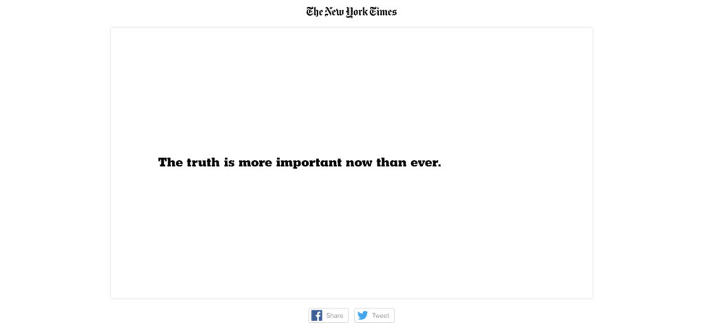
A screenshot from The New York Times’ latest campaign, “The Truth”
In the wake of the 2016 U.S. election, many professional bodies and organisations within the creative industries released official statements. Some were reflective, some were rallying cries; but all made the case that the work we do – as designers and artists and architects – is now more important than ever. This is not untrue. But the issuing of these statements – all of which were wound up in asserting our own value – was ultimately motivated by our need to be comforted. During those raw weeks of anxiety and onsetting numbness, we needed to feel that, through our work, we had some power to control events and change public opinion – do all the things that we felt we’d perhaps failed to do in the months prior.
We want desperately to believe that the outcome of the election was the fault of fake news, exaggerations, untruths, and lies. We want to believe that design was complicit in allowing these things to masquerade as fact (whether deliberately or through complacency). We want to believe this because if it is true, then it is also true that we possess the power to fix it. We want to believe that there is an aesthetic of legitimacy and that, briefly, the wrong narrative was allowed to stray into it. So, what is this aesthetic of legitimacy? What does fact look like?
There is no doubt that the way we look at things has changed. When I scroll through my Twitter feed, I’m no longer sure about what to believe and what to discount – a nibbling uncertainty I don’t remember experiencing prior to the last eighteen months. In late December, Courtney Johnston, Director of the Dowse Art Museum, pointed readers of her newsletter to an article by Kyle Chayka, about the aesthetic of fake news. Chayka suggests that the reformatting of news articles – for platforms like Google AMP, Facebook Instant Articles, and Apple News – strips away the elements of graphic design that we rely on to judge the reliability of the content. The graphic restraint of these reading interfaces – which is partly driven by their intent to optimise the content for viewing on mobile devices – visually tames even sensational stories. It’s a convincing argument, worth considering given that “fake news” is not in and of itself a new phenomenon – tabloids and gossip magazines have been keeping people entertained at the supermarket checkout for as long as I can remember.
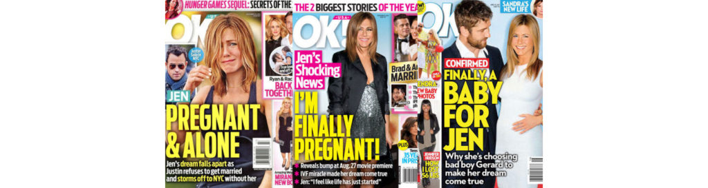
The eternally pregnant Jennifer Aniston. OK! Magazine covers compiled by Elle.
But it is not just that sensational news is adopting the visual cues that were previously the domain of trusted publications. Throughout our information saturated landscape, things are sliding around, boundaries are shifting, and new frontiers are appearing on the horizon. Every election takes place in an unprecedented and unpredictable mediascape. The accelerated pace of technological and cultural change births innumerable adjustments to the way we interact with information within a single presidential term (four years).
When Barack Obama was elected to a second term in November 2012, the online publishing platform Medium was only three months old, but by early 2015 it was big enough that the White House published Obama’s State of the Union address to the site before he delivered it. Medium is a site that hosts content by both “professional” and “amateur” writers and journalists. No matter whether a post is written by an individual publishing for the first time, or is from a publisher such as Pacific Standard or The Awl, the platform gives both the same visual treatment. This visual treatment comes in the form of an unvarying template, clean, uniform, and relatively non-hierarchical (in a visual sense rather than an algorithmic sense).
Medium’s founder, Evan Williams (who also founded Twitter) earlier co-founded the service Blogger, which launched in 1999. Blogger is a great example of the avenues that were available to individuals wishing to publish their own content in 1999 and for most of the following decade. The platform looked like – well, a blog. Pages were highly customisable using HTML or one of the hundreds (maybe thousands) of templates available. The endless possibilities of customisation inevitably spawned an amateur aesthetic that more closely aligned Blogger with a platform like Myspace than an online publication or news outlet.

Two recent blog posts by individuals writing about American politics – one published on Medium, the other using Blogger.
The impact of Medium’s convergence of “professional” and “amateur” aesthetics is intertwined with the simultaneous atomisation of the workforce. While writers have long worked in contractual and freelance arrangements, platforms such as Medium now provide a means of self-publishing as a supplement to publishing pieces under an established masthead. It is not uncommon for a journalist to write for several publications as well as publishing content themselves – a scenario that, for us as readers, complicates traditional measures of journalistic legitimacy. What new critical awareness is needed on the part of the reader to track the legitimacy of an author across various platforms – rather than relying on the visual identity prescribed by the platform? This is not to say that platforms such as Medium have an impact because that is where people are ingesting their news, but that platforms such as Medium are changing the wider visual context for the information we interact with – disrupting our established visual literacy. A freelance journalist (or anyone with the motivation) is now easily able to establish a convincing professional identity using tools that are available to anyone with an internet connection – a Twitter account, a Squarespace website, maybe even a Patreon page. Such platforms give equal aesthetic weight to a range of voices. They provide even amateurs with the boost they need to make it past the thresholds of our aesthetic tests of validity.
Beneath this visual cloak, these platforms also provide venues for the mixing of personal and professional personas. This is paired with the increasingly social ways that news stories are presented by traditional news outlets. For example, Stuff (I still can’t believe New Zealand’s largest news website is called Stuff) and TVNZ’s use of the Facebook reaction buttons to poll their readers could be seen as a visual de-professionalisation of their journalism brand (as well as being highly reductive) that chips away at the aesthetic boundaries of legitimacy. When one of these agencies recently streamed a press conference announcing John Key’s resignation using the Facebook Live function, the comments were filled with viewers asking why it was being filmed using what seemed to be the reporter’s phone, and without a tripod.
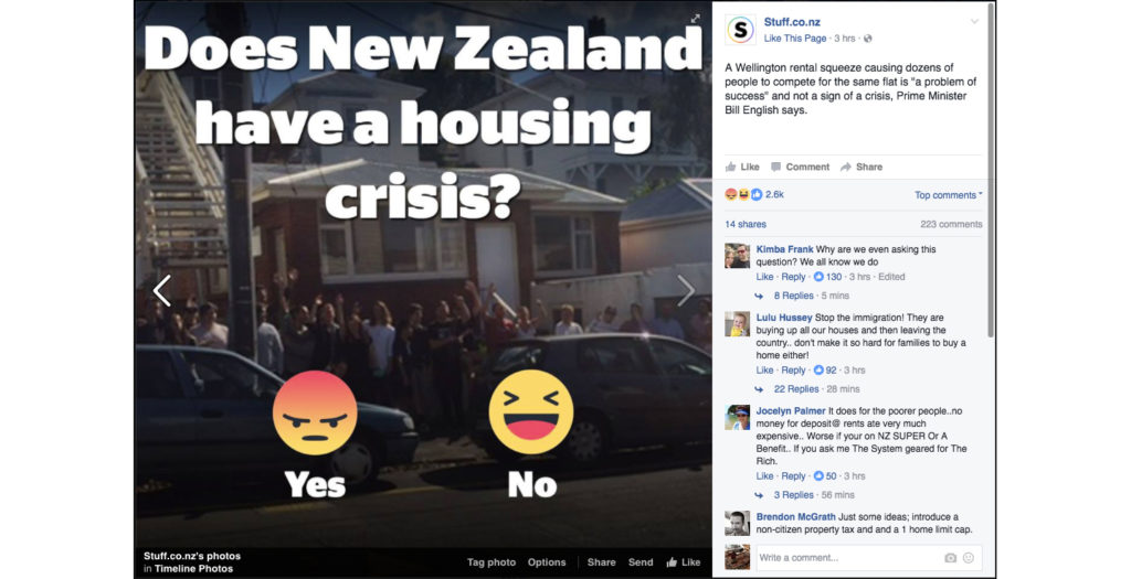
A recent Facebook post by Stuff.co.nz
As you might have noticed, the word “legitimacy” keeps surfacing. Underlying a question such as what does a fact look like (and is this changing)? are greater questions that have more to do with legitimacy than the visual verification of some sort of objective truth. Jean-François Lyotard, the French philosopher (and curator of the influential 1985 exhibition Les Immatériaux) suggested in 1979, that the legitimisation of knowledge is a key problem in an era of computerisation – and that a fragmented landscape of heterogeneous narratives (the post-modern condition of the book’s title) has replaced a unifying belief in a grand metanarrative (metanarrative having been the driving force of modernism). Identifying knowledge and power as interlinked – who decides what knowledge is, and what knowledge is worth storing? – he wonders whether a multi-national corporation like IBM might someday control a belt in the Earth’s orbital field and use it to circulate satellites for communication or store data banks. Lyotard asks of these hypothetical databases and communication tools: “Who will have access to them? Who will determine which channels or data are forbidden? The State? Or will the State simply be one user among others? New legal issues will be raised, and with them the question: “who will know?”
This passage, from The Postmodern Condition, is interesting to return to almost 40 years later – swapping out IBM and replacing it with Facebook (a company Lyotard did not live to witness). Facebook’s influence as a site through which information is produced, directed, and organised (surfaced or buried) is well recognised as a source of contemporary fear. Over the past year, the company’s power to legitimise “fake news” and reinforce existing biases through “filter bubbles” has repeatedly been questioned – as Kyle Chayka does in his piece on the aesthetics of fake news. Mark Zuckerberg has been seemingly reluctant to acknowledge Facebook’s legitimising power, perhaps with the aim of shirking the responsibilities and principles that news organisations and journalists – as traditional legitimisers of knowledge – aim to hold themselves accountable to. Visually however, Facebook has made moves to own this legitimising function through design changes to the platform. In early 2014, Facebook redesigned the way that links to external content (including, and especially, news stories) looked in the newsfeed, switching the sans serif headlines to a more newspaper-y serif – reaping all the connotations of trust and reliability that come along with it. In 2015, Facebook poached the partners from the firm behind the design of Medium and other news-focused products, Teehan+Lax, for their own design team – presumably with the intent of harnessing their expertise in designing news readers and interfaces. Decisions like these point to a clear internal understanding of the company’s relationship to news production and distribution – and the potential impact of Facebook on the circulation of information.
We, as users of the platform – or even just as people living in a Facebook world – cannot underestimate the effect that these platforms for sharing and encountering news stories have on the way we interpret information. In reality, for most of us there is probably a divergence between how we think we (or how we would like to) encounter and digest news (by diligently scrolling through our favourite publishers every day), and where we actually come across it (by clicking on Tweeted links and shared Facebook posts).
A few weeks ago, on February 16, Mark Zuckerberg finally addressed some of these questions of power and responsibility in a 5500+ word long manifesto of sorts, titled “Building Global Community”. In a section called “Informed Community” Zuckerberg outlines the company’s approach to displaying news stories on the site. He writes: “Our approach will focus less on banning misinformation, and more on surfacing additional perspectives and information, including that fact checkers dispute an item’s accuracy.” I want to pick up on this reference to fact checking. Facebook had announced in December new “fact checking partnerships” with organisations such as The Associated Press, PolitiFact and Snopes, which would see them help to identify stories that are factually incorrect (checking items flagged as potential fake news by users). A warning would then be applied to these stories when they’re displayed in the newsfeed, and when someone goes to share such posts.

Facebook’s images showing how these fake news warnings might look.
To date, I haven’t seen these warnings in use (perhaps I haven’t had any flagged stories enter my newsfeed), but the images above indicate what they might look like. For obvious reasons, fact checking seems to have become a core activity within current political journalism. For example, during live political events such as significant speeches, many news organisations publish live fact checks, assessing the veracity of claims made by politicians. This perhaps gives us some sort of answer to our initial question – what does a fact look like?
Answer: it is bite-sized and colour-coded.

The New York Times, “Fact Checks of the 2016 Election”
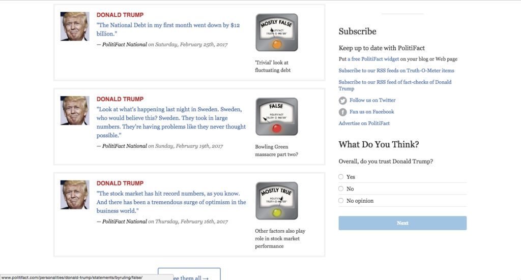
Politifact’s “Truth-O-MeterTM” rulings on statements by Donald Trump
The visual characteristics of these fact checking pages – brevity, the use of scales to quantify truthfulness, and the simple use of red, green and yellow to categorise veracity – point to a desire for definitive clarity. It seems that what we seek from journalism is an objective, authoritative, legitimate voice. This may seem like a strangely obvious thing to state, but I think it’s important to contextualise contemporary journalism as relatively “objective” in relation to previously more (acutely) partisan news publishing. If we can think of journalistic objectivity as invented, produced, and designed, we can pose bigger questions such as: what does it mean when politics is framed as a battle for objective truth (fake news vs. fact checking), rather than a battle between differing ideological viewpoints? Politifact is a Pulitzer Prize-winning news organisation. How does their presentation of their Truth-O-MeterTM as a scale – with “True” on one end and “Pants on Fire!” on the other – shape the way we think about politics, rather than just reflect it?
Yes, the work of designers is more important than ever. But our role is not to entrench the boundaries of aesthetic legitimacy. We are involved in a bigger play – using language to frame our shared experience. Visual language is fundamental to the organisation and communication of information – we can only articulate ideas when we have the language to do so. When we design platforms and tools for the circulation of ideas – whether it’s a poster, a newspaper, or a social media network – we are laying the groundwork that determines the questions we’ll think to ask. The battlefield is a product of design.