Fresh from the field — GoodFor, Marx Design
This week’s Fresh from the Field celebrates the feel good, beautiful, new small brand identity for GoodFor, Ponsonby’s recently established wholefoods refillery, brought to you by Marx.
If you’ve got new or recent work that you’d like to share in our weekly Fresh from the Field series email Zoë for details.

GoodFor is a wholefoods refillery that allows you to scoop and weigh your own produce (think BINN INN). It’s got a Ponsonby storefront, offering a wide-range of herbs, spices, grains – and all the ‘superfoods’ (chia, acai etc.) that you can think of.
Simple branding job, right?
Like other Ponsonby hipster-brands, all we need is to slap on a meaningless logo with a bold typeface, get someone with a beard and tattoos to be the mascot, and we’re golden!
But that’s not GoodFor.
GoodFor’s anything but another fad-chasing, cynical, money-maker.


GoodFor exists for one reason – to help the environment by making sustainable shopping easier. They’ve a multifaceted approach: from eliminating plastic in store, to having their own reusables range to help reduce people’s footprint (the goal being a plastic-free pantry), through to planting a tree (through the Trees for the Future charity) for every purchase a customer makes.
GoodFor wants people to know that buying GoodFor’s produce isn’t only good for their health, but also great for the planet’s.
That was our challenge – how do we launch GoodFor in a way that conveys to consumers the simplicity of their brand ethos, while highlighting the myriad ways in which they’re doing it? And we needed to move swiftly, because similar operations in Australia were eyeing up New Zealand.
They wanted every customer to feel a pang of pride, every time they enter the store.
A tough job…
We started with what we knew. Their ethos is about waste reduction, so it needed to be uncomplicated. Keep it clean, but ensure that there’s depth.
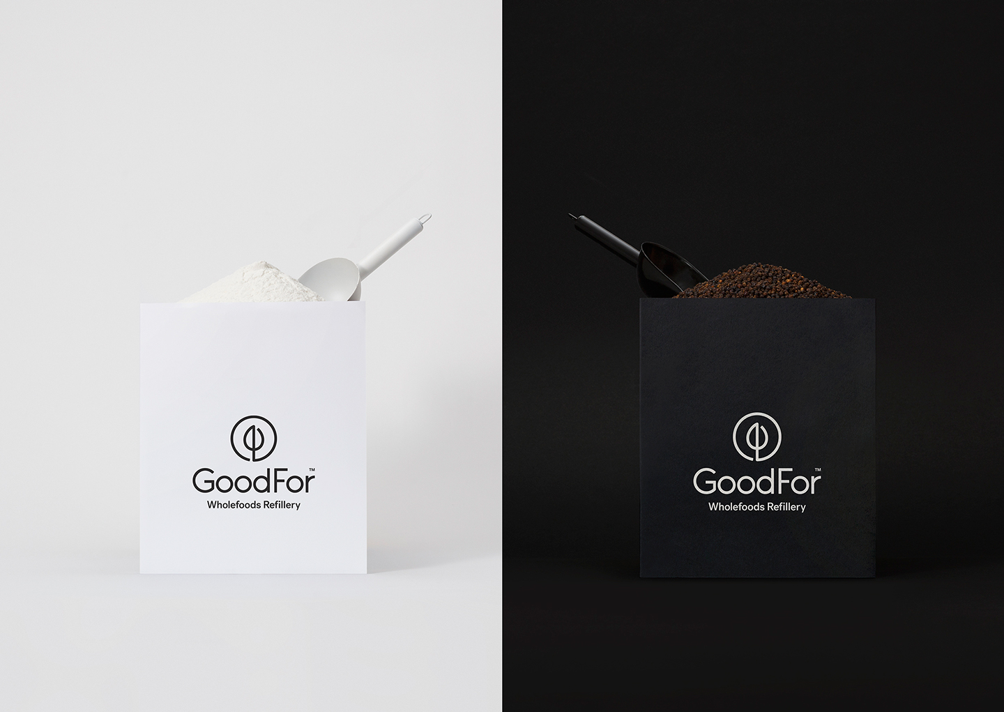
We chose one hero motif – the sapling. A symbol for new life, growth and an indicator of a healthy environment, but it also showcases the work they’re doing with their tree planting. The simplicity of the image echoes the simplicity of their ethos, while also being visually endearing.
We contained the sapling in a loop, representing the cycle of sustainability inherent to the brand ethos.
Following the theme of reducing, we reduced our colour palate in both logo and type, to only black. When seen on the store’s recycled timber, it brings eye-catching contrast and clear communication. This, combined with a well-crafted sans-serif (only two weights) and a simple grid-system, appears not only approachable but sophisticated too.
Importantly for a small business, it’s easy to execute at scale and throughout all touchpoints.


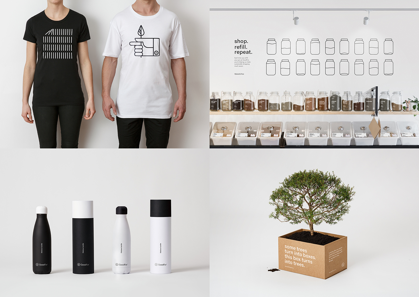


The tone of voice is significant. We are fighting an important fight, but occasionally brands that try can appear self-important, over-complicated or preachy. We needed to be approachable and our mission easily understood; by using clear language and simple illustrations with some wit and charm, to ensure that people understood and wanted to come on the journey.
Through the development of a seemingly uncomplicated logo, typeface and tone of voice, but with a layer of meaning behind it all, we successfully achieved the brand’s desire to be simple, but make their multi-faceted mission easily understood.
Every touchpoint now explains why shopping at GoodFor is good for everyone.
See more from Ryan and the team at Marx by visiting: www.marxdesign.co.nz
Copywriting by Kate Phillips


