
Fresh From The Field — Oli Booth Architecture – By PERKS
Softly spoken typographic style and a distinctive art direction capturing the essence of the ‘moments’ within a space, PERKS walk us through their recent brand identity and website design for OB A.
Want to submit your own work to Fresh From The Field? Fill out the FFTF form here.

The Brief:
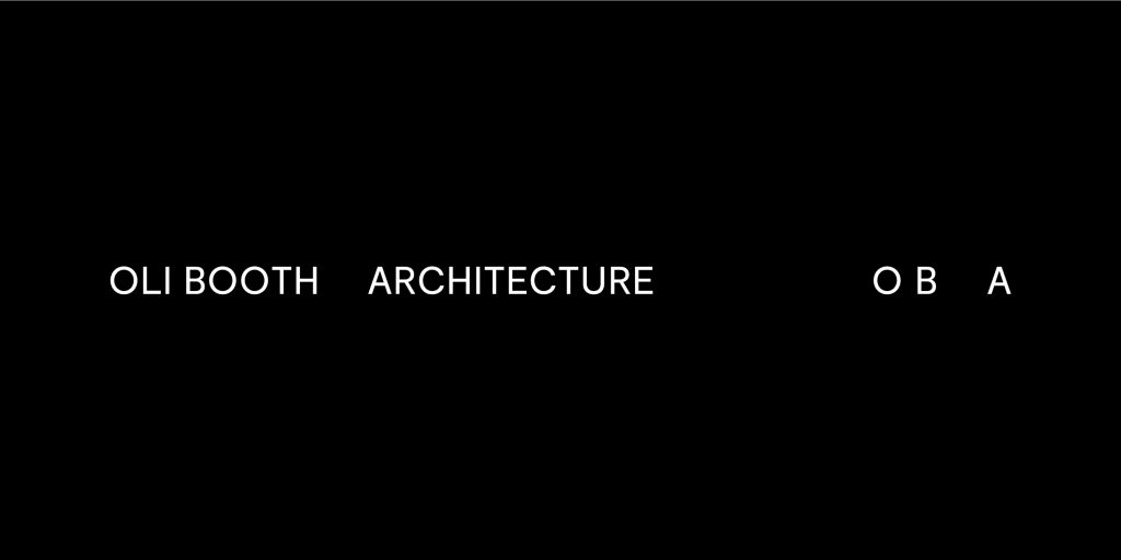
OB A is a residential architecture practice based in Tāmaki Makaurau Auckland. PERKS was engaged by OB A to create a brand identity and website to reflect its unique design philosophy.
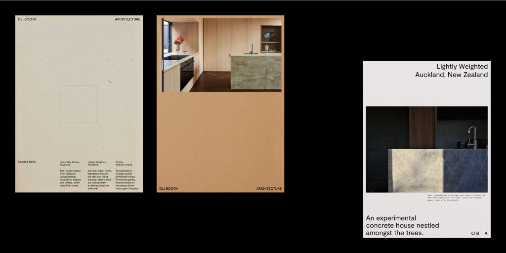
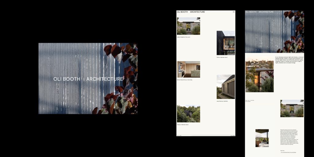
The main requirement of the brief was to translate the OB A approach – this focuses on how the environment and people’s routines intersect within a place and can be utilised to enhance the everyday lived experience. These ‘moments’ and happenings within a place that would once be overlooked are honoured within the OB A process and embedded within the architecture. It was important to communicate the intentionality of the OB A process within the identity, whilst also ensuring a personal feeling – just as a home feels to those who live in it.
The Design Response:
This was achieved through a softly spoken typographic style that allows the architecture to be the main focus. A distinctive art direction approach was established that captured the essence of the ‘moments’ within a space, as well as creating a rich, natural colour palette – this is best seen through a series of video stills captured by Samuel Hartnett.
One of the most interesting parts of working on this project was uncovering the overlap of design processes between architecture and graphic design, and utilising this to work in a new and collaborative way.

The Design Team:
Ella Hampshire-Perks, Lead Designer
https://www.perks.design/
https://www.instagram.com/perks.design/
The Client Team:
Oli Booth
https://www.instagram.com/_olibooth/
https://www.oba.co.nz/
Collaborators:
Photographer: Samuel Hartnett


