Martina Plantijn is a better Plantin
Named after an indomitable 17th century businesswoman, author, and head of the largest printing business in the world, Martina Plantijn is the newest typeface released from our Friends over at Klim Type Foundry
Designed by Klim Type Foundry’s Kris Sowersby, Martina Plantijn is a new type family informed by the workhorse qualities of Frank Hinman Pierpont’s well-known 1913 typeface, Plantin. Sowersby’s design expands upon Pierpont’s research of 16th century type at the Museum Plantin-Moretus in Antwerp, making decisive digital updates across its roman and italic cuts.
Martina Plantijn builds on an evolutionary body of type design work. As Sowersby describes it,
“Martina Plantijn is my third official bite at the Plantin cherry. The first was Galaxie Copernicus (2007) with Chester Jenkins. Tiempos (2010–18), a re-focussing of Galaxie Copernicus through the lens of Times New Roman, was the second. Martina Plantijn is a more accurate rendition. I’m honouring the original spirit and fortitude of Plantin.”

The typeface is named, with a subtle Dutch “ij” digraph tweak, after an indomitable 17th century businesswoman, author, and head of the largest printing business in the world. Martina Plantin was Christophe Plantin’s daughter and married his apprentice Jan Moretus. At five years old she was proofing texts in her father’s printshop—by 25 she was running it. Martina Plantin inspired a lineage of strong, emancipated women who managed the Plantin-Moretus printing house for the next 300 years. As Sowersby emphasises in his typically incisive essay on the typeface design process, Martina’s stewardship and care “helped lay the foundations of the Plantin-Moretus archives, embodying the true definition of curator.”
Continuing from where Pierpont left off, Martina Plantijn improves and rebalances. Like Plantin, it’s extremely robust at small sizes, hard-working and modest, while larger settings reveal practical and opinionated arcs, cuts and terminals. Martina Plantijn is a formidable next-generation Plantin that reconciles historical analogue qualities with a 21st-century digital reality.
This overlap of analogue and digital, past and present, is embodied in a deceptively simple launch campaign with creative direction by James Goggin (Practise). On one level it’s essentially documentation of a font in use: Antwerp-based graphic designer Stephanie Specht working with the typeface on a laptop. But the core concept was to collapse time and space, people working with type across centuries, an ethereal simultaneity of past and present.
Goggin commissioned the respected London-based Belgian portrait photographer Eva Vermandel to join Specht for a day exploring the Museum Plantin-Moretus, an institution that’s legendary in type design, dating from the Renaissance and Baroque periods. Rare access was gained to otherwise off-limits areas of the grote bibliotheek (Great Library) and the Printing Works, where an anachronistic hall of mirrors played out. The spirit of Martina Plantin was made manifest in Specht’s spectral presence, a contemporary independent designer working on her laptop with a font informed by the collections held in the very spaces that Martina once managed.

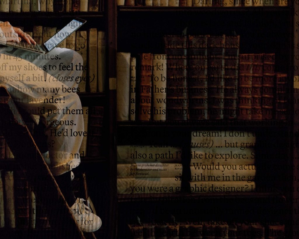
Specht herself worked with an unusual commission from Practise that was hard to describe: to be photographed while exploring the museum, and to work on what Goggin loosely defined as a “typographic composition” of some kind, to be featured in the photography in some way. In just one of many serendipitous moments in the project, it turned out that Specht had already participated with the museum for a design residency, which by sheer coincidence had resulted in a project researching Martina’s mother, Jeanne Rivière. This illuminated an evocative speculative dialogue between Martina and Jeanne that Stephanie wrote and typeset, working live in the Plantin-Moretus library, which was then beautifully superimposed in-camera as double exposures on medium format film by Vermandel.
Further sustaining the echoes and reverberations between past and present, an atmospheric piece by Argentinian electronic musician Ana Helder accompanies the slow-fade photomontage videos launched on social media and the web. The use of Helder’s track is an advance exclusive from new London-based production music start-up Feelslike before they go live in July.