Fresh From The Field — Dads Pies – By Onfire Design
Fresh from the Field is a weekly article series sharing the fresh and inspiring work of our Aotearoa Design Assembly community.
By carefully refining letterforms and stripping away graphics that pigeon-holed the tone of voice, Onfire walk us through their redesign work for Dads Pies.
Want to submit your own work to Fresh From The Field? Fill out the FFTF form here.
The brief
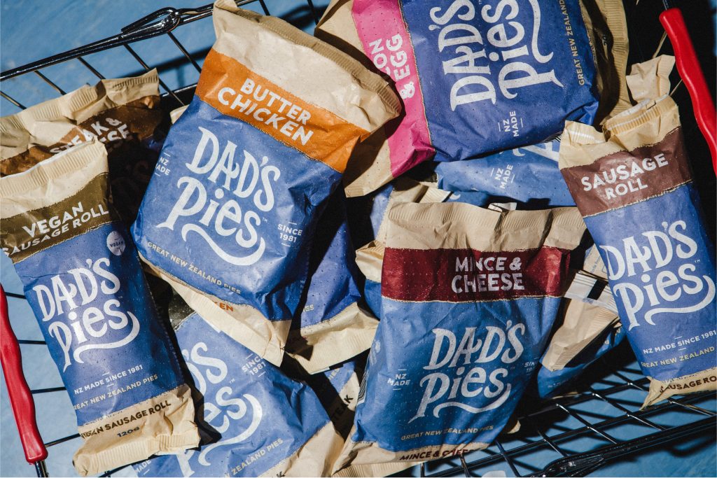
1981, Red Beach, Auckland. This was the beginning of the journey for Dad’s Pies, with a small store offering great quality New Zealand pies to peckish beachgoers. Since then, the brand has grown rapidly – building a loyal fan base and going from a small family shop run by Dad; to a renowned retail brand which could be found throughout the country, managed day-to-day by the sons. The previous packaging had brought the idea of ‘Dad’ to life, giving the brand a quirky and artisan appeal. But the visual elements were not resonating with a broader and younger audience.

The Design Response
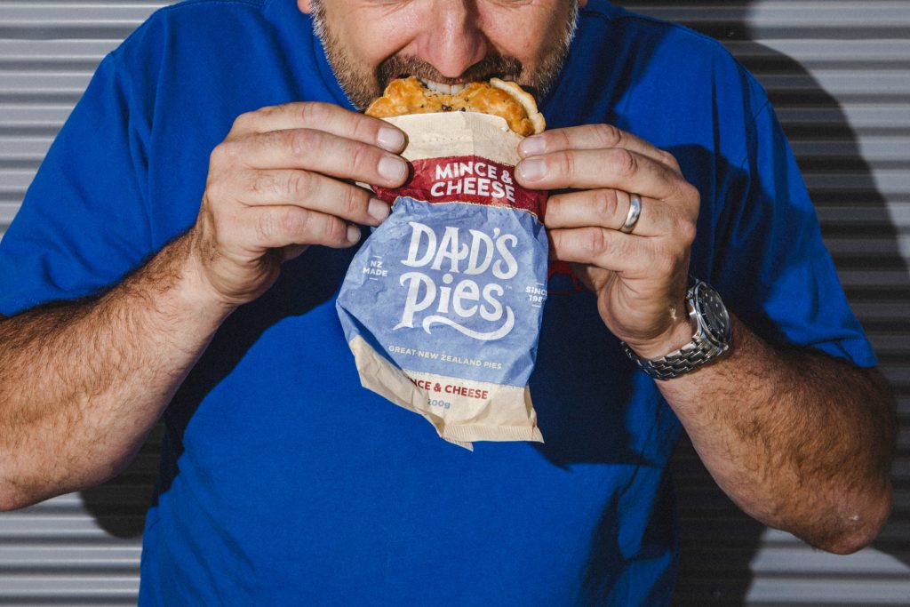
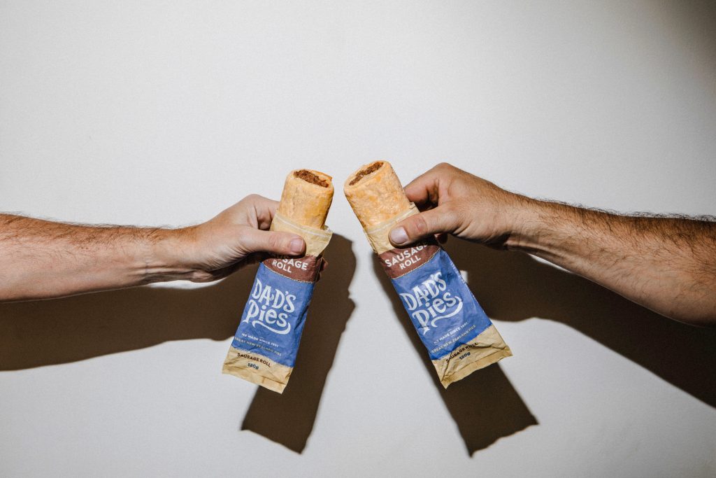
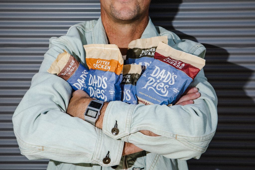
Working with the brand’s marketing team, we identified the opportunity to bring prominence to the core asset – the name and whimsical brand wordmark. In contrast to competitor brands which used various images, messages and assets which cluttered packs, Dad’s Pies needed to go back to 1981 and own the name. We enlarged the logo by stripping away the secondary graphic elements that pigeon-holed the tone of voice. We carefully refined the wordmark’s letterforms, decluttering and tightening up spacing, resulting in a more compact wordmark. Secondary messaging focuses on being a Proud New Zealand brand; the primary blue colour brightened, while flavour callouts were made more prominent – solving the navigation issue in retail store chillers and pie warmers.


The Design Team
Sam Allan
Matt Grantham
Jamie Turnball
https://www.weareonfire.co.nz/
https://www.linkedin.com/company/onfire-design/
https://www.instagram.com/onfiredesign/
https://www.facebook.com/onfiredesign/
The Client Team
Dads Pies
Client details
https://www.facebook.com/dadspies
https://www.instagram.com/dadspies/
https://www.dadspies.co.nz/