Fresh From The Field — My Morning Mantra – By Creative Jam
Fresh from the Field is a weekly article series sharing the fresh and inspiring work of our Design Assembly community.
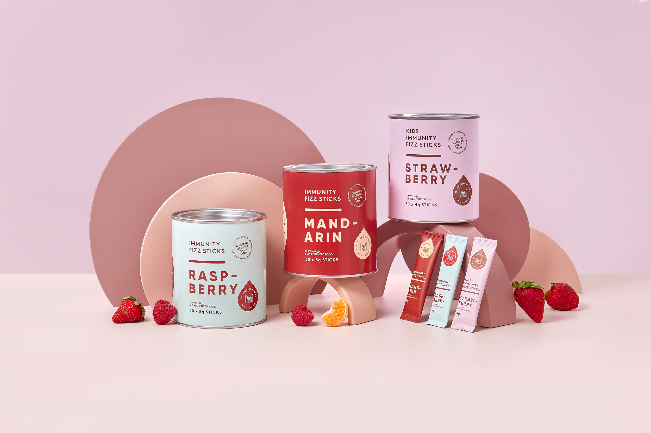
With the use of ‘bright colours and bold design that buck the trend of craft paper and washed out earthy tones typical in the supplements sector’, Creative Jam walk us through their identity and packaging design for My Morning Mantra. The resulting work focuses on a ‘less is more’ approach with a vibrancy that stands out in the e-commerce space.
Want to submit your own work to Fresh From The Field? Fill out the FFTF form here.
The brief
In the competitive category of health and wellness, grounded, calm and ingredient-led brands are the norm. Earthy tones and organic forms clutter the packaging landscape. We saw an opportunity to create a vibrant life-style focused brand, positioned in an energetic space with focus on the benefits of creating healthy habits.
The approach also needed to be easily transferable across a range of different products. With clear and clean lines to ensure the consumer “gets it” in the simplest of ways, nothing crowded or cramped, a touch of brightness for alertness – just as your body should feel when using the products.

The Design Response
Inspired by the traditional potent natural ingredients in the products, the brand mark is a nod to ancient patterns and motifs. Paired with a water droplet which is all you need to add to enjoy the products themselves.
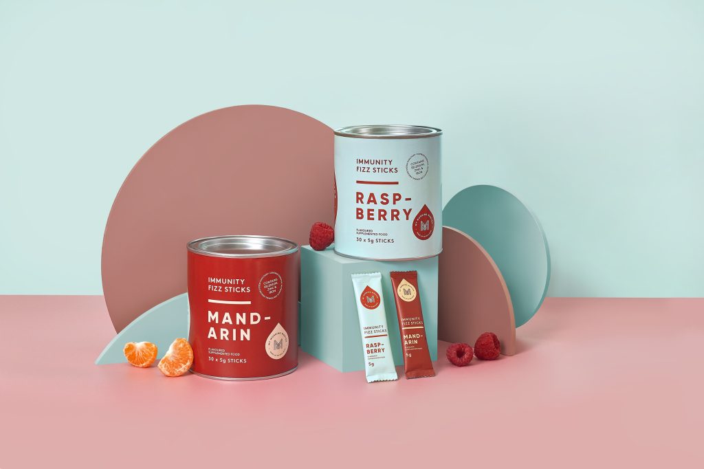
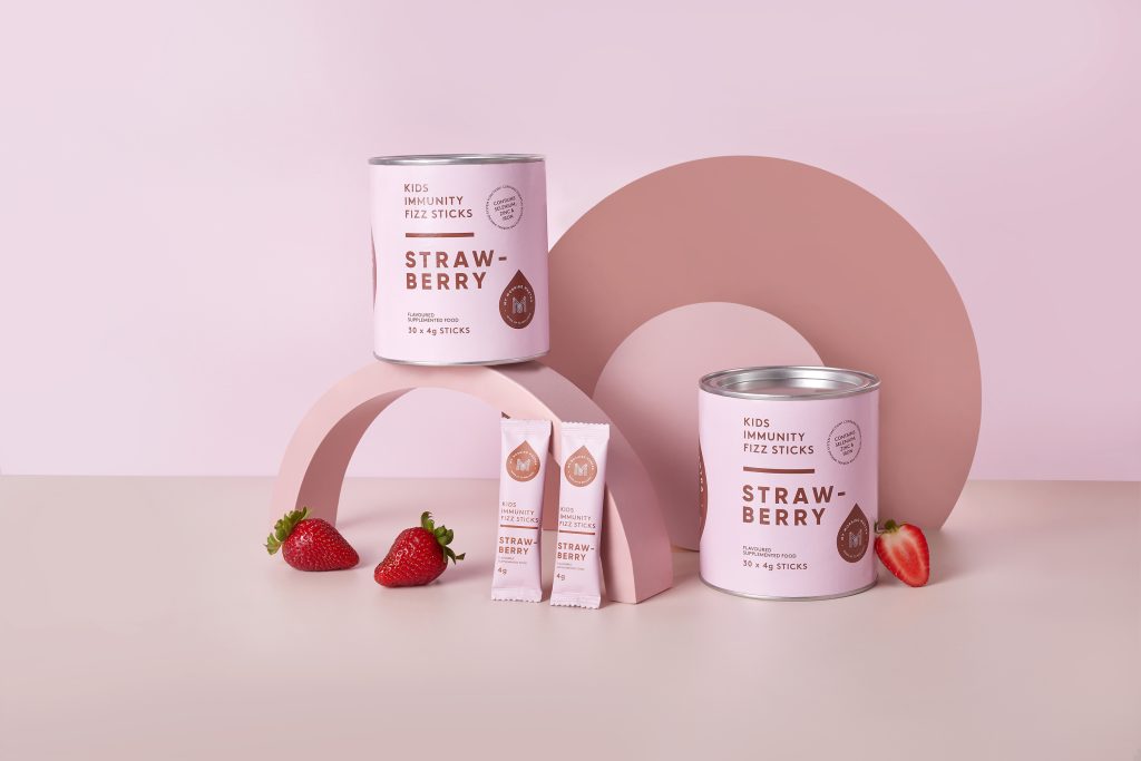
The duo-colour packaging palette allows for multiple combinations and flexibility when creating future ranges. Each range of products contains just a few pantones, we have used the same shade of red across the Mandarin and Raspberry flavoured fizz sticks in different ways. Future product ranges would use this “less is more” style approach and we would use one pantone in a variety of ways across each set of products.

My Morning Mantra is a brand that helps people feel fresh and ready to face the day. Bright colours and bold design not only buck the trend of craft paper and washed out earthy tones so typical in the supplements sector. but are also crucial for standing out in e-commerce and creating the all important “grammable” feature for customers.
My Morning Mantra is everything you want your body and mind to be; vibrant and energised, bright and clear.

The Design Team
Laura Feavearyear – Creative Director
Tanya Kerr – Design Support
Tamara Potts – Design Support
Photography – Sarah Willcox
https://creativejam.co.nz/
@creative_jam_nz
The Client Team
My Morning Mantra
Client details
@mymorningmantraco_
https://www.mymorningmantra.co.nz/


