Fresh from the Field – Tauihi Basketball Aotearoa – EightyOne
Fresh from the Field is a weekly article series sharing the fresh and inspiring work of our Design Assembly community.
Starting from the ground up, EightyOne helped to develop the aspirational name and brand identity for Basketball New Zealand’s equal-pay Women’s National Basketball League.
With the identity’s core narrative centred around the concept of “soar”, the team at EightyOne worked with BBNZ’s kaumatua, Dr Taku Parai (Ngāti Toa) to land on the te reo expression “Tauihi” along with cultural design specialists, SixOneNine, to develop a design which expresses the essence of the international sport while still being rooted in a modern Aotearoa.
Want to submit your own work to Fresh From The Field? Fill out the FFTF form here.
The Brief:
Basketball New Zealand were launching their world-leading, equal-pay Women’s National Basketball League and they needed a name and brand identity that reflected this uplifting, aspirational pathway for female athletes. This also included brand identities for the five franchises that are competing for the league title.
The Design Response:
Starting from the ground up, in partnership with cultural design specialists SixOneNine, we created an uplifting, aspirational, brand identity for the league and its five franchises. One that expressed the essence of basketball, an international sport, rooted in a modern Aotearoa. One that our elite athletes could wear with pride. That would inspire support across the nation. And that girls could identify with and feel they belonged to.
From our research with the leading lights of women’s basketball in Aotearoa – managers, coaches, youth development officers, Olympians, current professionals and up and coming stars in NZ and in the NCAA – We came to our core narrative for the league, centered on the concept of “soar”.
Working with BBNZ’s kaumatua, Dr Taku Parai (Ngāti Toa) we landed on a te reo expression “Tauihi” (to soar, to glide in the air). And rooted the origins of our league in the origins of Aotearoa by linking our narrative back to Kuramarotini, wife of Kupe the navigator who was first to lift her gaze to see the mass of white cloud signalling land and cry out “He ao! He aotea! He Aotearoa!”.

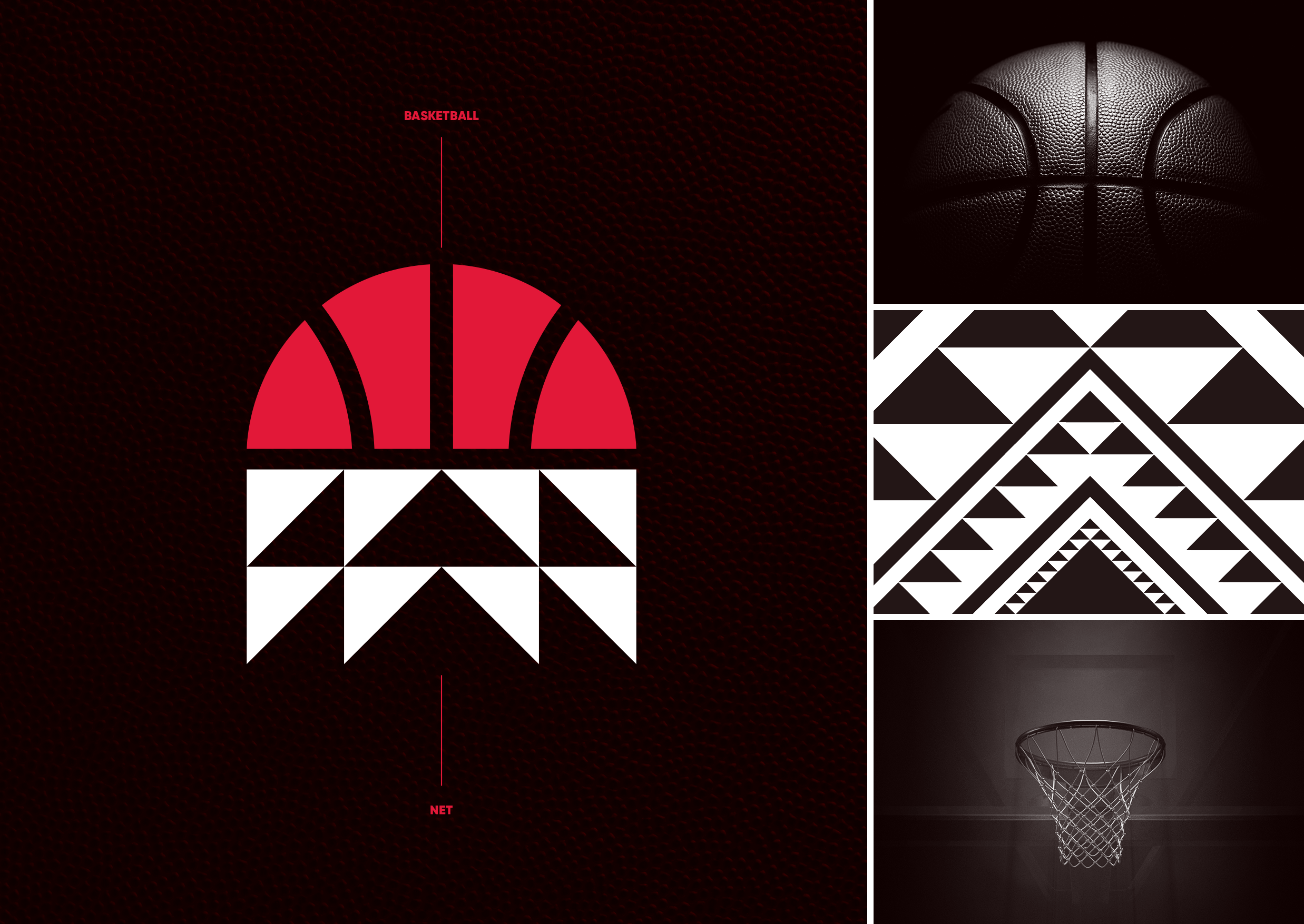
Following on from this, our league logo is a representation of a basketball swishing through the net. The top half shows the ball just before it disappears through the hoop. Below this, the net is made up of a simple taniko/tukutuku triangle pattern – a combination of Niho Taniwha and Aronui designs. These symbolise determination, tenacity, striving for excellence, and the pursuit of knowledge. Look closely and you can see an arrow design within the taniko pattern, which symbolises our name Tauihi…to soar.
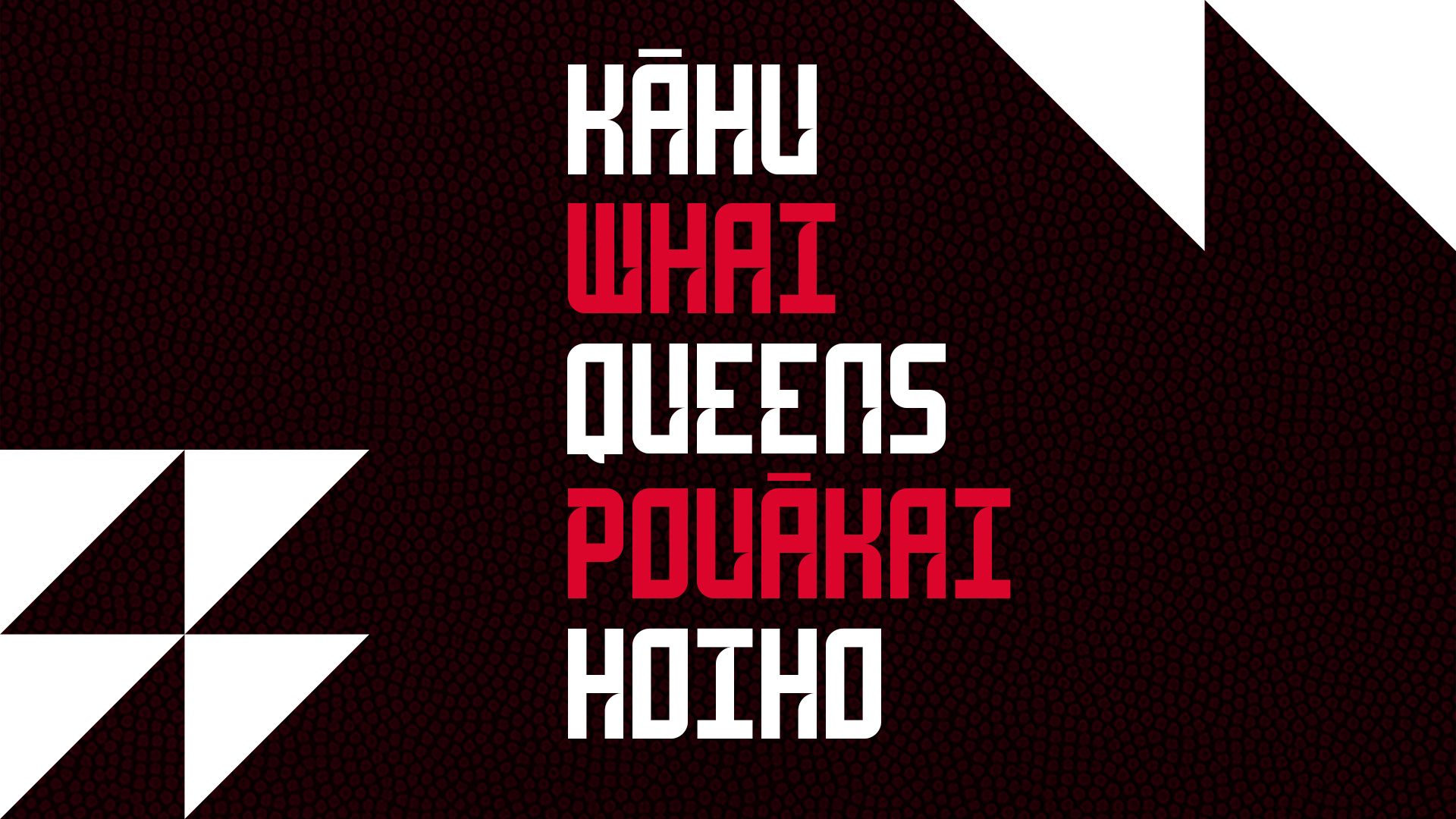
In collaboration with franchise tikanga Māori partners, we developed team names and logos that combined our masterbrand narrative with their own regional identities. This led to all five teams having te reo Māori monikers – a national first for a sporting competition.
The Tauihi brand system includes a taniko based pattern, deconstructed pattern graphic assets, and a bespoke typeface
“We put a lot of trust in EightyOne to create the brand for our pioneering new women’s competition. That trust was repaid, and then some. At all times they understood us, led us, followed us, and delivered for us. The results were well beyond our expectations.” Huw Beynon, General Manager of Leagues, Basketball New Zealand
The Design Team:
Creative Director – Chris Bleackley
Design Directors – Phila Lagaluga, Carlos Constable
Team Members – Julius Fernie, James Henderson, Brendan Sturrock, Megan Compain, Ceilidh Hooper
Client – Basketball New Zealand
https://www.eightyone.co.nz/
https://www.instagram.com/eightyonenz/
https://nz.linkedin.com/company/eightyone
https://www.facebook.com/eightyone8181
The Client Team:
Basketball New Zealand
Collaborators
SixOneNine
Dr Taku Parai
Mel Bennet
Rachel Taulelei
Hemi Sundgren
Jackie Kukutai


