Fresh From The Field: Papaiti Gin — Mountains to Sea – By Holiday Studio
With a rich variety of flavours, this design by Holiday Studio is crafted to reflect the characteristic taste of Papaiti Gin.
Fresh from the Field is a weekly article series sharing fresh and inspiring work from the Design Assembly community. Want to submit your work to Fresh From The Field? Fill out the form here.
The brief
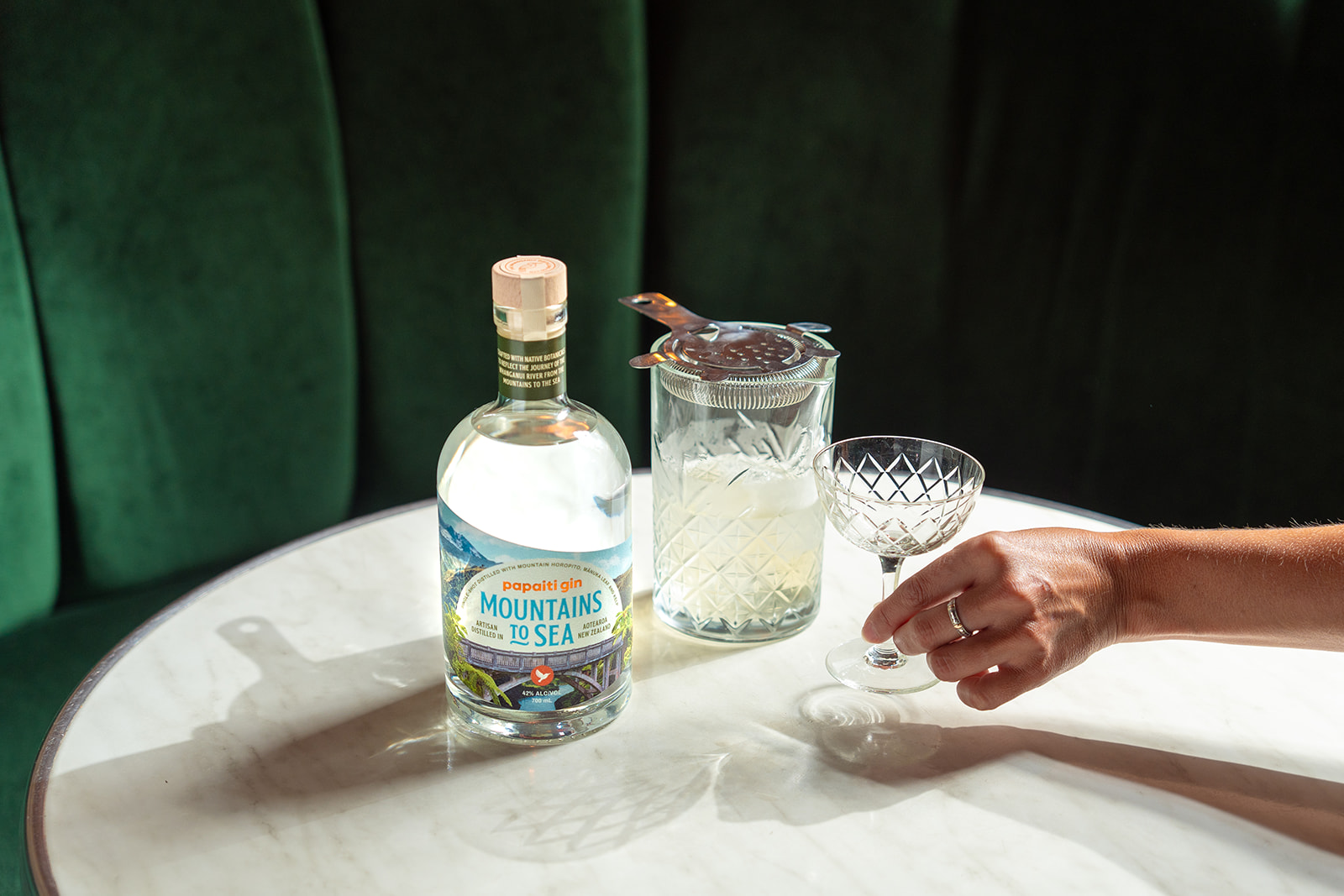
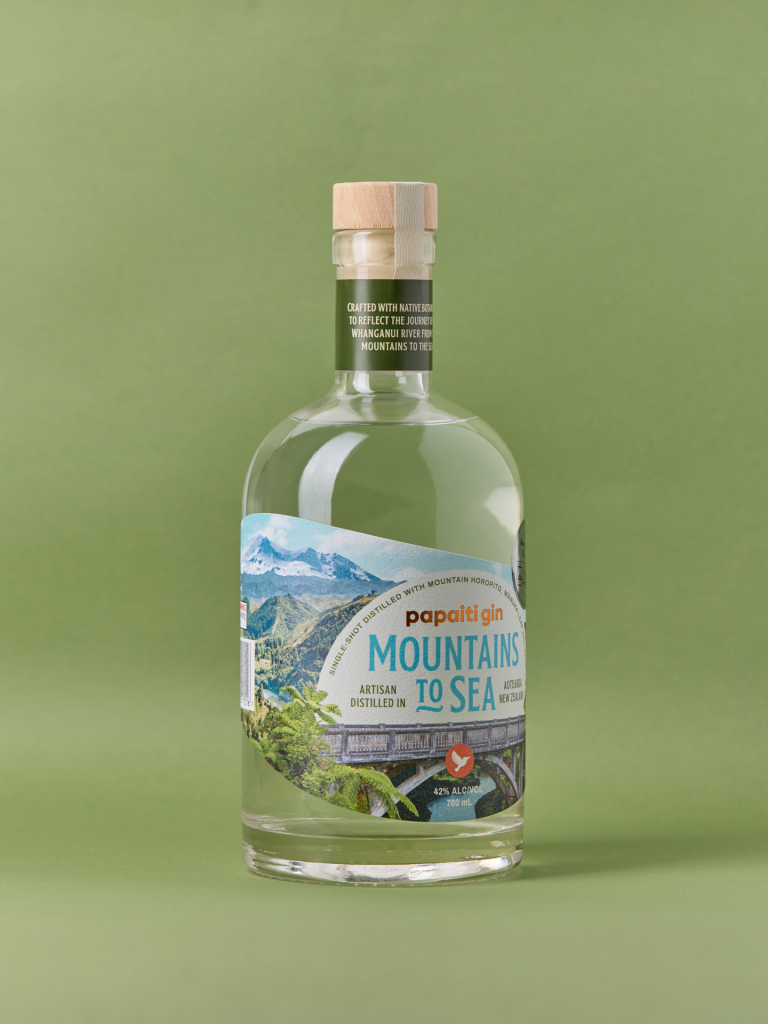
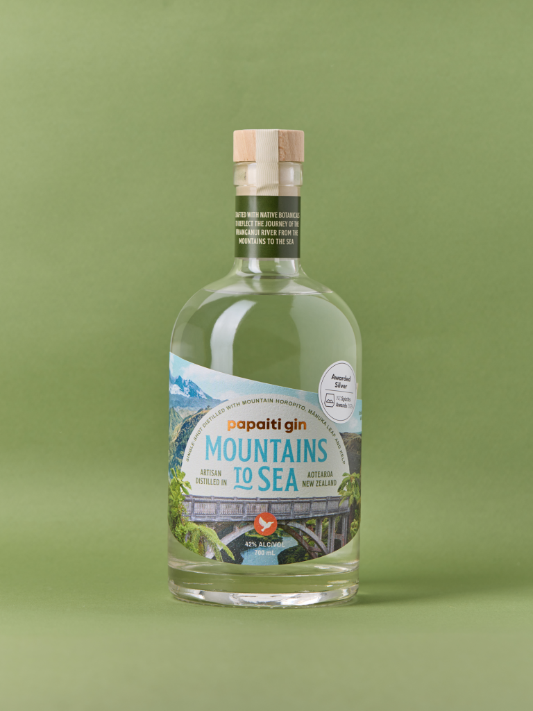
Mountains to Sea is a special release gin for Papaiti Gin, created to celebrate the journey of the Mountains to Sea cycle trail – a personal love of the distillery owners. The brief called for a distinctive packaging concept that could stand apart from the core range, while still feeling considered and cohesive within the broader brand system.
The concept of journey is embedded not only in the story, but also in the botanicals used in the gin — horopito from the forests, mānuka from the riverbanks, and kelp from the sea, capturing the transition from alpine peaks through to the Whanganui River mouth. The packaging needed to reflect this layered narrative visually, while delivering a strong sense of place that would resonate with gin lovers seeking something uniquely Aotearoa.
The design response
The design focuses on bringing the idea of journey to life in a clear and engaging way. A collage-style illustration was developed to map the path from Mt Ruapehu through the Whanganui River and out to the river mouth, combining multiple landscapes into one continuous scene. This creates a sense of movement across the label, encouraging the viewer to visually travel through the environment.
The illustration style leans into vintage New Zealand tourism posters, referencing a familiar visual language of exploration and place. This gives the packaging a strong sense of identity while helping it stand apart on shelf as a special release.
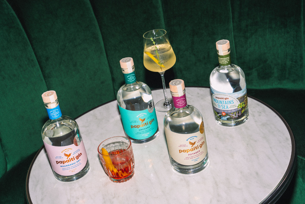
Typography follows a similar lock-up approach to the core Papaiti Gin range, maintaining consistency across the brand. The hierarchy has been adjusted to hero “Mountains to Sea” first, with Papaiti Gin sitting secondary, creating a strategy for future special edition gins to follow.
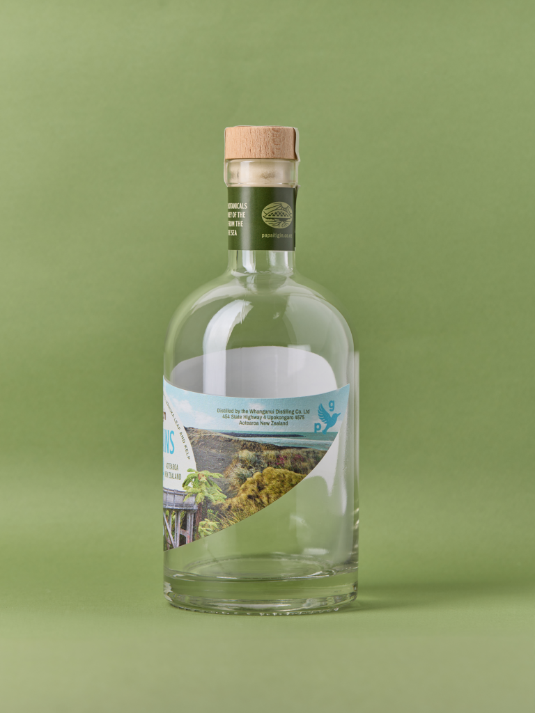
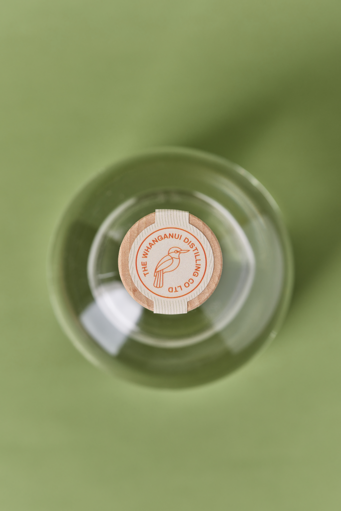
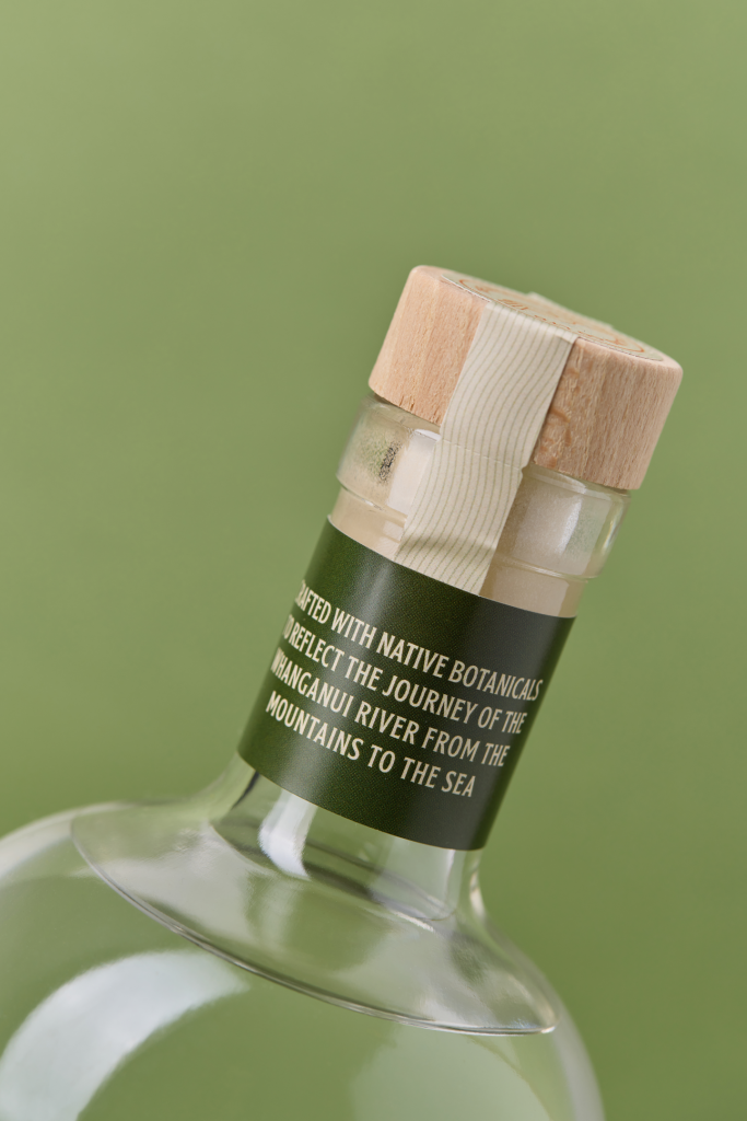
The range is further tied together through the use of the same custom dieline and neck label. These elements were originally designed to reflect the flow of the Whanganui River and the wing of a kingfisher that frequents the distillery, creating a subtle but recognisable connection across all products.
The design team
Manda Clarke
https://www.holidaystudio.co.nz/
https://www.instagram.com/holiday.studio/
https://www.linkedin.com/company/holidaystudio-nz
The client team
Papaiti Gin
https://www.instagram.com/papaiti_gin
https://www.facebook.com/papaitigin
https://papaitigin.co.nz/
Collaborators
Photography Credits
Kate Battersby: https://www.katefrancisbattersby.co.nz/
Ashley Alexander: https://www.instagram.com/alexanders_art_agency/