Fresh From The Field – Epicene by Klim Type Foundry
Epicene is a new Baroque-inspired serif typeface collection from the Klim Type Foundry. Taking around a decade to come into creation, the Epicene Collection is an experiment in modernising Baroque letterforms. It was anything but a linear process – inspired by articles and essays about gender and sexuality in society, Baroque art and type history. But in the end, came Epicene, and Klim proposes all fonts are epicene.
Want to submit your own work to Fresh From The Field? Fill out the FFTF form here.
Taking its name from Susan Sontag’s infamous essay, Notes On “Camp”, to be epicene means to lack gender distinction and to have aspects of both or neither. In applying this notion to a typographic context, Klim is calling out the tendency that codes modern, functional or ‘neutral’ visual forms as ‘masculine’, while equating anything ornate or decorative with ‘feminine’ traits.
Klim’s director, Kris Sowersby, says, “The gendering of ornamentation seems borne of cultural amnesia or myopia: decorative fabrics and accessories are commonly worn by both men and women today, especially by non-Europeans; highly-decorated illuminated manuscripts were made when men dominated artistic production; and during the 18th century, lace, leggings, wigs and high heels were actually worn equally by men and women.”
Sowersby adds, “Describing things as “masculine” or “feminine” in design and typography is historically and culturally loaded. Language is powerful, typography makes language concrete. Language has a shared meaning and heritage. This language is corrupt and bankrupt in today’s society. Gender shouldn’t be used as a metaphor.”
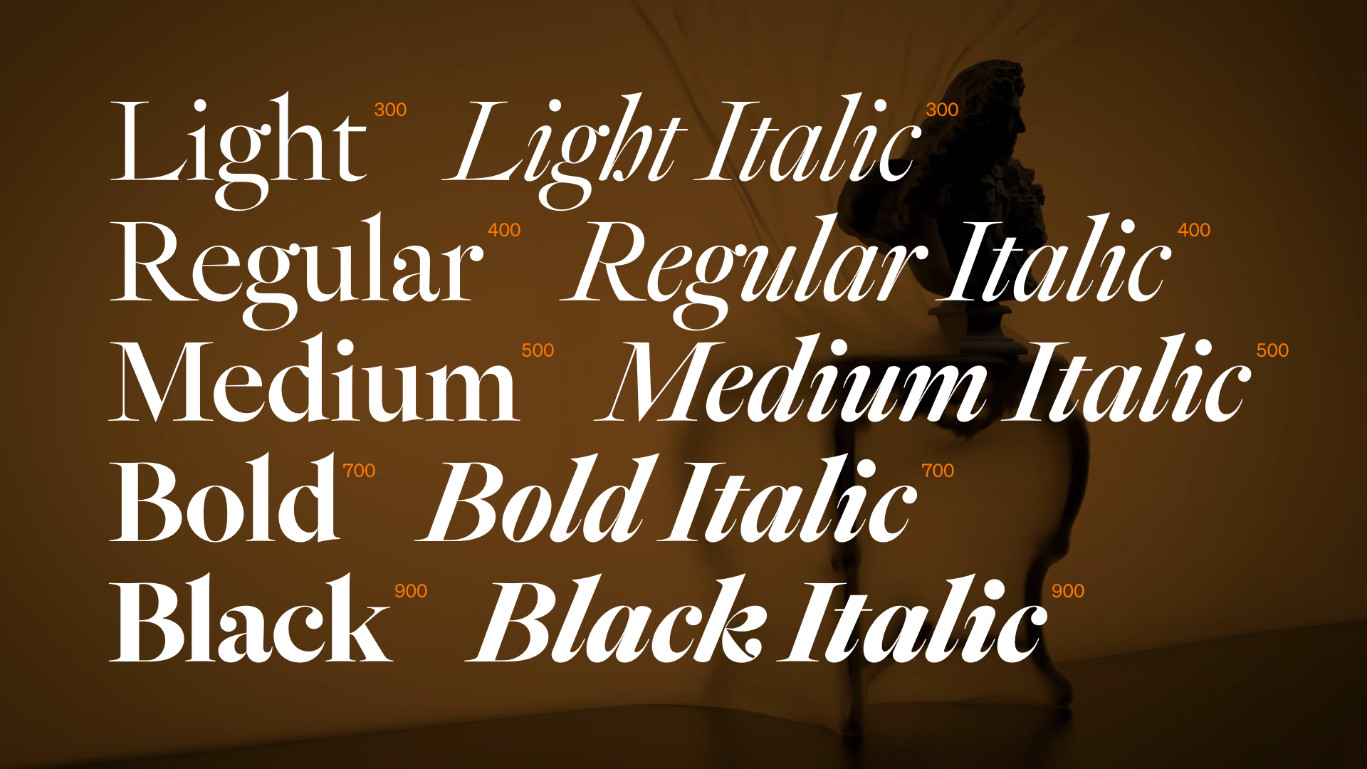
Building out from 18th century European typographic traditions, Epicene is a proposition and its own counter-proposition, a reconciliation of the work of rival typographers Jacques-François Rosart and Johann Michael Fleischmann. It is an expressive and functional type family featuring text and display variants with a generous range of weights.
Epicene Text is inspired by Fleischmann’s types. They are deliberate and focussed, but energised through cheekiness and a sly wink manifested in the small details. Epicene Display, in the spirit of Rosart, is instead given license to perform with a smaller obligation to function. Taut, refined curves terminate in exaggerated, overhanging serifs while fluid italics are suddenly interrupted with bombastic swoops and curls. The echo chamber within Baroque visual culture that celebrates sculpted, flowing and exaggerated forms of expression is reflected in its typographic voice. These letterforms are designed to be seen, as much as they are to be read.
“The entire Epicene Collection project took about a decade. It was anything but a linear process. The formal font design and drawing happened in fits and spurts. Baroque art and type history research was sporadic during this period, as was my reading of articles and essays about gender and sexuality in society. All of this was underpinned by my longstanding, but unarticulated sense that gendering fonts (and other things) is wrong”, says Sowersby.

While attentive to history, Epicene is not a revival typeface. It is an experiment in modernising Baroque letterforms without muzzling their ornamental idiosyncrasy nor falling into the trap of gender codifications. All fonts have no gender. All fonts are indeed epicene.
Epicene’s campaign is a collaboration between Klim, Kelvin Soh (DDMMYY), Simon Oosterdijk and Paul Gerring (Sines and Cymbals).
The Epicene Collection is Klim’s 29th typeface release since the foundry began in 2005. The visual campaign begins on 22 September 2021 [NZST], via Instagram, Twitter, Facebook and Klim’s website (klim.co.nz) with seven videos rolled out in quick succession; six single letter teasers and a long-form finale.
The Epicene campaign is a Baroque-infused nightmare, punctuated by the distortion of its most known signifiers. Inspired by Baroque paintings and sculpture, the dynamic depiction of fabrics is brought to life with movement and materiality. They obscure and reveal the presence of ambiguous human-like figures, letterforms and objects, all staged within a sparse theatrical world.

Additional resources:
- View, test & buy the Epicene Collection
- Read: About Kris Sowersby and Klim’s team and collaborators
- Read: Interviews with Kris Sowersby