Fresh from the Field — Walker Brothers kombucha by makebardo
This Fresh From The Field features bold packaging and identity design for Walker Brothers kombucha by makebardo. If you have new or recent work that you would like to share in Fresh from the Field email Louise for details.
The Brief:
A family culture.
Founded in 2018, Walker Brothers brew traditional and high gravity (alcoholic) kombucha. For them, brewing kombucha is a family affair. They inherited the company’s first SCOBY (the live culture used to make kombucha) from their aunt who would supply bottles of fizzy, homemade kombucha at all Walker family events. It was out of this tradition that Walker Brothers kombucha grew – literally! The culture in Walker Brothers kombucha is the same that their founders have shared over years of family gatherings and they invite you to join the celebration.
The Response:
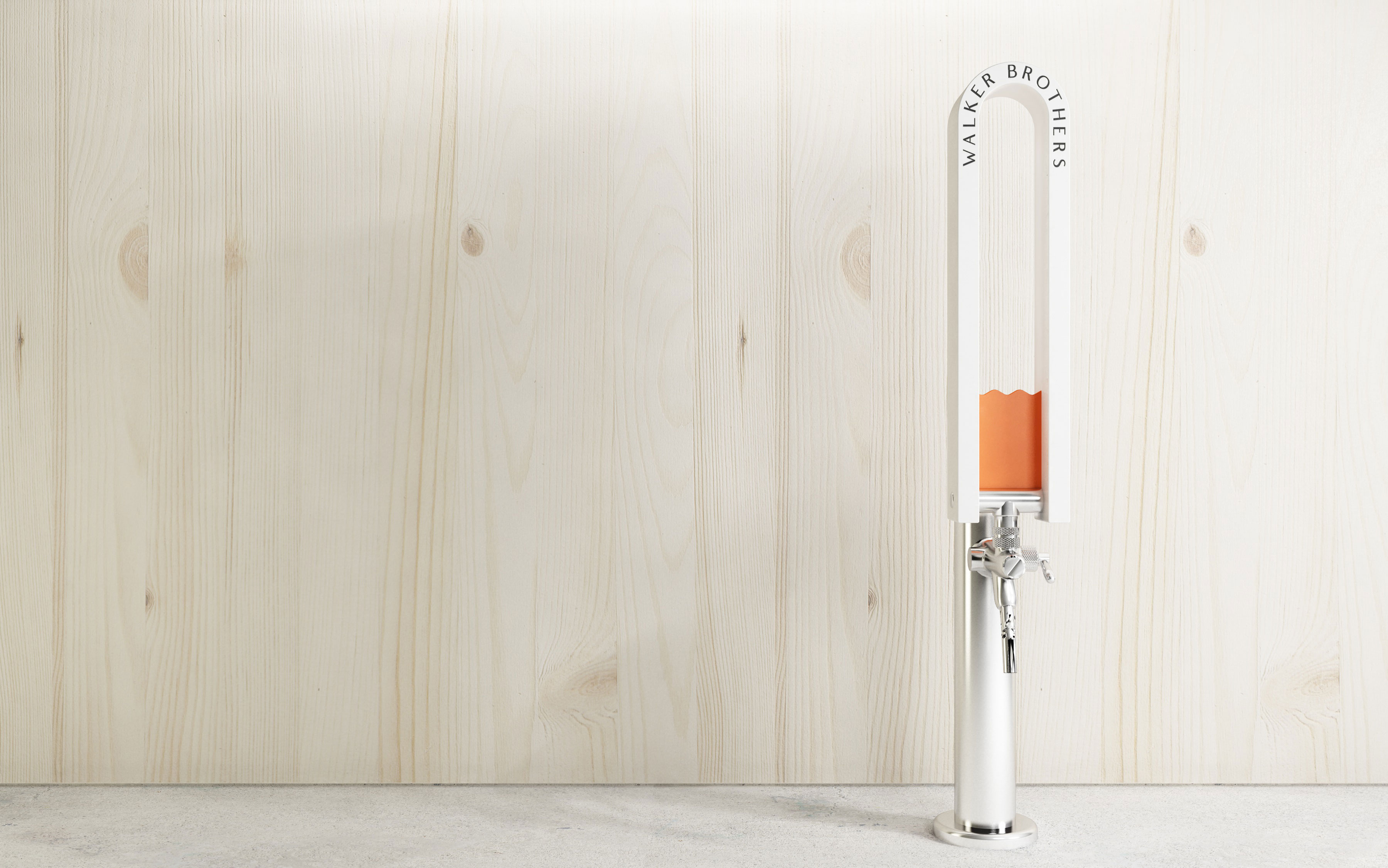
The concept on which makebardo have relied for the creation of the brand was ‘the bridge’, because this symbol captures what Walker Brothers are going for in their core values as a business. For example, they believe that community is an essential part of holistic health. In their experience, the act of having a drink – alcoholic or not – with a friend can create a space (a bridge) for the type of vulnerable engagement that facilitates community.


It is their hope that Walker Brothers kombucha will be enjoyed in this way.
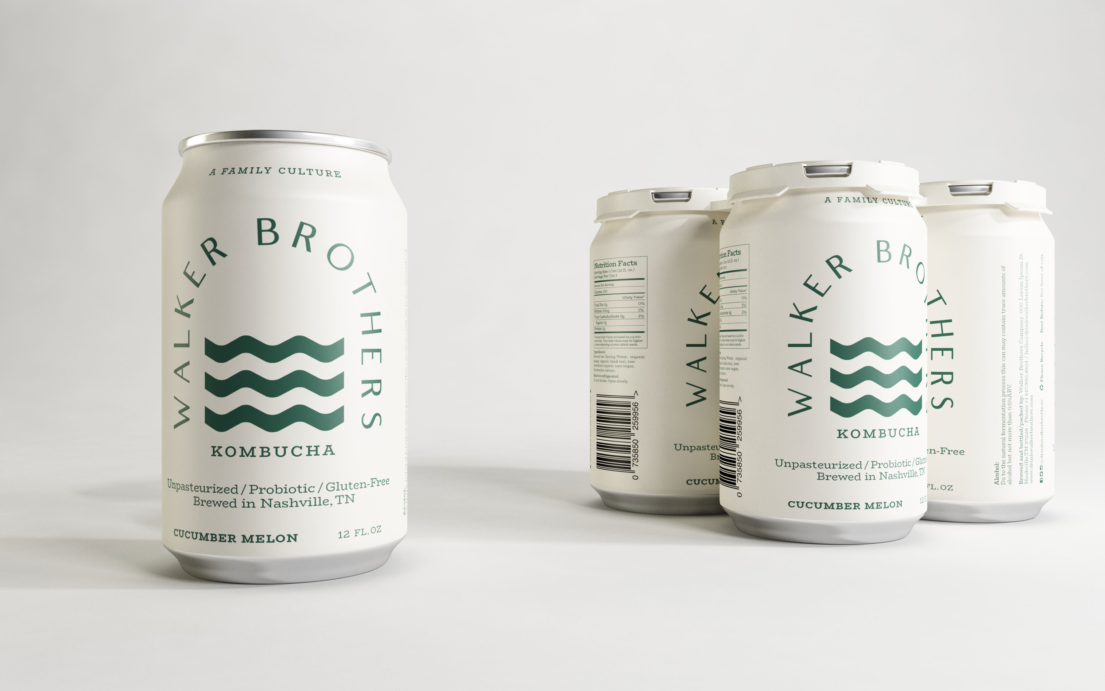
makebardo worked on a thin line between the literal and metaphoric. Instead of doing a pictorial bridge through an illustrative line work, they decided to express the concept of the bridge through the morphology of the wordmark, achieving a more interesting outcome. To close and reinforce the bridge concept, makebardo created waves with movement that are strong and pure, representing a bold stream. At the same time these waves make a perfect contrast with the subtle and elegant typographical choice of the wordmark. Regarding the palette, they opted for colours that have the right balance between freshness and maturity, appealing to multiple audiences.
The result expresses a bold, fresh vision of holistic health.