Fresh from the field — Refreshing L&P, Marx
This week’s Fresh from the Field celebrates L&P‘s rebranding via some stunning photography, brought to you by Marx.
If you’ve got new or recent work that you’d like to share in our weekly Fresh from the Field series email Zoë for details.

With their ‘World Famous in New Zealand’ campaign in the mid 2000’s, L&P cemented itself as a New Zealand icon. Unfortunately, its nostalgia focused comms (featuring very tight stubbies), wasn’t resonating with a youth market of 18-24 year-olds.
We’d already completed a redesign of the range to address the issue. We’d designed a new bottle shape, developed a stippled can and crafted a refreshing label design, with added vibrancy, a new logo, and quirky, surrealist illustrations to deliver L&P’s iconic sense of humour.
Our next challenge was to bring our new branding to life through photography.


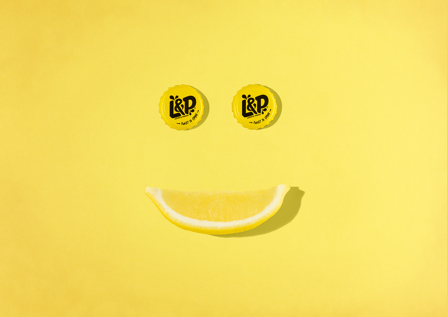
From the success of the new bottles, we knew that we should continue to take a contemporary, eye-catching approach while keeping L&P’s quirky outlook.
Our approach was to bring to life the fun, energy and spontaneity that comes from the Kiwi summer (a time when all Kiwis should reach for an L&P) in a way true to the new L&P positioning.
But, we had to be a bit different, aye.
We wanted to create something that would, like our new brand, make people pause for a second, tilt their heads in a moment of intrigue and smile.
So we drew inspiration from some of the brand’s new elements – focusing on the ‘splash’ forms, the new vibrant colours and the joy that is a New Zealand summer.
We used the splash forms as our backdrop. They are a dynamic element to add vitality and refreshment cues to the brand and are a key motif throughout the packaging.
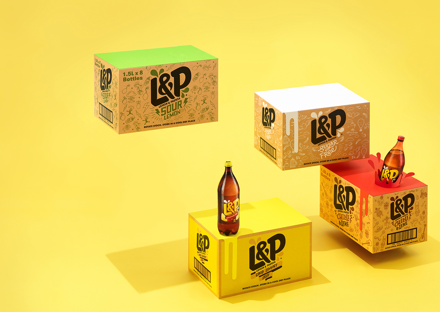


The bright, highly saturated photography techniques were an intentional departure from the 70s-inspired previous campaign. We used colours true to the L&P brand, and added vibrancy by shooting with long, harsh shadows, replicating rays of sun beating down on a hot day.
Each shot was meticulously planned to ensure the product looked immaculately refreshing, but also so that we captured the information required to piece together the vision in post production. Some of the final images are comped from up to ten individual shots.
When approaching the L&P shoot it was important to the new brand that we didn’t take ourselves too seriously – our vision was to bring the new contemporary L&P brand to life in a way that was, well… a bit different, aye.
See more from Ryan and the team at Marx by visiting: www.marxdesign.co.nz
