Plans and Reality in Central City Christchurch: How graphic design works towards, shapes, navigates and imagines a future city
Written by Cameron Ralston
Supported by Creative New Zealand

Cameron Ralston is a contributor to Aotearoa Design Thinking 2017, a series of commissioned critical design essays published by Design Assembly and funded by Creative New Zealand.
This article is the third in a four part series which looks internally at this concept of ‘Design Thinking’ and what on earth that actually means. Is there really a designer-ly way of thinking? And what is relationship between thinking and designing? This series will attempt to clarify where we find ourselves in the current field of design.
Part Two: Who’s Winning? Graphic Design Competitions
Part One: What is Design Thinking?
Between now and the end of 2018 it is expected that Christchurch’s central city will be less blocked off. More roads will be open again, many major development projects will be completed and the centre will begin to look less like a building site and more like a functioning place. The residents of Christchurch have been constantly assured of the city rebuild having an end point ever since the earthquake in 2011, although the timeline of when this will happen keeps being extended.
This piece will look at how graphic design is, and has been, used to display, inform and advertise new developments and plans. And subsequently how graphic design exists in the central city right now with a thought about what role it has in making sense of the new spaces.

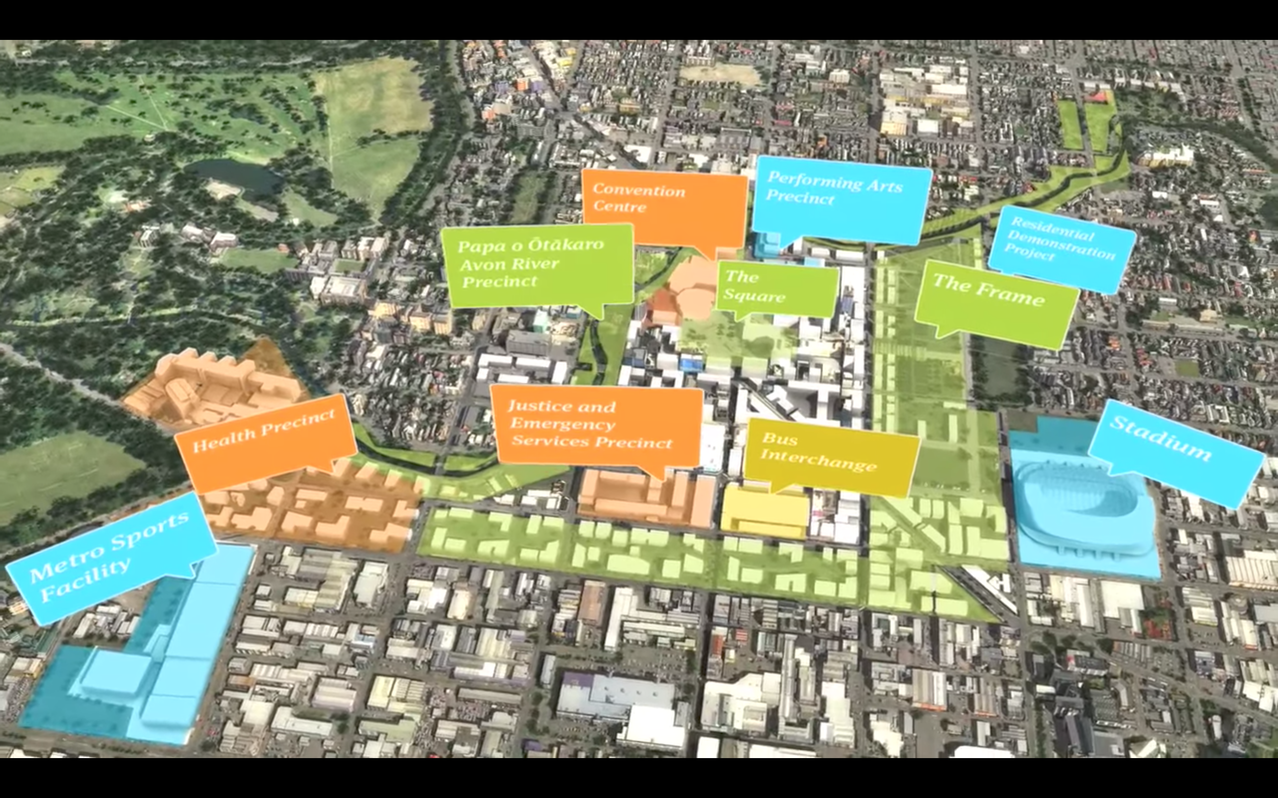
On the 30th of July 2012 the Christchurch Central Recovery Plan (CCRP) was launched. This plan otherwise known as the ‘Blueprint’ was, and still is, a document that has shaped the new pieces of the central city as it is now. The video that accompanied the launch of the Blueprint states:
The blueprint identifies a number of key projects that will catalyse development, provide certainty, clarity and inspire confidence.
The CCRP sets out that this is the way forward. In post-earthquake Christchurch the presentation of future plans has always been a tough thing to do. As in any democracy you simply can’t please everyone. So the challenge presents itself: how do you make design democratic (or at least look that way)?
 The CCRP was preceded by the ‘Share an Idea’ campaign—a Christchurch City Council initiative—which involved the Christchurch community in putting forward their thoughts on what they wanted the new city to become. The responses were large and varied and despite some consensus it is difficult to see how the voices of so many locals could be accommodated in the Blueprint. Strategy Creative produced the graphic design for the Share and Idea campaign, utilising speech bubbles as the central theme. This speech motif was used throughout the campaign to imply a sense of public ownership and voice in the planning processes. This carried on to the Blueprint, the speech motif being adapted into abstract building blocks and as labels for Anchor Projects. As Matthew Galloway wrote:
Here, the message could not be clearer: the voice of the people, as represented by bright icons of free speech, had been listened to and the shape of the new city had been directly informed by this collective voice. In other words, what was implied through this visualisation was a sense of collective power, achieved not only through ownership of process, but ownership of outcomes.
And furthermore
To lessen the burden of having to sell a new city plan to its citizens, the CCC – through the campaign’s ability to imply the idea of consent and freedom – was seemingly employing the people to sell it back to themselves.
 So Share an Idea was a kind of interpersonal mapping that felt fluid and open. But due to the definitive nature of the Blueprint a disconnect was created. As was co-written in A Transitional Imaginary: Space, Network and Memory in Christchurch
There is a tension between the imagination of cities and the imposition of maps as power.[1]
The Blueprint was imposed over the city that had since the earthquakes already been imagined many times over. But this was different coming from the top, this was official. Amongst the temporary, fluctuating, transitional and communal these things would be permanent.
The blueprint mapped out major anchor projects, including a convention centre, a covered stadium and a justice precinct. This represented not only a symbolic loss of the agora but a surrendering of local autonomy and responsibility for the re-envisioning of Christchurch.[2]
This idea of the agora is an interesting one. It is defined by the same authors as:
…a central public space in the city where free persons (men of property) could gather to debate, buy and sell in the market and take part in the athletic, artistic and spiritual life of the city.[3]
The agora in contemporary society is free to all people and infers a kind of civic and open ground. Prior to the Blueprint, and embodied in Share and Idea, was this sense of community driving the way the central spaces they were red-zoned out of would be envisioned. This is where the ‘symbolic loss’ is.
Despite all this we find ourselves six and a half years on from the earthquake and nearly two years since the publishing of A Transitional Imaginary. Its arguable that a lot of what has been completed and is being worked towards in the rebuild of Christchurch this year has been creating networks or linked shared spaces, from which commercial and further civic development will rise around their borders. And furthermore attempting to find a way for people to reengage with the central city, when most small businesses have moved to the suburbs, the number of residents in the central city has lowered and with them the number of licenced venues.
The most current example of where an attempt to rebuild the public agora and connection with the city is the draft process by Regenerate Christchurch for Christchurch’s Cathedral Square. The handout accompanying this reads:
This is just a draft – a conversation starter to help get people talking about what we can do to improve the area, and how we should go about doing it.
We know we aren’t working with a blank canvas. This draft concept is based on what you’ve said through Share an Idea, as well as more recent reports, market research, targeted engagement with property owners and community input.
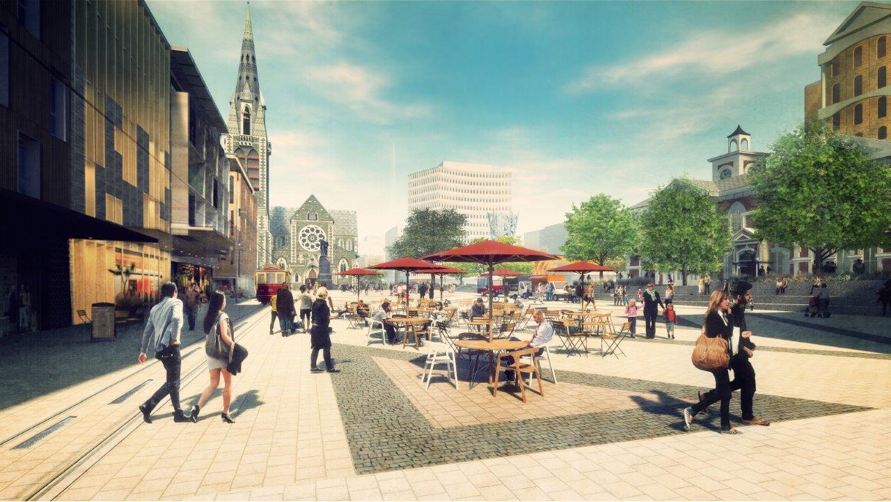
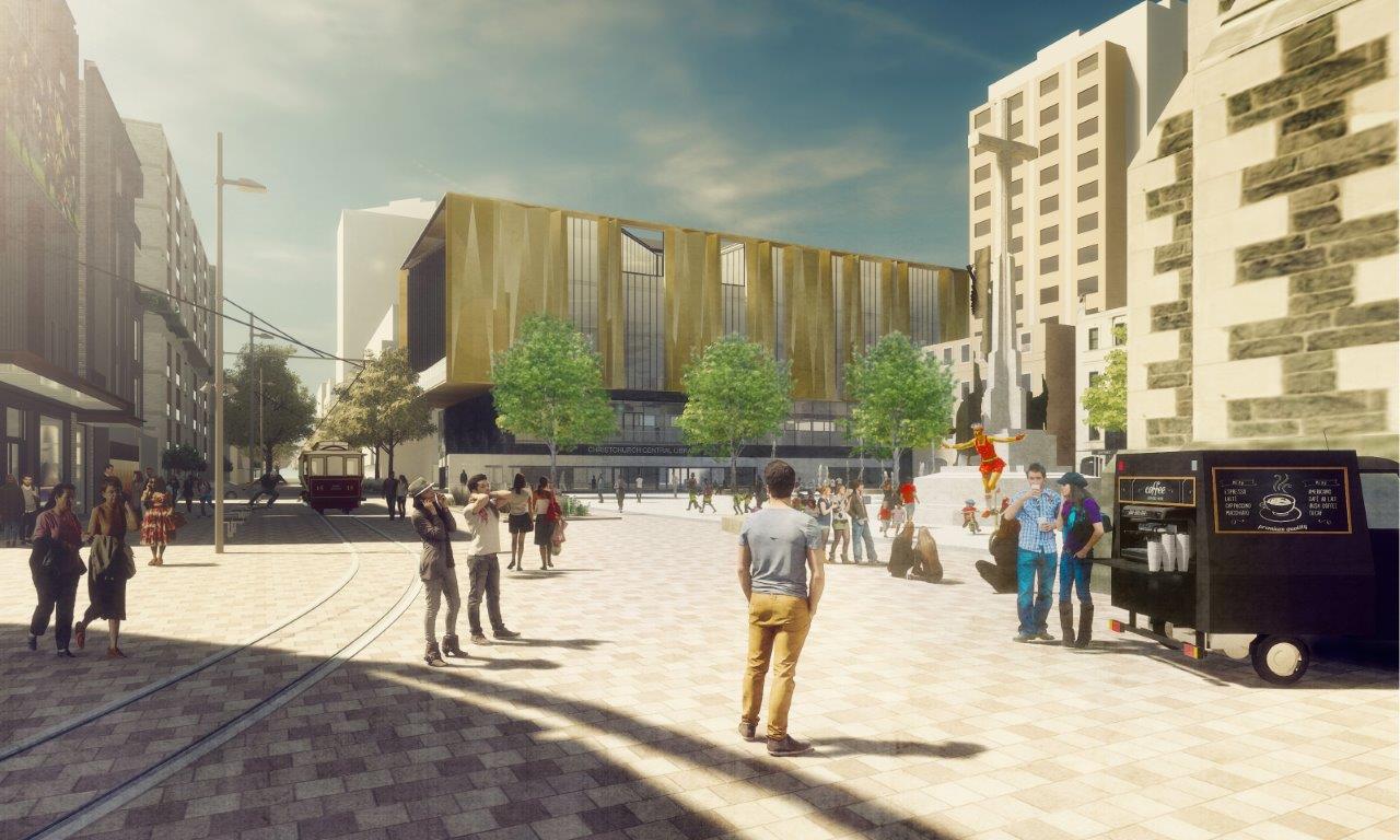
The approach of offering a draft for the public to look over and talk about feels like it will lead to a more successful space. As with just about every other major plan the plan comprises of two major design elements: maps and artist renderings.
 Where the Blueprint map presented blocks dedicating large portions of faceless land the Cathedral Square map zooms in and introduces arrows describing movement of people. Describing this movement has bring the map into the realm of the individual and hence imagination. The map is fairly simplistic but attempts to display how the city can become more complex, a step away from large zones of land. Architecture designer and write Barnaby Bennett wrote on the benefits of splitting the overall planned space into smaller sections:
This move is also convenient in terms of being able to stage the development, so the easy and obvious can start soon and the more expensive, difficult, uncertain, or contentious parts can be worked out and don’t hold up the whole project. This is the kind of sequential and staged thinking missing from so much of the Blueprint process.
This kind of thinking, about how the redeveloping and rebuilding will affect the area is often lost in presented plans. Christchurch has been called a ‘Transitional City’, but we are supposedly living in the post-transitional city (and have been for some time). It would be interesting to see plans developed that take into mind how the city transforms and questions asked such as: How will the place function whist in construction? Will there be some form of temporary installations in the spaces? How will specific examples of events play out in the space, can the space change when needed? A second edition of Share and Idea could be worthwhile to hear from residents about their feelings around the rebuild and how the Blueprint and construction projects have been carried out.
All these things can be displayed and facilitated with graphic design and photographic manipulation. However what we do have, in the maps and below images, are useful tools for discussion and forming public visions. They are easy jumping off points for further development, if the process is successful in attracting community input this space could be every bit as vibrant as the artist renderings suggest it could be.


 Artist renderings are an important part of giving the spaces recognisable futures. These were once drawn images, but are now generated on computer screens. Unlike other impressions, such as for Vanguard Square, the Cathedral Aquare visions come across as more plausible. That’s not to say that any of these public places can’t be bustling urban environments as is envisioned. Events such as FESTA, the Botanic D’Lights event and Christchurch Art Gallery’s late night events all prove that people aren’t shy of coming into the central city when there is things attracting them there. Perhaps therein lies the issue, that they way the central city has been presented to its people has been overly clinical, too boring, not about the street level and interior interactions.
 What we see in renderings is finished, completed spaces which soften at the edges and stretch off to blue horizons. Any construction is hidden. The people that occupy the spaces present idealised occupants. As architecture writer Alice Walker writes:
People need to see people — faces, expressions, clothing, lifestyles that they immediately identify with. They need to see representations of themselves.
In the Cathedral Square renderings there is specific choosing of characters to occupy the landscape, this being a part of the targeted marketing of the square plan. The segmented but interweaved purposes of the spaces can be seen in the images: in the library plaza young adults mingle, drink coffee and talk on mobile phones and the gardens have kids playing around the water while adults watch. There are no cars in this idealised landscape, vehicles are to be removed from the area. Looking at different renderings you’ll also find the same images being reused in different spaces. The image of a couple standing together, the woman leaning in to say something in her partner’s ear seems to be popular.
Artist visualisations aren’t only online and in printed handouts, they have been used throughout the city on the hoardings and fences surrounding their respective construction sites. They are intended to give the location a view beyond the fence. Overlayed and or sitting below their unpolished intended structures, they advertise a future on top of an inaccessible present.
Looking through the crystal ball of these future landscapes we can begin to wonder what kind of graphic identity Christchurch will have. Usually this is closely tied to the architecture, nature and history of the place. But in central Christchurch all these have been disrupted and changed. Could Christchurch find some kind of evolving graphic identity to connect parts of the city and enable new ways of wayfinding?
 To a degree this has already been started. In a place where demolishing and rebuilding is ongoing and rapid, memories associated to specific landmarks are compromised. Furthermore, street maps as navigational tools have become less useful and Google struggles to keep up with closed roads and detours. The city council erected Wayfinding Towers in an attempt to create non-permanent structures that aid in navigating the city. However as towers alongside fenced off sections pointing at distant places they struggle to relate to the context and scale of the city. More than signs, which often require reading of text, over time emotional resonance with symbols and shapes in the cityscape through activity and memory create nodes for locating oneself. Architectural historian and FESTA head Jessica Halliday wrote in June 2011:
Memories so easily gained and so vital to human survival are unerringly, unwittingly ‘pegged’ with emotional associations. What will happen to us who live in Christchurch, individually and collectively, when more of these buildings vanish from our knowledge and experience of the city? If our city no longer matches our memories, will we still identify and comprehend it, will it still mean something to us, will we still find our way in her streets?[4]
Can graphic design provide a link between past and present memories of space? And even, working with architecture, create symbols and images for new memories?
Graphic images and type in a landscape can become waypoints when placed at privileged positions in the landscape. For example the Vodafone InnoV8 building on Tuam St is visible throughout the surrounding area compliments its giant glowing logos. This is a smaller scale example of things like Hollywood’s sign, Portland’s white stag sign and even the Trump tower in Chicago.
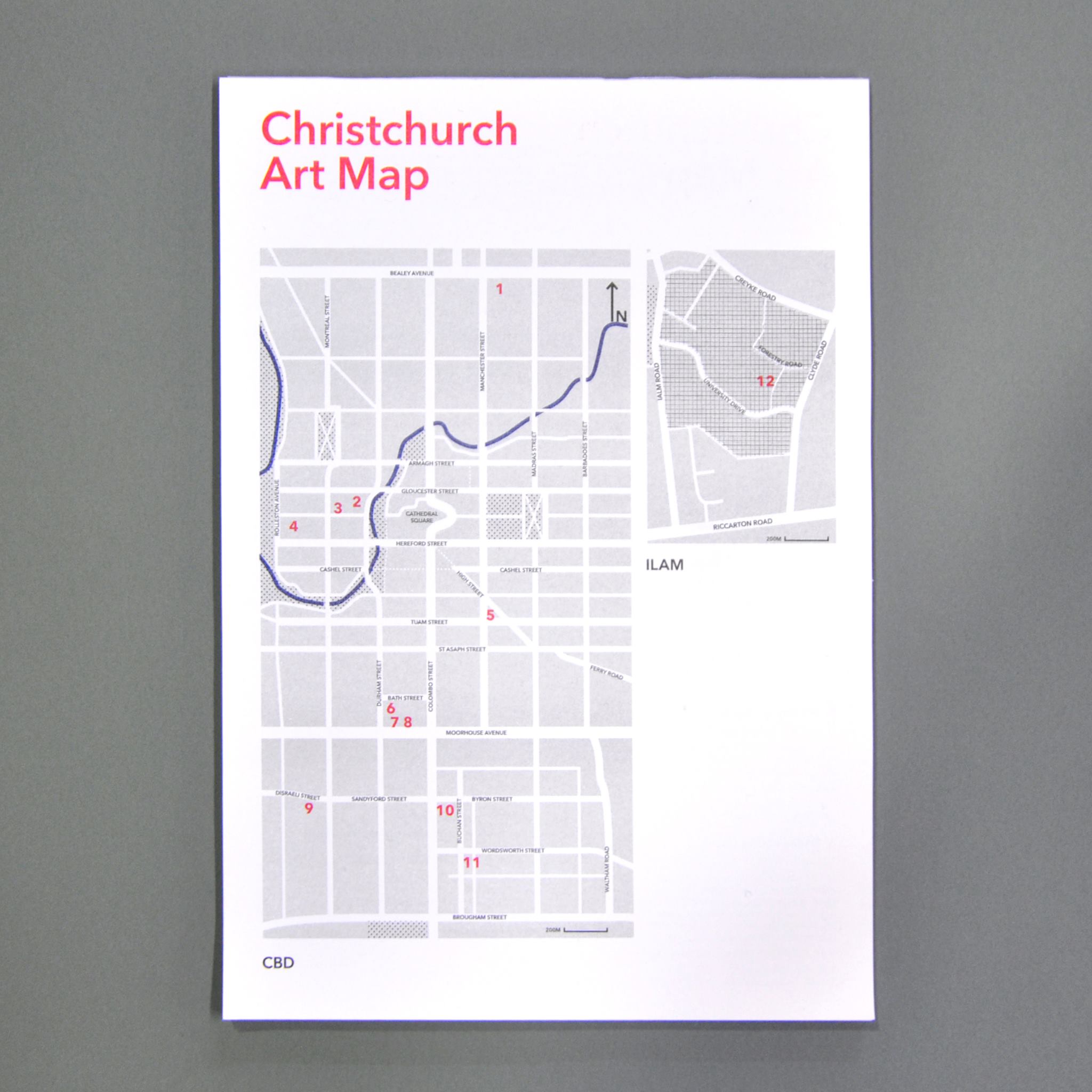
Community or business generated maps can fulfil a similar function. Examples of this include Neat Places, which filters specific spaces using the common pin symbol or websites such as Trivago or Airbnb similarly filter the city. Recently a combined effort by local galleries to promote culture in the city has lead to the Christchurch Art Map obtainable at most galleries. These walking maps also present different ways of finding paths through the city. The SCAPE public art walkways offer a view of the city through its public sculptures and murals and even more recently Ōtākaro Limited’s new central city walking map encourages interaction with new builds. All of these look down on the city and humanise it through human level locations.
 With all this in mind what is the city actually like at the moment and what graphic design exists in the urban environment? Graphic design in central cities usually comes in informative, commercial and cultural forms. But as a developing city there are major differences and flow on effects of having areas unoccupied for over five years.
In the current Christchurch central city there is a curious case of being in the midst of a slow unveiling. Post earthquake graffiti and murals (both public commissions or otherwise) are beginning to be enveloped by new developments while laneways are being opened and banners attempt to elicit a sense of belonging through the local red and black. Māori motifs sit proudly in the new spaces and poetry embedded into concrete or through hydrophobic technology eek in some human history. There are traditional spaces of graphic design as well, in the bollards, street signage, trash bins and building names.
Perhaps it is easiest told through images. On the 5th of August this year I joined in a ‘CBD Rediscovery Walking Tour’ hosted by Ōtākaro Ltd. The following images were taken with an eye on graphic design developments.
It’s nearly impossible as a resident to imagine the future of Christchurch. We can gather some information through what is given to us considering how the city is right now however it’ll take time for the design and the people to create visual connections. Graphic design does have a part to play in the layering of civic culture in the central city, but for the moment there is slight disconnect between the planned visuals and the reality. I look forward with anticipation for when the two finally meet.
[1] A Transitional Imaginary: Space, Network and Memory in Christchurch, Susan Balland, Tracey Benson, Robert Carter, Tim Corballis, Zita Joyce, Helen Moore, Julian Priest, Vicki Smith, Aotearoa Digital Arts, Christchurch, New Zealand, 2015, p.23
[2] Ibid p.28
[3] Ibid, p.25
[4] In The Silver Bulletin #2, June 2011, Christchurch, New Zealand


