Fresh from the Field — ClickClack By Dow Design
In this week’s Fresh from the Field we profile a new project by Dow Design for ClickClack.
If you’ve got new or recent work that you’d like to share in our weekly Fresh from the Field series email Zoë for details.
The Brief:
To look at the ClickClack identity. The client suspected that they didn’t have a great-looking brand, and they were right! We were asked to look at the whole brand, both on shelf and off.
Studio Response:
When we looked at ClickClack in its world of kitchen storage we discovered what a confusing world it was. Ironic for something that is supposed to help you get more organised! There were so many different products to choose from and they all had similar names like Klip it, Flip-Tite, or TrueSeal, which made them all blur together into one muddling mass.
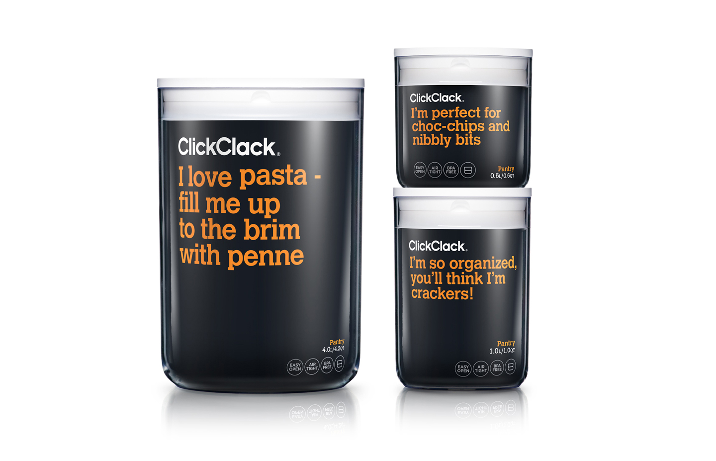
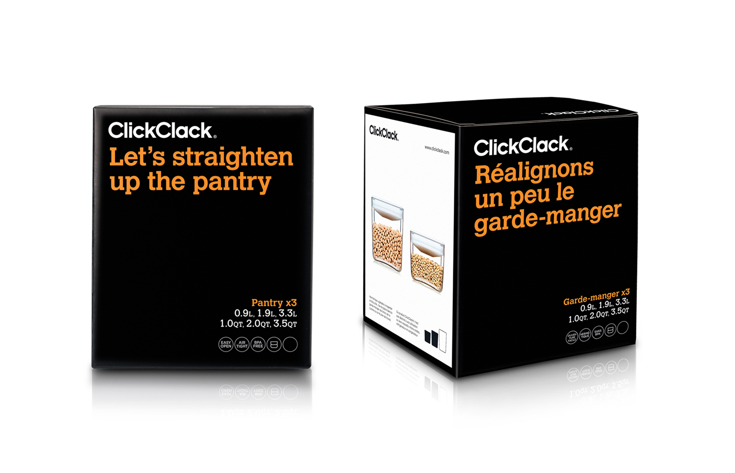
We saw an opportunity for Click Clack to be truly helpful. And Tada! Click Clack Your Food Friend was born. A brand that talks to you, and helps you make sense of all those container options. What for what? What will fit my 900g bag of flour? Can I cook with this one?
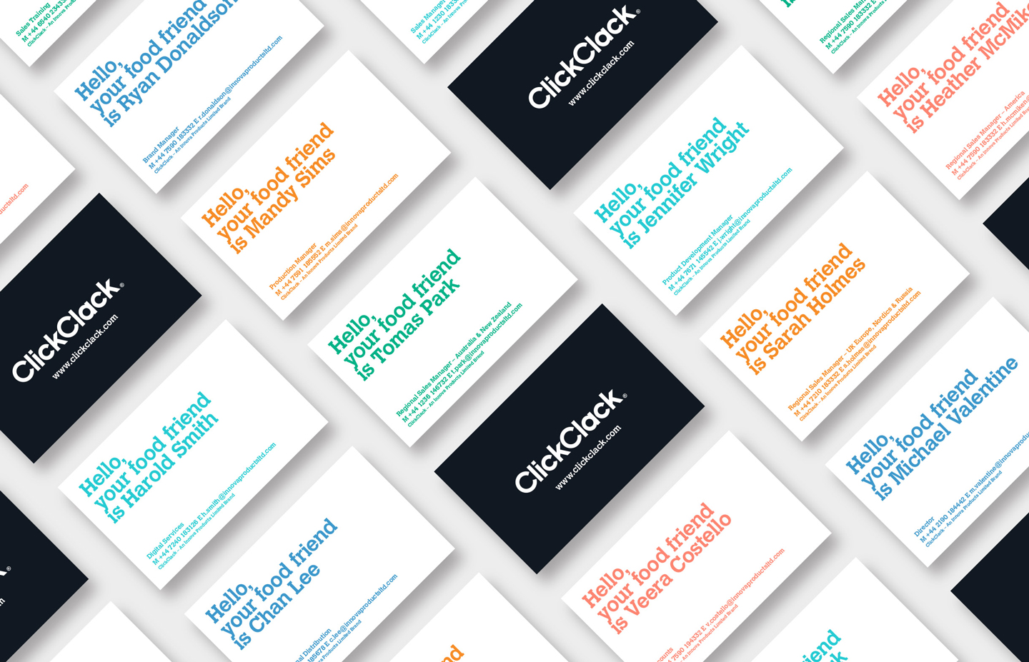
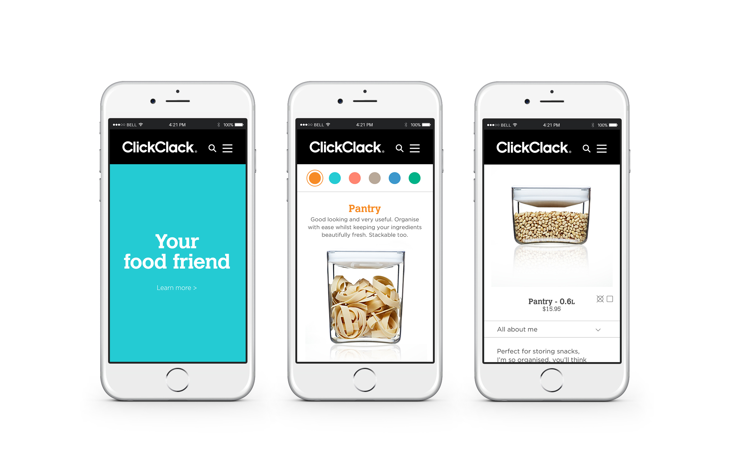
We used typography to have conversations with the shopper, and we simplified their product ranges. We have also designed a new website for them as well as in-store videos and trade shows.The client has now gained significant large-scale distribution and retail ranging in many international regions which had previously not accepted them, so there’s the proof of the power of great design!
Design Team:
Donna McCort
Leonie Whyte
Jeannie Burnside
Jamie Pettigrew
Ben Dean
Carl Dixon
Donna McCort
Leonie Whyte
Jeannie Burnside
Jamie Pettigrew
Ben Dean
Carl Dixon