Fresh From The Field — Moksha – By Tomorrow
Fresh from the Field is a weekly article series sharing the fresh and inspiring work of our Design Assembly community.
Overloading all of the senses, from sight and smell to taste and touch, Tomorrow take us behind their brand identity work for Moksha.
Want to submit your own work to Fresh From The Field? Fill out the FFTF form here.
The brief
Moksha is a new spirits company inspired by one of the founder’s personal experiences and connection with India. Crafted here in Aotearoa, it’s the spirit for free spirits. Fiercely flavourful, Moksha prowls the palate by challenging the conventions of what traditional spirits should taste like.
In Hindi Moksha means you’ve found liberation, transcendence and true freedom. Escaping the normalcy of everyday life is the freedom Moksha strives to achieve with its brand and products.
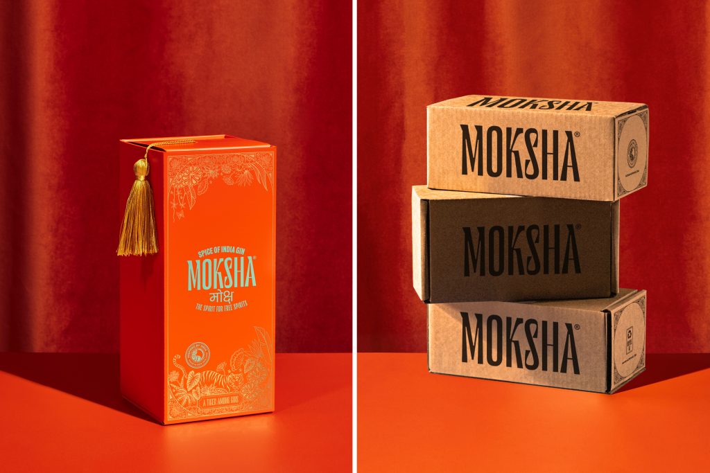
Our task was to develop the brand’s identity, packaging, imagery and e-commerce website to launch their first product, the Spice of India Gin. A cardamom-forward, aromatic gin where classic botanicals collide with contemporary bite.


The Design Response
In a highly competitive and saturated category, we wanted to create a brand that would overload all of the senses, from sight and smell to taste and touch, just like India does. A brand that would embody the vibrancy of this wonderful country and take consumers on a journey from their everyday to create stand out on-shelf and online.
A vibrant colour palette and eastern inspired typography laid the brand’s foundations. A product story based in the Indian jungles was written, then visualised through illustration by Victoria Garcia. Ornate detailing completed the flexible brand system, providing visual and textural interest, especially when executed via foiling and embossing on the product and packaging.
Online, we strove to bring Moksha’s personality and story to life in an immersive and differentiated fashion. Especially the brand’s meaningful connection to India and the intricate nuances of the gin’s botanical flavours. This was achieved by combining the bold brand system, with characterful copy, vibrant imagery and interactive behaviours.


The Design Team
Charlotte Sowman, Design Director
Ben Crawford, Strategy Director
Nick Vaudrey, Lead Developer
Marc Warwick, Developer
https://www.instagram.com/tomorrow.brand.studio
https://www.linkedin.com/company/tomorrow-brand-studio
The Client Team
Moksha
Client details
https://www.instagram.com/mokshadrinks/
https://mokshadrinks.com/
Collaborators
Illustration: Victoria Garcia
Photography: Simeon Patience, The Collective Force
Photography Styling: Sam van Kan
Packaging Partners: Porter Packaging
Labels: MCC Labels


