Fresh From The Field — Berg – By Marx Design
Fresh from the Field is a weekly article series sharing the fresh and inspiring work of our Design Assembly community.
Marx Design take us deep into their strategic thinking and design response behind the brand identity work for Berg, a water-based alcoholic seltzer.
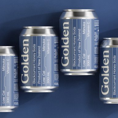
Building off of the idea that there is more to this drink than meets the eye, Marx’s design – which ended up winning first place at the 2022 Dieline Awards in the ‘Beers, Ciders and Malts’ category – includes the above/below divide of a floating iceberg with a textured hard edge illustration style, that stands out from a distance and gives the pack a tactile feel when up close.
Want to submit your own work to Fresh From The Field? Fill out the FFTF form here.
The Brief:
Lion approached us to develop the brand identity for a water-based alcoholic seltzer created using a unique method leaving it free from artificial colours, preservatives and the need to add common liquors to the mix. Made exclusively with sparkling water, alcohol, and a light dash of fruit flavour for sweetness, with minimal carbs and calories, this drink was the perfect refreshing option for summer.
An iceberg, or ‘Berg’, was an apt metaphor for a water-based alcoholic drink that was simple on the surface, yet made using a complex process that delivered a refreshing clean taste.
As a new drink in an overly saturated market ‘Berg’ needed to bring its glacial purity up front, stand up mountain tall against competitors, and communicate the depths of its uniqueness all at a glance.
Like it’s icy floating namesake, there was more to ‘Berg’ than met the eye.


The Design Response:
We built on this iconic idea because of its clear association with Berg’s product proposition, and to make an easy system for brand asset creation; flowing across tone of voice, packaging, photography and illustration.
Firstly we turned ‘Berg’ into the ‘refreshingly deep’ character of the party, someone that’s not ‘waiting’ for you, they are just ‘chilling’. Someone that’s ‘not to be underestimated, just ask the titanic’. This balance between candid charm and intriguing obviousness set up a path for the rest of the brand touch points.
The idea that there is more to this range than other seltzers on the market led to the introduction of the above/below divide of a floating iceberg, used as an iconic metaphor for hidden depths. This included a literal interpretation of ‘hard water’ (ice) on pack, with the brand blue creating a horizon line, and the variant colour added to the iceberg tip to inject a gentle flavour cue.


With deep thinking drinkers in mind, Berg’s packaging needed to portray a high level of visual interest to communicate its point of difference and project a strong shelf presence. We developed a textured hard edge illustration style, that stood out from a distance but also gave the pack a tactile feel when up close. A strategic choice that gave the brand an easy to reproduce visual language that became an essential part of its social media arsenal.
To bring the hidden depths metaphor to life in Berg’s occasion photography, we relied on props, locations and clothing colours. It became more of a challenge to execute the idea when it came to product photography, as we sought to prevent visual tiredness in the social media feed. Our breakthrough came with the realisation that our ‘blue divide’ could be associated with nautical flags, which set us free to create appealing photographic compositions with minimal repetition.
The end result was a sophisticated brand and beverage for discerning drinkers yearning for a refined alternative to the standard seltzer offerings, and has since been rewarded with first place at the 2022 Dieline Awards in the ‘Beers, Ciders and Malts’ category.
The Design Team:
Ryan Marx, Manuel Payán, Drew Robertson, Sam Bulkeley.
https://marxdesign.co.nz/
https://www.instagram.com/marxdesign.co.nz
https://www.facebook.com/marxdesignnz/