Fresh From The Field: Salash Delicatessen — By Onfire Design
Calling all foodies… our Friends at Onfire Design serve up their design process for Salash Delicatessen.
Fresh from the Field is a weekly article series sharing fresh and inspiring work from the Design Assembly community. Want to submit your work to Fresh From The Field? Fill out the form here.
The Brief
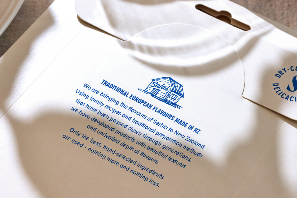
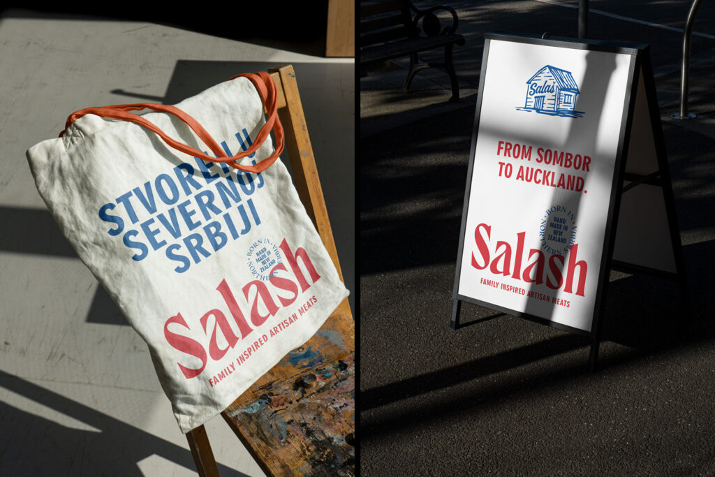
Salash Delicatessen is a small, family-run smallgoods business based in Kumeu and a regular at food markets throughout the Auckland region. Salash’s point of difference is its family history and geographic origins. Hailing from Northern Serbia, the family has been refining how they make and produce dry-cured meats for four generations. This imbues their dry-cured meats with unique flavours, styles, and textures.
Since immigrating to Aotearoa New Zealand in 2009, the brand has built a very loyal following. A new business strategy aimed to get the brand into nationwide supermarkets. Discussions with supermarket brands highlighted the need to invest in their existing brand and packaging, enabling the brand to stand out in chiller aisles and speak to a premium price point and discerning ‘foodie’ consumer.
The Design Response
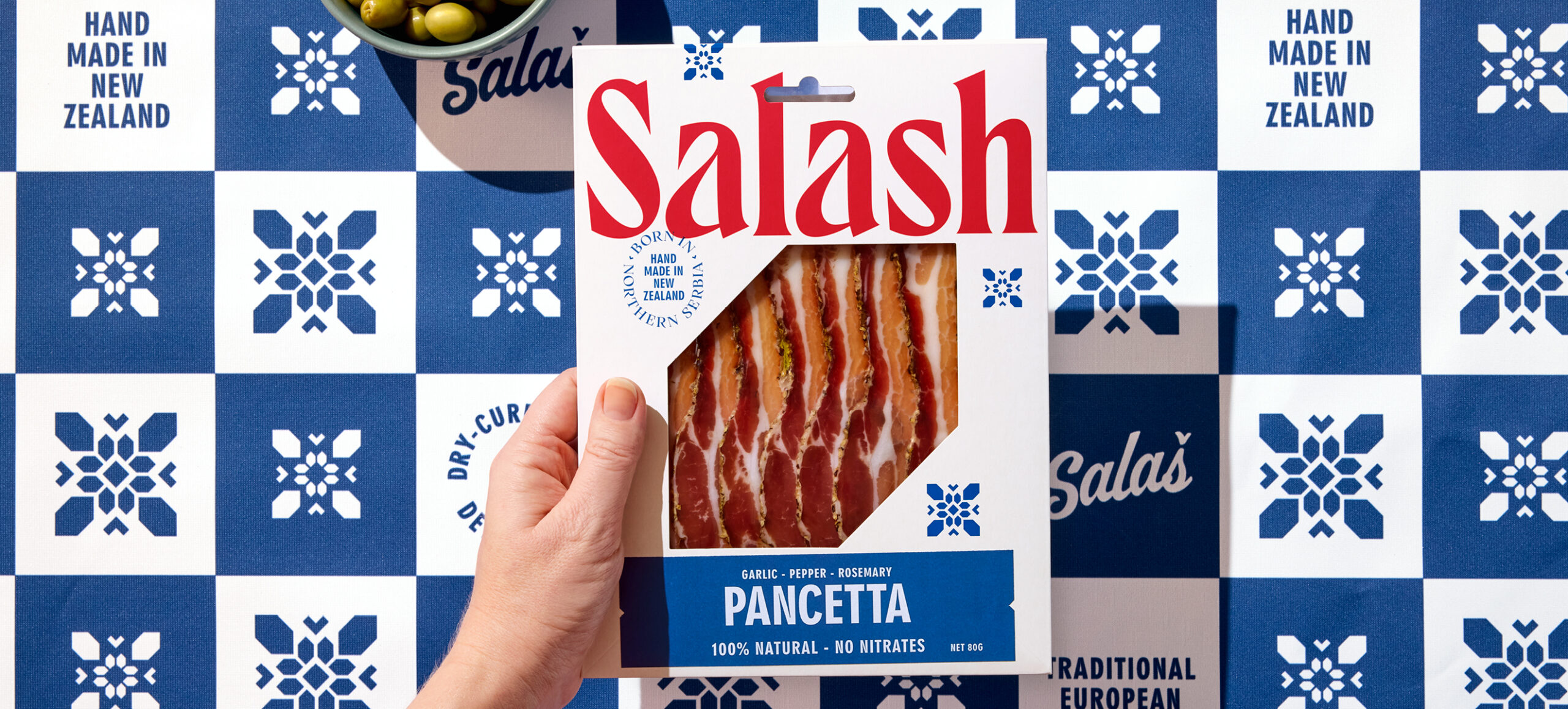
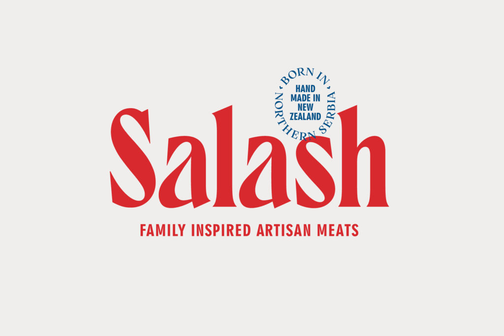
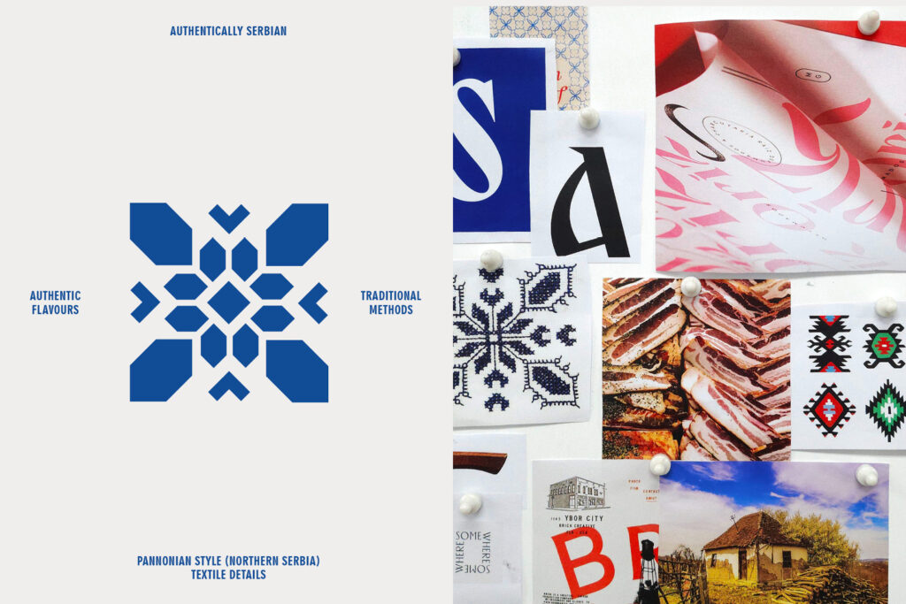
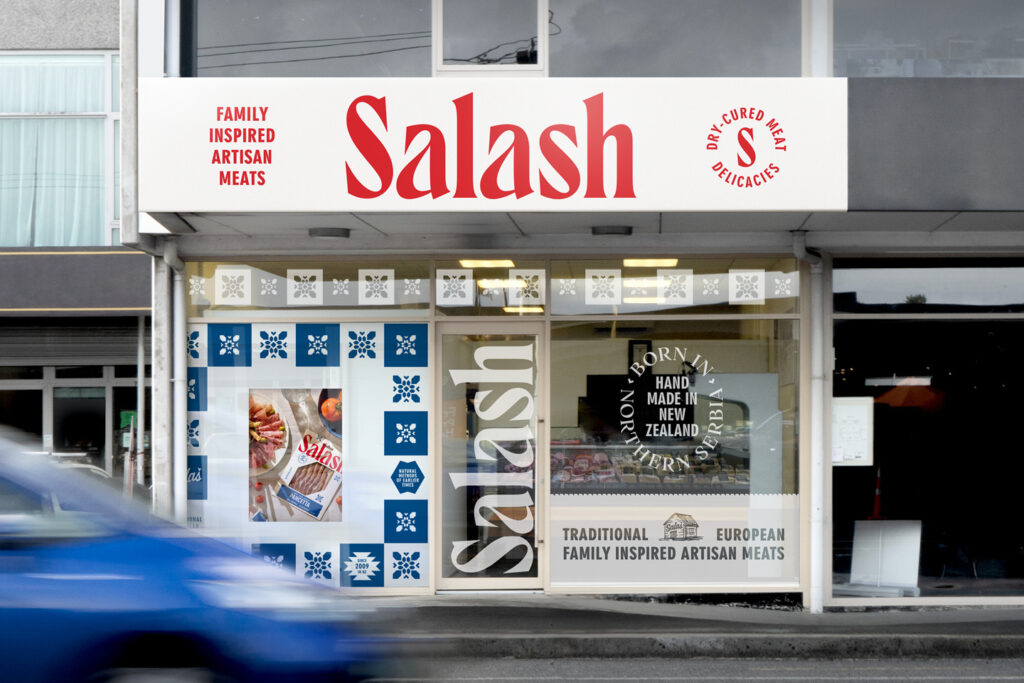
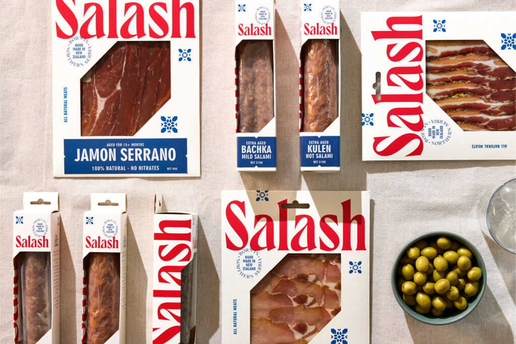
The design process explored visual styles and patterns from the Eastern European region. Taking historical cues and reinterpreting them for the modern foodie consumer. The bespoke wordmark draws inspiration from the Cyrillic alphabet, with sharp serifs that speak to butchery, knives and hooks that are used to hang meat cuts up during drying. Secondary brand elements, icons and patterns are modernised and simplified interpretations of historical regional costumes and textiles. The Serbian national flag directly inspires the colour palette. The simple blue, white, and red starkly contrast with the earthy tones used by competitor brands.
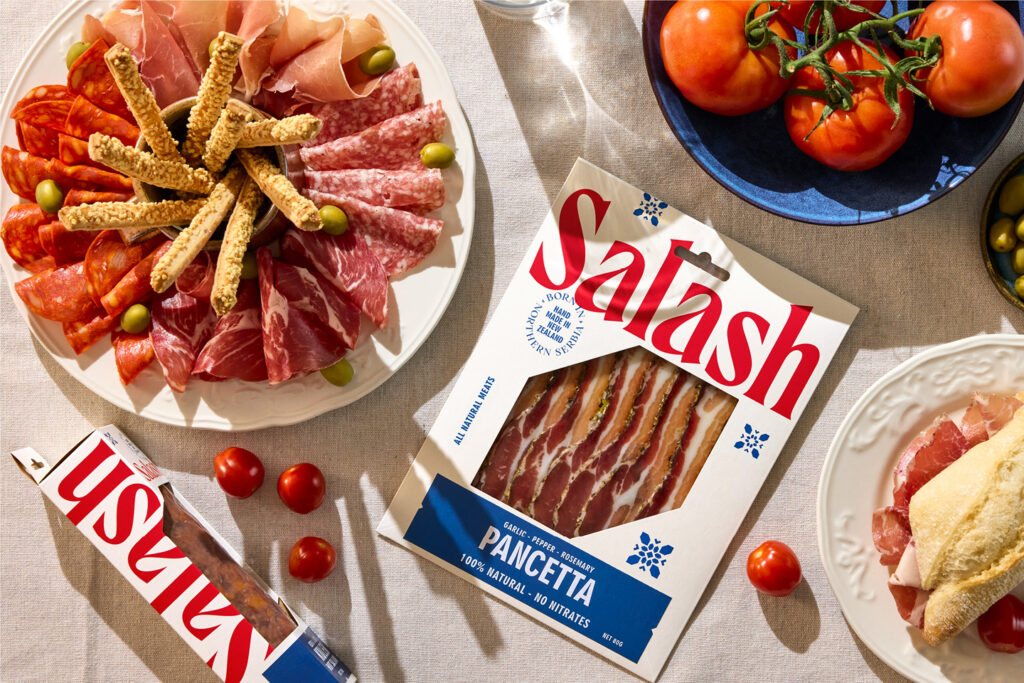
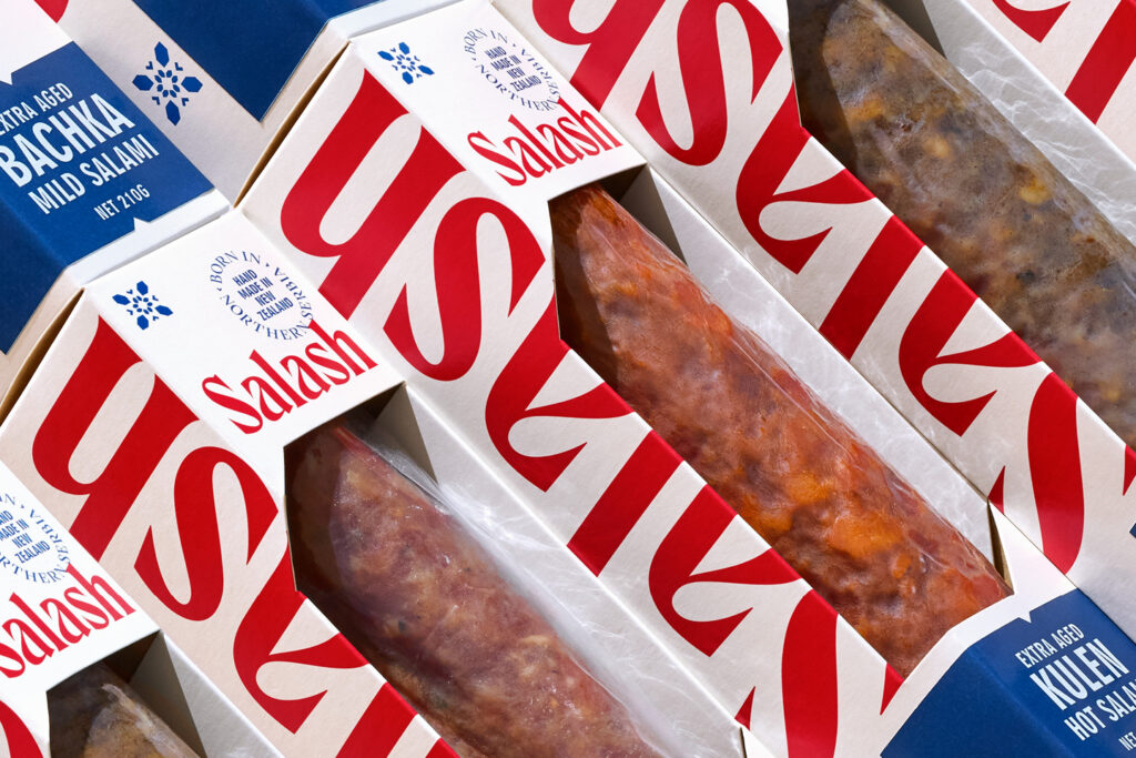
Simple, oversized pack formats were created to cater to various sizes, shapes, and formats of meat to minimise the amount of packaging the small business needs to produce and store. Printed with generic information, a simple stickering system using bold and utilitarian typography is hand-applied at the packing stage.
Early success saw the brand listed in Farro food market stores and positioning in nationwide retailers.
The Design Team
Creative Director: Matt Grantham
Art Director: Natasha Alimova
Designer: Natasha Alimova
Typographer: Natasha Alimova
Finished Artist: Natasha Alimova
https://www.weareonfire.co.nz/
Facebook: Onfire Design
Instagram: @onfiredesign
Fresh from the Field is a weekly article series sharing fresh and inspiring work from the Design Assembly community. Want to submit your work to Fresh From The Field? Fill out the form here.