
Fresh From The Field — Social Sector Commissioning Visual Identity – By Gusto Design
Fresh from the Field is a weekly article series sharing the fresh and inspiring work of our Aotearoa Design Assembly community.
Showcasing the strength that comes with community, Gusto Design take us behind their recent brand identity work for MSD.
Want to submit your own work to Fresh From The Field? Fill out the FFTF form here.
The brief
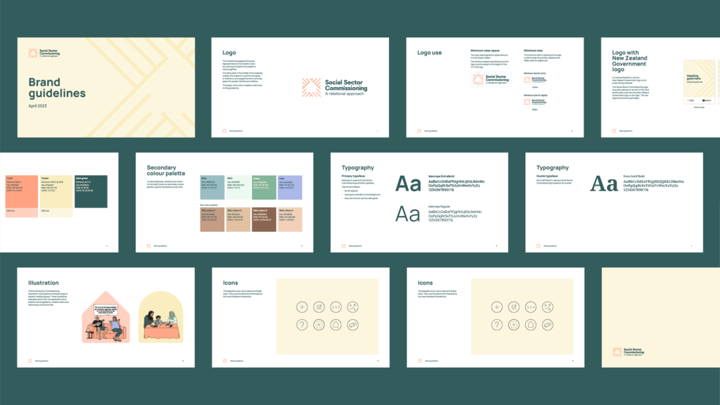
MSD needed the right tools to tell their story on Social Sector Commissioning. Work is under way across government agencies to improve the commissioning of social services in New Zealand. Their aim is to transform the way social supports and services are commissioned; to ensure they best support people, families and whānau to live the lives they value. We designed a new visual identity for them, including a revamped logo and illustration style. We then applied the fresh look and feel to a range of engaging and informative collateral, including the 2022–2028 Social Sector Commissioning Action Plan and summary.


The Design Response
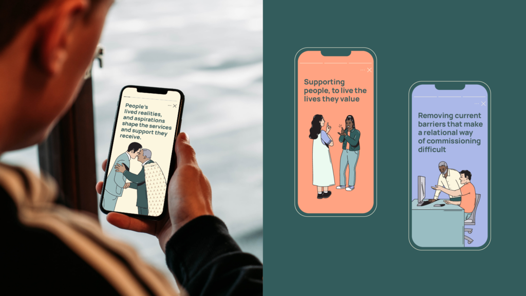
The Social Sector Commissioning Action Plan centres around the Government’s commitment to a new relational approach. This includes fostering strong partnerships, supporting community-led initiatives and client/whānau-centred design to improve wellbeing across New Zealand communities. To successfully deliver and communicate MSD’s important messages, our design had to be inclusive, accessible and engaging for three key audiences: the social sector, government agencies and decision makers who play a key role in the commissioning process.
It was crucial that the logo and new visual language that Gusto developed showcased the strength that comes with community. The logo design was influenced by wharenui/meeting house or community space, and the weaving of a whāriki/woven mat. The whāriki symbolises the joining of individual threads to form a strong foundation on which communities can share knowledge and support – a solid base for people to come together. In the middle of the weaving, a silhouette creates the shape of a wharenui, symbolising a supportive and nurturing environment for people, families, and whānau.
To ensure the overall outputs are clear and accessible to a broad audience, we joined forces with our regular ‘partners in clarity’, plain language consultants Write, and also collaborated with professional translation services. This allowed us to remove any barriers of understanding, and ensured these resources could be easily shared and understood in both Te Reo Māori and English.


The Design Team
Gusto Design
https://gustodesign.co.nz/
https://www.linkedin.com/company/gusto-design
https://www.instagram.com/gusto_design_nz
The Client Team
Ministry of Social Development
Client details
Collaborators
https://write.co.nz/


