Fresh From The Field — Hubbards Granola – By Onfire Design
Fresh from the Field is a weekly article series sharing the fresh and inspiring work of our Aotearoa Design Assembly community.
Onfire Design share their design process and how they reinvigorated the product range personality for Hubbards Granola.
Want to submit your own work to Fresh From The Field? Fill out the FFTF form here.
The brief
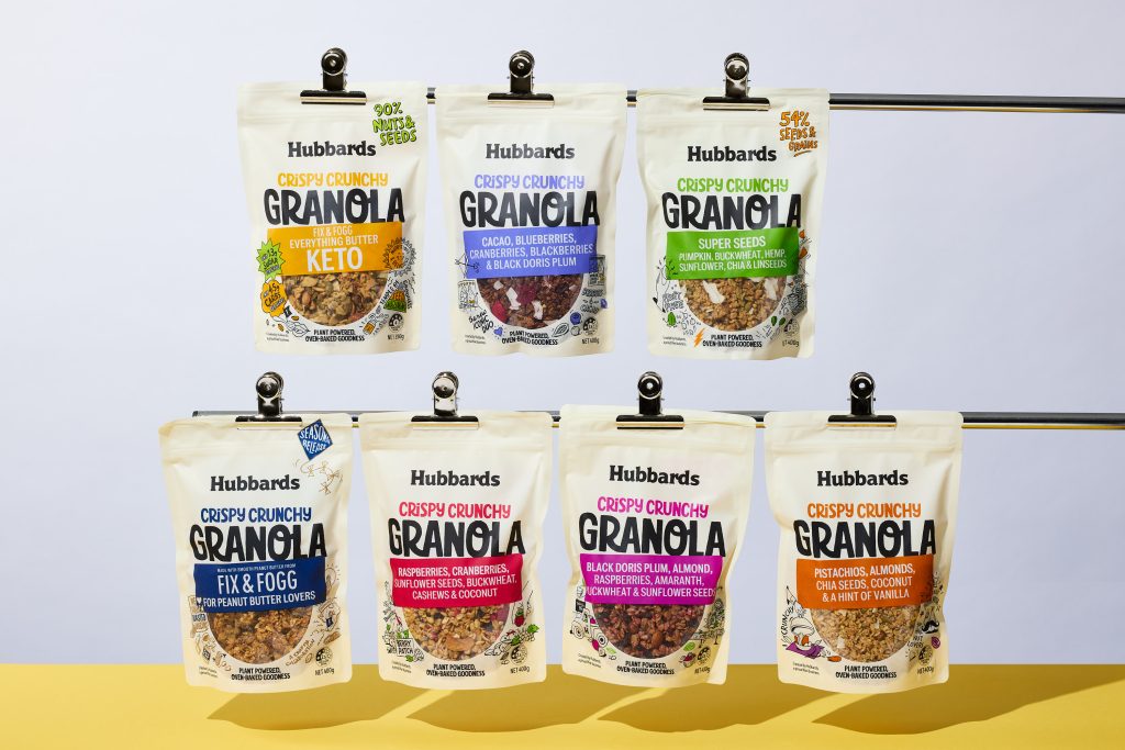
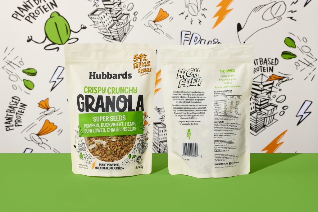
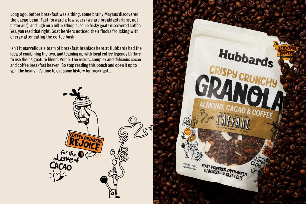
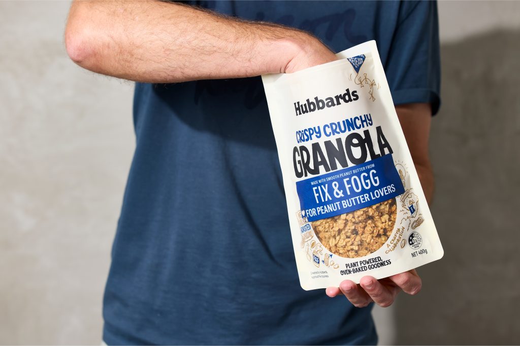
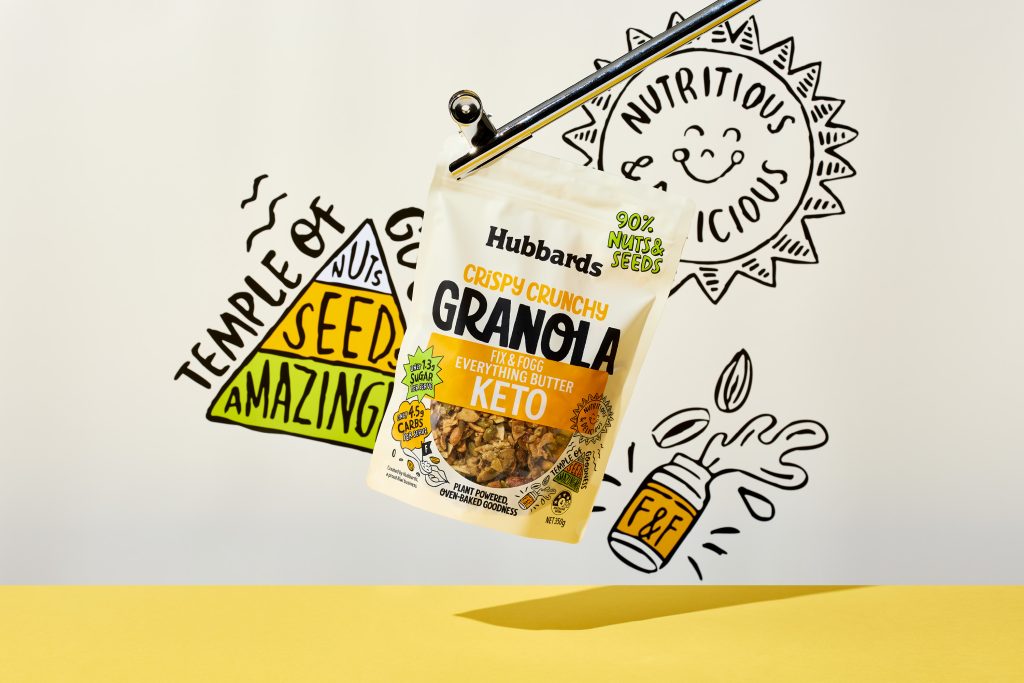
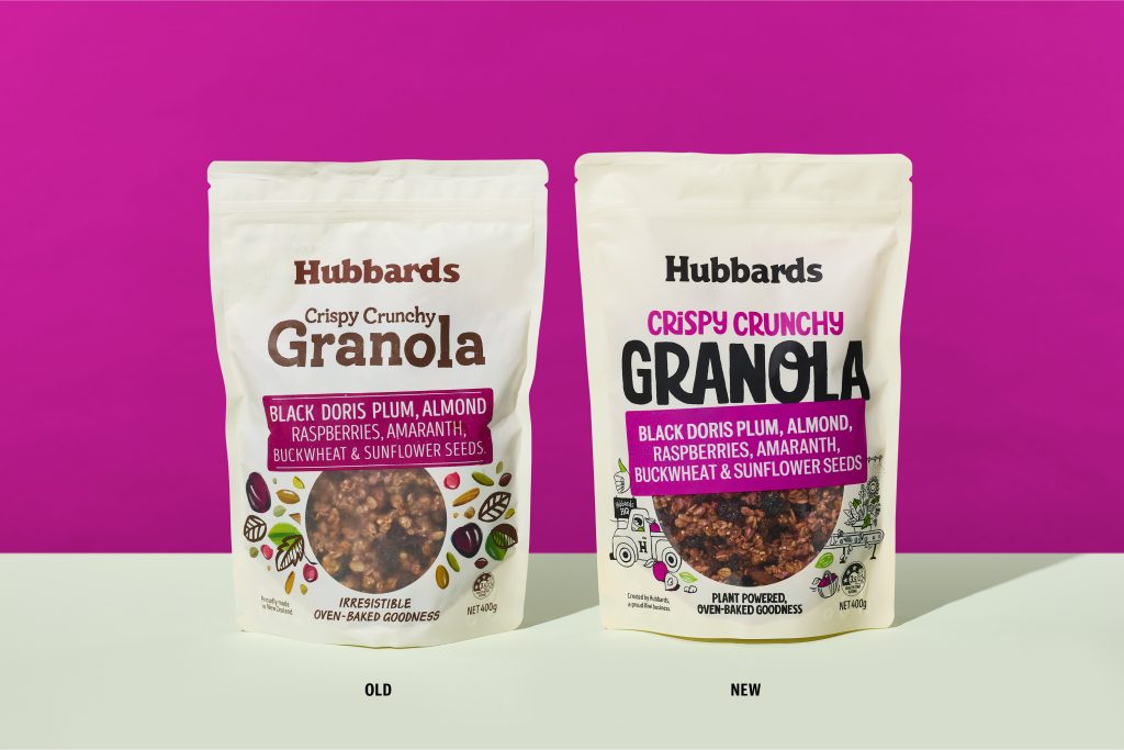
Hubbards Crispy Crunchy Granola is a retail rockstar. The range was responsible for reinvigorating the retail Granola category in 2016 when it was launched and has carried on blazing a trail for others to follow. Onfire was tasked with updating all key visual assets with the new brand toolkit which we had developed, without losing the essence of what made this range so successful.

The Design Response
While retaining the pack hierarchy and recognisable flavour sticker visual assets, the new Hubbards Inventive Sans font shifts the tone-of-voice from restrained foodie to proud creator. The previous abstract ingredient illustrations are replaced with new linear graphics. Integrating with the larger product window, these illustrations are a fanciful expression of the product ingredients and the inventor mindset that is a foundation of the new Hubbard brand. A brighter colour palette and expressive copywriting complete the reinvigoration of the product range personality.

The Design Team
Sam Allan
Matt Grantham
Michael Nicholls
https://www.weareonfire.co.nz/
https://www.linkedin.com/company/onfire-design/
https://www.facebook.com/onfiredesign/
https://www.instagram.com/onfiredesign/
The Client Team
Hubbards
Client details
https://www.instagram.com/hubbards/
https://www.facebook.com/Hubbards
https://hubbards.co.nz/
Collaborators