Fresh From The Field – Burnett Foundation Aotearoa By Special Group
Fresh from the Field is a weekly article series sharing the fresh and inspiring work of our Design Assembly community.
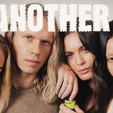
Special Group take us behind their rebranding work for The New Zealand AIDS Foundation. The new brand, Burnett Foundation Aotearoa, honours the legacy of the past while also reflecting the spirit and vitality of the diverse community it serves today.
Want to submit your own work to Fresh From The Field? Fill out the FFTF form here.

The brief
The New Zealand AIDS Foundation invited us to help re-align their brand to better reflect the work they do today. The HIV/AIDS landscape in Aotearoa has changed significantly since the New Zealand AIDS Foundation was founded in the 1980’s. HIV cases have been decreasing and there are more prevention tools in place. While the organisation has evolved over time to include a wider range of programmes and services, the brand had remained the same.
The brief was to create a new brand that both honours the legacy of the past and the heroes who came before us, while also making it more relevant and modern, representing the diverse community it serves today.
The design system needs to accommodate for both of their brands; New Zealand AIDS Foundation and Ending HIV which was their more provocative community based social platform.


The design response
Firstly, Special renamed New Zealand AIDS Foundation to Burnett Foundation Aotearoa. Honouring the legacy of Bruce Burnett, a co-founder of NZAF and a pioneering AIDS activists who shared his story of living with HIV to raise awareness and reduce stigma.
With such a vibrant community at the heart of the organisation, we created a brand that’s warm and energetic to reflect their spirit and vitality. The identity needs to feel friendly, welcoming, and inclusive, while also remaining credible as a funding organisation. We wanted to ensure the new brand stands apart from traditional healthcare services that can feel quite cold and corporate, and instead apply the same bravery that Bruce showed in our approach to the work.
We typeset the wordmark in GT Ultra Median from Grilli Type Foundry. It balances between a sans and a serif, which gives it both professionalism and personality. The ultra-weight cut of the typeface that we selected as the display type is bold and expressive and feels suited to the fearless nature and liveliness of the community.
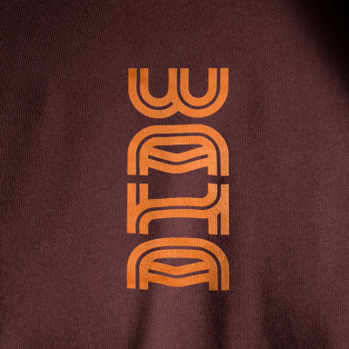
Taking inspiration from early AIDS awareness iconography, we developed a graphic system to create a range of bold, expressive housing devices and cheeky, provocative icons. All built from the same two geometric shapes and circular grid to create a unique and distinctive set.


The colour palette was chosen to celebrate the diversity and spirit of the community’s culture. We retained their core red which had been with the brand and AIDS Movement since the 1980s. We wanted to ensure inclusivity to all no matter their gender, sexuality, ethnicity, or culture, to do this we added a diverse range of bold, vibrant colours that work in tonal pairs to work with the existing core colour red.
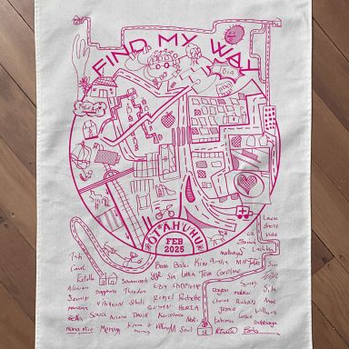
A foundation component of the brand identity is an artistic partnership initiative which we developed to help share stories and better connect the foundation with new and existing communities. Art has always played a key role in activism, addressing social issues of inequality and discrimination. So as an organisation that is passionate for raising awareness, reducing stigma and on a mission to improve the health and wellbeing of those within the community, we decided artist collaborations could be a powerful way to do this.
To launch the new identity and the brand’s first artistic partnership, we collaborated with Shannon Novak, a LGBTQ+ artist & activist to create a mural on the Burnett Centre walls to reflect the past, present and future of Burnett Foundation Aotearoa.
The journey to a new name and identity took time, all the details were carefully considered alongside the team at Burnett Foundation Aotearoa. With the community at the centre of the foundation, we needed to ensure the new identity would feel inclusive, compassionate, and represent the generations to come.


Studio/Designer’s Team
Special
Heath Lowe
Richard Francis
Madeline Lissington
Emma Vivian
Shalin Kothare
Katie Hamilton
https://www.instagram.com/special_group/
Client
Burnett Foundation Aotearoa
Collaborators
Shannon Novak


