- Auckland
- Brand Strategy
- Design Assembly Friends
- Digital
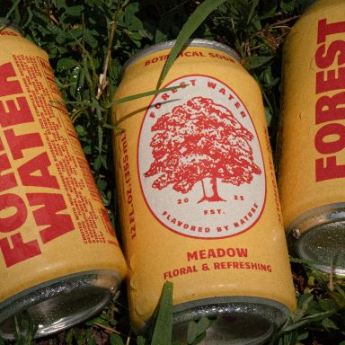
- Fresh from the field
- Graphic Design
- Website Design
Fresh From The Field — Viare – By Iceberg
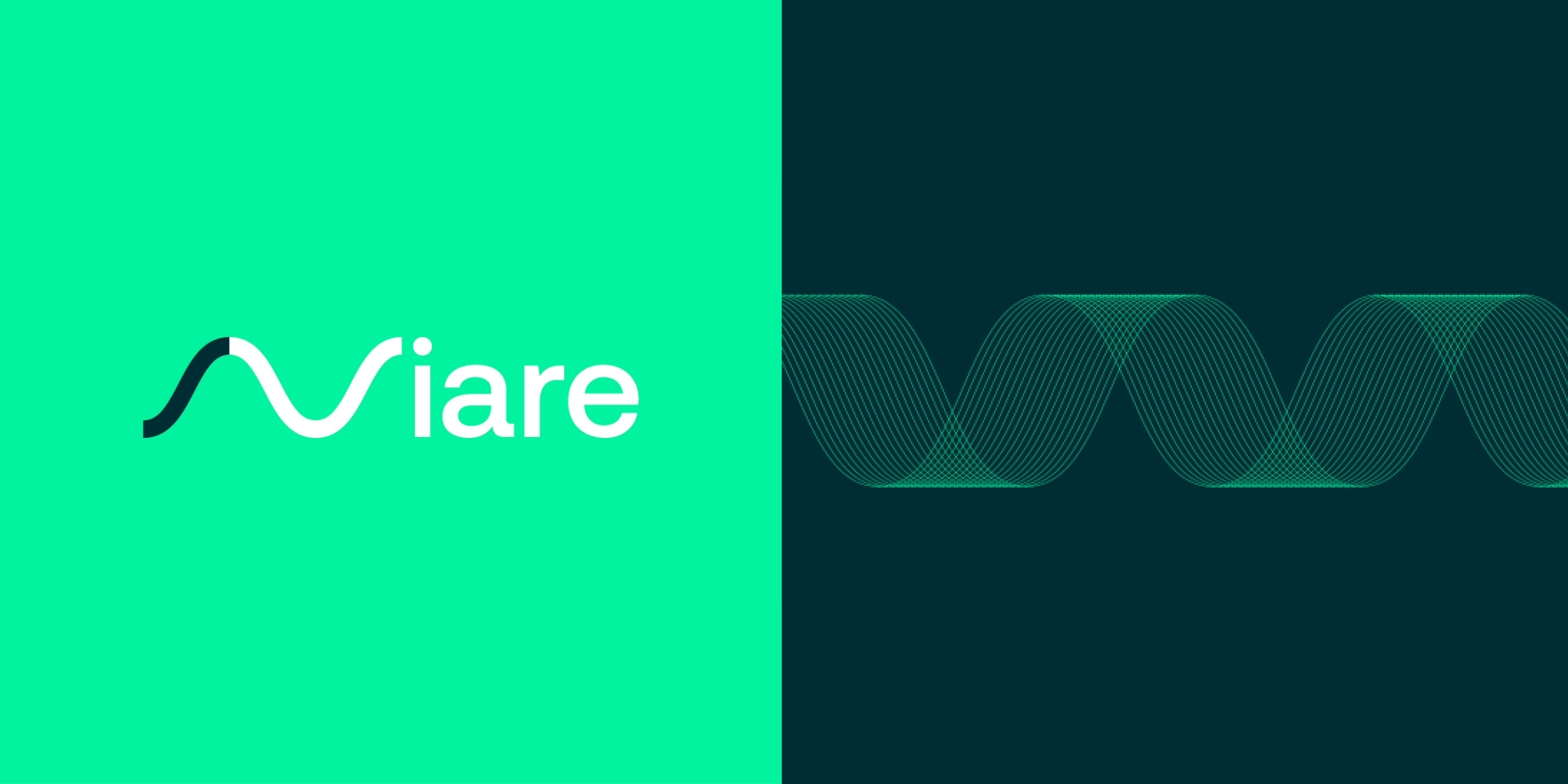
Iceberg was asked by estar OMS to design the brand identity for their new ecommerce software product, Viare.
Built around the idea of order flow and in response to the effects of Covid19, Viare helps retailers better manage the fulfilment side of their ecommerce businesses. Read below to learn more about the brief and how Iceberg took the concept of flow and translated it into a software brand identity.
Want to submit your own work to Fresh From The Field? Fill out the FFTF form here.
The Brief:
COVID-19 has changed the ecommerce landscape. Fulfillment is now a more important part of a retailer’s business than ever before. eStar, the maker of ecommerce software used by retailers like Briscoes Group and David Jones, has reacted to this by creating a new stand-alone software product to manage just that part of the online shopping ecosystem.
Iceberg was engaged to help launch the product to an international audience; create the name, identity and launch website for the new product.

The Design Response:
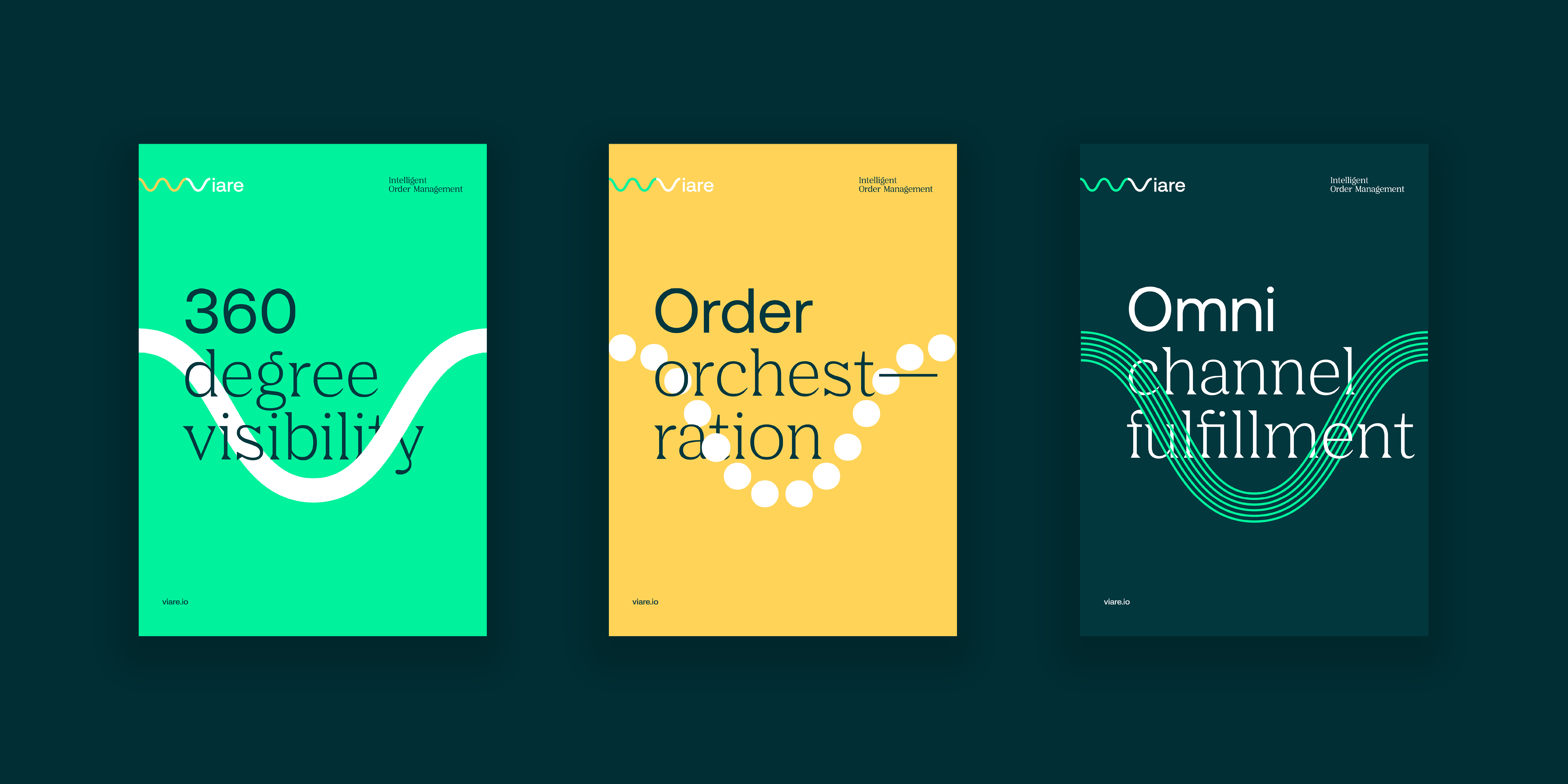
Previously referred to internally as eStar OMS (order management system), the product is built around the idea of order flow; the way in which ecommerce orders are routed through stores, distribution centres and delivery services for maximum efficiency and accuracy.
That concept of “flow” is reflected in a wave graphic that we use as recurring visuals throughout the brand. Most obviously the wave within the logo itself, but also in icons, framing for imagery and even graphs.

As a digital business, it made sense for the brand to make use of bright RGB colours that might traditionally be avoided due to printing difficulties. The font pairing of Nib and Aeonik also provide two contrasting voices for the brand. Viare is not just a technology seller, but a friendly partner for their customers.

The Design Team:
David Bourke, Vijay Patel
https://weareiceberg.co/
@weareiceberg
The Client Team:
Viare by eStar
https://www.viare.io/