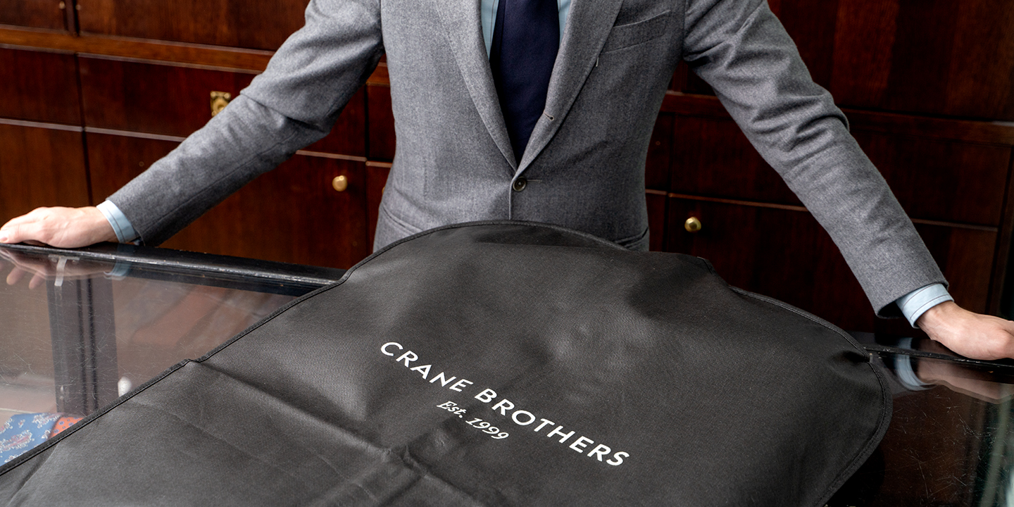
Fresh From The Field — Crane Brothers’ Brand Refresh By Voice
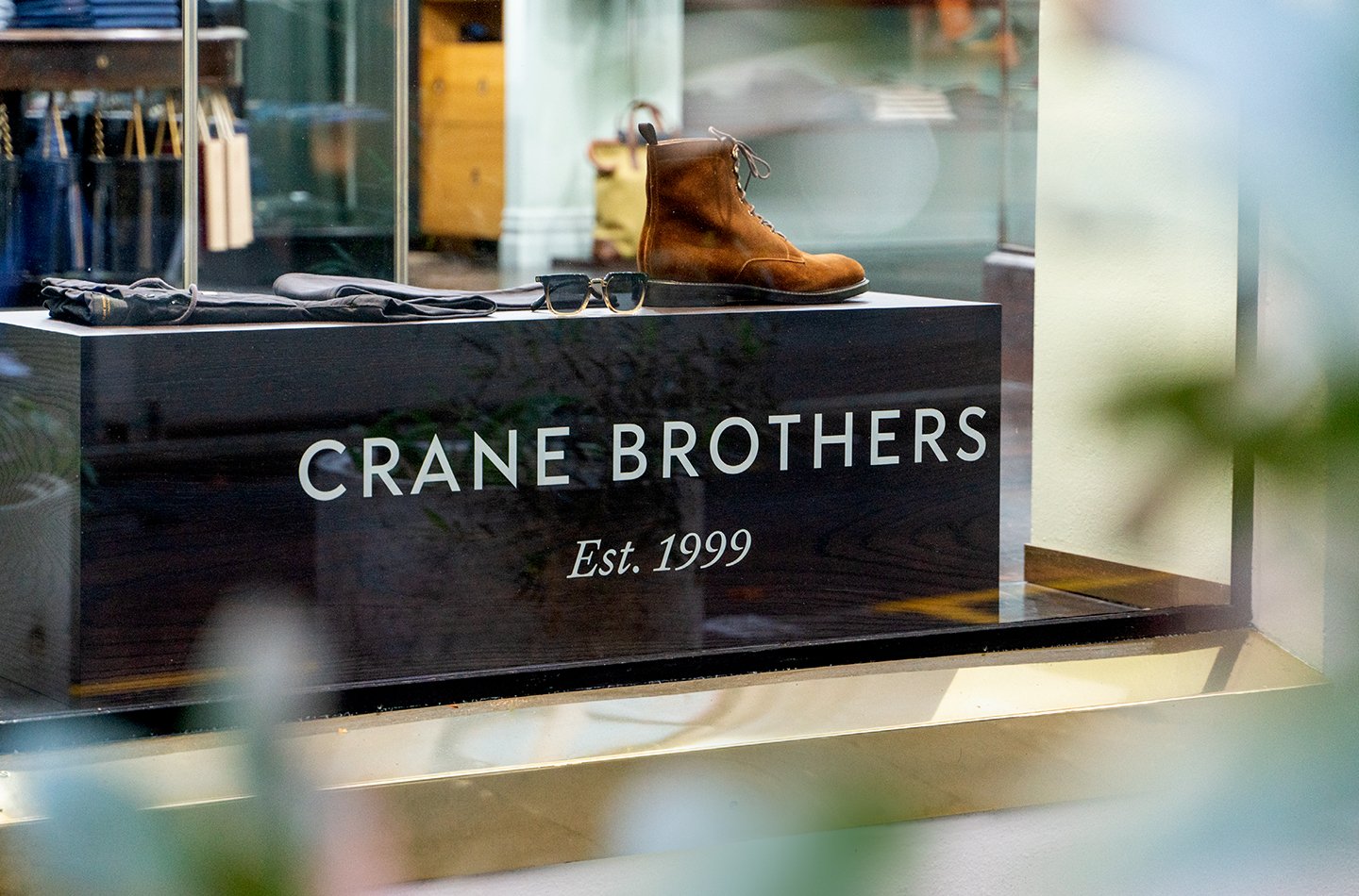
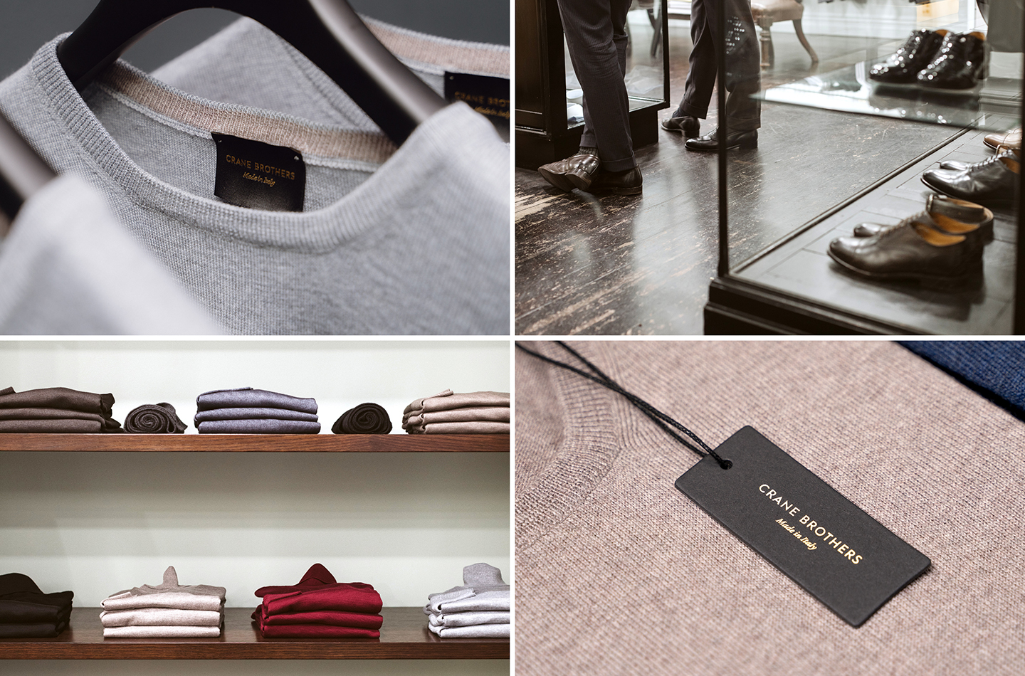
Voice were asked to refresh the Crane Brothers logotype, to ensure it could be continue to represent class and distinction for another 20 years to come. The brand refresh makes sure that these purveyors of fine suits, luxury casual clothing and hand-made shoes can continue to represent the pinnacle of artisanal menswear, with an easy-wearing Antipodean twist.
Want to submit your own work to Fresh From The Field? Fill out the FFTF form here.
The brief:
Now 20 years old, Crane Brothers continues to reinvent traditional mens tailoring in New Zealand. Most recently a new sub-brand, Made in Italy, was launched to deliver Italian style and quality to Auckland’s discerning men. Added to this, a foray into more casual workwear with jackets, coats, sneakers, jeans and chinos in response to the need to deliver a less formal working wardrobe. Voice is asked to refresh the logotype and ensure it would continue to endure as a brand of class and distinction for the next 20 years.

“The balance is always about modernity versus heritage. Adding the new without losing the old”, says Jonathan Sagar, Voice Creative Director. “The Crane Brothers brand must endure, through seasons and what’s fashionable, as confident, classic and timeless. But we also want it to appeal to the younger men who are also conscious about their image. A balancing act.”


The Design Response:
Deep attention to letterforms and negative space to create a logotype that would hold up to high quality forms of reproduction. “Luxury brands are often reproduced alone, glossy, on a full page, with a perfect image. The logotype had to be impeccable to stand up to that type of scrutiny”, said Jonathan.
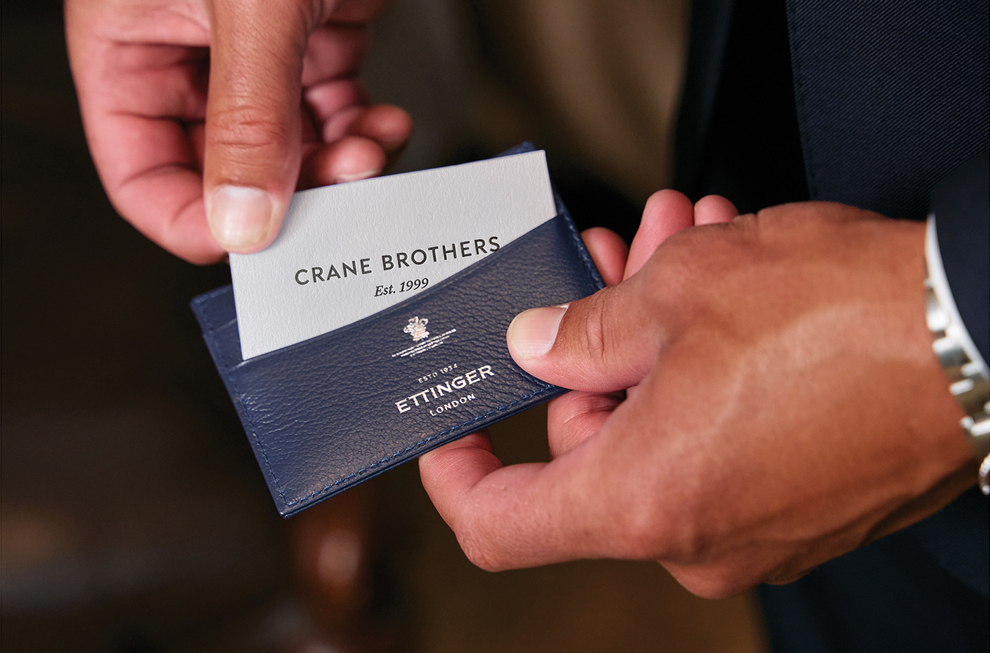

Attention was also given to the brand colour palette, how the master brand and sub-brands related and a review of their wrapping and packaging . “Crane Brothers weren’t in need of a full visual identity review. The brand must remain confident and coherent allowing seasonal fashion and imagery to flow through every year.”

The Design Team Details:
- Jonathan Sagar – Creative Director
- Richie Hartness – Design Director
- Dave Foster – Typographer
- Matt James – Graphic Designer
- Jayson Ulrich – Graphic Designer
- https://voicebrandagency.com
The Client Details: