AUT AD21 Graduation Exhibition
5 years ago by Louise Kellerman
We’re giving you a sneak peek at some of the graduating talent coming out of Aotearoa this year, and a taste of what they’ve been working on.
The online artanddesign.aut.ac.nz exhibition represents the culmination of an educational experience; exploring a range of art and design topics, issues, approaches, and technologies, reflecting the School’s ambition to foster the individual creative potential of each student through engagement with world-class facilities.
Communication Design:
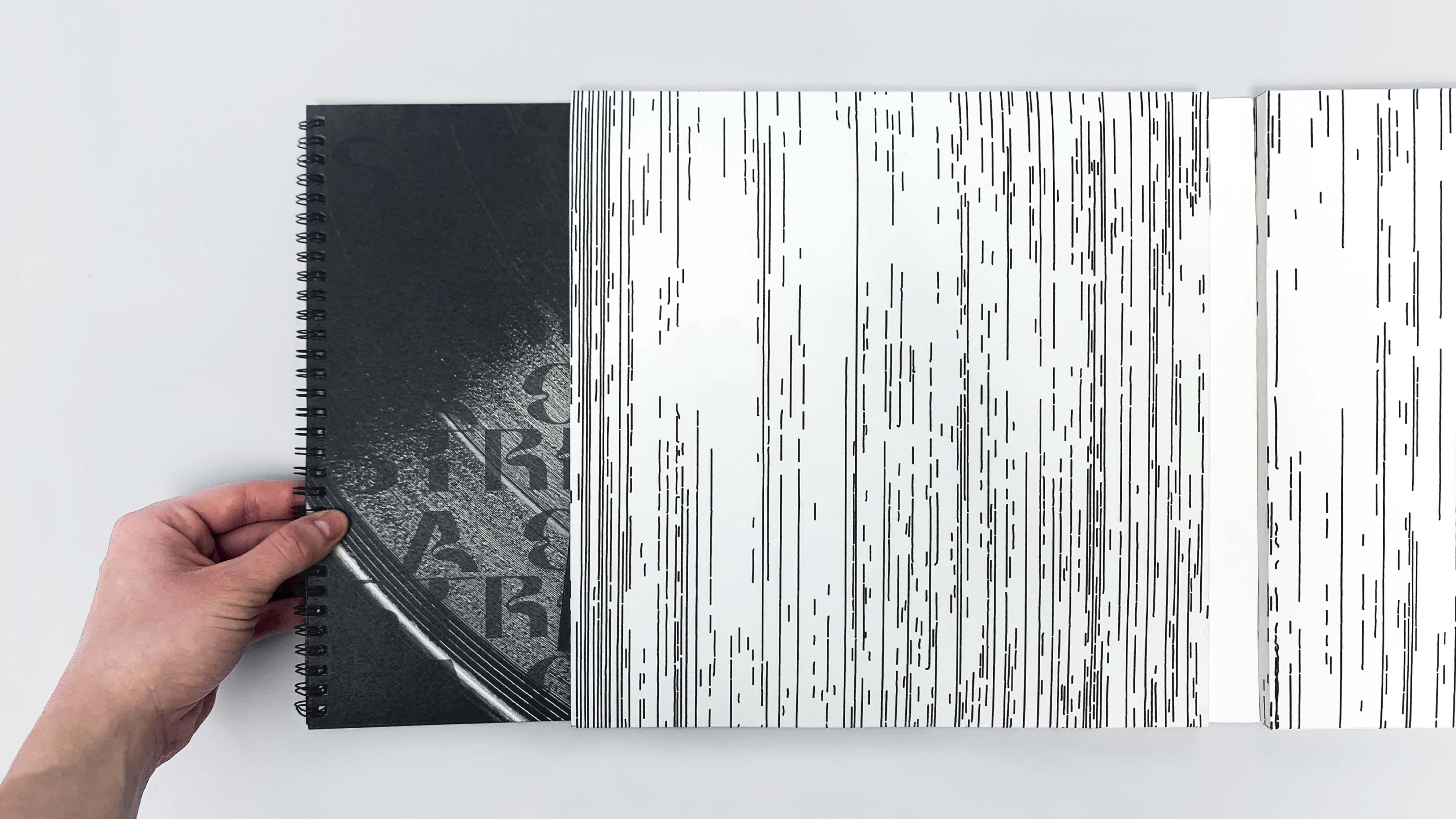
Farin Dickinson – Striking a Chord
AD21 Award | Semi Permanent Award – For excellence in Communication Design.
Connection in Music. “Striking a Chord” was a project which investigated the personal connections of music in everything we do and highlighted its value beyond the pleasure of listening, expanding into self-expression. Seen as the physical embodiment of one’s musical tastes, vinyl records became the lens of this project. A record collection can really be seen as self-representation. “Striking a Chord” ultimately presented both a distillation of the key findings from a rich research undertaking, as well as a reflection of my own connection with music, looking to my personal vinyl record collection in doing so.
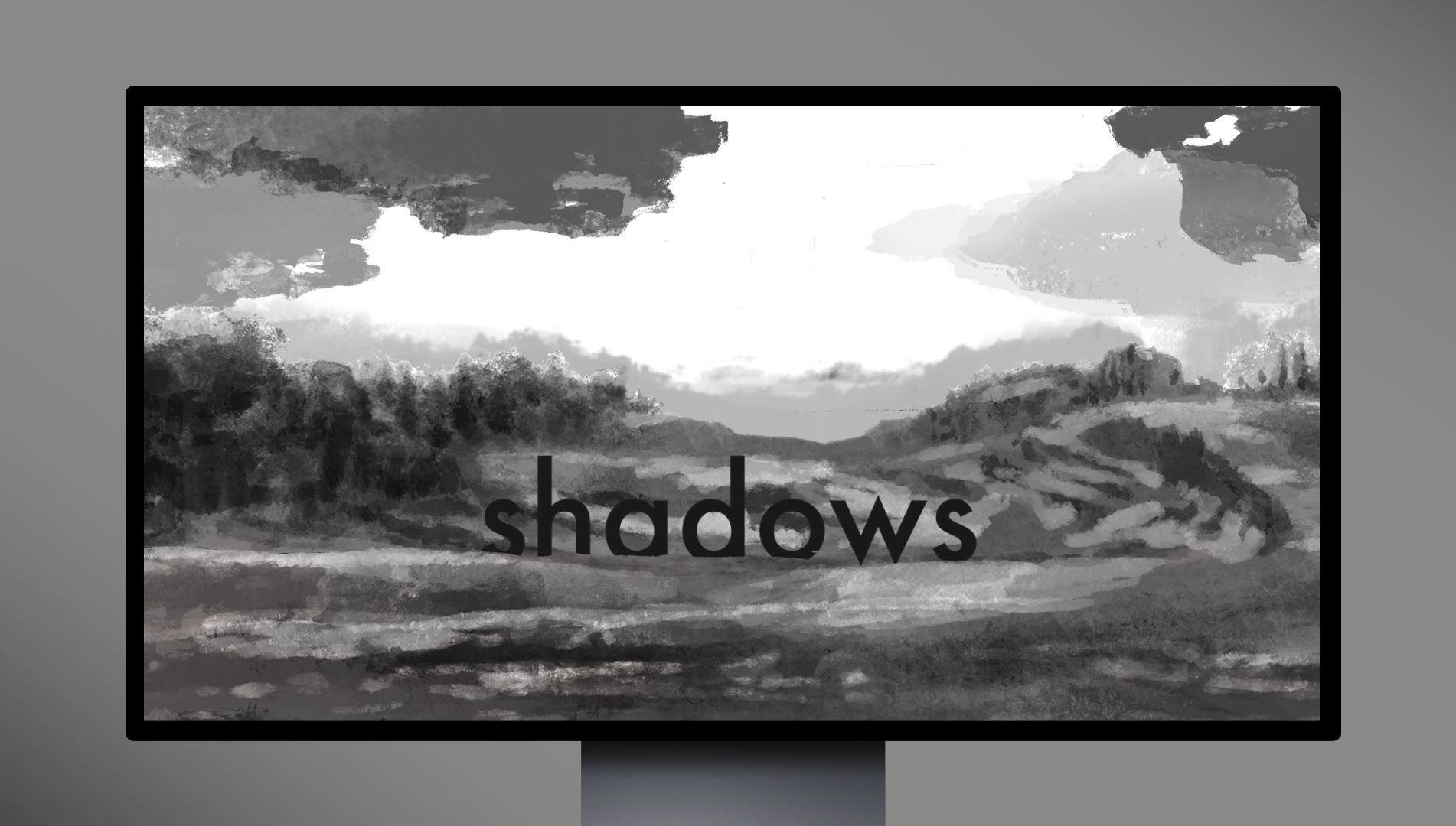
An Autoethnographic Exploration of Grief Through Illustrative Digital Storytelling. Shadows is a practice-led design project that uses an autoethnographic framework to investigate, reflect upon and illustrate the human process of mortality and loss. The question posed at the center of this research investigated the application of traditionally illustrated material in a digital environment, asking how an interactive user-experience could present new opportunities for storytelling in a modern, technology-based era. Shadows is an illustrative web-story, portraying the jumbled and hidden thoughts of a person who has experienced the passing of a loved one.
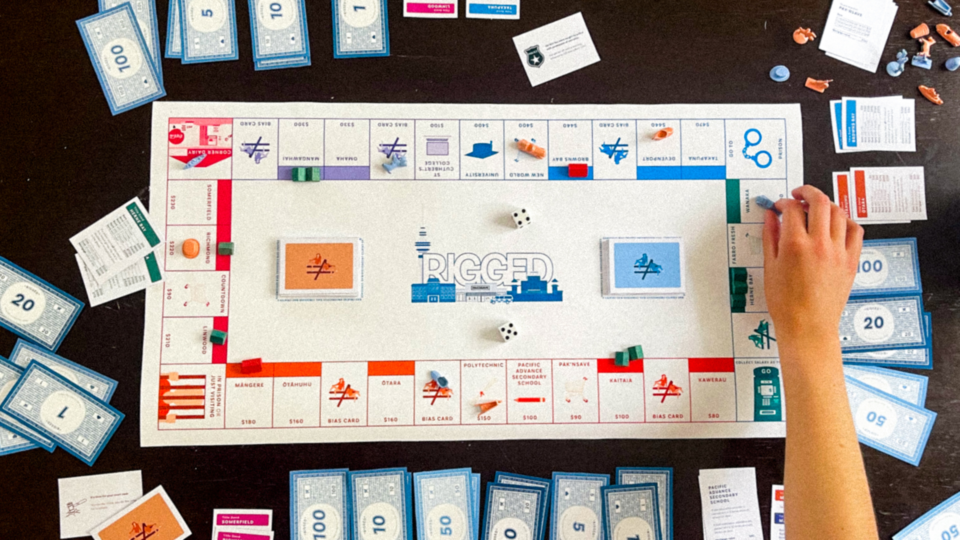
Rigged offers a chance for people to play to their privilege, as they are forced to see the racial disparities present in Aotearoa. My project brings bias, whether unconscious or conscious, to the forefront of conversations and confronts it. On a mission to design for social good and change, I bought racial disparities in Aotearoa to life through Rigged, a property trading board-game. Rigged offers users a chance to play to their privilege as they play a game that is quite literally rigged as it favours one group of players over the other. My project explored Aotearoa’s colonial history to unpack and collectively learn what impacts that has on today’s society. I wanted to use my own ignorance as a platform for self-critique to do better and help aid the change I wanted to see. I aimed to unpack my very own privilege through my project as it transcends to assist users in recognising their own privilege, confronting them with any biases they may carry.
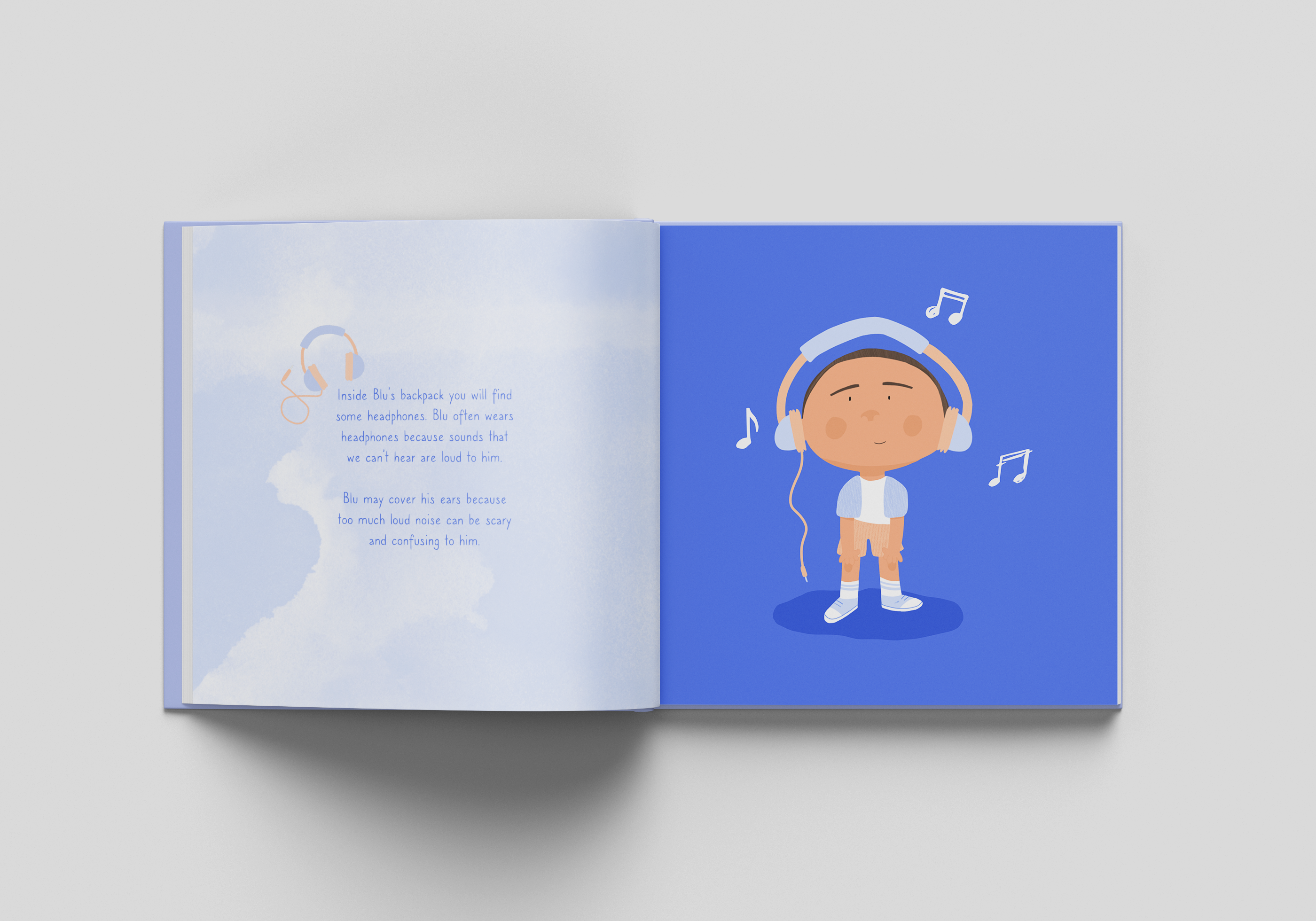
Kendra Smith – Blu’s Backpack
AD21 Award | ECC NZ Student Craft Design Award – For Illustration.
“How can a brand project help support and raise awareness about primary school children with autism?”. Blu’s Backpack is an illustrative and informative picture book about Autism.
Blu aims to help educate children who have Autism as well as their families and friends who may need to understand this disorder more. The Artefact consists of an illustrative picture book alongside merchandise. Stickers, Badges, and a Bag hopes to bring more knowledge and educational help to children who have been recently diagnosed and are struggling to understand this processing disorder. Arguably, there seem to be limited educational resources or picture books specifically aimed at Autistic children and this is something I want to create to help create awareness of the issue.
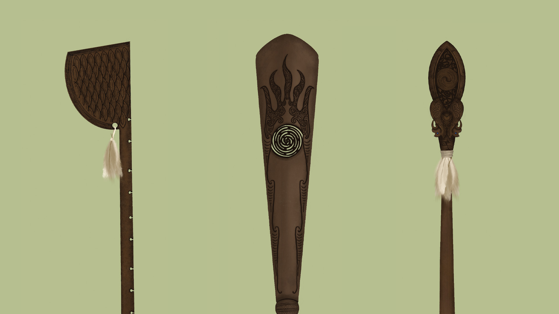
Bella Martin – Te Haerenga
AD21 Award | Toi Māia Award – For cultural contribution to mātauranga Māori and indigenous knowledge.
Te Haerenga – Ngā Mau Rākau o Atua Wāhine Te Haerenga has been a journey of understanding tikanga within design, creating a tikanga-centred practice, and applying this knowledge to a real project – Ngā Mau Rākau o Atua Wāhine. These pieces, three carved weapons, represent the stories and strength of three atua wāhine. This mahi serves to uplift Māori means of communication through oral history, whakairo, and mau rākau. My focus throughout this semester and my entire time at AUT has been creating work that uplifts Māori people, traditions and values.
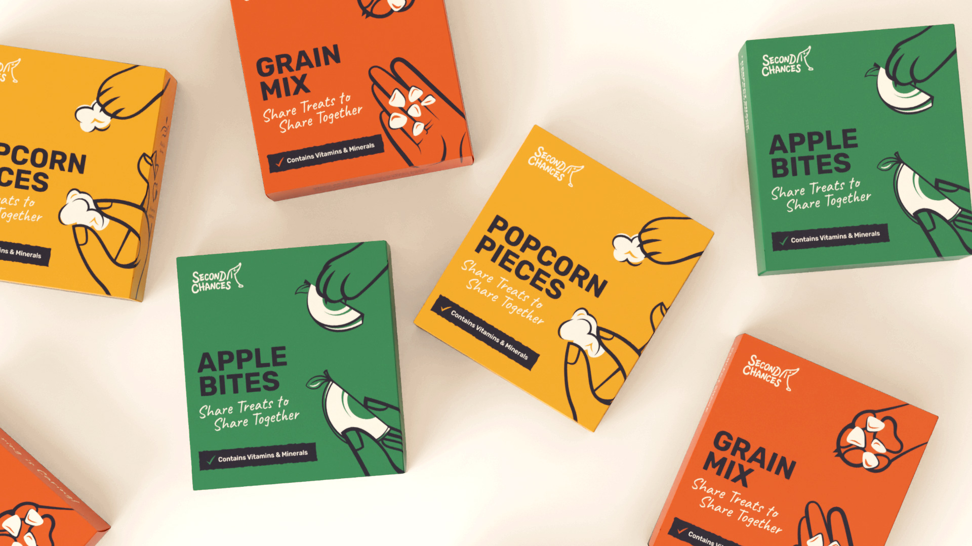
Georgia Billman – Second Chances
Bonding Through Shared Experiences. Second Chances Share Box is a bonding kit for an owner and their new, previously owned dog, providing them with ways of bonding and strengthening their connection with one another, similar to ways in which humans would with each other, over food and activities.
This is communicated through the addition of humour and playfulness to create a sense of approachability, initiating involvement, and providing a sense of comfort and support during the bonding process. Outcomes produced provide a way of achieving this. These include a pamphlet, food packaging, and activity cards which will be housed as a kit alongside additional collateral of a tote bag and dog bandana.
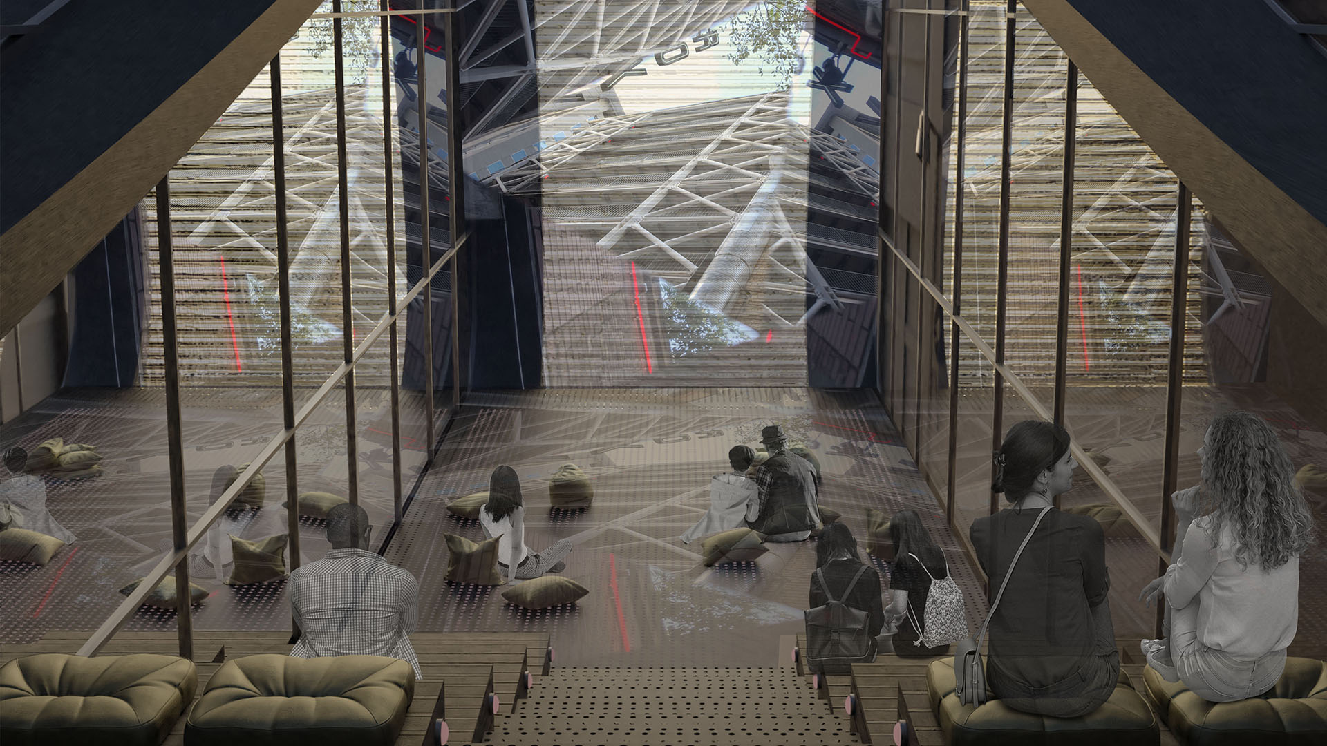
Jenna Oliver – The Reel of Fort Lane
A Cinematic Exhibition Space into Fort Lane. Cinema is the introduction to various art forms, cultures, imagination and storytelling. The combination of silence, light, emotion, colour and moving image builds an atmosphere that connects people through a shared experience allowing one to slowly slip away into a new reality. Fort Lane was once the home and embodiment of this cinematic spirit of love, sadness, action and stillness. It was the place for all early settlers of Auckland to be. As history progressed, Fort Lane slowly stopped being a destination of creativity, entertainment and distraction. It became a transitional space that paved a pathway from one place to another. Through the use of light projection, materiality and form, I hope to restore a sense of imagination and wonder to the community.
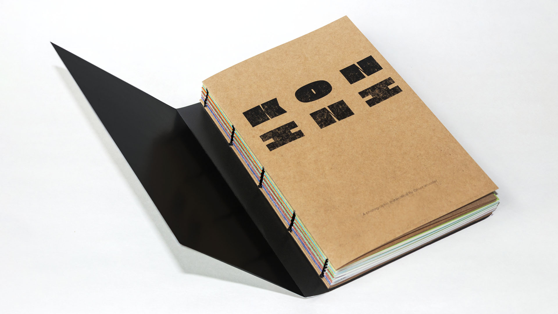
Oliver Wooster – Konini
AD21 Award | Soar Print Award – For Innovation in Print.
Konini is a photographic publication which documents the homes on one street in Tāmaki Makaurau Auckland, Aotearoa New Zealand. The publication is 164 pages including foldouts and features 18 homes presented in a swiss bound cover exposing coptic bound sections.
Over time in Western societies, growing consumerism and home comforts have led to a decline in neighbourhood communities. The broad nature of the mandated Covid-19 lockdowns, which spanned the world in 2020, brought about unencountered feelings of community amongst many neighbourhoods, none more so than from a local experience within my own neighbourhood. Reflecting on these feelings of community post 2020 lockdown sparked an idea about exploring a community and attempting to find out what has been under my nose for 15 years.
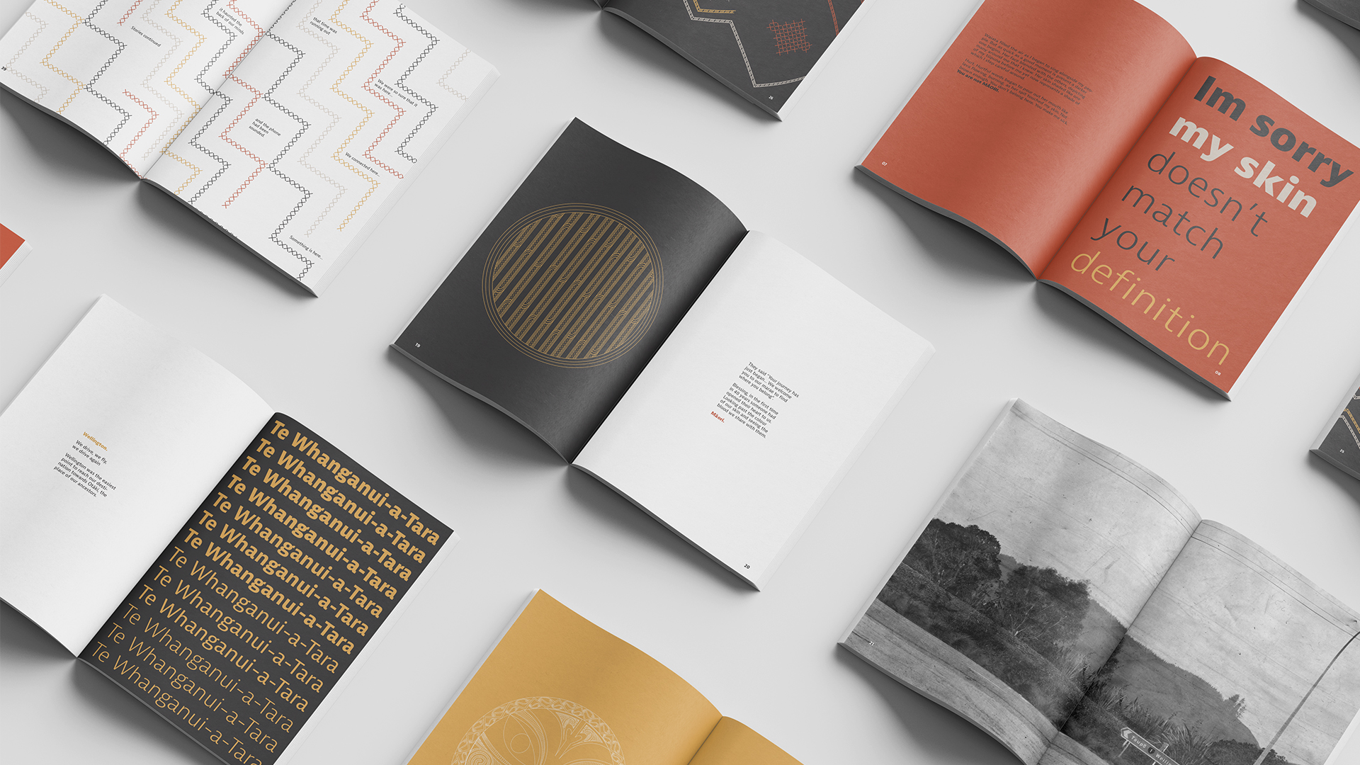
Marama Godfrey – MARAMA
AD21 Award | Toi Maia Award – For artistic, cultural and academic merit.
The journey of finding my Māori identity. Many thanks to Wehi Wehi Marae and the Godfrey family, without their support this project would never have been able to be completed in guiding me towards my whakapapa. Arohanui ki a koutou katoa
‘Marama’ was created to allow people who were struggling with their own journey of finding identity, to feel reassured through another’s story. Creating a piece particularly for Māori in the hopes of inspiring them to embrace their whakapapa, despite the colour of their skin. Identity is a large aspect of life, giving purpose to one’s being, so, was the intended theme behind the publication. This contemporary publication features detailed pattern work alongside the poetry of the designer’s journey to identity. Explaining stories from childhood to an adult, it explores the issues surrounding being a ‘white Māori’ and wanting to reconnect with whakapapa. For any person unsure on their journey to identity, this publication can be used as guidance and reassurance that the journey can be completed in time. With minimal colour and typefaces, the patterns are able to engage the reader to continue through the publication, ending with a found Māori identity of the designer.
Alisha Reddy – Disruptions
AD21 Award | Auckland Art Gallery Award – For High Achievement.
A Study of Potential Matter and Incidental Happenings. Alisha Reddy’s practice resides within an ‘active space’ of making where process meets material. Within this site of making, the experience of becoming and being is nurtured in its purest form. Here, within a seemingly infinite fantasy, exists that within which possibility and opportunity do not necessarily have a beginning or an end. Reddy aims to access a beyond, a virtual fold, a new plane of life, perpetually escaping into a world anew. Disruptions (2021) manifests through material-site and non-site contingencies, which concern potential matter and incidental happenings. The artwork addresses the realm of possibility found within discarded remnants of everyday encounters by engaging with material processes, orchestrated situations, and disrupted conditions of the real. As the materials are revealed within their immediate environment, their coherent body is shaped by peculiar progressions and entropic implications of their process. In this sense, while the experience of becoming is being constructed, the conditions in which they emerge are also constantly redefined. All the while, cosmic ambitions are dissolved into reality, as the artwork’s own being becomes nothing other than itself.
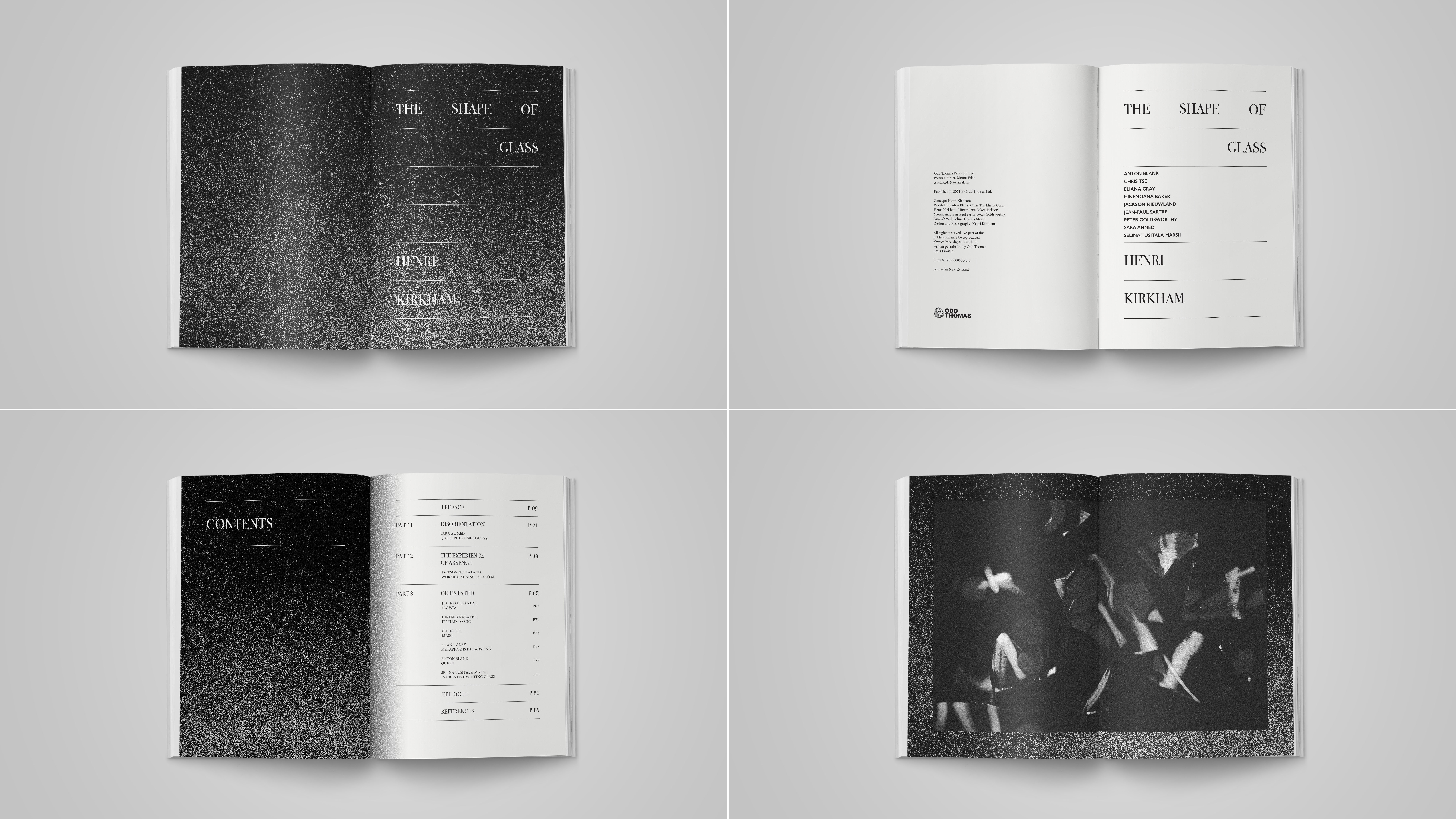
Henri Kirkham – The Shape of Glass
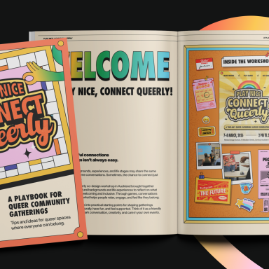
The Shape of Glass is a research-based project in response to the need of consistent and accurate forms of representation. Within the queer community, visibility, representation, and connection are amongst, if not the greatest, tools to combat feeling uncomfortable or lost within society. Ongoing forms of representation are essential for queer individuals to feel at ease in a world dominated by heteronormative standards and ideals. This project discusses the concept of queer disorientation and the ‘erasure of queerness’ phenomenon, which censors the expression of creators worldwide. The Shape of Glass is a resource created for the community that emphasises the importance of representation and encourages members of the queer community to create if they have means to do so. Taking my own advice, I have re-imagined what traditional queer symbolism might look like stripped of all colour and manipulated it through the metaphorical medium of glass. Along with the publication, I designed a series of eight alternative Pride flags. The range of flags, which also act as a wrap for the book, allow anyone purchasing the publication to choose whichever flag they feel most represented by or drawn to.
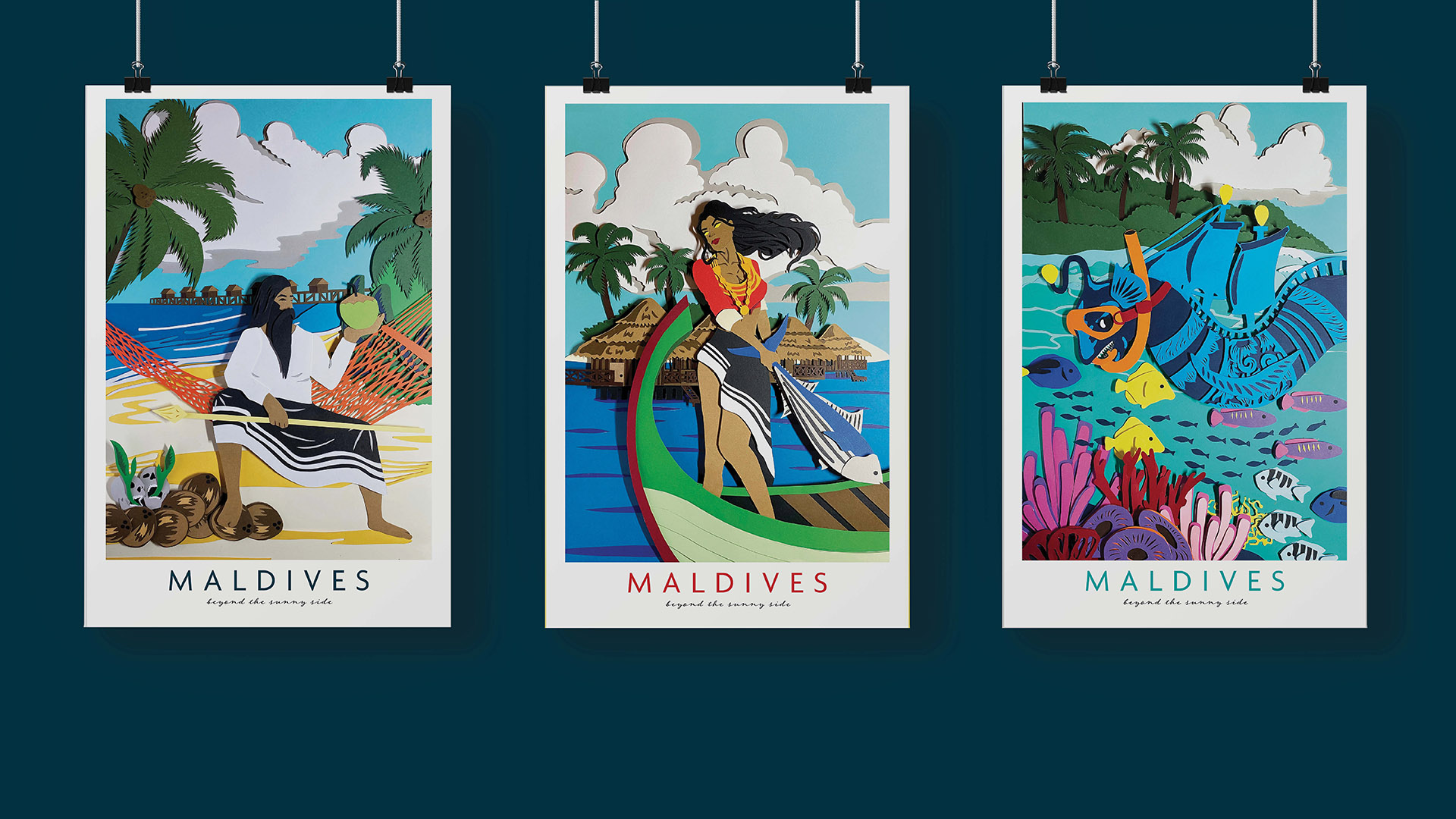
Zaffa Gayoom – Stories From Paradise
AD21 Award | BJBall Award – For Colour and Texture in Graphic Design.
With the book and the three posters, this project shows how the country of Maldives is a combination of deeply rooted tradition and the more recently introduced resort culture. This project helps to pique the interest of the audience and encourage them to look deeper into the fading traditions and history of this country. I have opted to design the posters combining the two sides of Maldives because it is important to show how the more traditional Maldives is just as important to the country as the tourism side of it.
Interaction Design:
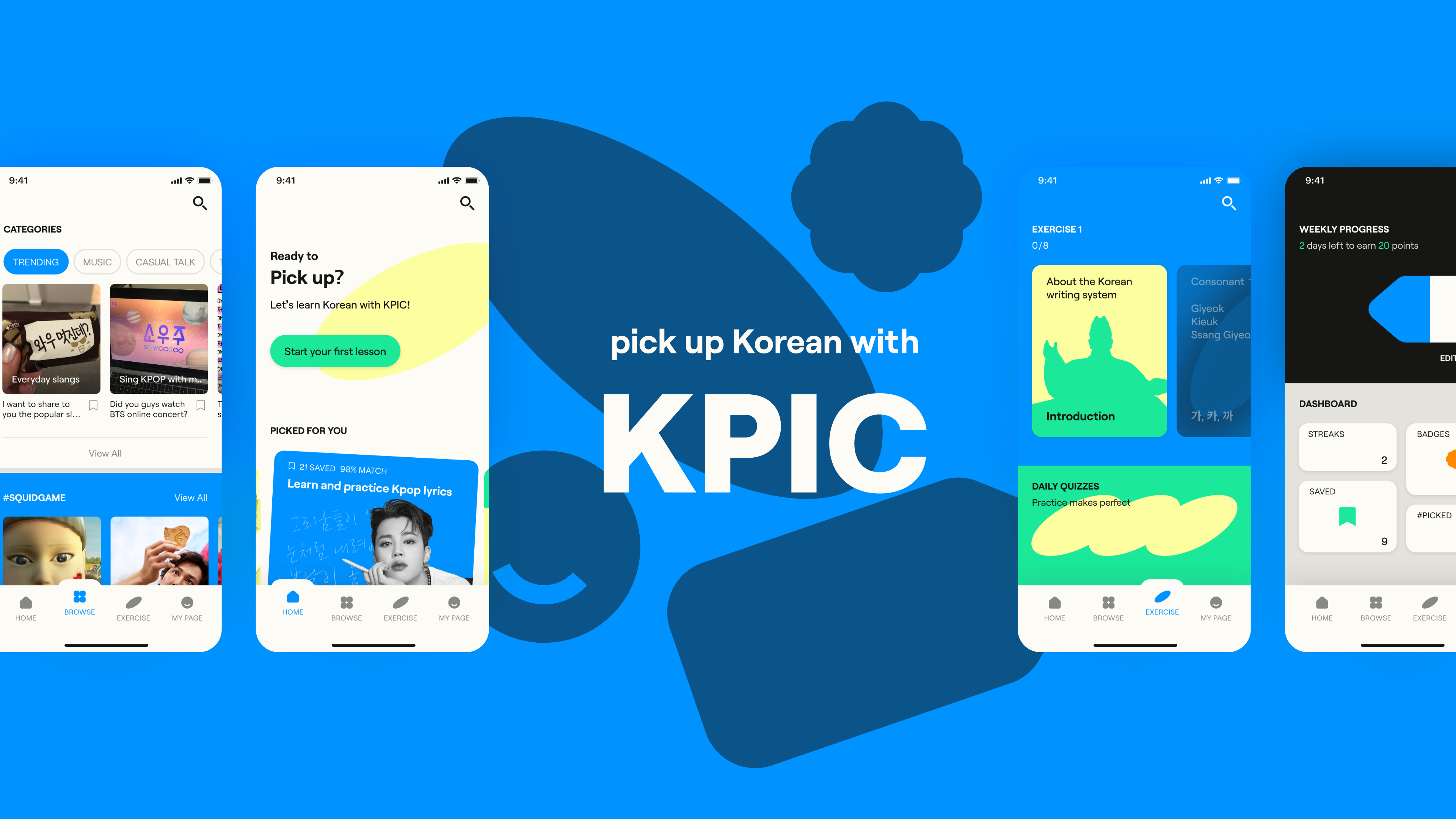
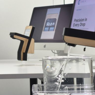
Harper Seo – KPIC
AD21 Award | Toi Māia Award – For cultural contribution to mātauranga Māori and indigenous knowledge.
A Korean learning app for beginners. Mobile language learning applications can offer free educational opportunities for people. KPIC is a mobile learning app of the Korean alphabet, called Hangul, with a focus on cultural enrichment. I want to express and challenge my identity as a Korean designer. I envision that the ideal situation is to lower the barrier of entry for foreigners to learn Hangul and be easily intrigued to study more. I want the designed outcome to be an enriching and mind-opening experience of Korean culture.
Hangul learning app KPIC was developed to engage users actively and to provide an enjoyable personal learning experience. The project focused on improving a Korean mobile learning user experience. The key findings from the initial research of the mobile learning process are that the current apps having lack of cultural learning aspects and have an obsessive streak system that is difficult to maintain. According to the research, designing a mobile app system and learning content that could assist users’ self-directed Korean learning effectively were my design challenges.
The opening of the 2021 (AD21) cohort exhibition website will be on Nov 26th, when the work from our talented AD21 cohort will go live.