Fresh from the Field — Will&Able by Shine
The brand execution profiled in this Fresh from the Field by Shine is expertly crafted, memorable and has significant heart. will&able drives social and environmental advancement, the smiley brand mark, and the joyous people-centred visual narrative are the perfect reflection of the feel-good vibes this project has throughout.

The Brief
People with disabilities have a hard time finding employment.
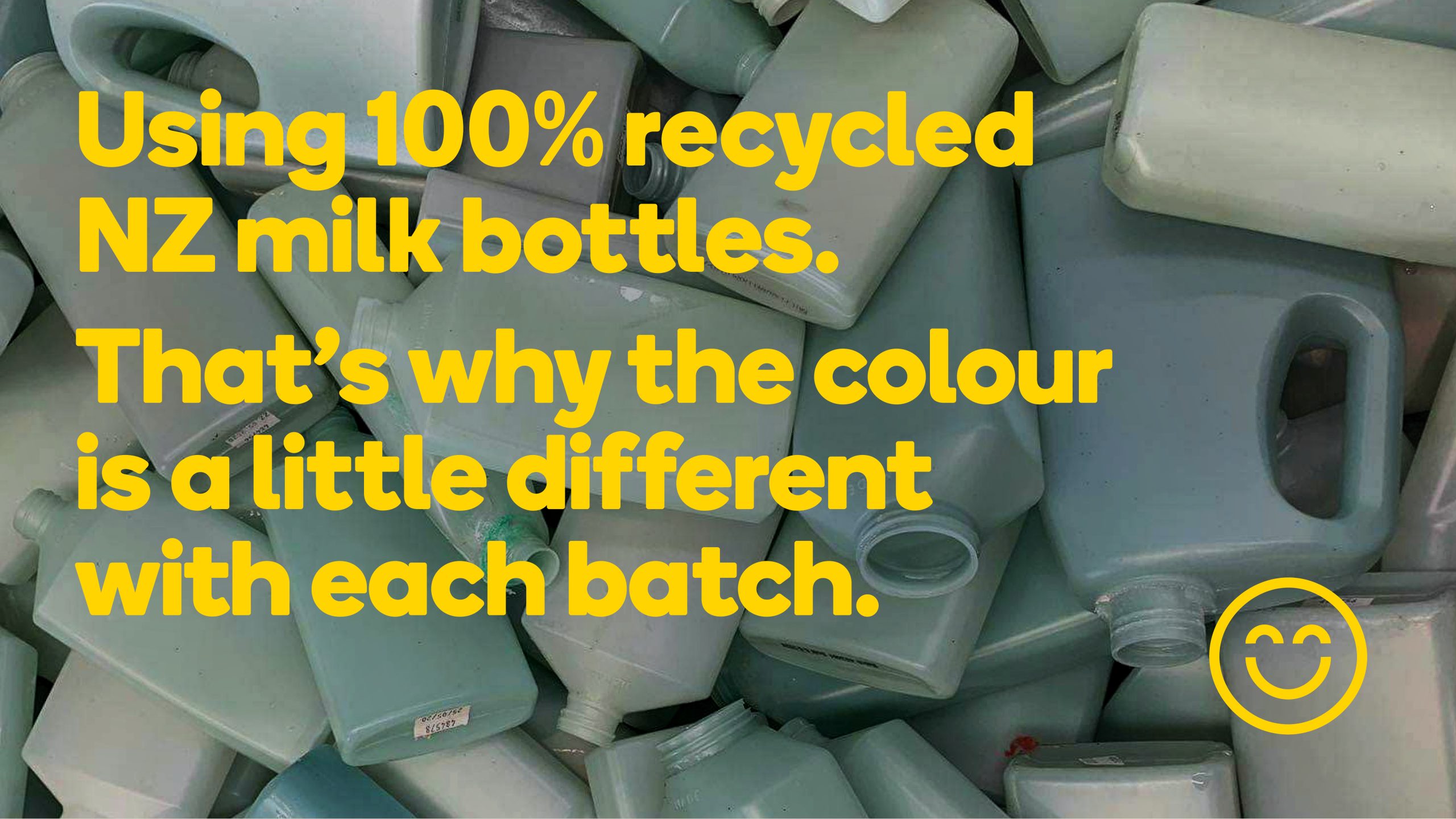
Will & Able is helping to change this. A social enterprise initiative, with a mission of providing people with mental and physical disabilities jobs. An eco-cleaning product that focuses on ecological sustainability and true 360 degrees recycling. Bottled in 100% recycled milk bottles (that’s why the bottles are that funny colour).

It provides over 200 employees with roles, a community to belong to, a purpose to strive for and a way to develop more independence and financial freedom.
This non-for-profit required an identity to wrap up all this good stuff into an approachable, bold manner.

The Response
The staff at will&able are like sunshine, emboldened, empowered and proud of having a full-time gig. An identity was created by making the staff front and centre (literally on pack) making them the manifestation of the brand.
Bold, graphic photography of each staff member, as well as their story, has been depicted across each product. Enticing and inviting the consumer to pick-up the product.

The circular enterprise of the business was celebrated through the design system touchpoints. From the business name, rounded typeface, icon proof points, background sunshine motif and tagline.
Does the job, creates a job, the brand promise not only endorses the product but signifies the circular enterprise that ensures positive job creation for people with disabilities.

The Team
- Head of Design – Danny Carlsen
- Designers – Simone Lash, Vijay Patel
- Copywriters – Oliver Green, Briar Wood
- Photography – Amber Jones
- Animation – Luke Guilford