Fresh From The Field — Maker’s Anonymous
This Fresh From The Field by Tried&True features a distinctively bold (and rebellious!) new identity, category-defining campaign imagery and playful packaging.
If you have new or recent work that you would like to share in Fresh from the Field email nicole@designassembly.org.nz for details.

The brief:
Pernod Ricard was launching an innovative new wine brand with a unique proposition to grow the premium wine segment and expand their portfolio. The brand was to go beyond the expected category wine credentials and the expected consumption occasion and be more about shifting up a gear – the casual drink catch up that continues into the evening and things just escalate. The freedom to be spontaneous, with no curfew, the ‘round of espresso martinis’ moment but with wine! Our target audience was Culture Seekers – ‘always on’ explorers; in every aspect of their life they embrace the new and enjoy discovery.
The design response:
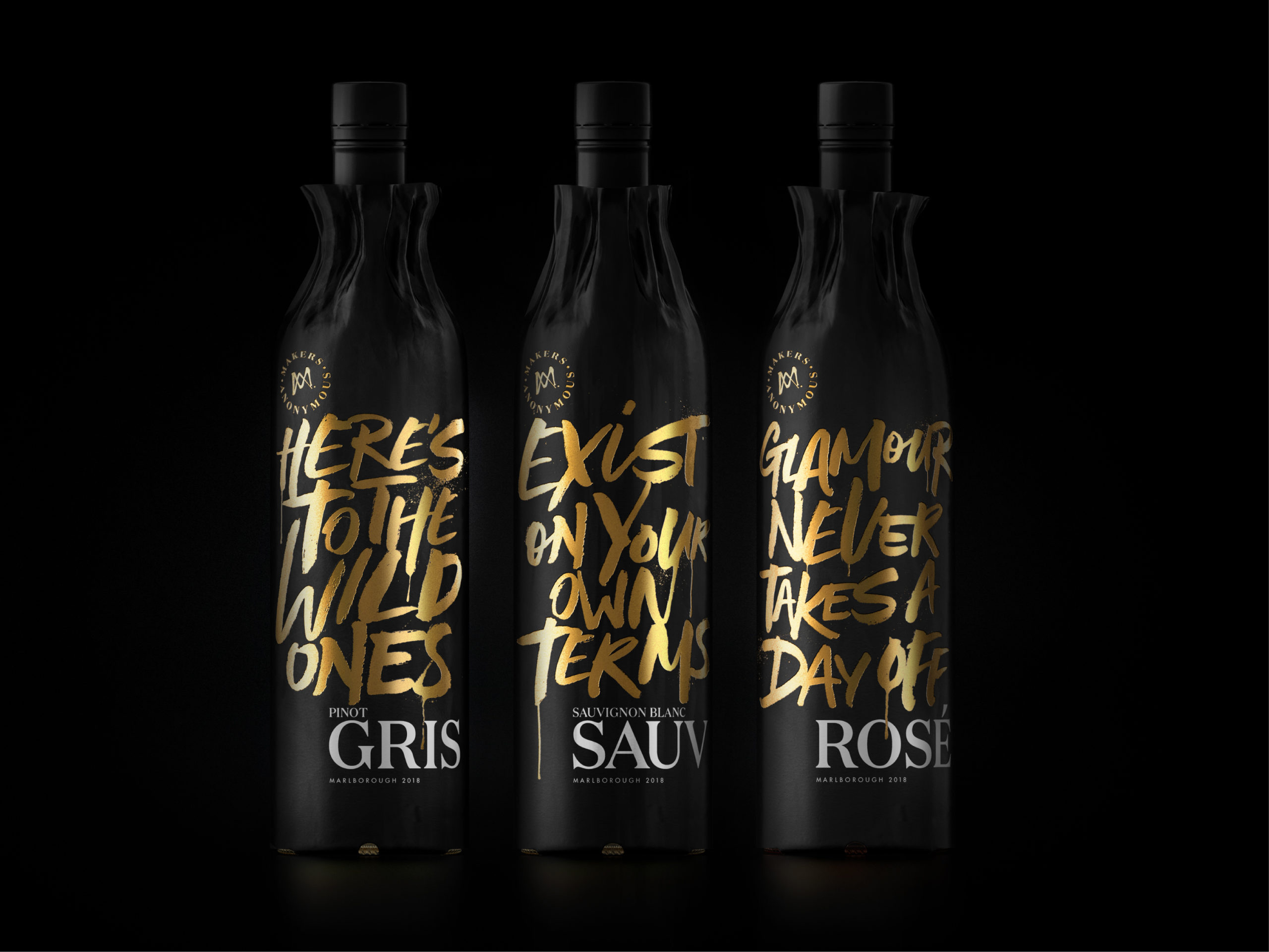
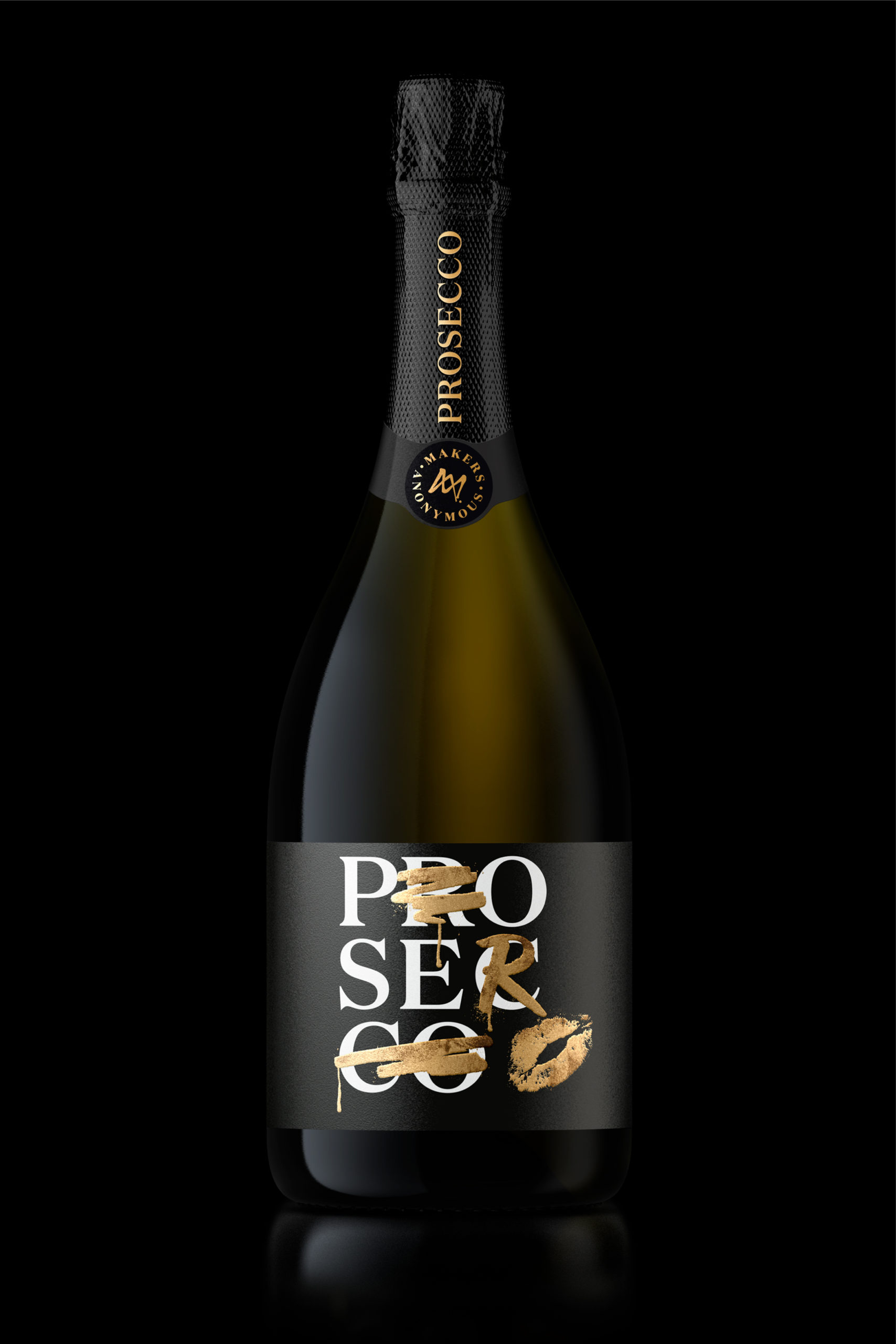
Unlike usual wine varietals, there wasn’t going to be a winemaker or tasting notes called out on the pack – the wine was to speak for itself, be disruptive and unique. We created the name – Makers Anonymous – to create mystery and capture those moments of something expected with the unexpected.

Working with type designer Dave Foster, we developed a bespoke typeface ‘Rebellious’. Printed directly to the bottle in striking gold metallic, it allowed for the colour of the wine to shine through, with cheeky, playful messages. Defacing the classic wine bottle with a graffiti concept brought to life the ‘glamorous rebellious’ nature of the brand.
For the festive season, we created bottle wraps for each of the varietals, each with their own playful message. These created a point of difference from their competitors, with strong shelf standout – something you’d be proud to take to your mates for drinks and post all over Instagram.

Collaborators:
Design team: Andrew Sparrow, Helena Willes, Brent Davies, Lee Gascoigne, Prue Fenwick. www.triedandtruedesign.co.nz
Typeface: Dave Foster. https://www.fostertype.com/
Instagram: @triedandtruedesign
Instagram: @makers.anonymous


