Fresh From The Field — Cassels by Strategy Creative
This Fresh From The Field by Strategy Creative features a reworked identity which looks forward (to ensure inclusivity of future generations) and back (with heritage-inspired aesthetic cues). The bold new brand presence is applied to packaging and promotional collateral which heroes Scott Jackson’s artwork to grab attention on the shelves and instantly convey the product’s ethos.
If you have new or recent work that you would like to share in Fresh from the Field email nicole@designassembly.org.nz for details.

The Brief:
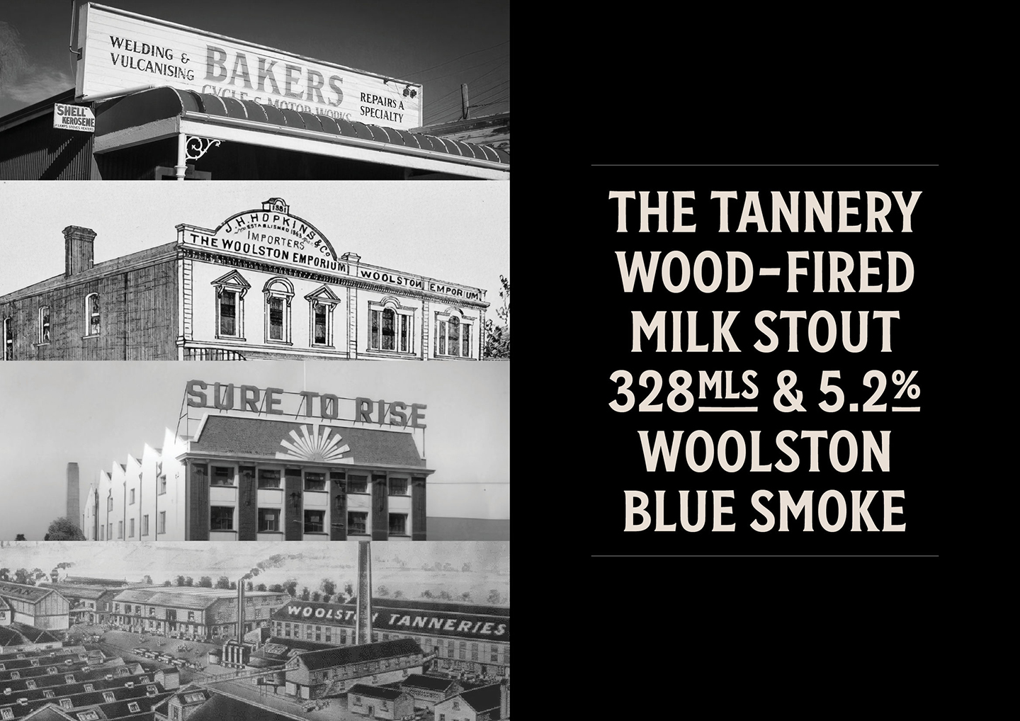
The Cassels family know who they are and what they do best. When you make the World’s Best Milk Stout (World Beer Awards 2019), you don’t fix what isn’t broken. So Strategy Creative made a brand that’s unapologetically Cassels — big, bold, aggressive, and showing appreciation for their Woolston heritage.

Loyalty is key to the Cassels family — and they’ve been working with artist Scott Jackson since day one. A real fine artist, not a commercial illustrator, Scott notoriously can’t be briefed. You get what you get — whether a cricket-fanantic fish (on fire), or an illuminati piss-take for the American Pale Ale.

Design Response:
Strategy elevated Scott’s illustrations — previously they were hidden within a roundel device. They created a simple design system to make his work the hero, screaming at you off the shelf. On the 6 packs we took it even further and wrapped the illustrations around the sides of the boxes to create maximum presence.


Changing the brand name from ‘Cassels & Sons’ to ‘Cassels’, to be inclusive of the entire family (of all genders) and make a legacy that can last for future generations.
Together the assets can be easily applied to any format with maximum brand presence to get the new look in the market. It’s not always trendy, but it’s always Cassels.


By documenting design outcomes, we create a record of New Zealand culture and people at any given point in time. As we generate professional archaeology, we help to define our industry, our value, and we build a resource that enables us to learn from the thinking, aesthetics and approaches that predate our practice.
See more Fresh from the Field features here and get in touch to submit your work, helping Design Assembly create a Pepeha for our visual design community.


