Fresh from the Field — WDOM brand and packaging by Dow Goodfolk

5 years ago by

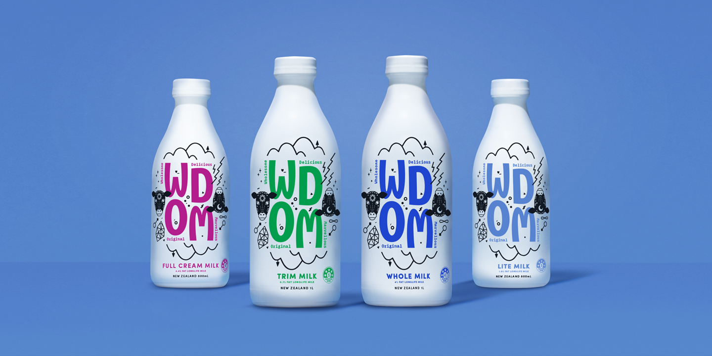
This week’s Fresh From The Field features the brand and packaging for WDOM by Dow Goodfolk
If you have new or recent work that you would like to share in Fresh from the Field email Lana for details.

The brief:
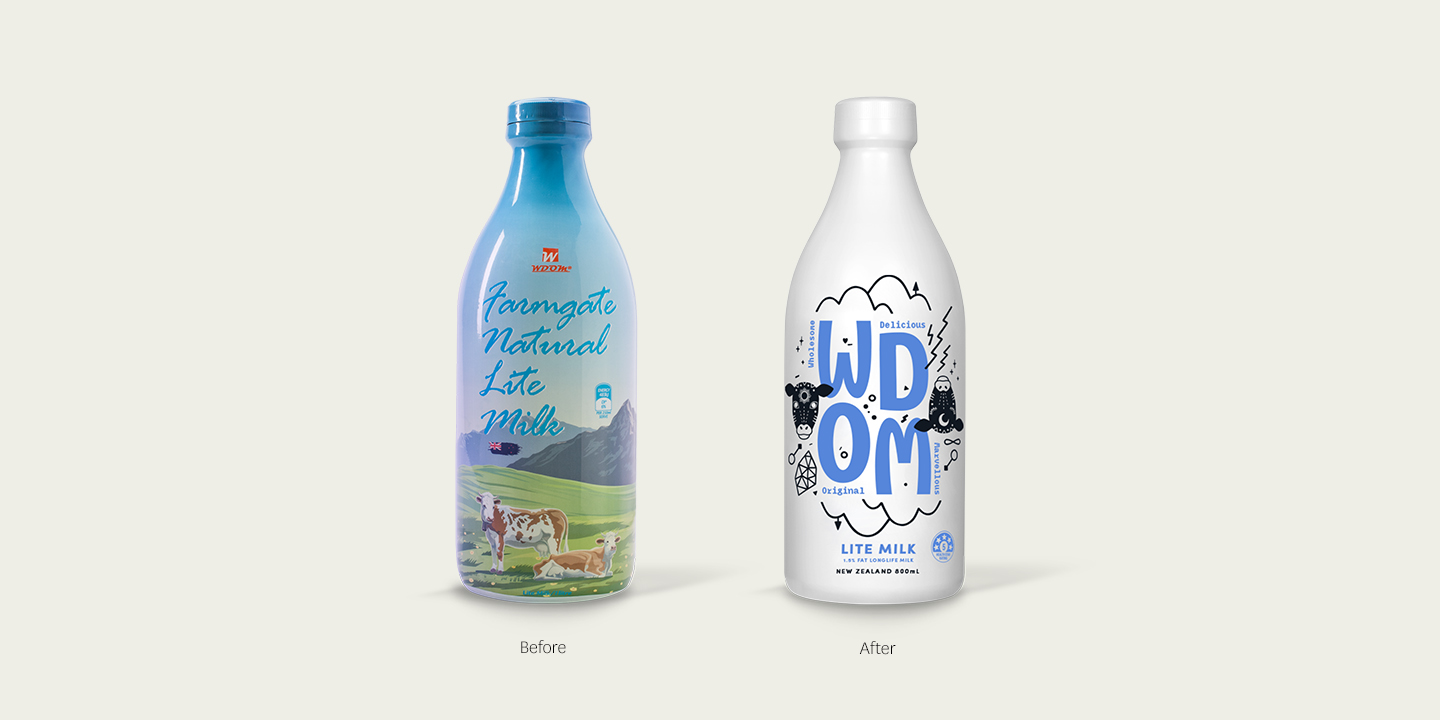
Our client was a group of young entrepreneurs who wanted to enter the dairy category with something different and better than competitors. The product was from New Zealand but their approach to business was very new age.
Design response:
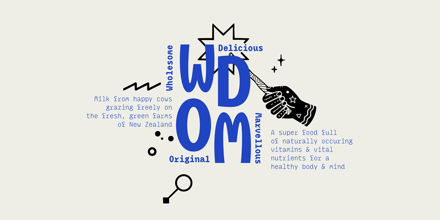
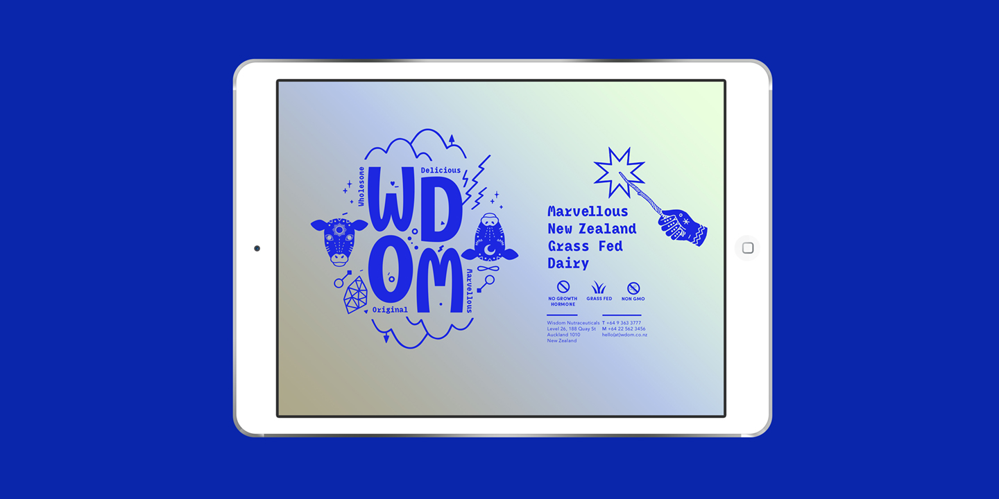
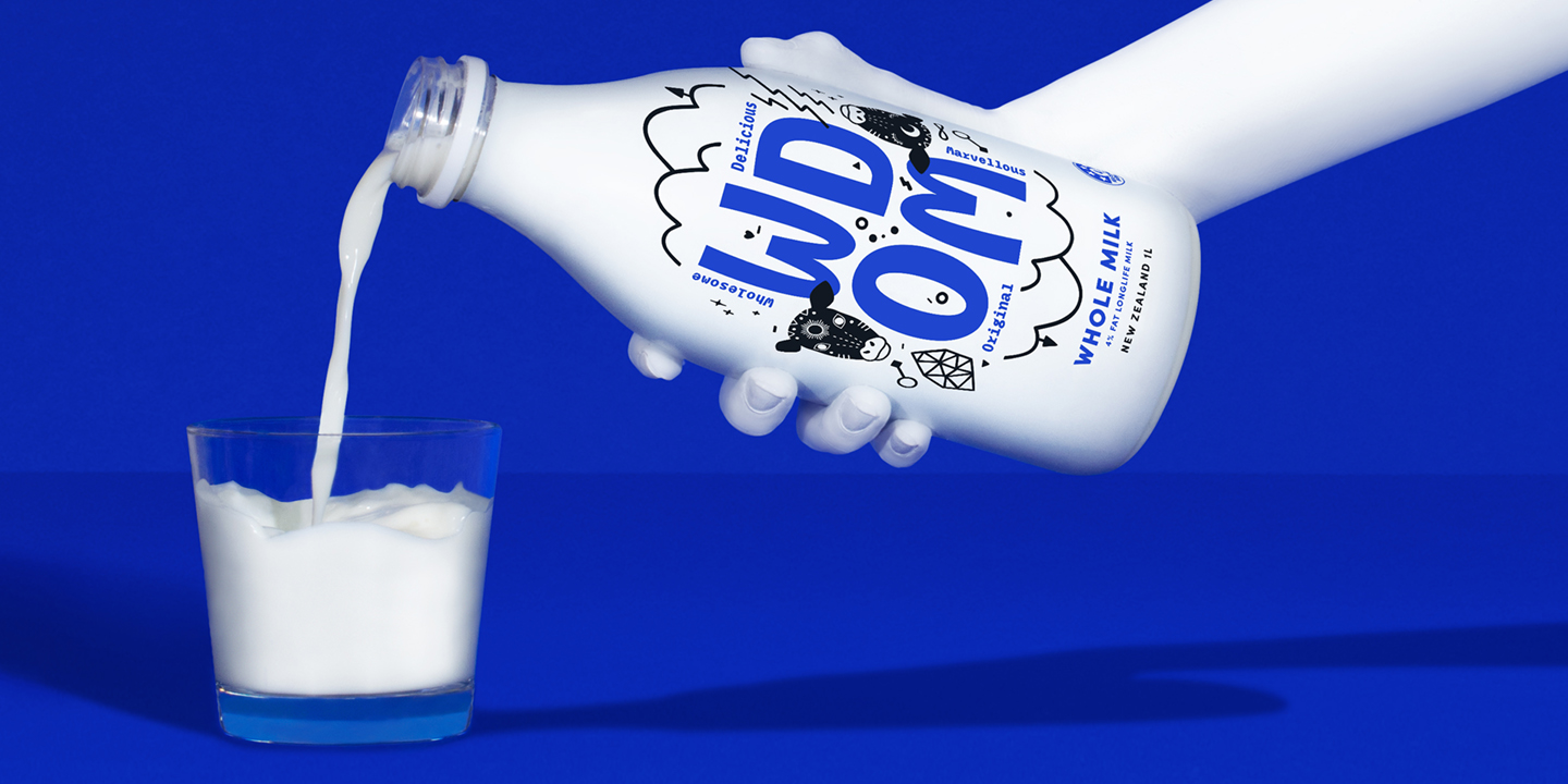
Our brand idea was inspired by alchemy, the idea of turning simple, humble ingredients into something more valuable and magical. We came up with four words to match their strange acronym name, and gave them a disruptive identity where mystical symbols surrounding New Zealand dairy icons – land and cows – spoke to a new kind of dairy.
Fresh From The Field — Wynyard Quarter – Transitional Spaces - By Fresh Concept

This week’s Fresh From The Field features the brand and packaging for WDOM by Dow Goodfolk If you have new or recent work that you would like to share in […]

5 years ago by

Fresh From The Field — Waihorotiu Path - By Maynard

This week’s Fresh From The Field features the brand and packaging for WDOM by Dow Goodfolk If you have new or recent work that you would like to share in […]

5 years ago by

Fresh From The Field — Mission’s Huchet - By Sartoria

This week’s Fresh From The Field features the brand and packaging for WDOM by Dow Goodfolk If you have new or recent work that you would like to share in […]

5 years ago by

Fresh From The Field — A project fit for a new king - By Fuller Studio

This week’s Fresh From The Field features the brand and packaging for WDOM by Dow Goodfolk If you have new or recent work that you would like to share in […]

5 years ago by

Leave a Reply