Fresh from the Field – Havana Brothers Cold Press Juice by Good Eye
This week’s Fresh From The Field features packaging design for Havana Brothers Cold Press Juice by Good Eye
If you have new or recent work that you would like to share in Fresh from the Field email Lana for details.
The brief:
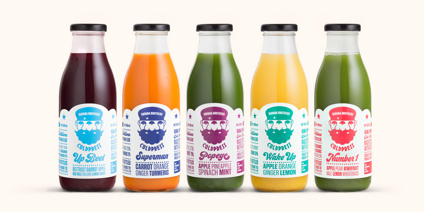
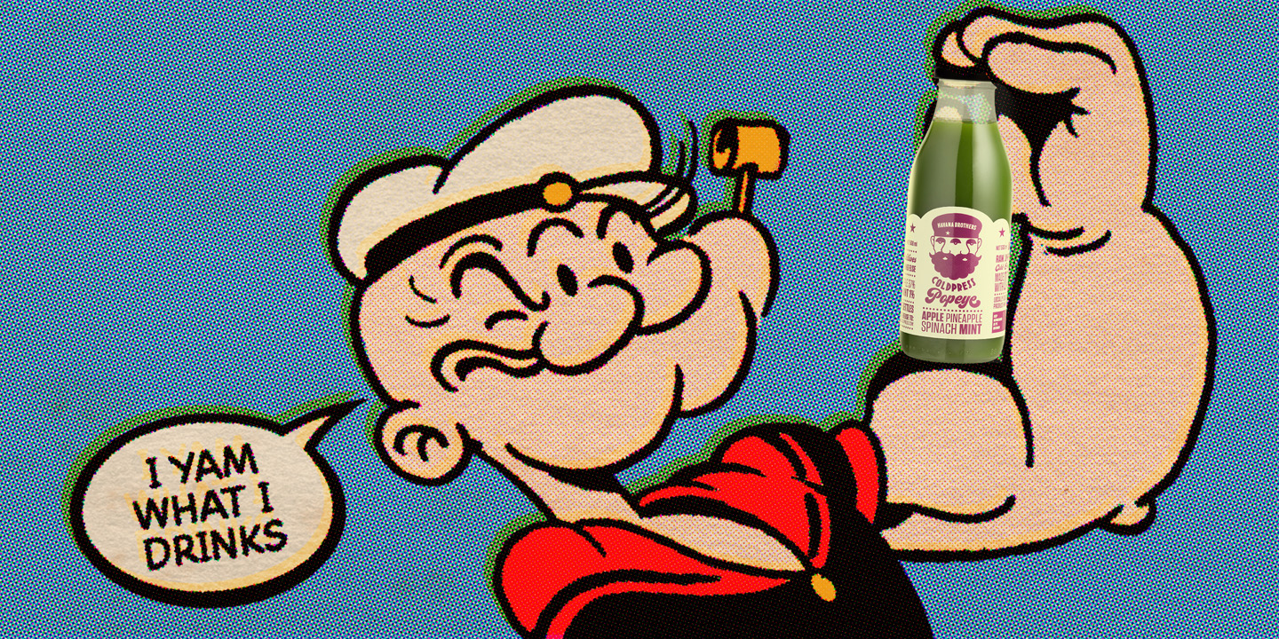
The Havana Brothers client had recently opened a bakehouse and were looking to produce their own organic cold press juices. They wanted to stand out in a market that often took itself very seriously and asked if we could create the story, marketing and packaging for the brand. Just saying that it was organic, seasonal and locally sourced wasn’t enough. They believed that being healthy could also mean having fun. And so, the con-joined Havana Brothers twins were born.
The studio response:
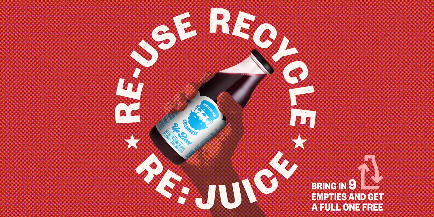
The first thing was to create the back story of Cedro and Eudendro’s unlikely origins in a small village in Cuba. Once the characters were established, we had the beginnings of an iconic image to carry the rest of the campaign. The three eyed brothers became the logo on the bottle as well as the marketing and social media imagery. Their product is unpasteurised and unprocessed. Their brand is unforgettable. Viva Havana Brothers.
Cedro and Eudendro Guerrero were often the victims of taunts and unpleasantness from the locals. Especially if their cafe ran out of Coldpressed juices. Fortunately they shared a singular vision to bring the finest, organic drinks to the people. In memory of their unlikely story, the commitment lives on today with Havana Brothers.


Design Team:
Geoff Francis – goodeye.co.nz
Chris Bleackley – eightyone.co.nz
Client:
havanabrotherscoldpress.com