Fresh from the Field — The Brand New by Folk Creative
This week’s Fresh From The Field features a new identity, The Brand New by Folk Creative
If you have new or recent work that you would like to share in Fresh from the Field email Lana for details.


The brief:
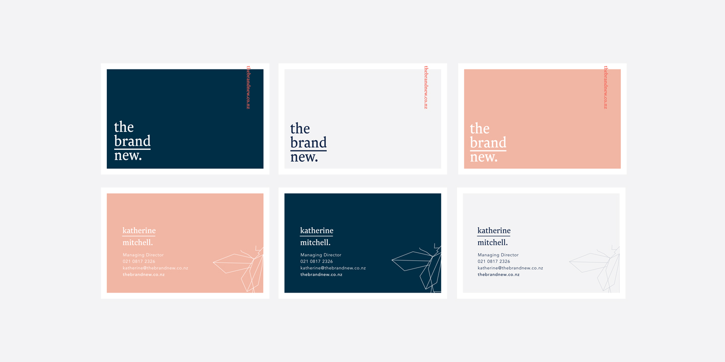
Our client, already a successful restaurateur asked Folk Creative to create an identity for her new business, a boutique marketing agency focusing on launching new brands into the marketplace.
The studio response:
As big fans of Klim Type Foundry, we felt that Newzald would be the perfect fit for the type treatment we had created for the logo. We paired it with a modern geometric illustration of a scarab beetle which is a significant symbol for Folk Creative and works as a great icon for the clients business.
When it came to colour, the client had a clear idea of what she liked, and we love how the mix of strong and soft hues play off well against each other, and give variety to work with.
Studio:
www.wearefolkcreative.com
@bron_alexander_design