Fresh from the Field — Lettering and Packaging for Moses Lake by Craig Black
This week’s Fresh from the Field features lettering and packaging for Moses Lake by Craig Black. Craig will be co-presenting our Wine & Type workshop alongside Nicole Arnett Phillips on 17th May in Auckland.
Sure to be a fun evening of type, wine and conversations – Get your tickets now at the early-bird price!
If you have new or recent work that you would like to share in Fresh from the Field email Lana for details.

The Brief:
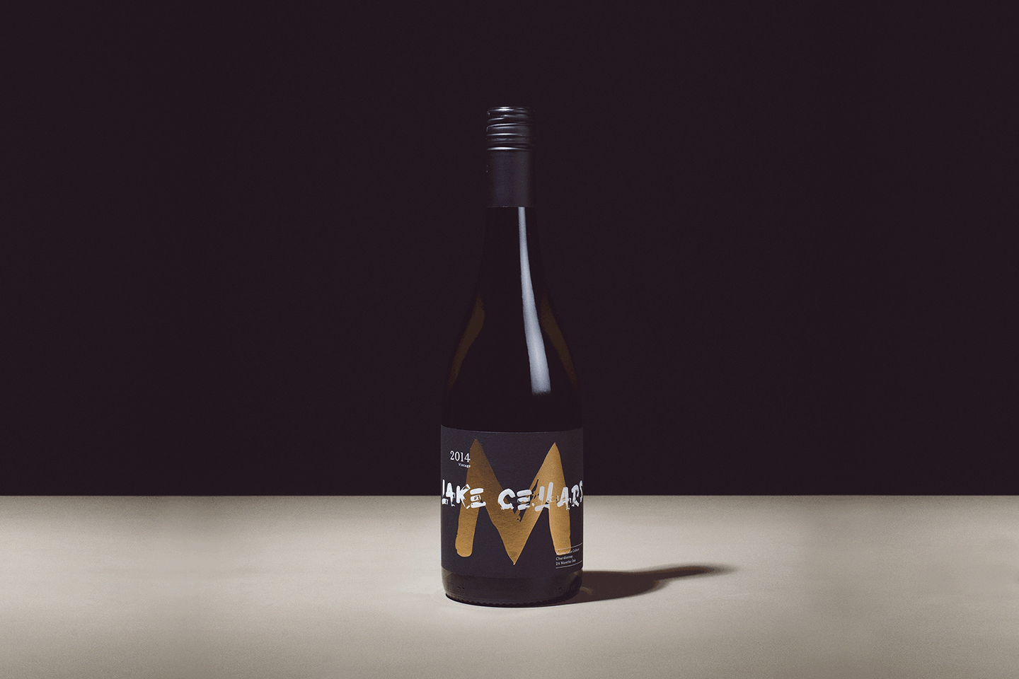
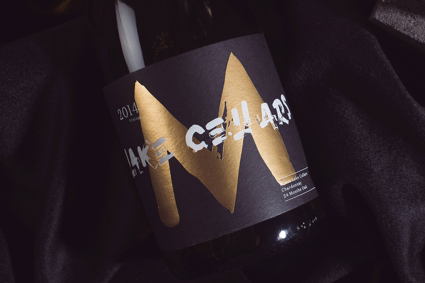
Moses Lake Cellars is a luxury West Coast American wine brand created by Thirst Craft. This concept is an exploration of a premium wine brand being presented in a unique way. This showcases a brand that works as a collective on a dinner table, visually tying together an eclectic core range of wines.
Working with Thirst Craft, I created the lettering style by using various brush techniques as well as building the full layout to final look of product. The brush strokes provide beautiful detail and offer a level of intricacy that gives the lettering depth and interest. This is much like the experience of drinking wine, it’s the small details that make it special.
Agency: Thirst Craft
www.craigblackdesign.com


