Fresh from the Field — First Light, Dow Design
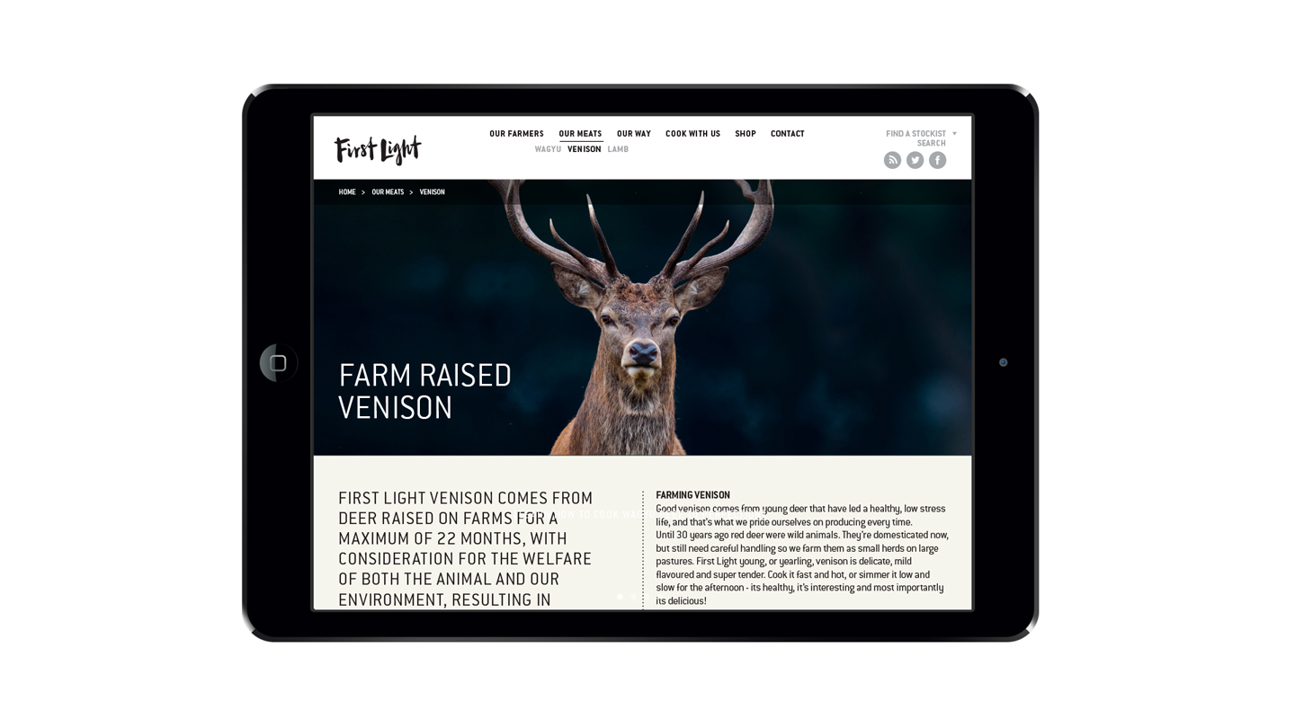
This week’s Fresh from the Field showcases the branding, identity and packaging for First Light grass-fed meats by Dow.
If you’ve got new or recent work that you’d like to share in our weekly Fresh from the Field series email Zoë for details.

The brief:
At first we were commissioned just to come up with a positioning for First Light. They had done a lot of research with their consumers in North America and needed to pull their brand story together for better success in that market. They had already been working with a brand consultant, but didn’t think he had cracked the positioning.
Enter Dow. No pressure.
Design response:
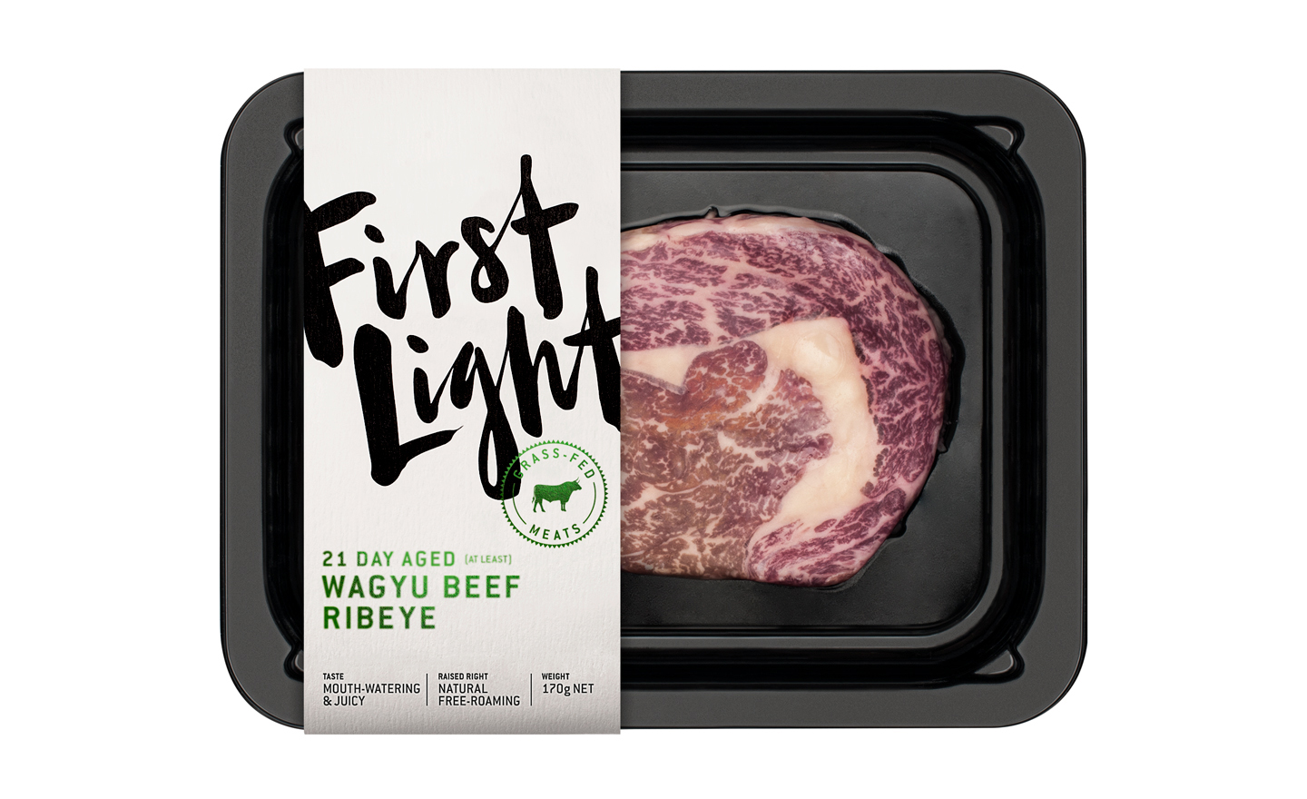
Once we had gained First Light’s confidence with a new brand positioning they loved, we got the job to redo the identity. Our idea was to bring to life the personal commitment behind this brand. That’s why the logo looks like a signature; the ultimate personal endorsement is when you sign your name to something.
We also wanted to use it in a very bold, individualistic way because this group of inventive farmers and rule-breaking meat men had broken a lot of precedents to get where they are today.
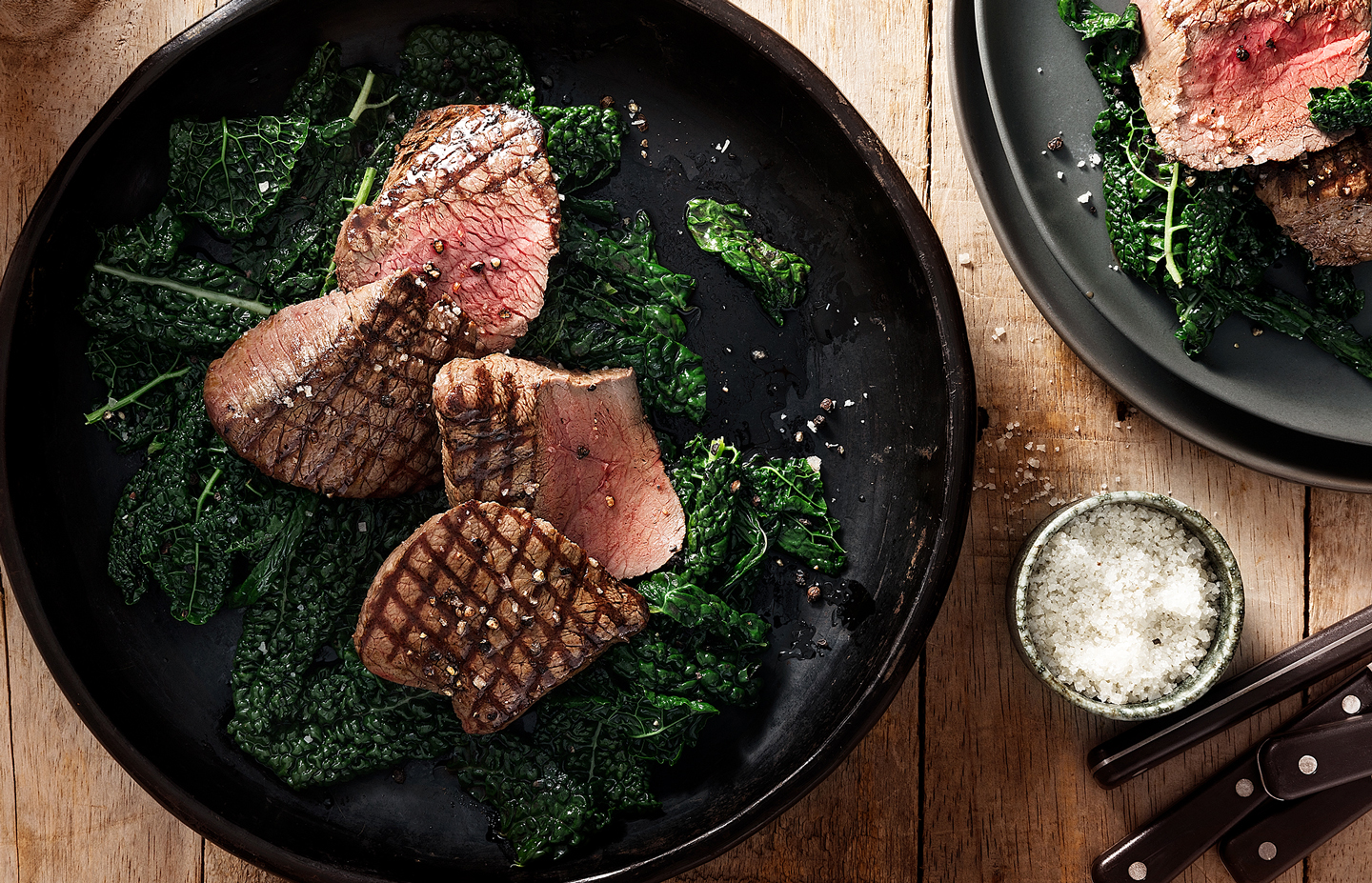
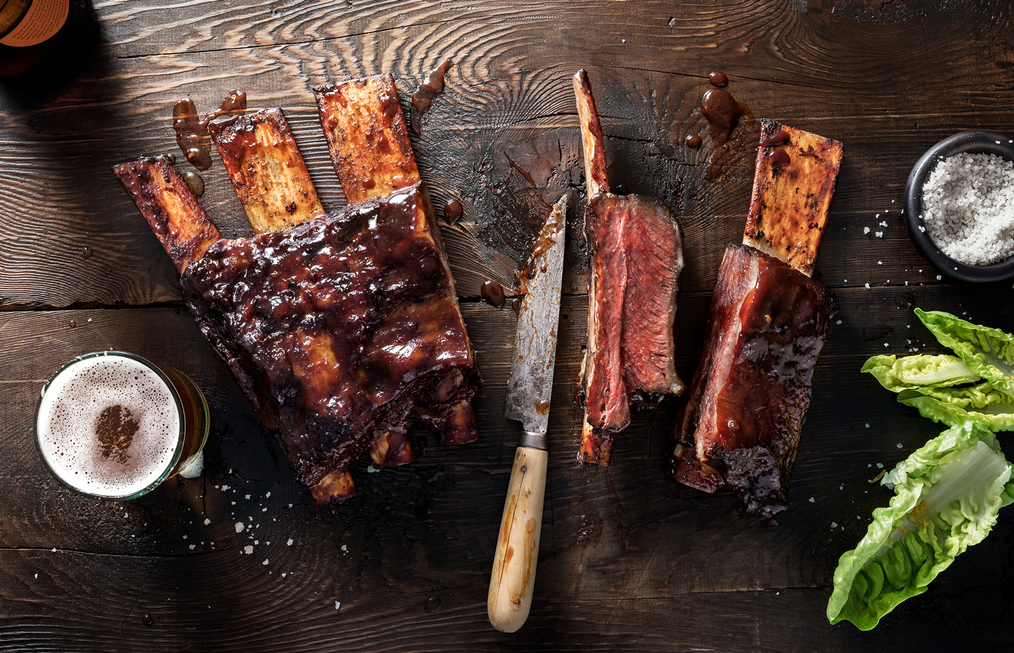
We used a beautiful letterer to create the logo, and some very sexy, dark photography. Because raising meat right is not for sissies.




Credits:
Donna McCort
Leonie Whyte
Jamie Pettigrew
Ben Dean
Carl Dixon
Photography & Styling: Kieren Scott
Chef: Geoff Scott