Fresh from the Field — Harker Herbals by Curious
If you have new or recent work that you would like to share in Fresh from the Field email Lana for details.

Nature meets science
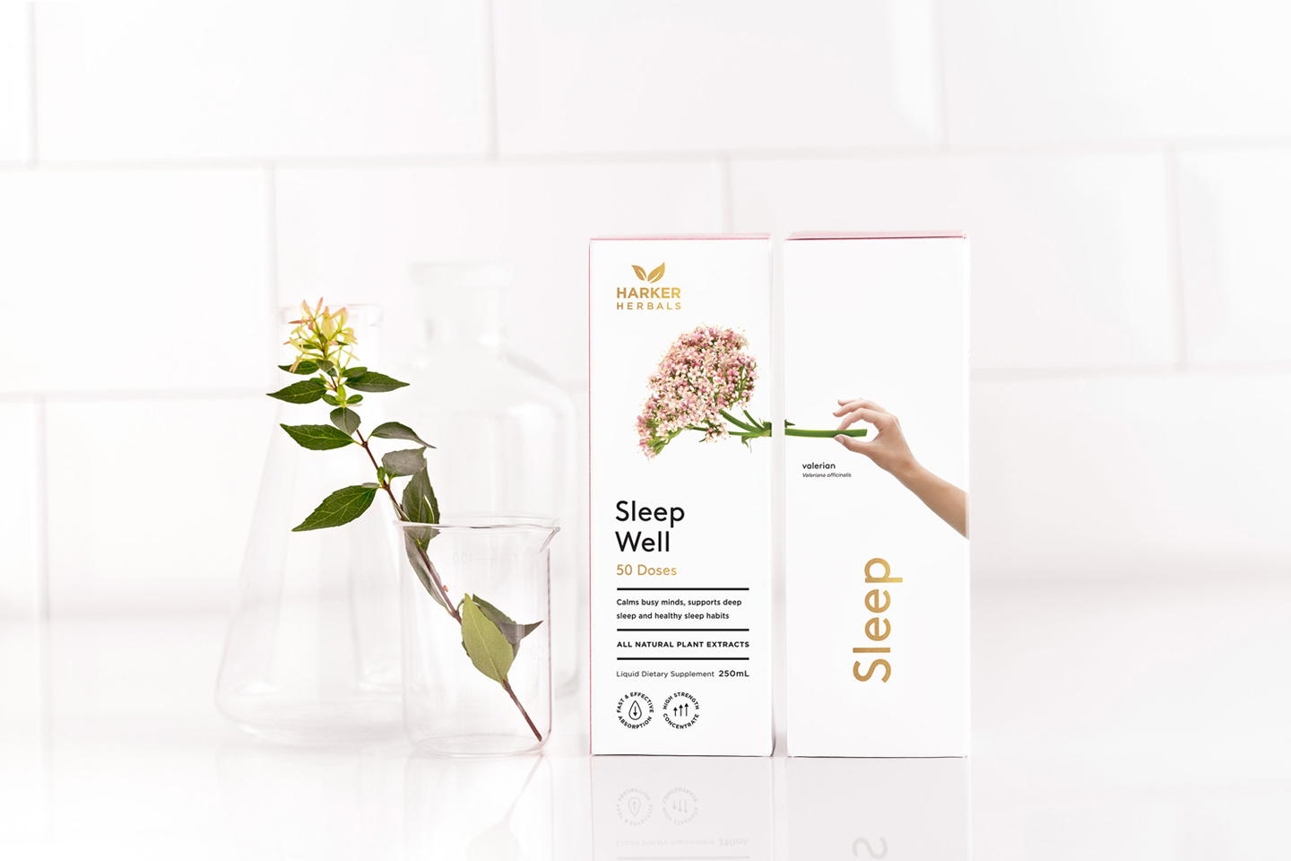
Harker Herbals have created a new generation of powerful, 100% natural plant-based formulations that are targeted to support recovery from illness and maintain wellness. They have been expertly crafted using decisive clinical research and traditional plant medicine know-how. All of the ingredients are sustainably sourced and independently tested for authenticity, providing the very best support for your health.
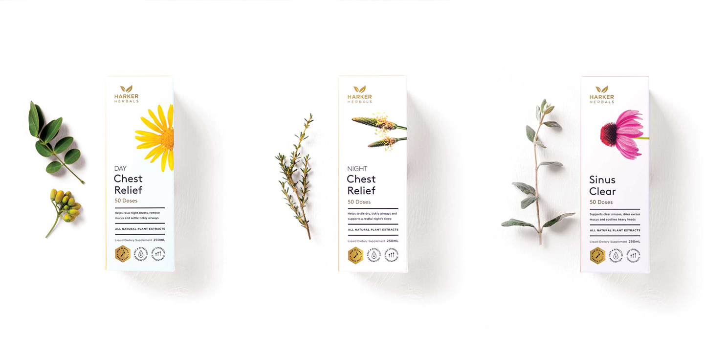
This symbiotic relationship of nature and science was the first thing that struck a deep resonance with the Curious team. The philosophy of balance and harmony between two seemingly polar opposite worlds was the catalyst that allowed us to expand a ‘dualism’ concept into the brand strategy and packaging. Modernity blends seamlessly with tradition. Functionality meets form. Efficacy fuses with heart and soul. This potent territory has been expertly realised into a visual language for the Harker Herbals Be well range.
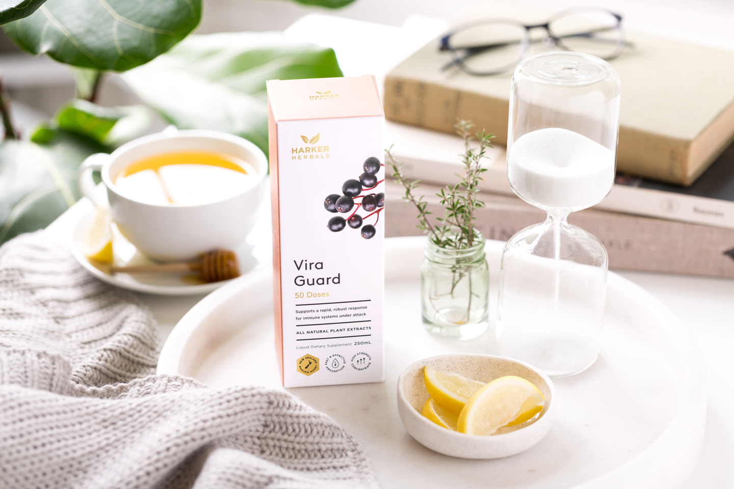
Beautiful photographic images of key ingredients are linked to a human hand, emphasising not only the consumer’s connection to nature with these unique products, but also reflecting the care and crafting that Harker Herbals have invested into them. This evocative imagery has then been complemented with a soft, muted colour palette, allowing each variant to have its own designated identification colour to assist the consumer at point of purchase.
“From day one, Nigel and the team at Curious understood our new range. They conceived and developed a contemporary, beautiful design for our packaging and point of sale materials that positions our products exactly as requested. Importantly, the design look and feel across the entire launch has generated real excitement in the market. Standouts for us are their innovative approach, attention to detail and willingness to work together to achieve a great result. Curious gets five stars from us.” – Harker Herbals


Fresh From The Field: Elmore Booth – By PERKS
It takes two. PERKS marks Elmore Booth’s next chapter with an identity built around two architects, two perspectives and the point where they meet. The brief Oli Booth Architecture […]
4 days ago by Iris Kalff
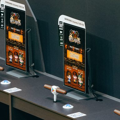
Fresh From The Field: Fresh From The Field – Google Play G-STAR minigames – By PHQ Studios
Press play! PHQ Studios transformed Google Play’s G-STAR booth into a high-energy arcade experience that kept more than 7,000 gamers coming back for more. The brief Google Play tasked PHQ […]
2 weeks ago by Iris Kalff
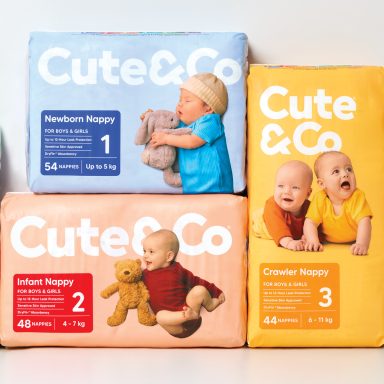
Fresh From The Field: Cute & Co – By Onfire Design
Cute by name, clever by design. Onfire gives Cute & Co a fresh new look where connection is all that matters. The brief In just four years, Cute & Co […]
3 weeks ago by Iris Kalff

Fresh From The Field: Big Ag and game of more – By Bryce Groves x Pixelpush
What started with a scroll through the Fresh From The Field archives became an award-winning collaboration. Bryce Groves and Pixelpush joined forces to create Greenpeace Aotearoa’s Big Ag and Game […]
1 month ago by Iris Kalff