Fresh From The Field: Cute & Co – By Onfire Design
Cute by name, clever by design. Onfire gives Cute & Co a fresh new look where connection is all that matters.
Fresh from the Field is a weekly article series sharing fresh and inspiring work from the Design Assembly community. Want to submit your work to Fresh From The Field? Fill out the form here.
The brief
In just four years, Cute & Co nappies grew from launch to 10% market share, a genuine challenger to the legacy brands. But as competition intensified and new brands entered the category, Cute & Co risked losing its connection with the modern, young parents it was built for. Onfire was brought in to sharpen the brand’s story, refresh its brand identity and packaging, and restore its relevance while staying true to its ‘everyday’ positioning.
The design response
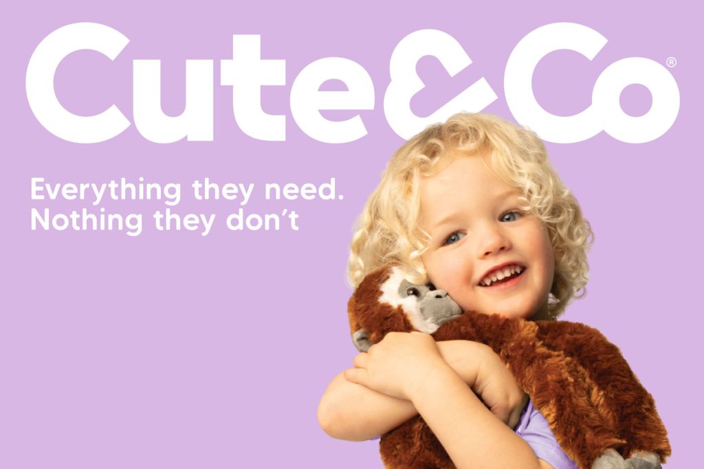
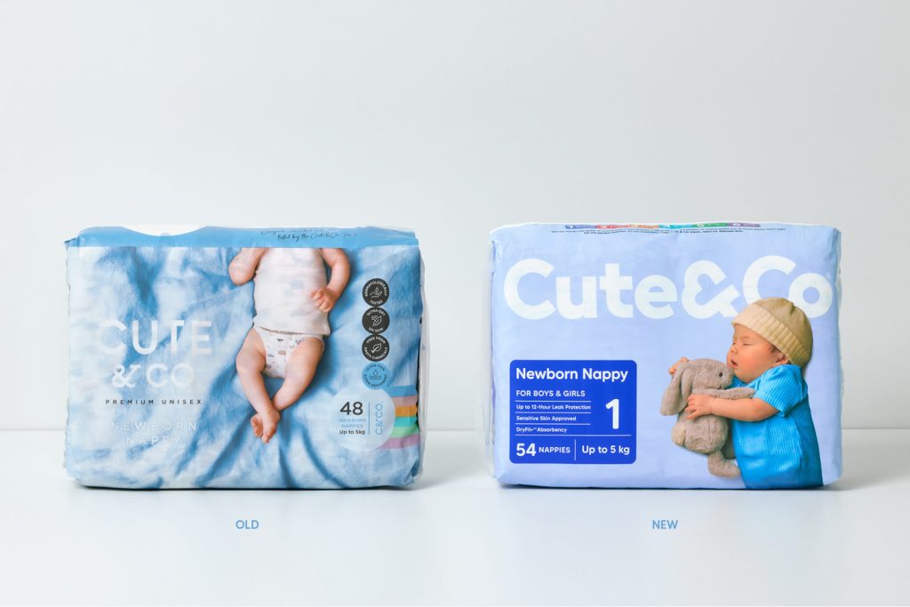
Onfire developed a new brand idea, “All that Matters,” which centres on what parents actually want: fewer distractions and more peace of mind. Rather than piling on features that drive up prices, Cute & Co gives parents exactly what they need to keep babies and toddlers dry and happy.
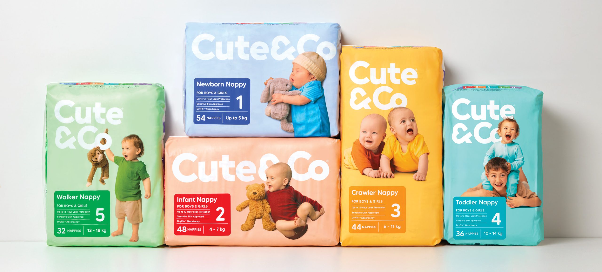
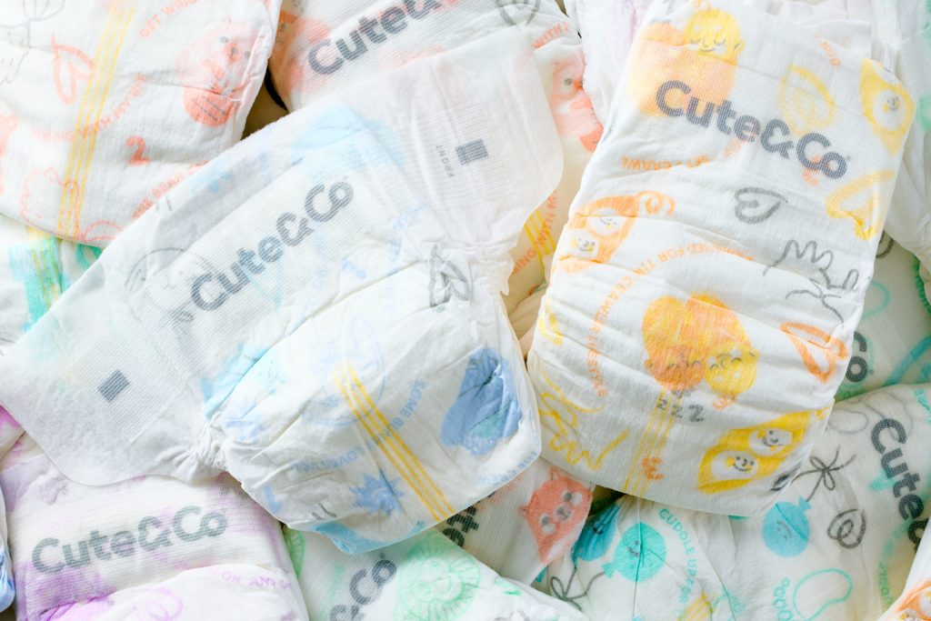
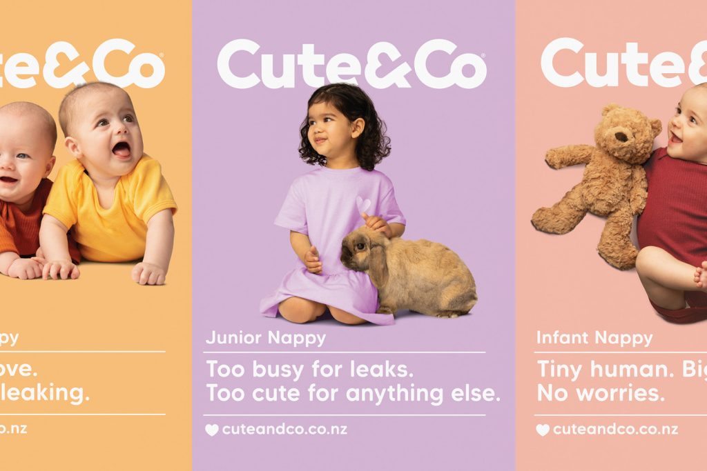
To bring this to life, the redesign strips away the usual clutter of claims and icons common to the category. The new design shifts focus to the emotional pull of the brand name – we celebrate ‘connections’, the small moments that define the early years: snuggles with a favourite toy, family support, friendships with people and pets. These are the “& Co” moments that shape these important stages. The brand name becomes something parents feel, relate to, not just read. The look is warm, modern, and quietly confident; more companion than commodity, inviting parents to feel at home with the brand both in-store and at home.
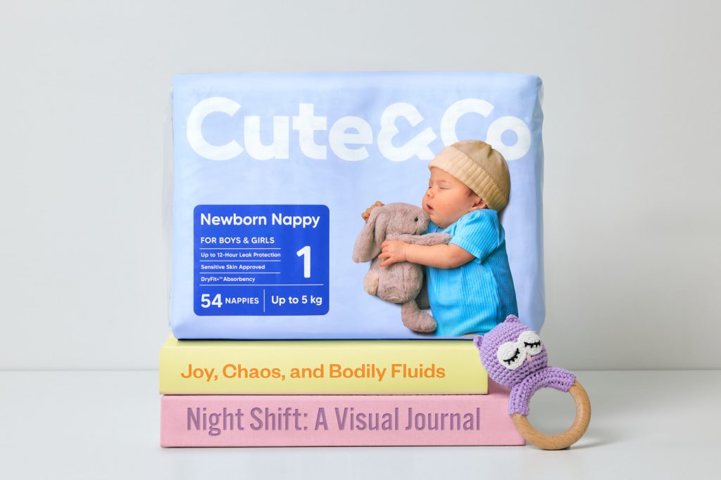
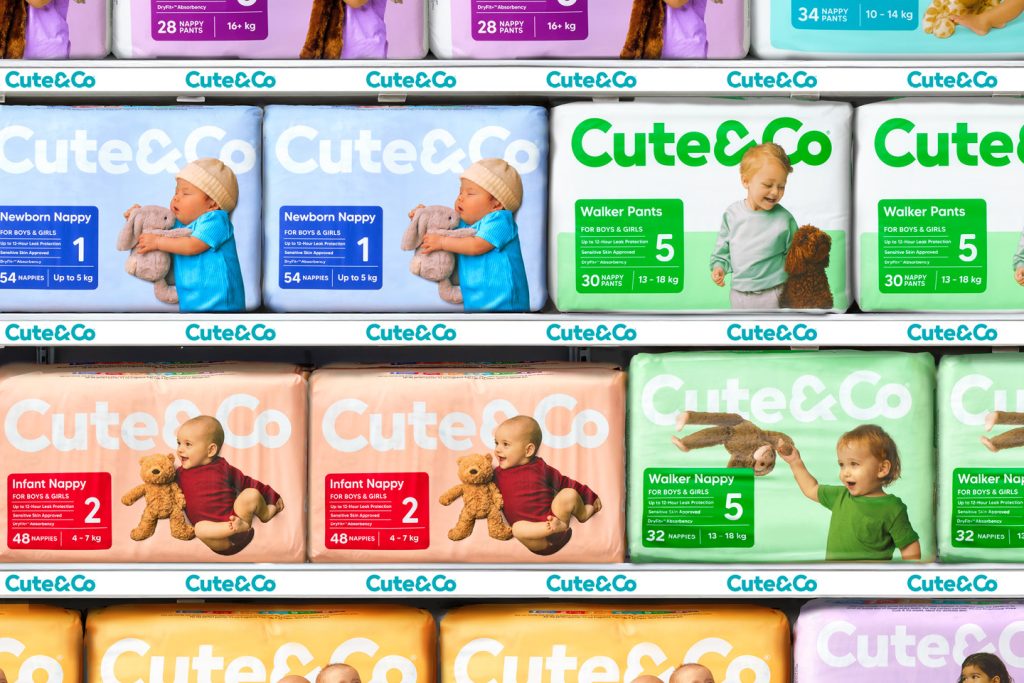
On shelf, the design is clean and purposeful. A bold wordmark anchors the pack, an ampersand shaped like a heart ties the idea together, and bright flat colours differentiate each nappy stage. Key information, including Dermatologically Tested, Ultra-Dry, Ultra-Thin, Super Absorbent, is easy to find, with no excess iconography.
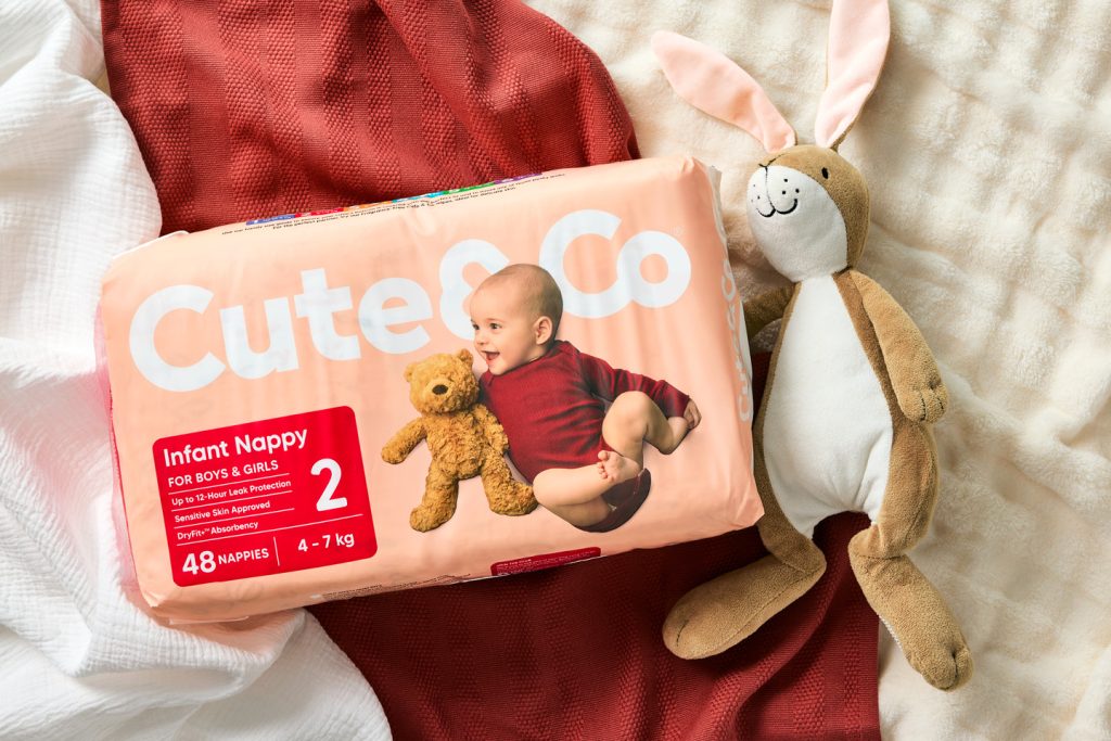
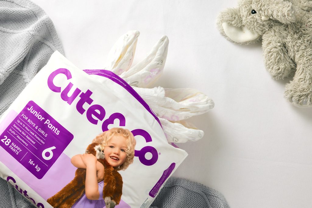
Photography brings it home. Each pack features a unique, intimate connection moment, with babies and toddlers front and centre, eyes, smiles, and dimples, alongside their everyday companions. The result is packaging that’s warmer, more memorable, and firmly positions Cute & Co as a modern, considered choice for parents navigating everyday life. Because connection is all that matters.
The design team
Website
Instagram: @onfiredesign
Facebook: https://www.facebook.com/onfiredesign
Linkedin: https://www.linkedin.com/company/onfire-design
The client team
Cottonsoft