Fresh From The Field: Elmore Booth – By PERKS
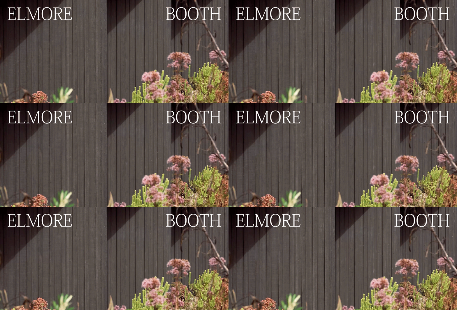
It takes two. PERKS marks Elmore Booth’s next chapter with an identity built around two architects, two perspectives and the point where they meet.
Fresh from the Field is a weekly article series sharing fresh and inspiring work from the Design Assembly community. Want to submit your work to Fresh From The Field? Fill out the form here.
The brief
Oli Booth Architecture had evolved into a creative partnership and needed an identity to reflect. The rename to Elmore Booth wasn’t simply a cosmetic change, it marked a shift in how the studio operated and how it wanted to be seen. The challenge was twofold: create a brand identity that felt true to the practice, and manage the transition carefully enough that long-standing clients would receive it with confidence. There was an understandable hesitation around change. When a name carries years of reputation, a rebrand can feel risky. The brief required both a considered design response and a steady, rollout strategy to protect the trust the studio had already built.

The design response
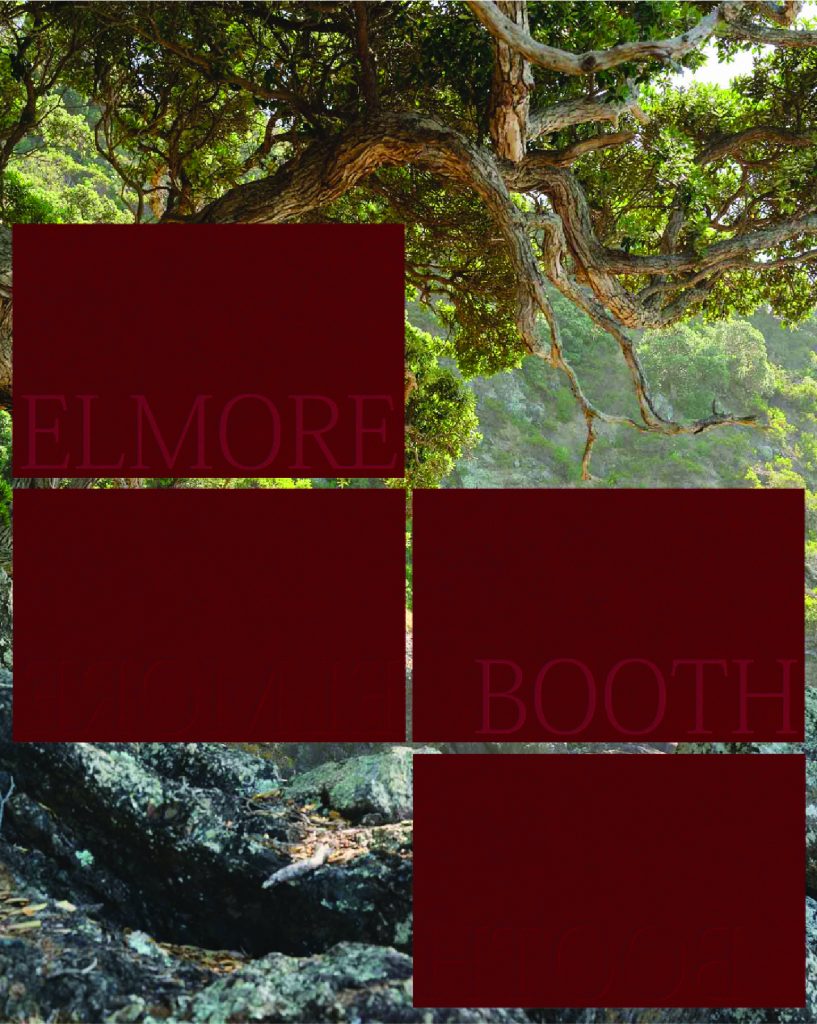
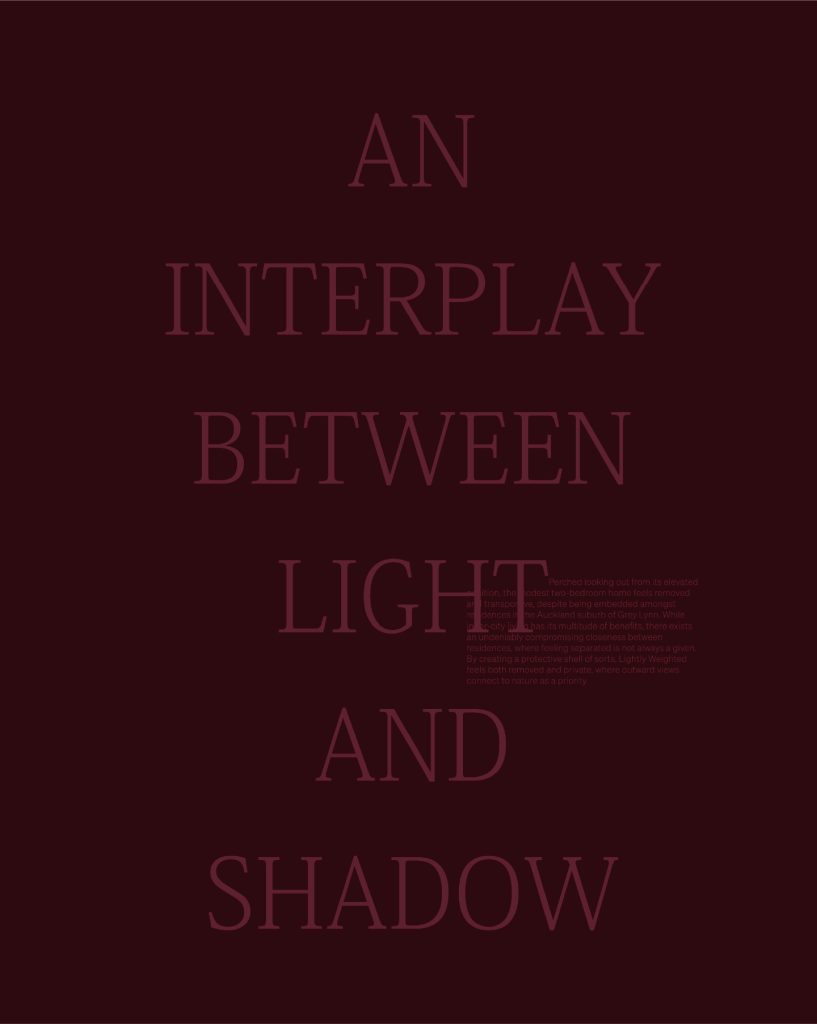
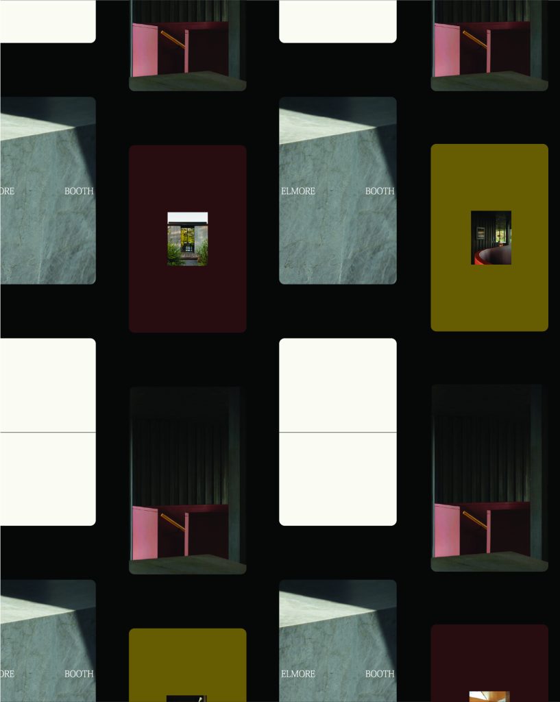
The concept centres on the partnership itself, two equal halves, two perspectives coming together. A line becomes the primary graphic device, dividing and swaying across applications, finding its point of equilibrium. The architects’ names move independently within the system, coming together and drifting apart, reflecting both the union of the partnership and the distinct strengths each architect brings to their practice. There is a collaborative centre, and there are individual voices, and the identity represents both.
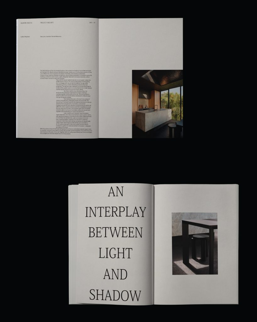
The logotype required the most exploration. Early conversations pointed us toward something handcrafted and characterful, and we worked through a number of directions to explore this. What emerged through the process was that the visual language of the practice itself asked for something more refined. We circled back to a delicate, tall serif, with subtle moments of craft added (like the connection of the two characters) which was the right decision, but we needed to go through the iterative process to get there.
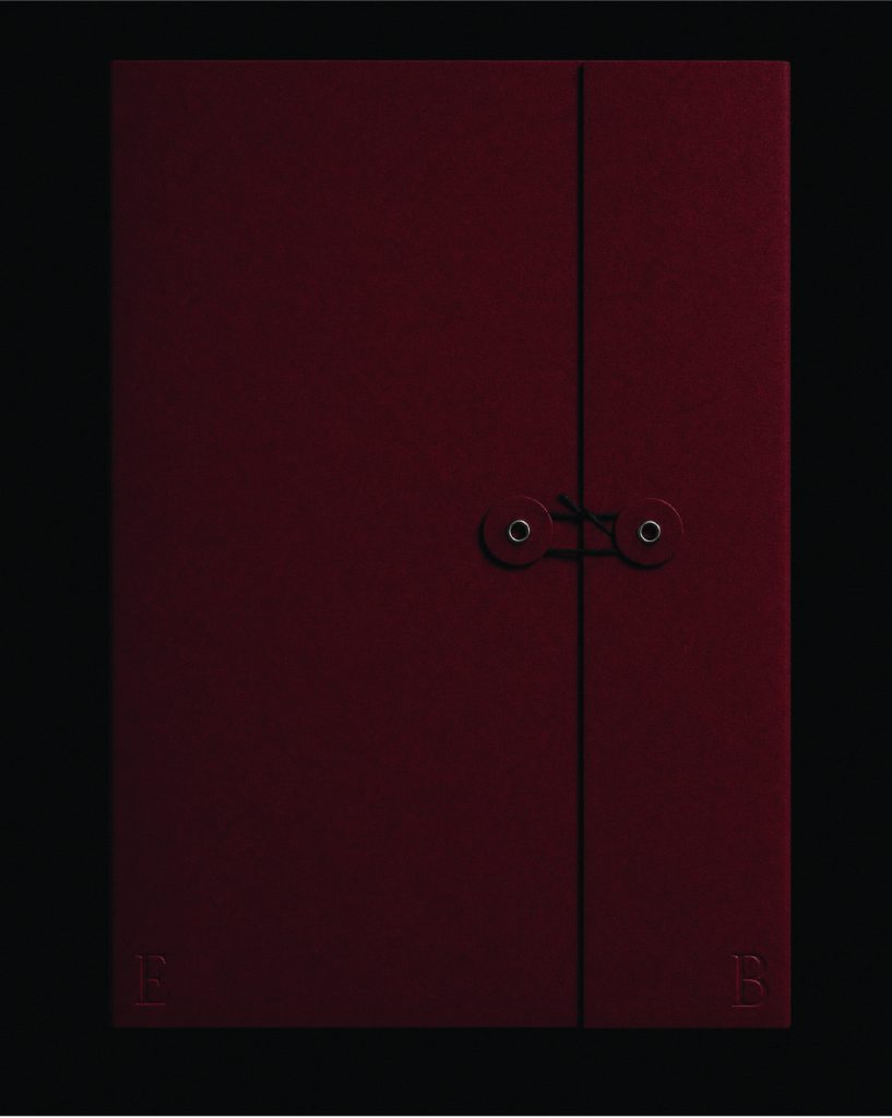
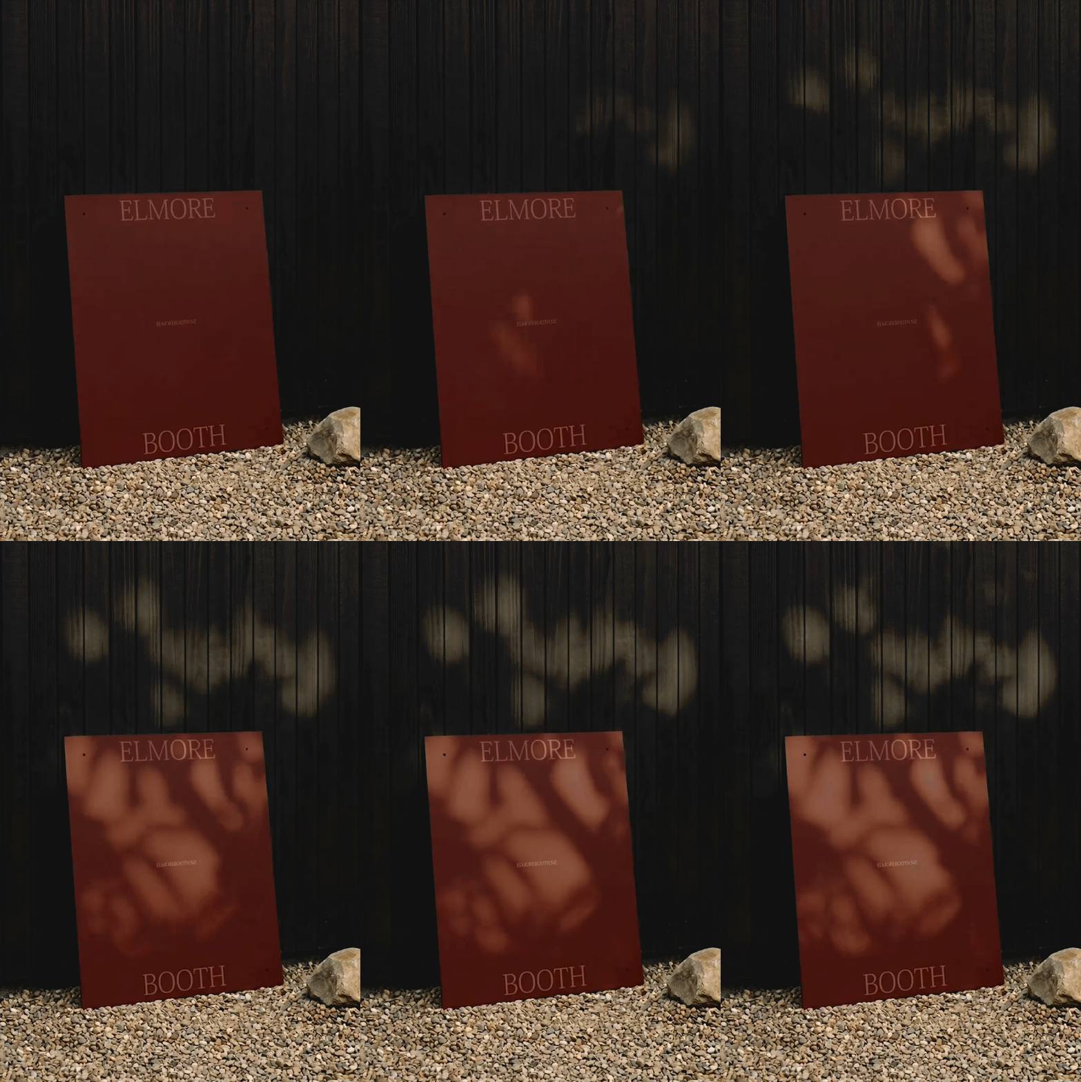
Colour was drawn from tones already present across their architectural work. Rather than introducing something new, we looked at what was already there, a consistent material and tonal language that had appeared across their projects for years.
The result is restrained and considered (like the architectural work), with enough movement and intention to communicate the nature of the partnership without being too overt. The rollout was handled carefully, with clear communication at each stage and a gentle launch, and as a result, it was received with warmth.
A key learning for this project is that the real value of a rebrand isn’t necessarily the visual outcome alone, it’s guiding a business to move forward without losing the trust it has spent years building.

The design team
Ella Hampshire-Perks, Lead Designer / Creative Director
Meagan Harbott, Graphic + Web Design
Rachel Goldsworthy, Motion
https://www.perks.design/
@perks.design
The client team
Elmore Booth
@elmorebooth
https://elmorebooth.nz/
Collaborators
Samuel Hartnett, Photography