Fresh From The Field — Waihorotiu Path – By Maynard
Design Assembly loves to profile the breadth and depth of design practice in Aotearoa. For September, in line with the Spring Conversations events, we’re putting a highlight on Placemaking & Design.
Maynard walk us through developing a thoughtful wayfinding system for Auckland Council which allows pedestrians, people on bikes and other micro-mobility users to have full, safer use of Queen Street, maximising low-carbon access to the wider city centre.
The brief
Auckland Council have undertaken a phased approach to reshaping Queen Street, creating a people-focused Waihorotiu Valley. In order to create an environment that fully supports access for all, the provision of up-to-date wayfinding information for all active modes of transport was critical.
The multi-use path runs on one side of Queen Street, serving cyclists, scooters, and pedestrians. A thoughtful wayfinding system was required for local navigation and path activation, facilitating the movement of people through Waihorotiu. An opportunity was identified to incorporate groundmarkings that both gave identity to the path, and provide necessary distinction from pedestrian-only paths for enhanced caution.


The Design Response
Maynard collaborated with Ngāti Whātua Ōrākei, Auckland Council and Auckland Transport to create a fit-for-purpose wayfinding system for Auckland’s Waihorotiu valley. In the heart of Auckland’s CBD, the Waihorotiu path allows pedestrians, people on bikes and other micro-mobility users to have full, safer use of Queen Street, maximising low-carbon access to the wider city centre.
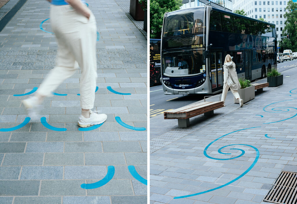
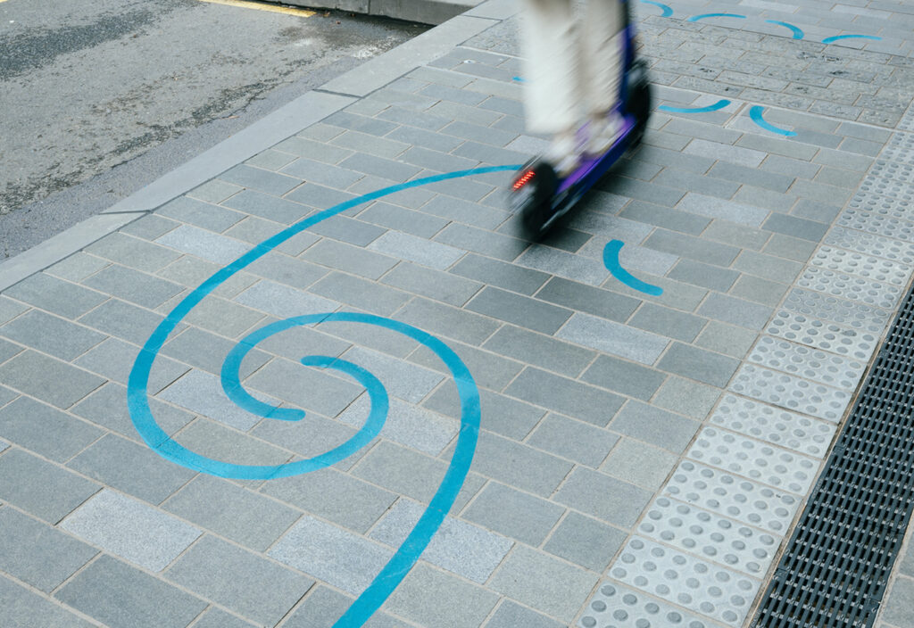
The visual language of the ground markings is inspired by the Waihorotiu stream that once meandered through the valley and now flows beneath present day Queen Street. Designed in collaboration with Mana Whenua design studio Kaunuku, fluid and guiding graphics gently move and connect people across the city centre of Tāmaki Makaurau.
As well as surfacing the narrative of the underground waterway, the path markings aim to draw attention and enhance visibility, alerting the wider users of Queen Street to the presence of those traveling by bike and micro-mobility. Unique graphic treatments have been designed for different zones, subtly communicating behavioural information including cross flows, direction and movement.
Three distinct forms of pattern language are employed on the path’s surface, each serving a specific purpose:
Wavelets – attention and direction: Wavelets connect the path experience and intensify around crossing points, creating a gentle reminder for surrounding people to take caution.
Boulders – cross-flow loading zone: Adjacent to loading zones, flowing arced shapes are reminiscent of large boulders that slow the flow of water.
Stream – flow zone: communicating speed and swiftness, this motif indicates areas with fewer obstructions.
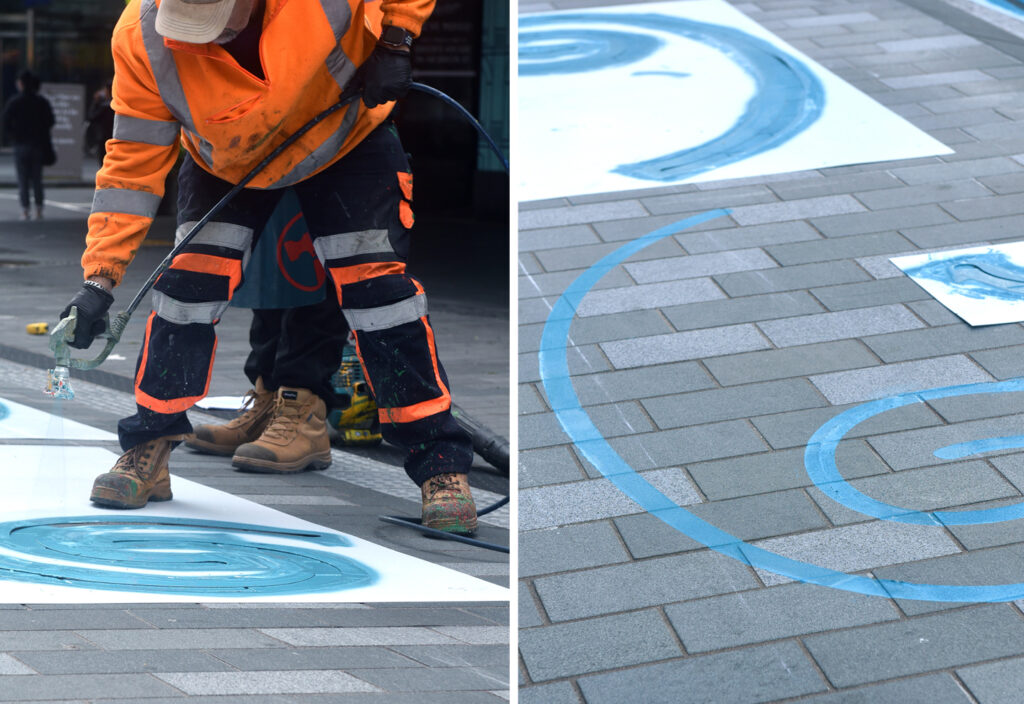
The groundmarking application intensifies at bus stops, loading zones and intersections, to give greater awareness to cross-flow activity. The implementation of the groundmarkings utilised a step-and-repeat pattern process using mask-and-spray stencils.
These graphic elements of the design are meticulously crafted to evoke a sense of fluidity and guidance, effectively connecting people throughout Tāmaki Makaurau’s City Centre. We aspire for this path to encourage users to share space safely whilst connecting with the historic landscape.


The Design Team
Simone Speet – Design Director
Emme Jacob – Graphic Designer
Jayson Urlich – Graphic Designer
Franziska Steinkohl – Wayfinding Designer
Eden Short – Wayfinding Designer
https://www.maynard-design.com/project/waihorotiu/
https://www.maynard-design.com/
Instagram: @maynarddesign
LinkedIn: Maynard Design Consultancy
https://www.linkedin.com/company/maynard-design-consultancy/
The Client Team
Auckland Council
Client details
Instagram: @aklcouncil
Linkedin: https://www.linkedin.com/company/auckland-council/
https://progressakl.co.nz/projects/auckland-council/wai-horotiu-queen-street-project/queen-street/
Collaborators
Landlab
Auckland Transport
Ngāti Whātua Ōrākei


